
In this post we’ll show one possible way of using MindFusion WPF Diagram with custom model objects, and will create a simple Sankey diagram as an example.
Continue readingTag Archives: wpf
Design custom shapes with WPF Diagram
Watch here the video for this tutorial.
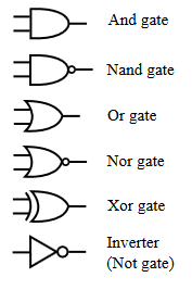
This tutorial will run you through the process of creating custom WPF diagram shapes using the built-in Shape Designer. Keep in mind that the Designer is intended as a sample and is limited in terms of functionality. The designer is available inside the installation of MindFusion.Diagramming for WPF but is also included in this tutorial for convenience. For the purposes of this tutorial, we will create an ‘AND Gate’ circuit diagram shape as illustrated by the following image:
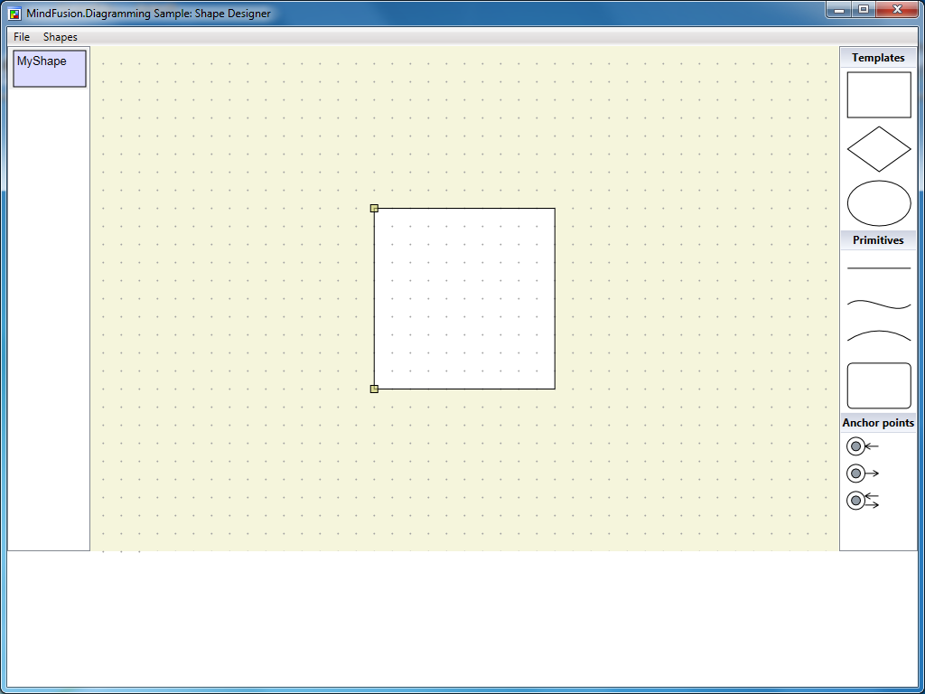
Run the Shape Designer application through the ShapeDesign.exe. The Shape Designer opens up with a single rectangular shape ready to be modified.
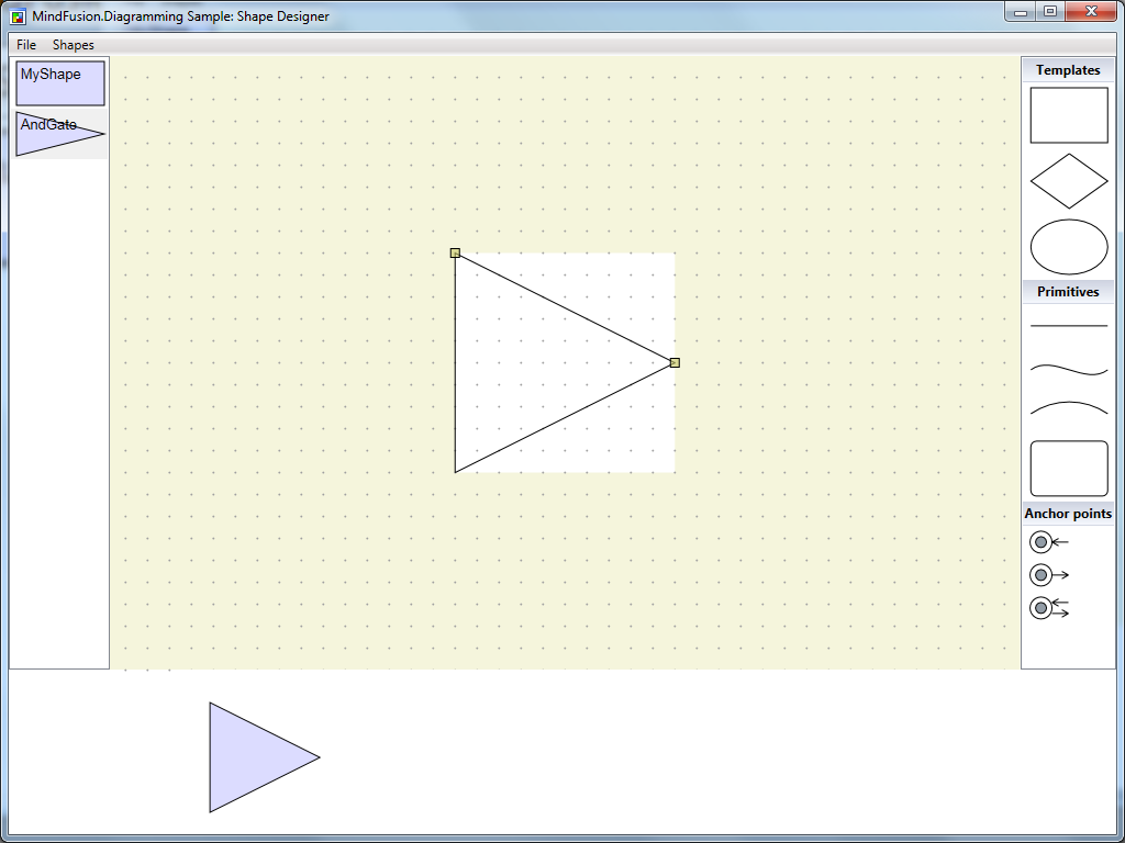
The Shape Designer does not currently support shape renaming (remember, it’s just a sample), therefore create a new shape through the Shapes menu and name it ‘AndGate’.

Select the newly created shape from the list on the left. In the editor select the right segment of the shape’s rectangle and press the DEL button on the keyboard. This will delete the segment and make the shape triangular.
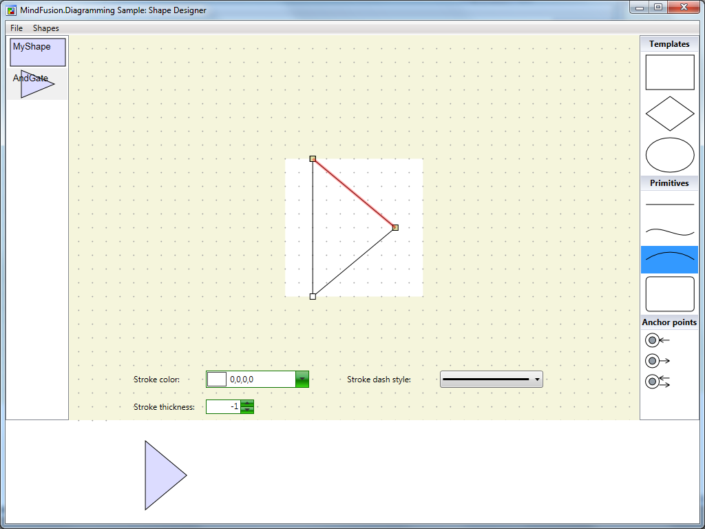
Adjust the end points of the shape segments so that it gets deflated on both sides. To adjust a segment, hover it with the mouse (so that its adjustment handles appear), then drag the handles.

Select the arc primitive from the list on the right side of the screen. Drag this primitive over the top segment of the shape (until it gets highlighted in red) then drop.
This will replace the line segment with an arc. Repeat the same process for the bottom segment of the shape.

Adjust the middle point of both segments so that the shape looks protruded. Then drag three line primitives from the list on the right to the editor pane. Be careful not to drop the primitives over existing elements because this will replace the elements.
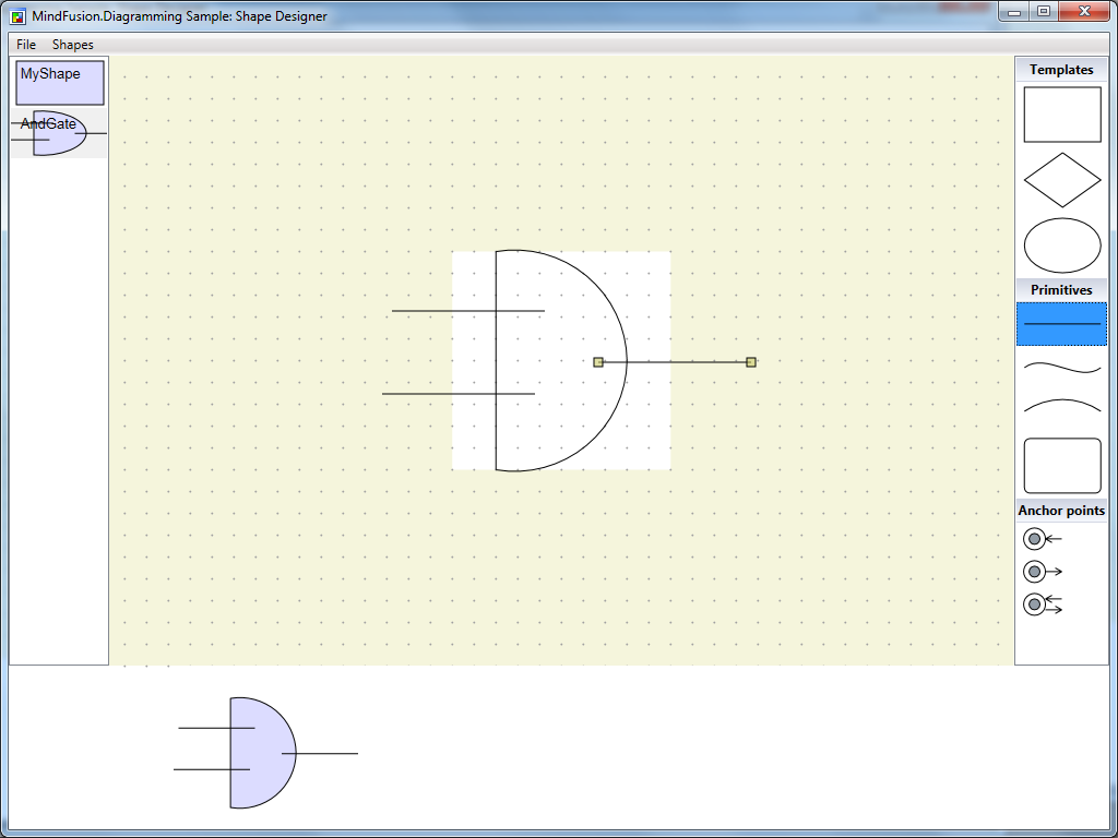
Align the newly created line primitives with the existing shape.

From the list with anchor points at the right side of the application, drag two anchor points from the first kind (input only) and one anchor point from the second kind (output only) and drop them inside the editor. Align the anchor points with the end points of the line segments created in the previous step.
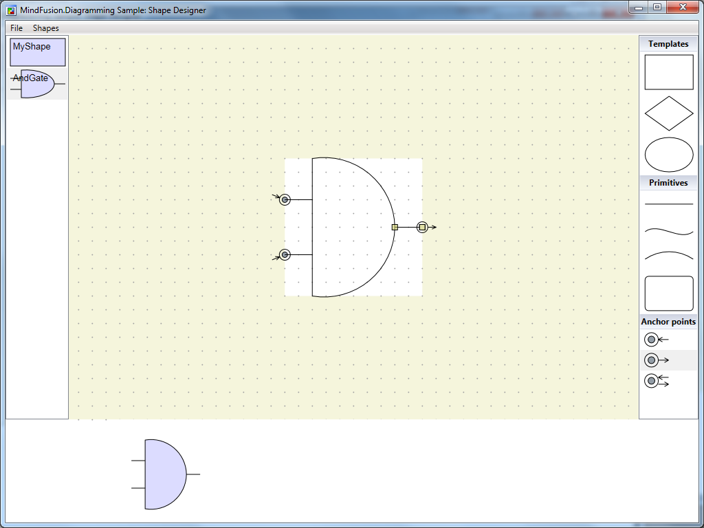
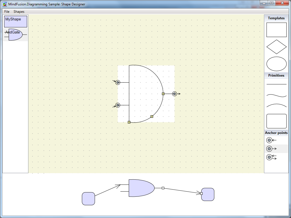
This will conclude the creation of the ‘AND Gate’ shape. You can test the shape in the preview diagram at the bottom of the screen.
Save the shape library. Using the same approach, recreate the other circuit shapes from the image above. The following screenshot illustrates the complete library.

The shape designer along with the shape library containing the circuit shapes can be downloaded from the link below:
You are welcome to ask any questions about the WpfDiagram control at MindFusion discussion board or per e-mail at support@mindfusion.eu.
Click here here to visit the official page of the control.
We hope you find this tutorial useful and thank you for your interest in MindFusion developer tools.
Custom Templates With the WPF Diagram Control
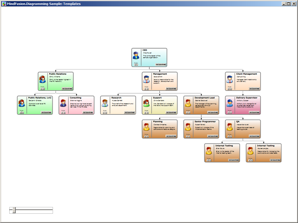
In this blog you will learn how to create a presentation of a hierarchical organization using MindFusion WPF Diagram control. The hierarchy is presented as a diagram, where each node represents an employee in the organization and each link represents the direct relationship between employees. The nodes in the diagram use custom templates to give a more detailed description of the employee, as well as to enable editing of various properties.
Setup
Create a new WPF application and add the necessary assemblies to the project. In the main window, declare the following namespace:
xmlns:diag="http://mindfusion.eu/diagramming/wpf"
Then declare an instance of the DiagramView class inside the root grid:
<diag:diagramview x:name="diagramView">
    <diag:diagram x:name="diagram" backbrush="White">
</diag:diagram></diag:diagramview>
Creating the custom node
To create the custom node, from the “Project -> Add New Item” menu add a new CustomControl (WPF) item to the project. This automatically creates a themes folder inside the project and a generic.xaml resource dictionary, which contains the template of the newly added class. Rename the newly created file (and class) to OrgChartNode. Ensure that the new class derives from TemplatedNode rather than Control. Then define the following dependency properties in the class: Title, FullName, and Image, of types string and ImageSource respectively.
Define the appearance of the node in its template in the generic.xaml file. In this case the node will display a round border, an image of the employee, its title, name, and description, and several buttons that can be used to change the role of the employee or add subordinates. The components bind directly to the properties of the node class. For example:
<textbox acceptsreturn="False" fontfamily="Verdana" fontsize="12" borderbrush="Transparent" background="Transparent" text="{Binding FullName}"></textbox>
The complete listing of the node’s template can be found in the project below.
To handle the Click event of the buttons in the template, register a routed event handler in the OrgChartNode class:
AddHandler(Button.ClickEvent, new RoutedEventHandler(OnClick));
...
void OnClick(object sender, RoutedEventArgs e)
{
    ...
}
Declare an Index property in the OrgChartNode class, which will indicate the role of the employee. Changing the role will automatically update the title and background color of the node:
public int Index
{
    get { return Images.IndexOf(Image); }
    set
    {
        if (value != -1)
        {
            Image = Images[value];
            Title = Titles[value];
            Brush = Fills[value];
        }
        else
        {
            Image = null;
        }

        InvalidateVisual();
    }
}
Create the hierarchy
Now that the custom node is ready, we can create a diagram representing the hierarchy. In the code behind of the main window, create a series of OrgChartNode objects, each representing an employee in the organization, then link the nodes using the CreateDiagramLink method of the diagram Factory class:
var node1 = new OrgChartNode
{
    Bounds = new Rect(0, 0, 300, 160),
    FullName = "Mike Powell",
    Text = "This is the leader of the sample organization.",
    Index = 2
};
diagram.Nodes.Add(node1);

var node2 = new OrgChartNode
{
    Bounds = new Rect(0, 0, 300, 160),
    FullName = "Emily Williams",
    Text = "Emily is the leader highest in the PR hierarchy.",
    Index = 1
};
diagram.Nodes.Add(node2);
...
diagram.Factory.CreateDiagramLink(node1, node2);
Finally, arrange the hierarchy by using the built-in tree layout:
TreeLayout layout = new TreeLayout();
layout.Type = TreeLayoutType.Centered;
layout.LinkStyle = TreeLayoutLinkType.Cascading3;
layout.Direction = TreeLayoutDirections.TopToBottom;
layout.KeepRootPosition = false;
layout.LevelDistance = 40;
layout.Arrange(diagram);
The following image illustrates the result:
The source code of the project together with all necessary libraries can be downloaded from here:
Download Organization Hierarchy Sample
You are welcome to ask any questions about the Diagram control at MindFusion discussion board or per e-mail at support@mindfusion.eu.
Click here here to visit the official page of the WPF diagram control.
We hope you find this tutorial useful and thank you for your interest in MindFusion developer tools.
Virtual Keyboard Controls Added To MindFusion WinForms/WPF Packs
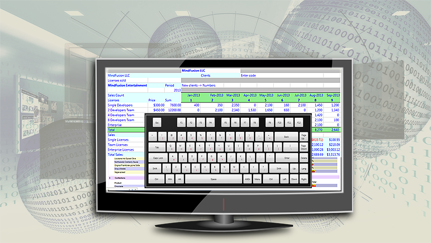
MindFusion UI controls suite now includes a virtual keyboard.
Dear MindFusion current and future clients,
Dear FreezePro clients,
MindFusion is pleased to announce that as of April 2016 it has acquired FreezePro Virtual Keyboard components, which will be released as part of MindFusion WinForms/WPF controls suites. We want to use this opportunity to thank all MindFusion and FreezePro clients for the loyalty – you’ve chosen us over multiple competitive products and we believe you are satisfied with your choice.
To please you even more we offer you special prices for upgrading to MindFusion WinForms/WPF pack. You get a 30% discount on the difference between the price of a component’s license you own and the price of the WinForms/WPF pack license you want to buy. MindFusion clients who already own a WinForms/WPF Pack license get the Virtual Keyboard component free of charge.
If you want to use the preferential upgrade prices please send an e-mail to info@mindfusion.eu no later than May 31st, 2016.
If you have technical questions about any of the components please contact MindFusion at support@mindfusion.eu. Use the same email for questions about licensing or transfer of intellectual property rights.
Welcome to the bigger MindFusion family!
- Diagram
- Chart
- Gauges
- Schedule
- Scheduling Control
- Project Management
- Gantt chart
- Grid
- TreeView
- Spreadsheet
- Report
- Map
- Virtual Keyboard
- UI
- Accordion
- Calendar
- Tab control
- Slider
- Dock
- Color picker
- Button
- Rating
- NumericUpDown
Line Chart With Multiple Axes in WPF
A common scenario when building charts is the ability to render multiple series bound to multiple axes, each one with its own scale. To deal with this issue, MindFusion.Charting for WPF control has added support for multiple axes of all types – X, Y, Y2, X2 and in this post we’ll look how to add and customize them and how to create series bound to a given axis.
The sample imitates a production chart, where three different scales measure three different values – work output, capital and energy consumption – all of which presumably participate in producing a single unit of a product. On the right side we have a single Y2 axis, which measures the amount of units produced. The X-axis displays the time scale. Let’s look at the chart elements, one by one.
I. The Y-Axes
The Y-axes, as all axes in the chart are an instance of the Axis class and are added to the appropriate collection property. The Axis class defines all types of useful properties needed to customize an axis. We define the three axes in XAML:
<chart:linechart.yaxes>
    <chart:axescollection>
        <chart:axis minvalue="0" interval="5" maxvalue="60" labelformat="F0" tick="3" title="kWh/day" titlerotationangle="270" labelstroke="Red" titlestroke="Red"></chart:axis>
        <chart:axis minvalue="0" interval="300" maxvalue="2100" title="Capital (USD)" tick="3" titlerotationangle="270" labelstroke="Purple" titlestroke="Purple"></chart:axis>
        <chart:axis minvalue="100" interval="2.5" maxvalue="130" title="Work Productivity (%)" customlabelposition="AutoScalePoints" axiscrossingpoint="100.0" labeltype="CustomText" tick="3" titlerotationangle="270" labelstroke="Green" titlestroke="Green"></chart:axis>
    </chart:axescollection>
</chart:linechart.yaxes>
The property names easily describe what is set: the minimum and maximum values on each of the three axes, the title, the stroke for the labels and the title, the interval and the length of the axis ticks. Let’s note that the type of labels for the last Y-axis is “CustomText” – this means we will specify the labels explicitly rather than allow the control to generate them as with the other two axes – they don’t set a label type and the default value (the auto scale) is rendered.
Here is how we define the labels:
double start = 100.0;

    //130 is the last number at the axis
    while (start <= 130)
    {
        string l = start.ToString("F1") + "%";
        chart.YAxes[2].Labels.Add(l);
        start += 2.5;
    }
II. The Y2 Axis
The Y2-axis is just one and it is entirely declared in XAML:
<chart:linechart.y2axes>
    <chart:axescollection>
        <chart:axis minvalue="0" interval="1000" maxvalue="12000" tick="3" labelformat="F0" titlerotationangle="270" title="Units"></chart:axis>
     </chart:axescollection>
</chart:linechart.y2axes>
The label format is set with the standard .NET numeric strings – in this case it is a floating number without trailing zeros. In this axis, as well in the other Y-axes you might have noticed that we use the TitleRotationAngle property. This property rotates the title label at an arbitrary angle between 0 and 360. In our case we want the label drawn vertically, to conserve space.
III. The Series
The series are created in code. They specify scatter type because we want each series to have markers at data points. The YAxis property specifies the Y-axis, which a given Series is bound to. Finally, we specify the tool tip type because we want to have a tool tip when the mouse hovers a data point.
 LineSeries series0 = new LineSeries();
 series0.YAxis = chart.YAxes[0];
 series0.ScatterType = ScatterType.Square;
 series0.ScatterFills = new BrushCollection() { Brushes.Pink };
 series0.ScatterStrokes = new BrushCollection() { Brushes.Red };
 series0.Strokes = new BrushCollection() { Brushes.Red };
 series0.ToolTipType = ToolTipType.ChartData;
The data is random generated numbers. We use the Axis.XData and Axis.YData properties to set it.
 for (int i = 0; i < 30; i++)
     {
        series0.XData.Add(i * 6);
        data1.Add(rand.NextDouble() * 60.0);
      }

      data1.Sort();
      series0.YData = new DoubleCollection(data1);
      //don't forget to add the series
      chart.Series.Add(series0);
Last but not least – don’t forget to add the series to the Series collection property of the chart. With that our chart is ready – here is the result:
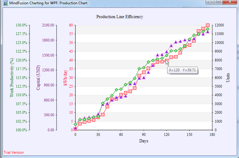
Charting for WPF: Multiple Axes and Series
You can download the sample with the chart libraries from here:
WPF Chart With Multiple Axes Sample Download
If you have any questions regarding the chart component use the forum, email or the help desk to contact MindFusion. More information about Charting for WPF, which includes a premium 3D charting library and a Real time charting library optimized to handle huge data sets can be found here.