
In two blog posts we will look at the main steps to create a sample server load web application. We will use the chart, gauge and diagram libraries. The data is simulated with random numbers.
Server Load Application in JavaScript
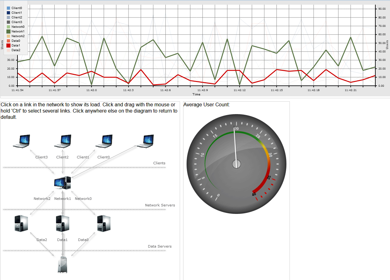
The chart shows number of users on a given connection between two stations in the network at each moment. The graphic includes data for the last 30 seconds. The diagram shows the servers and clients that build the network. By default the charts shows data only for the two most important connections, out of total 10. Users can select different connections and view their graphics. The gauge control provides data for the average count of users at any given moment.
I. Project Setup
We create an empty website and add a Scripts folder with the necessary files:
MindFusion.Gauges.js
MindFusion.Diagramming.js
MindFusion.Common.js
MindFusion.Charting.js
require.js
and a reference to jQuery or the jQuery library itself:
jquery.js
We create a blank HTML file and we create three HTML Canvas elements – one for each of the controls: chart, diagram, gauge.
We use the Flexbox layout and we create a CSS file referenced by the index.html file where we write the CSS settings for the layout:
We initialize a section region that would have a Flexbox layout:
section {
   display: flex;
   max-width: 700px;
}
The CSS class used for <div> elements inside <section>:
.column {
  margin: 10px 10px 0px 0px;
  flex: 1 1 0;
  border: 1px solid #cecece;
}

section:first-of-type .column:first-of-type {
  flex: 1 1 auto;
}
We specify that the first column on the second row would be twice wider than the other column. This is the diagram, and the other column is occupied by the gauge.
section:nth-of-type(2) .column:first-of-type {
  flex: 2 2 22;
}
That’s how the HTML uses the CSS attributes:
<section>
<div class="column"></div>
</section>
Note the id=”lineChart” attribute – we will use the id to initialize the LineChart object in the *.js file. The diagram and gauge Canvas instances also have id-s.
At the end of the index.html we include a reference to the require.js file to load the chart and gauge libraries this way:
<script src="Scripts/diagram.js" type="text/javascript"></script>
<script data-main="charts" src="Scripts/require.js"></script>
Note: Internet Explorer might not load properly the JavaScript libraries if they are declared at the beginning of the file, (in the head section) before the initialization of the Canvas-es. Therefore it is best to put the script references at the bottom, right before the closing </body> tag.
II. The Gauge
The code for the OvalGauge and the LineChart is in a single method:
var lineChart = null;

define(["require", "exports", 'MindFusion.Common', 'Scripts/MindFusion.Charting', 'MindFusion.Gauges'], function (require, exports, MindFusion_Common_1, m, g) {
    "use strict";
.........
.........
}
Before the method we declare a global variable for the LineChart. We need to access it in the diagram file so it must have a global visibility.
The OvalGauge control is created using the id of the HTML Canvas:
var userCounter = g.OvalGauge.create($('#userCounter')[0], false);
We will use two Events – raised before the background was painted and before the pointer was painted – to customize how the gauge background and pointer look.
//use custom painting of the background and of the pointer
userCounter.addEventListener(g.Events.prepaintBackground, onGaugerepaintBackground.bind(this));
userCounter.addEventListener(g.Events.prepaintPointer, onPrepaintPointer.bind(this));
The gauge needs a scale – we create an OvalScale and set its min and max value:
var scale = new g.OvalScale(userCounter);
scale.setMinValue(0);
scale.setMaxValue(40);
................
We will also set all three types of settings on the scale – MajorTickSettings, MiddleTickSettings and MinorTickSettings
//initialize the major settings
var majorSettings = scale.majorTickSettings;
majorSettings.setTickShape(TickShape.Ellipse);
..........................
A CustomInterval at the MajorTickSettings indicates a special range. We will use one to paint in red the portion on the scale that corresponds to the high amount of users:
 var interval = new g.CustomInterval();
    interval.setMinValue(35);
    interval.setFill('Red');
    majorSettings.addCustomInterval(interval);
Then we customize the MajorTickSettings, the MiddleTickSettings and MinorTickSettings:
//initialize the middle settings
var middleSettings = scale.middleTickSettings;
middleSettings.setShowLabels(false);
...............

//initalize the minor settings
var minorSettings = scale.minorTickSettings;
minorSettings.setShowLabels(false);
minorSettings.setShowTicks(false);
The scale shows a Range: that is a visual indication of regions on the gauge. It is determined by its setMinValue and setMaxValue values and in our case we will show it on the whole gauge:
//add a range in gradient colors
var range = new g.Range();
range.setMinValue(0);
range.setMaxValue(40);
range.setFill(g.Utils.createLinearGradient(320, [1, '#ce0000', 0.8, '#ce0000', 0.7, '#FFA500', 0.6, '#FFD700', 0.5, '#008000', 0, '#008000']));
...............
scale.addRange(range);
That’s how we handle the PrepaintBackground event to draw custom background for the gauge:
//paint the background in gradient
function onGaugerepaintBackground(sender, args) {
   args.setCancelDefaultPainting(true);
   var context = args.getContext();
   var element = args.getElement();
   var size = sender.getSize();
   var ellipse = new g.Ellipse();
   ellipse.setFill('gray');
   ellipse.setStroke('transparent');
   args.paintVisualElement(ellipse, size);
   var ellipse = new g.Ellipse();
   ellipse.setFill(g.Utils.createLinearGradient(300, [0, '#808080', 0.2, '#808080', 0.8, '#909090', 1, '#909090']));
   ellipse.setStroke('transparent');
   ellipse.setMargin(new g.Thickness(0.015));
   args.paintVisualElement(ellipse, size);
}
The code that handles the prepaint pointer event is similar. The value of the Pointer is set this way:
//add some initial value
pointer.setValue(26);
When the last chart values changes – each second – we update the pointer value:
var pointer = userCounter.scales[0].pointers[0];
pointer.setValue(sum/10);
III. The Chart
First we create the LineChart object from the Canvas that we have initialized in the HTML. We take the width and height of the control from its parent container:
var lineChartEl = document.getElementById('lineChart');
lineChartEl.width = lineChartEl.offsetParent.clientWidth;
lineChartEl.height = lineChartEl.offsetParent.clientHeight;
lineChart = new Controls.LineChart(lineChartEl);
The data for the line series is stored in 10 Series2D instances. For each of them we need a list with the X and Y values. The X-values are the same for all series, the Y-values are randomly generated numbers. All of them are instances of the List class:
var values1 = new Collections.List();
var values2 = new Collections.List();
......................................
var xValues = new Collections.List();
var xLabels = new Collections.List();
Here we fill the xValues list with numbers:
//initialize x-values and labels, generate sample data for the series
for (var i = 0; i < 30; i++) {
  xValues.add(i);
  setXLabels(false);
  generateData();
}
The setXLabels method takes care of the custom labels at the X-axis. At each 3rd call, it removes the first three values and adds three new ones: one with the current time stamp and two more as empty strings.
if (d.getSeconds() % 3 == 0)
   {
     //clear the first three values
     //if the count of the labels is more than 30
     if (removeFirst) {
         xLabels.removeAt(0);
         xLabels.removeAt(0);
         xLabels.removeAt(0);
       }

       //add a label and two empty strings
       xLabels.add(d.getHours() + ":" + d.getMinutes() + ":" + d.getSeconds());
       xLabels.add("");
       xLabels.add("");
    }
We create the Series2D instances and add them to the Series property of the line chart:
//the series for the chart
var series = new Collections.ObservableCollection(new Array(
    new Charting.Series2D(xValues, values1, xLabels),
    new Charting.Series2D(xValues, values2, null),
    ...........
    new Charting.Series2D(xValues, values10, null)));
The xLables are assigned just to the first series, they will serve as labels source for the X-axis.To show them, we must first hide the coordinates and assign them to the xAxis:
lineChart.xAxis.labels = xLabels;
lineChart.showXCoordinates = false;
then we must “tell” the first series that its labels are used for the XAxis:
//tell the series that the labels are for the X-axis.
series.item(0).supportedLabels = m.MindFusion.Charting.LabelKinds.XAxisLabel;
We use the title property of a Series object to identify the series. That’s why we assign to them unique labels:
//series titles are important - we identify the series with them
for (var i = 0; i < 4; i++)
    series.item(i).title = "Client" + i;

for (var i = 0; i < 3; i++)
    series.item(i + 4).title ="Network" + i;

for (var i = 0; i < 3; i++)
    series.item(i + 7).title ="Data" + i;
Since it is going to be a long chart, we want a second Y-axis to appear to the right. That can be done by adding another YAxisRenderer with the same yAxis to the components rendered by default by the LineChart control. We add the new YAxisRenderer to a vertical StackPanel:
 var y2Stack = new m.MindFusion.Charting.Components.StackPanel();
 y2Stack.orientation = m.MindFusion.Charting.Components.Orientation.Vertical;
 y2Stack.gridRow = 0;
 //add the stack panel to the last grid column
 y2Stack.gridColumn = lineChart.chartPanel.columns.count() - 1;

 lineChart.chartPanel.children.add(y2Stack);
The layout manager for a LineChart is a Grid panel. We add a new column to it, where the second Y-axis will be rendered. Then we add the StackPanel with the YAxisRenderer to this column. Next we add the yAxis and we specify that the plot is not to the left side of it:
//create the second Y-axis
var secondYAxis = new Charting.YAxisRenderer(lineChart.yAxis);
secondYAxis.plotLeftSide = false;
lineChart.yAxisRenderers.add(secondYAxis);
y2Stack.children.add(secondYAxis);
Then we customize the grid and trigger the timer that will update the data values at each second:
lineChart.gridType = Charting.GridType.Crossed;
lineChart.backColor = new Drawing.Color.fromArgb(230, 230, 230);
lineChart.theme.gridColor1 = Drawing.Color.fromArgb(1, 255, 255, 255);
lineChart.theme.gridColor2 = Drawing.Color.fromArgb(1, 255, 255, 255);
lineChart.theme.gridLineColor = Drawing.Color.fromArgb(0.5, 240, 240, 240);
//start the timer
setInterval(setTime, 1000);
Finally, let’s look at the styling of the series. We keep the brushes in a list. The colors for those brushes are stored in a list with lists – each one with three elements for the red, green and blue values of the color.
//the colors for the brushes
var brushes = new Collections.List();

var rgbColors = new Collections.List();
rgbColors.add(new Array(102, 154, 204));
..............
What we actually do to show the graphics of the connections that are selected in the diagram is thicken the strokes for those line graphics and set the thickness to the rest to 0.15 to make them barely visible.
We do that by using the thicknesses property of the PerSeriesStyle class that we use for styling the chart.
lineChart.plot.seriesStyle = new Charting.PerSeriesStyle(brushes, brushes, thicknesses);
And here is how we create the thicknesses and the brushes:
//create brushes for the chart
var thicknesses = new Collections.List();
  for (var i = 0; i < 10; i++)
   {
      var a = rgbColors.item(i);
      brushes.add(new Drawing.Brush(new Drawing.Color.fromArgb(a[0], a[1], a[2])));
      if (i == 5 || i == 8)
          thicknesses.add(3.0);
      else
         thicknesses.add(0.15);

  }
Only the 5th and 8th thickness are set to 3, the others are almost zero – enough to draw the silhouettes of the graphics.
And that’s all for this part I of the tutorial on how to build the client side of a sample server load monitor application in JavaScript. In part II we will look at the diagram control. You can run the sample from here:
Run the online server load monitor application
Here is the link to download the full source code for the application:
You can also fork it from GitHub.
Find out more about the chart, gauge and diagram JavaScript libraries from their official pages on the MindFusion website.