
We have just has released MindFusion.Pack for WPF 2013.R1. There are new features in most of the components in the pack. Here are the details:
Support for VisualStudio 2012
The pack installer creates VS2012 toolbox palette for all the components and can optionally install VS2012 sample projects. Toolbox palettes are also created for all .NET target environments supported by the respective Visual Studio versions.
 MindFusion.Charting
Style and Themes
Styles define the appearance of a given chart element – the axis, the series, the legend. Each ChartTheme is a collection of styles. You can:
• create themes based on the appearance of an existing chart
• create themes with the ThemeEditor tool
• save themes to XML files
• load themes from XML files
• use a number of predefined themes
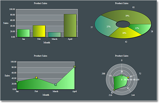
The green theme
Improved Design Time Support
You can now edit all collection properties, including the Series collection, the brushes, strokes, legends and all other collections in design time through the property grid.
Axis Intervals
The new AxisSettings.IntervalCount property lets you specify the exact number of intervals at the axis. In such case the control does not use the Interval property and calculates the value of each interval based on AxisSettings.Min, AxisSettings.Max and AxisSettings.IntervalCount.
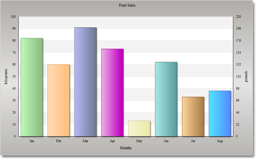
A bar chart with two Y-axes.
API Changes
- ChartSeries.Fills, ChartSeries.Strokes, LineSeries.ScatterFills, LineSeries.ScatterStrokes are now of type BrushCollection. The change was required by the new design time support features.
- a bug with the Series property in the ChartLegend was fixed.
 MindFusion.Diagramming
Preserve order in tree layout
You can set now the Balance property of the TreeLayout to Preserve if you want to keep the original geometric order of child nodes when arranging them under their parent. This can be used to arrange tree branches in a specific order by first positioning them in increasing horizontal or vertical positions.
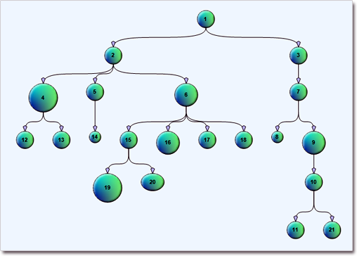
The tree layout.
Selection improvements
- Set Behavior to SelectOnly to let users select existing items, but not modify them or draw new ones.
- Use the SetsDirtyFlag property of the Selection class to specify whether the Dirty flag should be set when selection changes.
- The SelectionStartMoving event is now raised when the user begins moving multiple selected items.
- Use the ToggleSelection modifier key to select or deselect items by clicking. The key disables selection via lasso rectangle.
Miscellaneous
- The new AllowAddChildren and AllowRemoveChildren properties of ContainerNode let you specify whether users are allowed to add or remove child nodes to / from the container.
- You can use the GetNearestBorderPoint method of DiagramNode to find a point from the node’s border closest to a specified point.
- The new ScrollZoneSize property of Diagram lets you specify the size of the area near the control edges that starts auto-scrolling.
- and many more.

Container nodes
 MindFusion.Reporting
Exporting
You can now use the new PdfExporter and MhtmlExporter, which enable exporting to the PDF and MHTML formats respectively. You can find detailed information about the new exporters in the “Exporting Reports” theme.
Side-By-Side Containers
You can arrange items parallelly by putting them inside the new SideBySideContainer report item. You can use it, for example, to display two (or more) data ranges one next to the other.
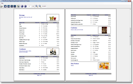
A classic report.
Miscellaneous
• New DefaultEncoding property in PdfExporter;
• New Median aggregate function;
 MindFusion.Scheduling
Improved item presenter
The ItemPresenter class gives you the start and end time of the represented item fragment through the new
StartTime and EndTime properties. In addition, derived classes can override the new OnStartTimeChanged,
OnEndTimeChanged, and OnItemPropertyChanged methods to get notified when the StartTime or EndTime properties change or when any property of the underlying item changes.
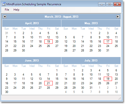
Item recurrence
Improved recurrence
You can validate and customize the occurrences of a recurrence pattern with the new ValidateOccurrence event of the Recurrence class.
You can find more about the new features of the components at the forum. Here is a link to download the trial version:
Download MindFusion.Pack for WPF 2013.R1
About MindFusion.Wpf Pack: A set of advanced WPF components that help you build your business application easy and on time. The tools provide you with a complete set of features to create, edit and render complex flowcharts, charts, diagrams, calendars, schedules, maps and reports. A set of gauges and UI elements is also included. Each component offers various samples, tutorials and detailed documentation. The controls offer simple and intuitive API, completely customizable appearance, numerous input/output options and a rich event set. Each tool has been thoroughly tested to guarantee that you and your application get the high quality and performance you deserve.
You can read more about the capabilities of each component at its features page:
- Charting for Wpf features page
- Gauges for Wpf features page
- Diagramming for Wpf features page
- Scheduling for Wpf features page
- Reporting for Wpf features page
- Mapping for Wpf features page
- UI for Wpf features page
Prices and licenses are explained in details at the buy page. We offer permanent discounts to certain types of commercial as well non commercial organizations – check here if you qualify.