The new release of MindFUsion WPF Control Suite lists many new features, aimed to empower developers to create compelling business applications with even less efforts. The pack also includes new samples and tutorials. Below are the details:
License keys
There is no separate trial build of the control assemblies anymore. Instead, set the LicenseKey property of the controls to disable their evaluation mode and stop displaying trial messages. If your application contains more than one control by MindFusion, you could call MindFusion.Licensing.LicenseManager.AddLicense(key) from application start-up code to specify the key once instead of setting it per each control.
Visual Studio 2015 support
MindFusion Pack for WPF now includes support for Visual Studio 2015. The installer can create VS2015 toolbox palette for the component.
Barcodes
The new BarcodeLabel class allow displaying EAN, UPC or QR barcodes.

BarcodeLabel: QR barcodes
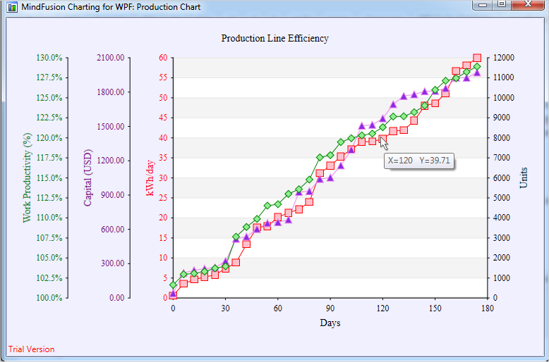
 MindFusion.Charting for WPF
Multiple Axes
The chart control enables developers to create unlimited number of axes of each type – X, X2, Y and Y2. Each axis is an instance of the Axis class and has its own set of properties for complete customization – label style, brush, tick length etc. You can set the X and Y axes of each ChartSeries to a series of your choice and thus bind each chart series to different axes, if you wish.
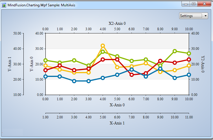
Multiple axes in the WPF chart control.
Improved Zooming
Selected area with width smaller than MinZoomSpan does not evoke any action in the control. In addition, the new ZoomChanged event fires whenever zoom occurs and provides useful data for the zoom action with its ZoomChangedArgs.
Cross Hair Improvements
The cross hair control has been improved with several new properties, a method and an event. The properties are:
The new CrossHairPosition method returns the current location of the cross hair. For more precise handling of cross hair movements a new event is available – CrossHairPositionChanged.
Greatly Improved 3D Charts
3D charts have received plenty of improvements, new properties and performance optimizations:
- PointMergeThreshold – The property sets the radius of an area around a given point where no other points are drawn. The result is better performance especially in charts with numerous points, which happen to be close to one another.
- InterpolationType.None – A new InterpolationType has been added to the InterpolationType, which does not interpolation but adds data directly and connects the points with triangulation.
The SurfaceType enum has been replaced with three bool properties, which makes the API easier to understand and use.
ScatterFaceSize – the property regulates the size of the polygons that build a 3D scatter. Bigger values lead to bigger polygons, which results in faster performance and more rough scatter mesh.
Effect3D.ShaderEffect – the property can be applied to all 3D chart elements, including scatters and performs much faster.
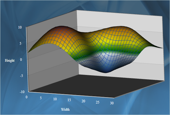
3D surface chart with color map and wire frame.
Exporting Images
Two new methods have been added for exporting the chart as an image – CreateImage and ExportImage.
Custom Formatting of Labels in Real-time Charts
A new property has been added to the RealTimeChart library – Axis.LabelFormatProvider. Use it to specify custom formatting of numeric labels. If required, you can specify format arguments for your format classes with Axis.LabelFormat.
 MindFusion.Diagramming for WPF
Free-form nodes
A FreeFormNode collects all points from users’ mouse or touch input and displays them as node’s outline. To let users draw free-form nodes interactively, set Diagram.Behavior to DrawFreeForms or LinkFreeforms. Use the Points property of FreeFormNode to get or set outline points programmatically. If the Closed property is set, the node is drawn as a closed shape and its interior filled, or otherwise the node is drawn as a poly-line. If the distance between first and last points drawn by user is shorter than Diagram.AutoCloseDistance, the node’s Closed property is automatically set to true . AutoCloseDistance default value is Double.MaxValue , so free-form nodes are always closed.
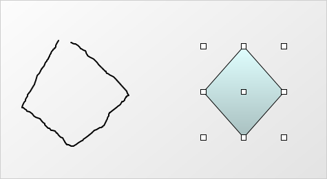
Wpf Diagram: Free Shapes
Shape control points
Shape formulas can now be parameterized by associating control points with Shape objects. Each control point is passed to the shape script as a named variable. Apart from the name, you can specify the default, min and max coordinates for each parameter via the ShapeControlPoint constructor, and whether to treat its values as percents or fixed offset.
Resize table columns and rows
Columns and rows of a TableNode can now be resized interactively if its AllowResizeColumns or AllowResizeRows properties are enabled. In order to resize, move the mouse pointer to the border line on column’s right side or row’s bottom side until it shows resize cursor and start dragging. The control raises TableColumnResizing and TableRowResizing events to let you validate new size or prevent resizing some elements.
Barcode nodes
The BarcodeNode class displays EAN, UPC or QR barcodes as node’s content. In-place edit operations let users enter new numeric codes for 1D codes or text strings for QR codes. The barcode format is specified via the Format property, the encoded number or text is set via Content, and color of 1D bars / 2D modules via BarColor.
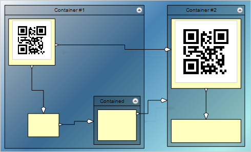
Barcode diagram nodes
Support for Visio stencils
The diagram can now display shapes from stencil files in Visio 2003 XML stencil format (.vsx). To load a stencil file, use an instance of the VisioStencil class. The shapes are displayed in the diagram through VisioNode objects.
ShapeDesigner improvements
- The ShapeDesigner control supports undo. Call its Undo or Redo methods to respectively undo or redo a change done to the designed shape.
- ZoomFactor property added to ShapeDesigner. It also supports interactive zoom in/out via mouse wheel.
- The SelectedElement property exposes the graphic element currently selected in ShapeDesigner canvas. You can bind to its stroke and brush properties to create alternative user interface for editing element attributes.
AnchorPatern improvements
- The XUnit and YUnit properties allow specifying the coordinates of an AnchorPoint as a fixed offset from the node’s top-left corner rather than in percentage, so that the point position does not change when the node is resized.
- The AnchorPattern property of Shape class lets you associate anchor points with shape definitions. If a ShapeNode instance does not contain its own AnchorPattern, it will derive the one defined by the node’s Shape.
- The RowAnchorPattern property lets you specify default AnchorPattern for all table rows.
 MindFusion.Mapping for WPF
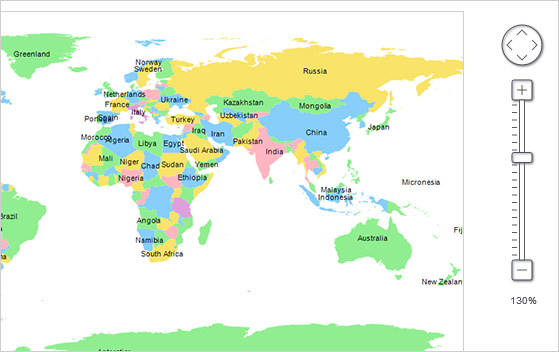
Zoom control
The ZoomControl class lets user change interactively the current zoom level and scroll position of a MapView. To set it up, add a ZoomControl to the page, place it anywhere over a MapView, and set the control’s Target property to that view. Set the ZoomStep and ScrollStep properties to specify the amount added to view’s zoom level or scroll position by ZoomControl’s buttons.
Miscellaneous
- The new Behavior property lets users select multiple map elements interactively.
 MindFusion.Reporting for WPF
Report Parameters
Parameters can now be added to a report through the new Parameters collection of the Report class. The parameters provide name, description and value and can be of any type, including expression. For more information about parameters, check the Report Parameters topic.
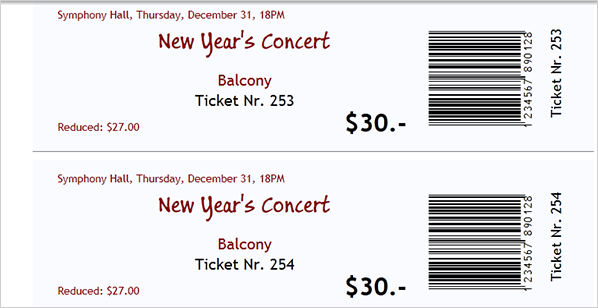
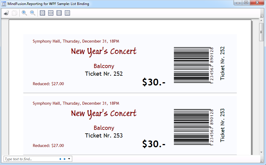
Barcodes
MindFusion.Reporting for WPF reports can now display UPC-A, UPC-E, EAN-8, EAN-13, and QR barcodes. The barcodes are represented by the new Barcode report item.
 MindFusion.Scheduling for WPF
Interactive Recurrence Rescheduling
Recurrences can be rescheduled interactively by holding down the RescheduleRecurrenceKey while dragging a recurrent item. The control tries to preserve the current pattern of the recurrence when possible.
New Theme
A new built-in theme is available in MindFusion.Scheduling for WPF – the Light theme. It is available through the ThemeType enumeration.
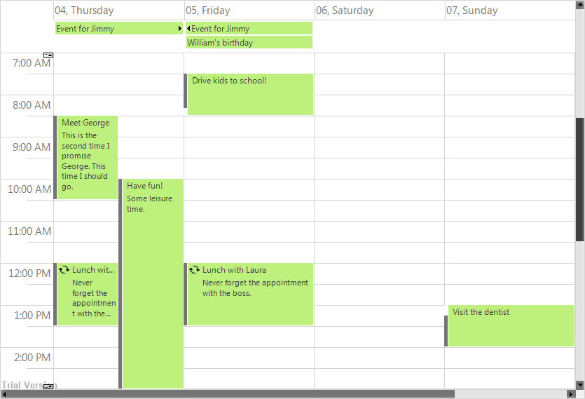
The new ‘Light’ theme
New Members
Several new properties and events have been added to the control:
You can read details about the new features of the pack at the news page on the forum. The trial version is available for direct download from this link:
Download MindFusion.Pack for WPF 2016.R1
About MindFusion.Wpf Pack: A set of advanced WPF components that help you build your business application easy and on time. The tools provide you with a complete set of features to create, edit and render complex flowcharts, charts, diagrams, calendars, schedules, maps and reports. A set of gauges and UI elements is also included. Each component offers various samples, tutorials and detailed documentation. The controls offer simple and intuitive API, completely customizable appearance, numerous input/output options and a rich event set. Each tool has been thoroughly tested to guarantee that you and your application get the high quality and performance you deserve.
You can read more about the capabilities of each component at its features page:
Prices and licenses are explained in details at the buy page.

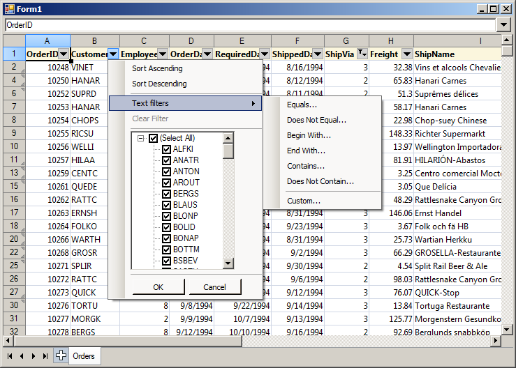
 MindFusion.Spreadsheet