The style and theme system provides a consistent way to customize the appearance of a Diagram and its items. By using styles and themes, it is easier to achieve coherent look and feel across the entire diagram. In addition, changing the look and feel can be achieved by simply replacing the current theme. New themes can be designed in the visual environment of the Theme Editor tool and subsequently used and distributed as XML files. Several pre-defined theme files are installed under the Themes subfolder of the control's root installation folder.
Styles
DiagramLite styling system uses regular Silverlight Style objects. To apply a style to an individual diagram item set the style to the item's Style property - the same way you would apply a style to a regular FrameworkElement object. All rules that apply to the Silverlight Style objects are in effect here as well. For example, you can define a Style as a resource, then reference this resource from diagram items declared in XAML. To apply a style for all items of a particular type, define a Style object within the current scope with its TargetType set to the appropriate type. Alternatively you can use a Theme (see the following section).
Themes
The theme in DiagramLite is a set of styles, each associated with specific item type. When the theme is applied to a diagram, the styles registered in the theme affect all objects of their associated type.
Themes are represented by the Theme class and can be assigned to Diagram objects through the Theme property. Styles are associated with types within the theme through the RegisterStyle method. The following code creates a new theme, with a single style for ShapeNode items and applies this theme to an existing diagram.
C#
 Copy Code Copy Code
|
|---|
Theme theme = new Theme(); |
VB.NET
 Copy Code Copy Code
|
|---|
Dim theme As New Theme() |
Alternatively, themes can be loaded from XML files by calling the LoadFromXml method. Such XML files can be produced by the Theme Editor tool, or by calling the SaveToXml method of an existing theme.
Another way to implicitly register styles with themes is through a set of shortcut properties exposed by the Diagram class, namely DiagramLinkStyle, ShapeNodeStyle, TableNodeStyle, ContainerNodeStyle, and TreeViewNodeStyle. Setting any of these properties automatically registers the property value as a style within the currently associated theme. These properties are particularly useful for specifying styles through XAML. The following example illustrates this:
XAML
 Copy Code Copy Code
|
|---|
<d:Diagram xmlns:d="http://mindfusion.eu/diagramming/silverlight"> |
Theme Editor
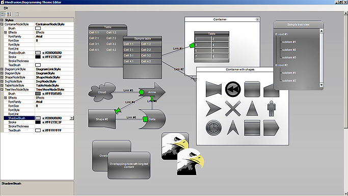
The Theme Editor provides simple visual environment for theme creation and modification. The editor displays a sample diagram with items of various types and exposes a list of all style properties through a property grid to the left. Any modification of the style properties in the grid is immediately reflected on the diagram to give a preview on what effect the change would have if the theme is applied to a diagram. The theme can be saved at any time through the Save menu. Existing themes can be opened and modified.
The following image illustrates the Theme Editor in action:


