


| MindFusion.Silverlight Package Programmer's Guide |
| Calendar Class |
| Remarks See Also |

|
Represents a light-weight calendar control.
Namespace: MindFusion.UI.Silverlight
Assembly: MindFusion.UI.Silverlight
 Syntax
C#
 Copy Code Copy Code
|
|---|
public class Calendar : ContentControl |
| Visual Basic
Copy Code
|
|---|
Public Class Calendar |
RemarksThe Calendar control can display several views with different resolution, varying from Time to Century. The user can switch from one view to another by either clicking on the calendar title or by clicking on a cell in the current view. The user can navigate within the current view by clicking on the navigation buttons in the calendar header.
The appearance of the cells in the different views can be customized through several data templates - DefaultItemTemplate, TodayItemTemplate, PaddingItemTemplate, WeekendItemTemplate, HolidayItemTemplate, SelectionItemTemplate, FocusItemTemplate and HoverItemTemplate.
The general appearance of the calendar can be customized through Background, BorderBrush, BorderThickness, ContentBackground, ContentBorderBrush, ContentBorderThickness, HeaderBackground, HeaderBorderBrush, HeaderBorderThickness and Foreground.
The dates displayed in the various views are formatted through several strings - TimeViewFormat, MonthViewFormat, YearViewFormat, DecadeViewFormat and CenturyViewFormat.
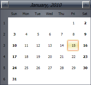
ExampleThe following code demonstrates the declaration of a Calendar control in XAML:
| XAML
Copy Code
|
|---|
<ui:Calendar Date="1/1/2010" MaxDrillIn="Month" SelectionMode="Multiple" /> |
The code above will produce a calendar similar to the following:
 Inheritance Hierarchy
System.Object
System.Windows.Threading.DispatcherObject
System.Windows.DependencyObject
System.Windows.Media.Visual
System.Windows.UIElement
System.Windows.FrameworkElement
System.Windows.Controls.Control
System.Windows.Controls.ContentControl
MindFusion.UI.Silverlight.Calendar
See Also