


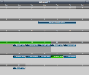 The Single Month view displays one month at a time and lets the user scroll to the previous or next month or the previous or next year by using the navigation buttons optionally displayed in the view header. The month represents a grid of day cells, which display the day number and the schedule events set to occur on the specific date.
In order to enable the Single Month view, set the CurrentView property of the Calendar class to SingleMonth. Use the MonthSettings property of the Calendar class to set the appearance of the view. The ItemSettings property affects how schedule items will be displayed.
The Style property of the associated DaySettings object specifies a common appearance style to be used for all cells in the view and the HeaderStyle property specifies the styles for the cell's headers. Specific styles can be applied to day cells, representing days from the previous/next month through the PaddingDaysStyle and PaddingDaysHeaderStyle properties. Set styles for the main, day names and week numbers headers through MainHeaderStyle, DayNamesHeaderStyle and WeekNumbersHeaderStyle properties. Use MonthSettings.Style to set the style of the entire view.