The list below describes recent changes and additions to DroidDiagram:
New in version 1.5.2
New in version 1.5.1
State management
DiagramView now handles Android lifecycle events to automatically preserve its scroll position, zoom level and diagram's contents. You no longer have to implement Activity's onSaveInstanceState and onRestoreInstanceState to manually manage state, unless you prefer rebuilding the diagram from already saved data. To disable built-in state management, set android:saveEnabled="false" in DiagramView's definition in layout file, or call respective setter from code.
Miscellaneous
- The createImage method of Diagram class returns a Bitmap representing the diagram's contents.
- The HtmlBuilder class creates an HTML image map whose areas link to items' HyperLink locations, letting users click on individual items in exported diagram images.
- The ShowGrid and GridStyle properties implemented in Diagram class let you draw alignment grid, either as points or lines.
New in version 1.5
Flip shapes
The shape of a ShapeNode can be flipped horizontally or vertically. Enable the AllowFlip property and the shape flips when an edge is dragged over its opposite edge. You can get or set current flip state using FlipX and FlipY properties.
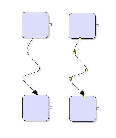
DiagramLink improvements
- AllowSplitLinks now works for Bezier links too. Users can insert a new Bezier segment by dragging any point (other than a control point) of a selected link. Adjacent segments can be merged back into a single one by dragging a tangent control point (square adjustment handle) onto a pass-through control point (round adjustment handle).
- IntermediateShape shapes are now rendered at correct position for Spline links.
Miscellaneous
- The PanAndModify behavior lets you select and modify when touch is over an item, or pan the view otherwise.
- Item texts are now rendered anti-aliased.
- The updateRuntimeIndices method of Diagram assigns unique integer identifiers to items, accessible via getRuntimeIndex. Identifiers are transient and valid only for the current state of diagram immediately after the updateRuntimeIndices() call.
- Zoom is now centered around touch position by default. The ZoomAtTopLeft Boolean property has been replaced by ZoomPivot property and respective enumeration, whose Center and TopLeft elements enable the old zoom behaviors.
- Brush, Pen and DashStyle classes have been moved to com.mindfusion.drawing package.
New in version 1.4
Fluent API
Builder classes in com.mindfusion.diagramming.builders package add support for fluent programming style. Static with and instance init methods in DiagramItem, DiagramItemStyle and Layout -derived classes return a builder instance that can be used to set up respective new or existing objects:
Java
 Copy Code Copy Code
|
|---|
diagram.getNodes().add(
ShapeNode.with()
.brush(Color.LIGHT_GRAY)
.font("Arial", 4)
.enableStyledText(true)
.text("Task <i>1</i>")
.toolTip("This is the task")
.create());
diagram.getFactory()
.createShapeNode(20, 20, 20, 20).init()
.brush(Color.LIGHT_GRAY)
.font("Arial", 4)
.enableStyledText(true)
.text("Task <i>2</i>")
.toolTip("This is the second task");
TreeLayout.with()
.levelDistance(20)
.nodeDistance(20)
.linkStyle(TreeLayoutLinkType.Cascading3)
.create()
.arrange(diagram); |
DiagramLink improvements
- The component no longer keeps a separate segmentCount field, removing a common source of errors. The SegmentCount property now calculates its value from ControlPoints elements. The updateFromPoints(updateGroups, updateSegments) overload has been removed too.
- SegmentCount setter no longer refuses changing number of segments if auto-routing is enabled or the link is a self-loop.
- The new Spline element of LinkShape enumeration draws links as interpolating splines that pass through all of their control points:
Enum types
Old-style enumeration classes with static finals have been replaced by enum types, improving type checking and auto-completion support. This change will not affect your code if only passing enum members to methods from the API. If storing them in fields on the other hand, you must change the field type from int to respective enum type.
The types changed to enum are - Action, Align, Anchoring, AttachToLink, AttachToNode, AutoResize, Behavior, CellFrameStyle, ColumnStyle, CustomDraw, DelKeyAction, DirectionConstraint, EffectPhase, ExpandButtonAction, ExpandButtonPosition, GlassEffectType, Granularity, GraphicsUnit, GridStyle, GroupRotation, HandlesStyle, HatchStyle, HitTestPriority, HyperLinkStyle, ImageAlign, LayeredLayoutLinkType, LinkCrossings, LinkShape, LinkTextStyle, MarkStyle, ModificationStart, MouseInputMode, MultipleGraphsPlacement, NodeHandleType, Orientation, Relationship, RelativeToLink, RerouteLinks, RestrictToBounds, SaveToStringFormat, SelectionStyle, ShadowsStyle, ShowAnchors, SimpleShape, SnapToAnchor, TableConnectionStyle, TickPosition, TreeLayoutBalance, TreeLayoutDirection, TreeLayoutLinkType, TreeLayoutType, TreeViewConnectionStyle.
Type of EnabledHandles and TriggerRerouting properties has been changed to EnumSet.
New in version 1.3
Free-form nodes
A
FreeFormNode collects all points from users' touch input and displays them as node's outline. To let users draw free-form nodes interactively, set Behavior to DrawFreeForms or LinkFreeForms. Use the
Points property of
FreeFormNode to get or set outline points programmatically. If the
Closed property is set, the node is drawn as a closed shape and its interior filled, or otherwise the node is drawn as a poly-line. If the distance between first and last points drawn by user is shorter than
AutoCloseDistance, the node's
Closed property is automatically set to
true.
AutoCloseDistance default value is Float.MAX_VALUE, so free-form nodes are always closed.
Convert free-form drawings to ShapeNodes
Additional Behavior modes, convenient for touch drawing, convert
FreeFormNode objects drawn by user to
ShapeNode objects with matching shapes. To enable them, set Behavior to DrawFreeShapes or LinkFreeShapes. The shapes against which the user's input is matched are set via diagram's
FreeFormTargets property. By default it contains Rectangle, Decision and Ellipse shapes.
Miscellaneous
- Dashed selection frames are now drawn in two colors and should be visible on both the default white background and custom darker backgrounds. You can change the second dash color via DashBackground property of HandlesVisualStyle.
- TreeViewNode now contains a scrollbar that lets users scroll its content interactively.
- HandlesStyle is now serialized by the base DiagramNode class. This automatically saves the value for custom node types and fixes lost non-default values for CompositeNode and TreeViewNode after serialization.
API changes
Adjustment handles are no longer identified by integer values but by instances of
AdjustmentHandle and derived classes. This changes the signatures of
DiagramItem.hitTestHandle methods and the InteractionState constructor. Standard handle classes included are
NodeAdjustmentHandle for changing a node's position and size,
LinkAdjustmentHandle for changing link control point positions, and
FreeFormHandle for changing the position of a
FreeFormNode outline point.
New in version 1.2.2
Context menu
A long press over a diagram item displays a radial menu that lets users delete the item, edit its text or toggle its selection state. Handle the contextMenuOpening event to customize the menu by adding new items or removing standard ones. You can add a new item by calling the addMenuItem method or by adding a new RadialMenuItem instance to the Items list. A long press in older versions of the library used to toggle selection, so for compatibility the selection menu item is considered a default one and its action is executed unless the user explicitly chooses another menu item. You can change this default by calling the setDefaultItem method. If there is no diagram item located at touch position, the control raises contextMenuOpening and displays a menu only if the event handler adds any custom items.
Miscellaneous
- Length and LengthType classes are now public to let you define GridPanel row and column sizes from code instead of XML templates.
- Undo/redo records for in-place edit operations are now created automatically.
- KeepInsideDiagram constraint prevents a node from leaving diagram boundaries during user interaction (the older RestrictItemsToBounds property does not stop nodes from leaving diagram area but returns them to original position if dropped outside).
- StartPoint and EndPoint properties provide a shortcut to setting the first and last control points of a DiagramLink.
New in version 1.2.1
License keys
There is no separate trial build of the control's .jar file anymore. Instead, call the
setLicenseKey method of
DiagramView to disable the component's evaluation mode and stop displaying trial messages.
setLicenseKey is static and you can call it just once before creating any views. License key strings are now listed on the Keys & Downloads page at MindFusion's customer portal.
Miscellaneous
- Constructors and methods of BehaviorBase -derived classes are now public, allowing reuse of standard behaviors' logic by delegation.
- Fixed crash when tracking more than two touches.
- Fix for losing XUnit and YUnit values when cloning an AnchorPoint.
New in version 1.2
AnchorPattern improvements
- The XUnit and YUnit properties allow specifying the coordinates of an AnchorPoint as a fixed offset from the node's top-left corner rather than in percentage, so that the point position does not change when the node is resized.
- The AnchorPattern property of Shape class lets you associate anchor points with shape definitions. If a ShapeNode instance does not contain its own AnchorPattern, it will derive the one defined by the node's Shape.
Miscellaneous
- Links can now snap to nodes from a distance when their AutoSnapToNode property is enabled. The maximum snap distance is specified via Diagram's AutoSnapDistance property. AutoSnapToNode supersedes the old SnapToNodeBorder property, which worked only for nodes under pointer location.
- Type of Margin property of LinkLabel has been changed from float to Thickness.
- The changeUnit method sets a new MeasureUnit and scales the coordinates of diagram items to keep them the same size.
- Fixed node spacing in bottom-to-top TreeLayout.
- Multiple-resize of rotated nodes fixed to apply same offsets in nodes' local coordinate system.
- Fixed text layout in rotated nodes.
- Improved layout of text components in CompositeNode.
New in version 1.1.1
Improved arrowhead rendering
- Arrowheads are rendered as a single path when possible and several arrowhead Shape definitions have been changed to implement mitered joints when HeadPen is set to a thick pen.
- The point where end segments connect to arrowheads can be specified via the LinkSegmentInset property of shapes. Shape definitions from the ArrowHeads class set it to suitable default value. This allows using transparent or semi-transparent brushes without seeing the link line drawn behind arrowheads.
- Arrowhead shadows are no longer filled if the link's EffectiveBrush is null or fully transparent.
- IntermediateShape is now also rendered for Bezier links.
Miscellaneous
- Link segments and node borders are now drawn anti-aliased.
- Improved DiagramLink rendering speed.
- Improved text layout in TextComponent and LinkLabel.
- Fixed null-reference exception in some situations when tap is outside of diagram boundaries.
New in version 1.1
Tree map layout
Tree maps represent hierarchies by nesting child nodes within their parents, where the areas of leaf nodes are proportional to their Weight values. Unlike other layout algorithms, TreeMapLayout expects hierarchies to be defined via grouping or containment (see attachTo method and ContainerNode class), and will ignore any links in the diagram. The diagram area covered by the topmost nodes in a hierarchy is specified via the LayoutArea property. By default, the layout tries to keep the ratio of node sides as close as possible to one. However this could make it hard to distinguish separate levels of the hierarchy. To alleviate that, set Squarify to false, and child nodes will be arranged either as a row or a column inside their parent node, alternating directions for each level. The drawback is that when Weight ratios differ greatly or nodes contain many children, some nodes could end up with very narrow rectangles.
Decision flowchart layout
DecisionLayout arranges simple flowcharts consisting of decision boxes with up to three outgoing links per node and activity boxes with a single outgoing link per node. The nodes are arranged in columns and rows, whose distance depends on the HorizontalPadding and VerticalPadding property values. When links share the same row or column, they are placed at a distance specified via LinkPadding. The layout arranges nodes recursively starting from StartNode. If StartNode is not specified, the algorithm selects the root of the deepest branch of the graph's spanning tree as start node.
Composite nodes
The CompositeNode class implements nodes whose appearance can be defined via composition of components and layout containers. The content of a composite node can be loaded from XML files similar to .NET Xaml templates and Android XML layouts. This initial release includes layout containers such as StackPanel and GridPanel, and read-only components like ImageComponent, TextComponent, ShapeComponent, BorderComponent. Future versions will add interactive components like buttons and text editors.
Resize multiple nodes
Now it is possible to resize multiple selected nodes simultaneously. To enable that, set the AllowMultipleResize property to true. When enabled, dragging a corner or side adjustment handle of any node resizes all nodes in the selection. The operation will be cancelled for all nodes if any of them does not accept its new size, e.g. if it's smaller than minimum allowed node size.
Binary serialization
The new saveTo and loadFrom methods implement serialization using Java Serializable interface. In addition, saveToString now creates base64-encoded string from a byte stream containing the binary-serialized form of the diagram. Binary format requires less memory and is much faster to process, which makes it more suitable for saving the diagram as part of Android Activity state. For general storage of diagram files we still recommend XML format, which lets you load diagrams into MindFusion components for other platforms or parse the files yourself.
Miscellaneous
- Layout algorithms now automatically resize diagram's Bounds if it's not large enough to fit the arranged content. To revert to old behavior and keep fixed Bounds size, set GrowToFit to false.
- LinkLabels are now copied by DiagramLink copy constructor and clipboard methods.
New in version 1.0.2
Swimlanes
The lanes grid lets you emphasize the relationship between a group of diagram items by displaying them in a distinct lane or cell within the grid. To display the lane grid, set the EnableLanes property of the Diagram class to true. In order to customize the grid, set the various attributes exposed by the LaneGrid property, which lets you specify the number of rows and columns, add headers, customize the cell appearance, etc. The new Lanes sample project uses the lane grid to let users draw Gantt charts.
Node list control
The
NodeListView is a list-view that can host any type of
DiagramNode objects. Nodes from to the
NodeListView control can be drag-and-dropped onto a
Diagram, which creates a clone of the dragged node at the drop position. Nodes can be added to the list using its
addNode and
addNodes methods. The size of nodes in the list view is specified via the
IconSize property. The size of nodes created by drag-and-drop is specified via
DefaultNodeSize. The control requires API Level 11 (HONEYCOMB) for support of drag events.
Miscellaneous
- Several new stock shapes provided by the Shape class - RightTriangle, Decagon, Trapezoid, Star4Pointed, Star5Pointed, Star6Pointed, Star7Pointed, Star16Pointed, Star24Pointed, Star32Pointed, Donut and Plaque.
- A long press will now display context menu if the View.setOnCreateContextMenuListener method has been called.
- resizeToFitText method added to ShapeNode and TreeViewNode.
New in version 1.0.1
Appearance
- the HatchBrush class has been fully implemented, and now supports all HatchStyle patterns from Windows Forms version of the control.
- the Pen class now supports dashed lines.
- fixed rendering of MoveOnly and Hatch* handle styles.
- new RoundAndSquare adjustment handle styles.
Zoom gesture improvements
- MinimumZoomSize specifies the smallest allowed size in pixels of zoomed-out diagrams.
- the control will no longer pan the diagram at the same time while zooming.
- ZoomAtTopLeft property lets you set the top-left corner as zoom anchor point, instead of the view center point.
Miscellaneous
- Minimum SDK level lowered to 10 (Android 2.3.3 GINGERBREAD_MR1).


