Search
Custom Composite Nodes

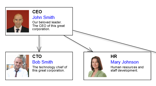
The CompositeNode class makes it easier to add custom graphics primitives to nodes. Appearance of composite nodes is defined by a tree of layout panels and child components. Unlike MindFusion's desktop diagram libraries, node templates are specified using JSON notation instead of XML. A sample client-side node class derived from CompositeNode can now be created declaratively using template as below.

C#  Copy Code

string template = @"{
    component: ""GridPanel"",
    rowDefinitions: [""*""],
    columnDefinitions: [""22"", ""*""],
    children:
    [
        {
            component: ""Rect"",
            name: ""Background"",
            pen: ""black"",
            brush: ""white"",
            columnSpan: 2
        },
        {
            component: ""Image"",
            name: ""Image"",
            autoProperty: true,
            location: ""Images/icon4.png"",
            margin: ""1"",
            imageAlign: ""Fit""
        },
        {
            component: ""StackPanel"",
            orientation: ""Vertical"",
            gridColumn: 1,
            margin: ""1"",
            verticalAlignment: ""Near"",
            children:
            [
                {
                    component: ""Text"",
                    name: ""Title"",
                    autoProperty: true,
                    text: ""title"",
                    font: ""Arial bold""
                },
                {
                    component: ""Text"",
                    name: ""FullName"",
                    autoProperty: true,
                    text: ""full name"",
                    pen: ""blue"",
                    padding: ""1,0,1,0""
                },
                {
                    component: ""Text"",
                    name: ""Details"",
                    autoProperty: true,
                    text: """",
                    font: ""Arial 3""
                }
            ]
        }
    ]
}
";

Objects from the MindFusion.Drawing namespace (such as Rect, Image, Path, Video), double as CompositeNode components. Apart from JSON templates, the visual tree can also be created by adding panels and drawing objects programmatically from JavaScript, starting from the node's root field.

Panel classes include:

  • SimplePanel, laying out its children to overlap each other, taking up all available space (useful for background graphics or images).
  • StackPanel, laying out its children side by side, either horizontally or vertically.
  • GridPanel, laying out its children in rows and columns, where children in same cell overlap. Rows and columns can be either set to a fixed size, auto-size to their child preferred size, or take up all space remaining unoccupied by other rows and columns.

Named components (with specified name value) can be accessed by calling the getComponent method. Components whose autoProperty attribute is enabled will have a pair of get/set property methods generated automatically by classFromTemplate method. The auto-properties from above template can be used as below.

JavaScript  Copy Code

var node1 = new OrgChartNode(diagram);
node1.setBounds(new Rect(25, 15, 60, 25));
node1.setTitle("CEO");
node1.setFullName("John Smith");
node1.setDetails(
    "Our beloved leader. \r\n" +
    "The CEO of this great corporation.");
node1.setImage("ceo.png");
diagram.addItem(node1);


Auto properties are also automatically serialized in JSON format, cloned by node.clone() method and saved/restored by undo commands.

The Shape class used to specify ShapeNode geometry can also be used as a component. When its isOutline attribute is set, the shape will control CompositeNode's geometry too, defining hit test and clip area, and link alignment points along node's border. If isOutline is disabled, the shape will serve mostly as a decorative element. The code below shows a sample fragment specifying shape component in template:

JavaScript  Copy Code
{
    component: "Shape",
    id: "Cloud",
    autoProperty: true,
    name: "OutlineShape",
    pen: "gray",
    brush: "Transparent",
    isOutline: true
},

A Button component that raises event when clicked can be added to template like this:

JavaScript  Copy Code

{
    component: "Button",
    brush: "#ccc",
    text: "Delete",
    width: 30,
    cornerRadius: 3.5,
    clickHandler: "onDeleteClick"
}

If custom nodes will be posted back to server, you must still declare a matching node class as a data container for the custom nodes:

C#  Copy Code

using MindFusion.Diagramming;
using MindFusion.Diagramming.WebForms;

public class OrgChartNode : CompositeNode
{
    public OrgChartNode()
    {
    }

    public OrgChartNode(Diagram diagram)
        : base(diagram)
    {
    }

    [AutoJson]
    public string Image { get; set; }

    [AutoJson]
    public string Title { get; set; }

    [AutoJson]
    public string FullName { get; set; }

    [AutoJson]
    public string Details { get; set; }
}

but unlike older methods of creating custom nodes, you no longer have to create client-script code. The latter is generated automatically from the template and bound to server class properties using a single call to RegisterItemType:

C#  Copy Code

protected void Page_Init(object sender, EventArgs e)
{
    // register custom item type
    diagramView.RegisterItemType(
        typeof(OrgChartNode), "OrgChartNode", "OrgChartNode", 100, template);
}

This is demonstrated in Tutorial 2 sample project installed with the component.