This tutorial demonstrates how to create custom themes for MindFusion.Scheduling using the MindFusion Theme Editor and how to integrate your custom themes into an application.
Start the Theme Editor. The Theme Editor (ThemeEditor.exe) is usually found in the directory where you have installed MindFusion.Scheduling. It can also be accessed from the Windows' Start menu. For more information on how to use the editor, please refer to the Theme Editor topic in this documentation.
Add a new theme using the Theme -> New menu. Enter a valid C# identifier for the theme name because it will be used as a name of the theme class when the source code of the theme is generated. Once you accept the theme name, the theme is created and placed in the Themes list on the left. Double-click on the theme name to open a form where you can edit various theme properties. By default, the new theme is based on the Standard predefined theme and is using the SingleMonth view for a preview.
You can now setup various appearance properties in the property grid on the left, as you would have done if you were working with a MindFusion.Scheduling control in an application. For the purposes of this tutorial we will set the following properties:
Our new custom theme is now ready. You can optionally save the theme via the File -> Save menu if you intend to make some changes in the future.
There are two ways to integrate the theme into your application now. You can copy the theme's source code and paste it directly into your application or you can compile the theme in an external dll file and reference this dll file in your project. In the next step we will examine the second technique since it requires a bit more efforts.
 Note Note |
|---|
The theme created above is also available in the Tutorial8.theme file. This file is located in the Tutorial8 project folder. |
Before compilation, you have to specify the name of the output dll file as well as references to the MindFusion.Scheduling.dll and MindFusion.Common.dll, both of which are used during compilation. To do so, select Options -> Settings from the editor menu. You can optionally select a code provider (either C# of VB.NET) and a namespace for your theme class.
Compile the theme using Options -> Compile or by pressing F7.
 Note Note |
|---|
It is recommended that you copy the dll file containing the theme to the folder containing the referenced MindFusion.Scheduling.dll and MindFusion.Common.dll files. Otherwise, there will be problems later when using the theme in an end-user application. |
Create a new application in the Visual Studio and add a Calendar control to its main form as described in steps 1 and 2 in Tutorial 1: Getting Started.
In order to use the custom theme in the design environment of the Visual Studio, you have to add the theme to the toolbox. This is done using the standard method of adding components to the toolbox, that is, right-click on the toolbox, select "Customize toolbox", and then navigate to the theme's dll file. Once the theme is added to the toolbox, you can double-click on it while editing the application's form or click on it and drag it to the form. This will create a new instance of the theme on this form.
To associate this instance with the Calendar control, select the control on the form and go to the Properties window (The properties window is accessed through the View -> Properties Window menu). Navigate to the CustomTheme property in the property grid and click on the drop-down arrow displayed next to the property value. Select your custom theme in the drop-down list, which appears (Note: Sometimes the name of your custom theme might not be visible in this list right away. In this case simply close the form and reopen it again.).
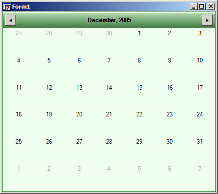
Now your custom theme is applied to the control. You should see the green header, background and frame visible in the design environment.
Compile and run the application. Here is what it should look like:
