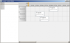
Expanding on the previous post we will now modify the appearance of the calendar items through the use of a custom item presenter. To define the new presenter, simply create a new Style resource with TargetType set to ItemPresenter and place this Style somewhere in the resource look-up path – for example in the application’s or the window’s resource dictionaries. The Style must contain a setter for the Template property that defines the appearance of the item:
<style targettype="{x:Type planner:ItemPresenter}">
  <Setter Property="Template">
    <Setter.Value>
      <ControlTemplate TargetType="{x:Type planner:ItemPresenter}">
        <Grid>
        ...
        </Grid>
      </ControlTemplate>
    </Setter.Value>
  </Setter>
</style>
In this particular case the presenter represents a grid with two rows. The top row contains an icon and the header text of the item. The bottom row contains the description text. Note, that the TextBlock displaying the header text of the item has a name – HeaderBlock. The element with this name defines the position of the TextBox when the item is in-place edited.
Various appearance properties are also customized – such as FontFamily, Background and BorderBrush, by assigning new values to the respective properties of the Calendar.ItemSettings.CalendarStyle object:
calendar.ItemSettings.CalendarStyle.FontFamily = new FontFamily("Segoe UI");
calendar.ItemSettings.CalendarStyle.Background = Brushes.White;
calendar.ItemSettings.CalendarStyle.BorderBrush = Brushes.SlateGray;
Finally, the size of the calendar lanes is increased to accommodate the new appearance of the items:
calendar.ResourceViewSettings.LaneSize = 54;
The final result is displayed below.
The complete sample project is available for download here:
https://mindfusion.eu/_samples/WpfPlannerCustomItems.zip
You can get the trial version of MindFusion.Scheduling for WPF from this link:
https://mindfusion.eu/WpfPlannerTrial.zip
Enjoy!

