The Different Ways to Style a Schedule

In this blog post we will look at the different levels of sty‌ling the elements and items of a schedule made with a MindFusion scheduling library. In our sample we use the Java Scheduling Library, but the API members that we use and the cascading levels of styling a schedule are universal across all MindFusion Scheduling components.

I. Top Level: Theme

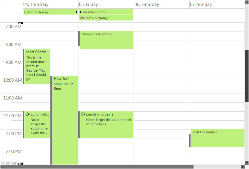
At the top level of styling you have themes. The scheduling library has a set of predefined themes: Light, Lila, Silver, Standard, Vista, Windows2013. You apply one of the predefined themes this way:

calendar.setTheme(ThemeType.Vista);

Here is what the calendar looks like styled with the vista theme:

In JavaScript, the themes are defined in CSS styles and you must reference the desired file and set the name of the theme to the calendar instance. In the other libraries, they are built-in and usually are available as members of an enum.

You have the option to create a custom theme, which you can save and apply this way:

calendar.setCustomTheme(new MyTheme());

Another way to apply the custom theme in Java Scheduling is:

calendar.setCustomTheme(new MyTheme());

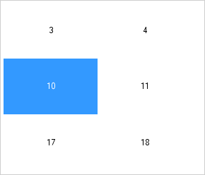
Here is the look of the calendar with the custom theme:

The custom theme has changed some of the colors, widened the header so that the week days could be seen and set some borders on the cells.

Creating a custom Theme requires that you override a strict set of methods. They are the public members of the Theme class. You should override all of them. Among the methods that style the calendar for each view – getMonthRangeSettings getMonthSettings etc. You could override in detail only the method that is responsible for styling the view you would use – if it is only one. For the rest of the methods you could just write:

private void initialize_MyTheme_ListViewSettings()
{
	_listViewSettings = super.createListViewSettings();
}

Every method in the Theme class must be dutifully implemented and all settings set. That comes from the fact that a Theme is the last and topmost styling instrument and it must know how to style any element that might not be explicitly styled down the tree.

The online and offline documentations of the Java Scheduling library come with topics that list in details the styling settings for each of the predefined themes. Our advice is that you get the code of the Theme that looks closest to what you want to have as a structure and modify it.

The sample project that you can download at the bottom of this post implements a custom Theme based on the Vista theme and lists all members in a theme that you must set with all details.

II. View and Item Settings

One level down the tree are the view settings properties. They are available for any view. You can access those settings with the getMonthSettings getMonthRangeSettings etc. methods. Each one of those methods returns the styling settings of a particular view. You should use the one that corresponds to the view you’ve chosen:

//set the view to SingleMonth
calendar.setCurrentView(CalendarView.SingleMonth);
//get the styling settings for SingleMonth view
calendar.getMonthSettings().getDaySettings().setTodayFillColor(Color.green);

You can style the items, regardless of the view used, with the ItemSettings object:

calendar.getItemSettings().setPadding(20);

The *Settings properties define the appearance of items in terms of alignment, spacing, padding, shadow, date format. The coloring of the elements is left to Style instances. Thus, if you want to change the color of items, you will use:

//customize just the items through the itemSettings field
calendar.getItemSettings().setPadding(20);
		
Style itemStyle = new Style();
itemStyle.setBrush(new SolidBrush(Color.white));
itemStyle.setHeaderTextColor(Color.DARK_GRAY);		
itemStyle.setHeaderTextShadowStyle(ShadowStyle.None);
calendar.getItemSettings().setStyle(itemStyle);

This styles all items on the calendar. For styling a particular item, you should use on of the methods listed underneath.

Our calendar now has green header on the current day, the background of events is white and there is a bit of a padding added to the events.

III. Using Events to Style Particular Items

When you want to select items that you want to style based on some distinct characteristics, you can use events. In our sample we handle the itemCreated event, where we check if the start date of an appointment happens to be during the weekend:

// Listen for item creation and for draw events
calendar.addCalendarListener(new CalendarAdapter(){
	//apply custom styling to selected items
	public void itemCreated(ItemEvent e) {
		onItemCreated(e);
	}				
});

The Java Scheduler provides various events, which are accessible through a CalendarListener and CalendarAdapter instances. We handle the itemCreated event this way:

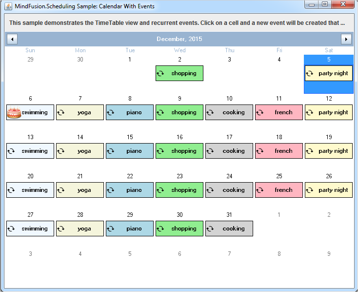
//color in red events that are scheduled to start on weekends
protected void onItemCreated(ItemEvent e) {

	Item item = e.getItem();
	if(item.getStartTime().getDayOfWeek() == DayOfWeek.Saturday || 
		item.getStartTime().getDayOfWeek() == DayOfWeek.Sunday)
		{
			item.getStyle().setBrush(new SolidBrush(new Color(213, 28, 32)));
			item.getStyle().setHeaderTextColor(Colors.White);
			item.getPointedStyle().setBrush(new SolidBrush(new Color(100, 100, 100)));
		}	
}

The ItemEvent class provides the item that was created and you can use the instance to apply any particular styling to the item.

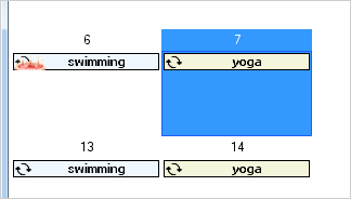
Here is our scheduler, which now colors the items on weekends in red:

In JavaScript, the items have a special field that allows you to assign to them a custom CSS style that you’ve defined. The style will be applied to the particular item only. The field is called ‘cssClass’.

IV. Custom Drawing

When you need to style in a very unique way calendar elements and nothing else helps, you have the option to draw them the way you want. Custom drawing can be made for many parts of the calendar. The available elements are identified as members of the CustomDrawElements enumeration.

You tell the control that you want to use custom drawing this way:

//specify that we will use custom drawing	
calendar.setCustomDraw(EnumSet.of(CustomDrawElements.CellContents));

The custom drawing must be part of the draw method, which is also a member of CalendarListener:

// Listen for item creation and for draw events
calendar.addCalendarListener(new CalendarAdapter(){
				
			
//add custom drawing to CellContents
@Override()
public void draw(CalendarDrawEvent e) {
	onDraw(e);
	} 
			
});

The event handler method looks like this:

//apply custom drawing to selected items
private void onDraw(CalendarDrawEvent e)
{
	if (e.getElement() == CustomDrawElements.CellContents)
	{
		DateTime date = e.getDate();		
		
		//color in light yellow the background of the first 10 days of a month
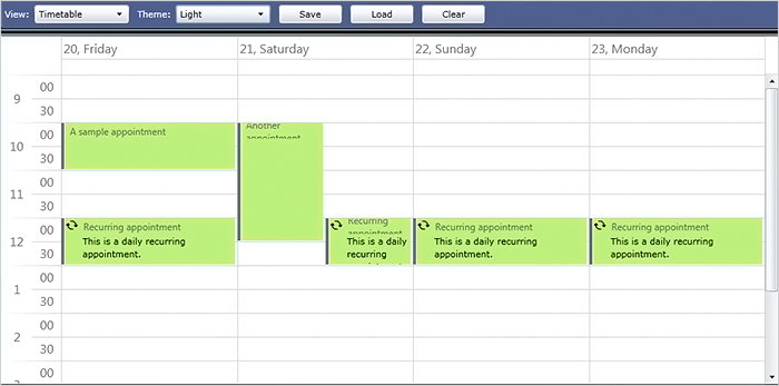
		if (date.getDay() < 11)
		{
			// Do the custom drawing
			Rectangle2D bounds = new Rectangle2D.Double(
			e.getBounds().getX(), e.getBounds().getY(),
			e.getBounds().getWidth() - 1, e.getBounds().getHeight() - 1);
			new AwtGraphics(e.getGraphics()).fillRectangle(Brushes.LightYellow, bounds);
		}
	}
}

The Calendar’s drawEvent class gives us useful methods to learn more about the item that is being drawn. In our case we want to draw the cell contents, so we check if draw was called for the cell contents, and if yes, we get the bounds of the element. We need the check, because draw is called for all elements that support custom drawing and we need to identify which one is drawn at the moment.

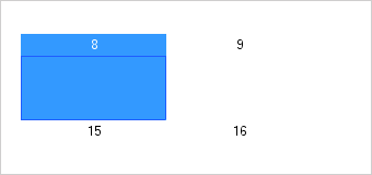
Thanks to the custom drawing, the monthly schedule now has a light yellow background on the first ten days of the month:

With this our review of the methods to style a schedule is finished. You can download the complete source code of the sample together with all MindFusion libraries used from this link:

How to Style a Java Schedule: Download Project Source Code

You can post questions about Mindusion Scheduling components at MindFusion online forums.

About MindFusion Scheduling Components MindFusion Scheduling components are available for a variety of platforms for web, mobile and desktop programming. All of them include a robust feature set that includes 6 calendar views, predefined themes, various events, predefined forms for creating appointments and recurrence. The components are fully interactive, easy to customize and style and are the ideal choice for any application that needs to implement time management features. You can learn more about MindFusion Scheduling tools at https://mindfusion.eu/scheduling-pack.html.

Virtual Keyboard Controls Added To MindFusion WinForms/WPF Packs

MindFusion UI controls suite now includes a virtual keyboard.

MindFusion UI controls suite now includes a virtual keyboard.

Dear MindFusion current and future clients,
Dear FreezePro clients,

MindFusion is pleased to announce that as of April 2016 it has acquired FreezePro Virtual Keyboard components, which will be released as part of MindFusion WinForms/WPF controls suites. We want to use this opportunity to thank all MindFusion and FreezePro clients for the loyalty – you’ve chosen us over multiple competitive products and we believe you are satisfied with your choice.

To please you even more we offer you special prices for upgrading to MindFusion WinForms/WPF pack. You get a 30% discount on the difference between the price of a component’s license you own and the price of the WinForms/WPF pack license you want to buy. MindFusion clients who already own a WinForms/WPF Pack license get the Virtual Keyboard component free of charge.

If you want to use the preferential upgrade prices please send an e-mail to info@mindfusion.eu no later than May 31st, 2016.

If you have technical questions about any of the components please contact MindFusion at support@mindfusion.eu. Use the same email for questions about licensing or transfer of intellectual property rights.

Welcome to the bigger MindFusion family!

MindFusion WPF Pack

MindFusion.WPF Pack, 2016.R1

The new release of MindFUsion WPF Control Suite lists many new features, aimed to empower developers to create compelling business applications with even less efforts. The pack also includes new samples and tutorials. Below are the details:

License keys
There is no separate trial build of the control assemblies anymore. Instead, set the LicenseKey property of the controls to disable their evaluation mode and stop displaying trial messages. If your application contains more than one control by MindFusion, you could call MindFusion.Licensing.LicenseManager.AddLicense(key) from application start-up code to specify the key once instead of setting it per each control.

Visual Studio 2015 support
MindFusion Pack for WPF now includes support for Visual Studio 2015. The installer can create VS2015 toolbox palette for the component.

Barcodes
The new BarcodeLabel class allow displaying EAN, UPC or QR barcodes.

BarcodeLabel: QR barcodes

BarcodeLabel: QR barcodes

MindFusion Chart ControlMindFusion.Charting for WPF

Multiple Axes
The chart control enables developers to create unlimited number of axes of each type – X, X2, Y and Y2. Each axis is an instance of the Axis class and has its own set of properties for complete customization – label style, brush, tick length etc. You can set the X and Y axes of each ChartSeries to a series of your choice and thus bind each chart series to different axes, if you wish.

Multiple axes in the WPF chart control.

Multiple axes in the WPF chart control.

Improved Zooming
Selected area with width smaller than MinZoomSpan does not evoke any action in the control. In addition, the new ZoomChanged event fires whenever zoom occurs and provides useful data for the zoom action with its ZoomChangedArgs.

Cross Hair Improvements
The cross hair control has been improved with several new properties, a method and an event. The properties are:

The new CrossHairPosition method returns the current location of the cross hair. For more precise handling of cross hair movements a new event is available – CrossHairPositionChanged.

Greatly Improved 3D Charts
3D charts have received plenty of improvements, new properties and performance optimizations:

  • PointMergeThreshold – The property sets the radius of an area around a given point where no other points are drawn. The result is better performance especially in charts with numerous points, which happen to be close to one another.
  • InterpolationType.None – A new InterpolationType has been added to the InterpolationType, which does not interpolation but adds data directly and connects the points with triangulation.

The SurfaceType enum has been replaced with three bool properties, which makes the API easier to understand and use.

ScatterFaceSize – the property regulates the size of the polygons that build a 3D scatter. Bigger values lead to bigger polygons, which results in faster performance and more rough scatter mesh.

Effect3D.ShaderEffect – the property can be applied to all 3D chart elements, including scatters and performs much faster.

3D surface chart with color map and wire frame.

3D surface chart with color map and wire frame.

Exporting Images
Two new methods have been added for exporting the chart as an image – CreateImage and ExportImage.

Custom Formatting of Labels in Real-time Charts
A new property has been added to the RealTimeChart library – Axis.LabelFormatProvider. Use it to specify custom formatting of numeric labels. If required, you can specify format arguments for your format classes with Axis.LabelFormat.

MindFusion WebForms DiagrammerMindFusion.Diagramming for WPF

Free-form nodes
A FreeFormNode collects all points from users’ mouse or touch input and displays them as node’s outline. To let users draw free-form nodes interactively, set Diagram.Behavior to DrawFreeForms or LinkFreeforms. Use the Points property of FreeFormNode to get or set outline points programmatically. If the Closed property is set, the node is drawn as a closed shape and its interior filled, or otherwise the node is drawn as a poly-line. If the distance between first and last points drawn by user is shorter than Diagram.AutoCloseDistance, the node’s Closed property is automatically set to true . AutoCloseDistance default value is Double.MaxValue , so free-form nodes are always closed.

Wpf Diagram: Free Shapes

Wpf Diagram: Free Shapes

Shape control points
Shape formulas can now be parameterized by associating control points with Shape objects. Each control point is passed to the shape script as a named variable. Apart from the name, you can specify the default, min and max coordinates for each parameter via the ShapeControlPoint constructor, and whether to treat its values as percents or fixed offset.

Resize table columns and rows
Columns and rows of a TableNode can now be resized interactively if its AllowResizeColumns or AllowResizeRows properties are enabled. In order to resize, move the mouse pointer to the border line on column’s right side or row’s bottom side until it shows resize cursor and start dragging. The control raises TableColumnResizing and TableRowResizing events to let you validate new size or prevent resizing some elements.

Barcode nodes
The BarcodeNode class displays EAN, UPC or QR barcodes as node’s content. In-place edit operations let users enter new numeric codes for 1D codes or text strings for QR codes. The barcode format is specified via the Format property, the encoded number or text is set via Content, and color of 1D bars / 2D modules via BarColor.

Barcode diagram nodes

Barcode diagram nodes

Support for Visio stencils
The diagram can now display shapes from stencil files in Visio 2003 XML stencil format (.vsx). To load a stencil file, use an instance of the VisioStencil class. The shapes are displayed in the diagram through VisioNode objects.

ShapeDesigner improvements

  • The ShapeDesigner control supports undo. Call its Undo or Redo methods to respectively undo or redo a change done to the designed shape.
  • ZoomFactor property added to ShapeDesigner. It also supports interactive zoom in/out via mouse wheel.
  • The SelectedElement property exposes the graphic element currently selected in ShapeDesigner canvas. You can bind to its stroke and brush properties to create alternative user interface for editing element attributes.

AnchorPatern improvements

  • The XUnit and YUnit properties allow specifying the coordinates of an AnchorPoint as a fixed offset from the node’s top-left corner rather than in percentage, so that the point position does not change when the node is resized.
  • The AnchorPattern property of Shape class lets you associate anchor points with shape definitions. If a ShapeNode instance does not contain its own AnchorPattern, it will derive the one defined by the node’s Shape.
  • The RowAnchorPattern property lets you specify default AnchorPattern for all table rows.

Map-16x16MindFusion.Mapping for WPF

Zoom control
The ZoomControl class lets user change interactively the current zoom level and scroll position of a MapView. To set it up, add a ZoomControl to the page, place it anywhere over a MapView, and set the control’s Target property to that view. Set the ZoomStep and ScrollStep properties to specify the amount added to view’s zoom level or scroll position by ZoomControl’s buttons.

map-control-zooming

Miscellaneous

  • The new Behavior property lets users select multiple map elements interactively.

WPF Reporting ToolMindFusion.Reporting for WPF

Report Parameters
Parameters can now be added to a report through the new Parameters collection of the Report class. The parameters provide name, description and value and can be of any type, including expression. For more information about parameters, check the Report Parameters topic.

Barcodes
MindFusion.Reporting for WPF reports can now display UPC-A, UPC-E, EAN-8, EAN-13, and QR barcodes. The barcodes are represented by the new Barcode report item.

wpf_barcode_report_items

Schedule ControlMindFusion.Scheduling for WPF

Interactive Recurrence Rescheduling
Recurrences can be rescheduled interactively by holding down the RescheduleRecurrenceKey while dragging a recurrent item. The control tries to preserve the current pattern of the recurrence when possible.

New Theme
A new built-in theme is available in MindFusion.Scheduling for WPF – the Light theme. It is available through the ThemeType enumeration.

The new 'Light' theme

The new ‘Light’ theme

New Members
Several new properties and events have been added to the control:

You can read details about the new features of the pack at the news page on the forum. The trial version is available for direct download from this link:

Download MindFusion.Pack for WPF 2016.R1

About MindFusion.Wpf Pack: A set of advanced WPF components that help you build your business application easy and on time. The tools provide you with a complete set of features to create, edit and render complex flowcharts, charts, diagrams, calendars, schedules, maps and reports. A set of gauges and UI elements is also included. Each component offers various samples, tutorials and detailed documentation. The controls offer simple and intuitive API, completely customizable appearance, numerous input/output options and a rich event set. Each tool has been thoroughly tested to guarantee that you and your application get the high quality and performance you deserve.

You can read more about the capabilities of each component at its features page:

Prices and licenses are explained in details at the buy page.

A Monthly Calendar in Java With Events and Recurring Appointments

This is a step-by-step guide that teaches you how to:

  • Setup the MindFusion Scheduler for Java library to display a single
    month calendar.
  • Attach and handle an event when the user clicks a calendar cell.
  • Create and setup recurrent events/appointments.
  • Perform custom drawing on a specific cell.

The sample builds a monthly calendar, which responds to a user click on a calendar cell by creating a recurrent appointment. The appointment is repeated on each subsequent day of the week for unlimited number of months.

When the user selects a given calendar cell (the 6th day of the month), a special icon appears. The icon is rendered using custom drawing.

Note: In this tutorial we use the words “appointment” and “event” interchangeably. Let’s start:

1. How to Setup the Calendar

All packages of the calendar are included in a single *.jar file – JPlanner.jar In our sample we will reference the following packages:

import com.mindfusion.common.*;
import com.mindfusion.common.Rectangle;
import com.mindfusion.drawing.*;
import com.mindfusion.drawing.awt.AwtImage;
import com.mindfusion.scheduling.*;
import com.mindfusion.scheduling.awt.*;
import com.mindfusion.scheduling.model.*;

For detailed reference about the packages and the classes of the schedule library check the online help.

Here are the first settings for our schedule:

  calendar = new AwtCalendar();
  calendar.beginInit();
  //set the current time
  calendar.setCurrentTime(DateTime.now());
  DateTime today = DateTime.today();
  //set the current date
  calendar.setDate(today);
  // Select the current date
  calendar.getSelection().set(DateTime.today());

We create a new calendar and signal that initialization starts. The time and date shown at the application start are the current date and time. We also select the cell with the current date.

Let’s make the calendar show exactly one month:

calendar.setCurrentView(CalendarView.SingleMonth);

By default each cell in a single month view has its header size set to 0, which makes the current date show in the center of the cell. As a consequence any events in the cell won’t have space to be rendered.

Java Scheduler: the header takes all the cell's height

Java Scheduler: the header takes all the cell’s height

Since we plan to create appointments on user click, we must push the header to the top and free cell space for drawing the events. This is very easy to do, just set:

calendar.getMonthSettings().getDaySettings().setHeaderSize(20);

Now the header is 20 px. and the rest will be for our appointments.

Java Scheduler: the header is 20px.

Java Scheduler: the header is 20px.

For now we are ready initializing the calendar.

calendar.endInit();

2. Handling User Clicks.

User clicks are handled with the dateClick event. We need an instance of the CalendarAdapter and there we associate the dateClick event with a method – onDateClicked. The event is fired when a date is selected.

 calendar.addCalendarListener(new CalendarAdapter(){
            public void dateClick(ResourceDateEvent e) {
                onDateClicked(e);
            }

        });

3. Create an Appointment and a Recurrence.

The first part of our event handler method is:

protected void onDateClicked(ResourceDateEvent e) {

    int dayIndex = e.getDate().getDayOfWeek();

    Appointment item = new Appointment();
    item.setStartTime(e.getDate());
    item.setEndTime(e.getDate());
    item.setHeaderText(events[dayIndex]);
    item.getStyle().setBrush(brushes[dayIndex]);

Here we create an Appointment and set its start and end date to the date which was clicked. The ResourceDateEvent keeps data about the date, the resource, if any and other useful information. The header text is the text, which will be rendered at the appointment. The style object contains appearance data for the cell and we use the setBrush
method to change the background of the appointment.

The second part of the method creates the Recurrence object:

      recurrence = new Recurrence();
      recurrence.setPattern(RecurrencePattern.Weekly);
      recurrence.setDaysOfWeek(getDayOfWeek(dayIndex));
      recurrence.setStartDate(e.getDate());
      recurrence.setRecurrenceEnd(RecurrenceEnd.Never);
      item.setRecurrence(recurrence);

The recurrence is once a week. There’s additional work to be done when we set the day of the week with setDaysOfWeek. The method accepts as an argument one of the DaysOfWeek enumeration values and we have to convert the index of the day to such value.

private int getDayOfWeek ( int i ) {

        switch (i) {
            case 1:
                return DaysOfWeek.Monday;
            case 2:
                return DaysOfWeek.Tuesday;
            case 3:
                return DaysOfWeek.Wednesday;
            case 4:
                return DaysOfWeek.Thursday;
            case 5:
                return DaysOfWeek.Friday;
            case 6:
                return DaysOfWeek.Saturday;
        }

        return DaysOfWeek.Sunday;

    }

Finally, let’s add the item with the recurrence pattern to the schedule items collection:

 calendar.getSchedule().getItems().add(item);

4. Custom Drawing a Cell’s Header

The last thing that needs to be done is to draw the icon on the special 6th day of each month. We will perform item drawing and we add to the calendar initialization code this line:

 calendar.setCustomDraw(CustomDrawElements.CalendarItem);

Now we are ready to handle the draw event:

   //add a listener for custom draw
       calendar.addCalendarListener(new CalendarAdapter()
        {
            @Override()
            public void draw(DrawEvent e) {
                onDraw(e);
            }
        });

Below is the first part of the handler method:

 private void onDraw(DrawEvent e)
    {
 if(e.getDate().getDay() == 6 )
            {
                java.awt.Image img = null;

                try {
                    // Read the image file from an input stream
                    InputStream is = new BufferedInputStream(
                            new FileInputStream("../cake.png"));
                    img = ImageIO.read(is);

                } catch (IOException ioe) {
                }

Here we read an image from an InputStream. The calendar method for drawing images requires mindfusion.scheduling.AwtImage and we must convert the java image:

AwtImage awtImage = new AwtImage(img);

Then we get the bounds of the drawing area and render the image:

   //gets the bounds of the drawing area
    Rectangle r = e.getBounds();
             
   //draw the image
   e.getGraphics().drawImage(awtImage, e.getBounds().getLeft(), e.getBounds().getTop(), 32, 32);

 }

The image is 32 x 32 pixels and gets clipped in the appointment.

Java Scheduler: the appointment's height is not enough.

Java Scheduler: the appointment’s height is not enough.

We’ll have to resize the item header to give it more space:

calendar.getItemSettings().setSize(32);

And now everything works just fine:

MindFusion Java Calendar: Month View with Events

MindFusion Java Calendar: Month View with Events

The sample is available for download from here:

Monthly Calendar in Java with Recurrent Appointments and Events

About Scheduling for Java Swing: A programming class library written entirely in Java that lets you build the most sophisticated schedules, calendars and task managers fast and easy. The component boasts a comprehensive feature set that includes custom-typed events, undo/redo functionality, scrolling, tool tips and much more. You can choose among six view styles, which are easy to change and customize. The appearance of each schedule is completely customizable and supports themes, user-assigned mouse cursors and a variety of font, pen and brush options.

A detailed list with the features of the tool is available at the Scheduling for Java Swing features page. The trial version includes a variety of samples and you have plenty of sample code to study. Online documentation with useful tutorials is also available.

The library is royalty-free, source-code is also available. You can see a list of the current prices here. Check the discount page for a list of the available discounts.

Reporting for Silverlight V1.4 and Scheduling for Silverlight, V3.4

MindFusion has released new versions for two of its Silverlight controls – Scheduler and Reporter. Below are details about the new features:

WebForms Scheduler by MindFusionWhat’s New in Scheduler for Silverlight, Version 3.4

Interactive Recurrence Rescheduling
Recurrences can be rescheduled interactively by holding down the RescheduleRecurrenceKey while dragging a recurrent item. The control tries to preserve the current pattern of the recurrence when possible. Otherwise, the recurrence may be modified to accommodate to the new start and end times of the modified item. Interactive rescheduling is not registered in the undo history.

New Theme
A new built-in theme is available in the Silverlight Scheduling control – the Light theme. It is available through the ThemeType enumeration.

Silverlight Scheduler: The Light Theme

Silverlight Scheduler: The Light Theme

New Members

Several new properties and events have been added to the control:

The trial version of Silverlight Scheduler is available for direct download from here:

MindFusion Scheduling for Silverlight, V3.4 Trial Download

The component is also available on Nuget. To install the component, run the following command in the Package Manager Console

PM> Install-Package MindFusion.Scheduling.Silverlight

WPF Reporting ToolWhat’s New in Silverlight Reporter, V1.4

Report Parameters

Parameters can now be added to a report through the new Parameters collection of the Report class. The parameters provide name, description and value and can be of any type, including expression. For more information about parameters, check the Report Parameters topic.

Barcodes

MindFusion Silverlight reports can now display UPC-A, UPC-E, EAN-8, EAN-13, and QR barcodes. The barcodes are represented by the new Barcode report item.

Silverlight Reporter: Barcode Report Items

Silverlight Reporter: Barcode Report Items

Miscellaneous

  • Report items can be searched by name through the new FindItem method.
  • Fixed an issue with horizontal data ranges.
  • Items in data range headers and footers can now bind to the data source of the data range.
  • New sample illustrating the Barcode report items.

You can download the trial version directly from here:

Reporting for Silverlight, V1.4 Trial Download

The component is also available on Nuget. To install the component, run the following command in the Package Manager Console:

PM> Install-Package MindFusion.Reporting.Silverlight

Technical support is available on the MindFusion discussion board, per email at support@mindfusion.eu. or at the Help Desk. Your questions and comments are always welcomed by MindFusion friendly and competent support team.

About MindFusion Scheduler for Silverlight: MindFusion.Scheduling for Silverlight provides your web application with a host of useful features for creating, customizing, importing and exporting calendars, time tables, appointment schedules. What’s more, the component includes a full-features Gantt chart with an activity chart and a resource chart. Unleash your creativity with the vast set of appearance options and enjoy the freedom to create calendars where every single detail is customizable and can be controlled by you. Implement professional Gantt diagrams and bring project planning features to your web software with a few mouse clicks. The library is packed with many samples, tutorials and extensive documentation to help you started. The licensing scheme is very attractive with various discount options and great savings for multiple licenses as well for small companies – check it here.

About Reporting for Silverlight: An intuitive programming component that integrates into any Silverlight application with ease and provides the full range of reporting features needed to render, customize and save business reports. The control ships with a versatile report viewer, optimized to display quickly even the largest reports and packed with a single-button import/export functionality to PDF, Excel as well full-featured print and print preview options. Impress the end-user with elegant charts and unlimited number of pictures. MindFusion reports can host any Silverlight component so you can efficiently change your reports as the requirements of the end user evolve. More on MindFusion Silverlight Reporter here.