This post shows how to add custom graphics to a chart by inheriting the SeriesRenderer class. We’ll use it to show marker lines on top of an area chart, which could be used to emphasize important values (e.g. dates on a timeline).


This post shows how to add custom graphics to a chart by inheriting the SeriesRenderer class. We’ll use it to show marker lines on top of an area chart, which could be used to emphasize important values (e.g. dates on a timeline).
In this post we’ll show how to implement Visio-like dynamic pagination of the diagram canvas, expanding or shrinking it while users draw nodes interactively, and rendering custom page borders. This is demonstrated using MindFusion Windows Forms Diagram control, but equivalent APIs are provided by MindFusion diagramming libraries for other platforms.
Continue readingWe are soon releasing Avalonia version of our Virtual Keyboard control. It synthesizes keyboard events through Avalonia event routing system, so it should work on any platform supported by Avalonia UI. Unlike MindFusion Windows keyboard controls, events can be sent only to input controls in current process, and not to external processes.
In addition, language support cannot be generated automatically via OS APIs as in Windows controls, but we’ll be creating character maps for each language. Currently supported cultures that can be assigned to VirtualKeyboard.InputLocale property are en-US, fr-FR, de-DE and nl-NL.
If anyone is interested in trying the preview version, please install the nuget package –
https://www.nuget.org/packages/MindFusion.Keyboard.Avalonia/
Continue readingMindFusion Xamarin Chart has been released with the complete set of features needed to create and customize a wide selection of charts. The control boasts a variety of chart types like radar, polar, line, bubble, bar, column, doughnut, step, scatter etc. Part of the library are also a dashboard component and a component for financial charts.
3D Xamarin Chart
Each chart type exposes numerous options to be customized in order to answer fully the requirements of the user. The control is packed with many samples that demonstrate different aspects of a chart type and offer ready-to-use code. The API is documented in details, with helpful tutorials and guides.
The chart component supports flexible data interface, which allows any data source to be used as a provider of chart data as long as it implements the Series interface. Predefined are a set of the most common data sources like XML, numeric lists, DateTime values, SQL database fields.
The innovative approach to styling lets developers control each aspect of the chart’s looks. They can alter the styling on the tiniest elements or concentrate on the bigger picture and create a global theme which can be reused.
Xamarin Bubble Chart
The component is free to try without feature restrictions for a period of 60 days. Each license includes 12 month upgrade subscription. You can find out more about MindFusion Xamarin chart component at http://mindfusion.eu/xamarin-chart.html
About MindFusion: MindFusion has provided quality software tools for thousands of organizations and individuals for over a decade. With focus on lean software design and excellent technical support, MindFusion has been preferred by many Fortune 500 companies and world-known names from all industries and fields of business. MindFusion programming components are easy to use, with plenty of options to be customized and make development much faster and successful.
Watch here the video for this tutorial.
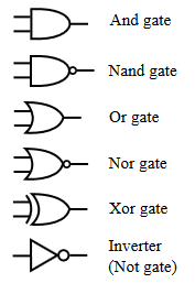
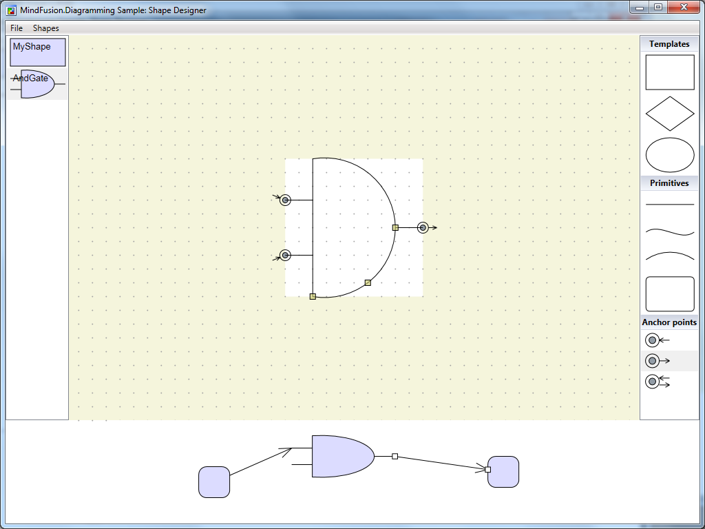
This tutorial will run you through the process of creating custom WPF diagram shapes using the built-in Shape Designer. Keep in mind that the Designer is intended as a sample and is limited in terms of functionality. The designer is available inside the installation of MindFusion.Diagramming for WPF but is also included in this tutorial for convenience. For the purposes of this tutorial, we will create an ‘AND Gate’ circuit diagram shape as illustrated by the following image:
Run the Shape Designer application through the ShapeDesign.exe. The Shape Designer opens up with a single rectangular shape ready to be modified.
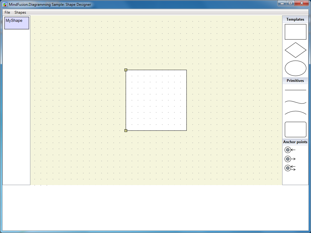
The Shape Designer does not currently support shape renaming (remember, it’s just a sample), therefore create a new shape through the Shapes menu and name it ‘AndGate’.

Select the newly created shape from the list on the left. In the editor select the right segment of the shape’s rectangle and press the DEL button on the keyboard. This will delete the segment and make the shape triangular.
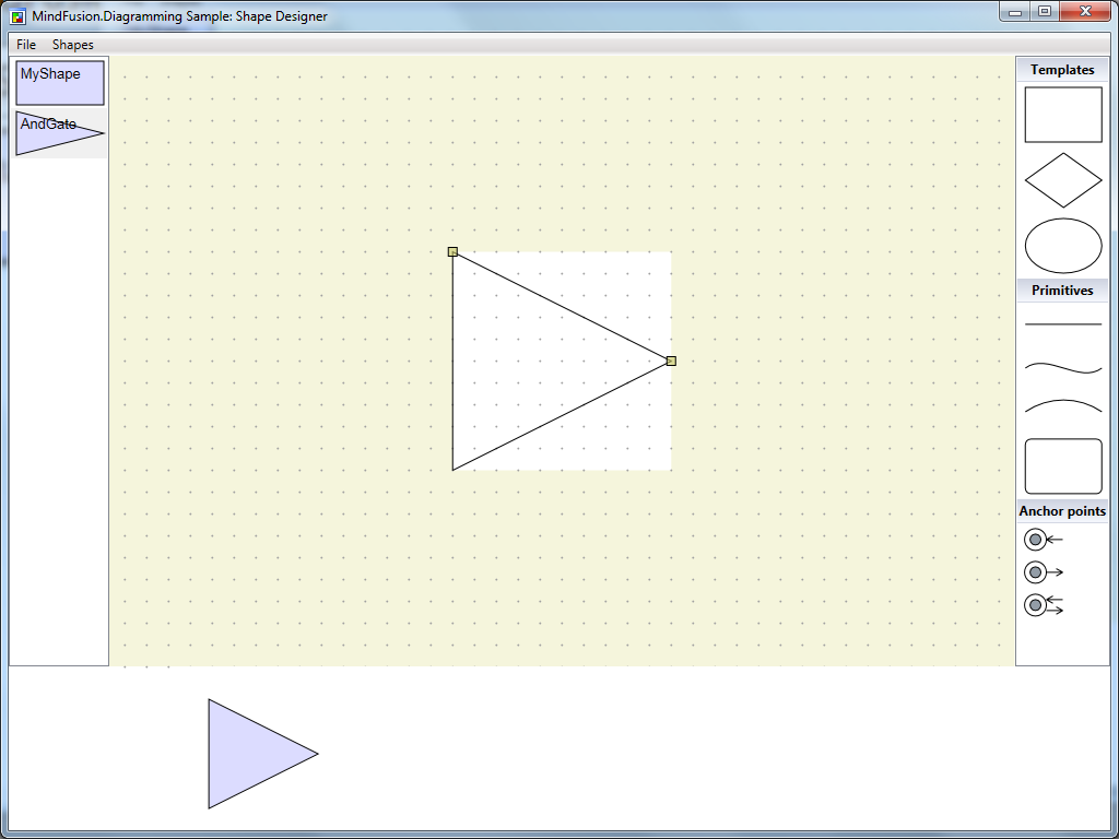
Adjust the end points of the shape segments so that it gets deflated on both sides. To adjust a segment, hover it with the mouse (so that its adjustment handles appear), then drag the handles.

Select the arc primitive from the list on the right side of the screen. Drag this primitive over the top segment of the shape (until it gets highlighted in red) then drop.
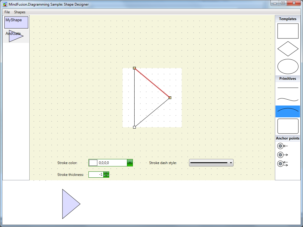
This will replace the line segment with an arc. Repeat the same process for the bottom segment of the shape.

Adjust the middle point of both segments so that the shape looks protruded. Then drag three line primitives from the list on the right to the editor pane. Be careful not to drop the primitives over existing elements because this will replace the elements.
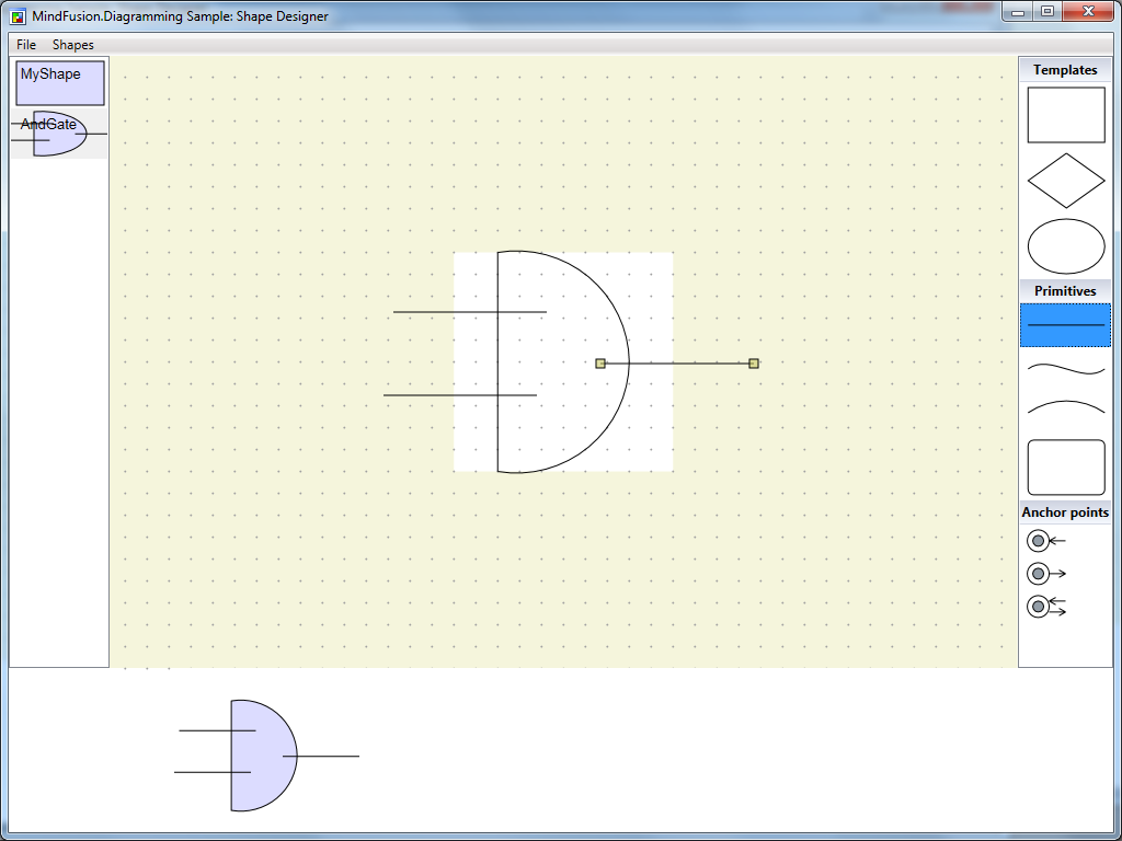
Align the newly created line primitives with the existing shape.

From the list with anchor points at the right side of the application, drag two anchor points from the first kind (input only) and one anchor point from the second kind (output only) and drop them inside the editor. Align the anchor points with the end points of the line segments created in the previous step.
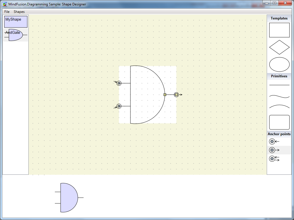
This will conclude the creation of the ‘AND Gate’ shape. You can test the shape in the preview diagram at the bottom of the screen.
Save the shape library. Using the same approach, recreate the other circuit shapes from the image above. The following screenshot illustrates the complete library.

The shape designer along with the shape library containing the circuit shapes can be downloaded from the link below:
You are welcome to ask any questions about the WpfDiagram control at MindFusion discussion board or per e-mail at support@mindfusion.eu.
Click here here to visit the official page of the control.
We hope you find this tutorial useful and thank you for your interest in MindFusion developer tools.