In this blog post we are going to look at the steps required to run the MindFusion Diagramming library for ASP.NET MVC under a Linux server.


In this blog post we are going to look at the steps required to run the MindFusion Diagramming library for ASP.NET MVC under a Linux server.
In this post we will look at the steps we need to make if we want to create this beautiful gauge below:

The gauge is done with MindFusion Charts and Gauges for JavaScript library. You can download the sample together with all needed libraries from this link.
I. Project Setup
We will build the gauge using the OvalGauge library from MindFusion JS Charts and Gauges control. We add two references, needed for the control to work properly:
<script type="text/javascript" src="Scripts/MindFusion.Common.js"></script>
<script type="text/javascript" src="Scripts/MindFusion.Gauges.js"></script>
We have placed those files in a Scripts folder. We will write the JavaScript code for the gauge in a separate file, which we call ValueGauge.js. This file is at the same directory where the web page is. We add a reference to it as well:
<script type="text/javascript" src="ValueGauge.js"></script>
The web page with our sample contains a table. We use the table to place the control together with a text box. The text box is not needed, but we will use it to give the user the option to set the value of the gauge by typing it not only by dragging the pointer.
<table cellpadding="10">
    <tbody>
        <tr>
            <td>Project Cost (in thousands)</td>
        </tr>
        <tr>
            <td><canvas id="value_meter" width="300" height="300"></canvas></td>
        </tr>
        <tr>
            <td>Cost <input id="cost" style="width: 80px"></td>
        </tr>
    </tbody>
</table>
The gauge will be rendered through an HTML Canvas element. The location and size of the Canvas determine the location and the size of the gauge. It is important that we add an id the Canvas – this way we can reference it in the JavaScript code page, which will be necessary.
II. The Control
Now we start editing the ValueGauge.js file and there we first add mappings to the namespaces of Mindusion.Gauges.js that we will use:
///
var Gauges = MindFusion.Gauges;

var d = MindFusion.Drawing;
var OvalScale = Gauges.OvalScale;
var Length = Gauges.Length;
var LengthType = Gauges.LengthType;
var Thickness = Gauges.Thickness;
var Alignment = Gauges.Alignment;
var LabelRotation = Gauges.LabelRotation;
var TickShape = Gauges.TickShape;
var PointerShape = Gauges.PointerShape;
The first line is a reference to the Intellisense file that allows us to use code completion of the API members, if supported by our JavaScript IDE.
Now we need to get the DOM Element that corresponds to the gauge Canvas and use it to create an instance of the OvalGauge class:
var value_meter = Gauges.OvalGauge.create(document.getElementById('value_meter'), false);
III. Gauge Scales
Gauge scales depend on the type of the gauge. For oval gauges we use OvalScale The OvalScale needs to be associated with a gauge and here is how we create it:
var valueScale = new Gauges.OvalScale(value_meter);
valueScale.setMinValue(0);
valueScale.setMaxValue(100);
valueScale.setStartAngle(120);
valueScale.setEndAngle(420);
The OvalScale class offers the full set of properties needed to customize the scale. We use the setMinValue and setMaxValue methods to specify the value range o the gauge. The setStartAngle and setEndAngle specify the arc of the gauge and we set them to 120 and 420 respectively. You see that the arc is 300 degrees, which is less than a full circle – exactly how we want it to be.
We continue our customization by setting the fill and stroke of the scale. We actually do not want the default scale to be rendered at all, so we use setFill and setStroke to specify transparent colors:
valueScale.setFill('Transparent');
valueScale.setStroke('Transparent');
valueScale.setMargin(new Gauges.Thickness(0.075, 0.075, 0.075, 0.075, true));
Now we can continue with the ticks. Each gauge can have major, middle and minor ticks. Those ticks are not rendered by default.
var majorSettings = valueScale.majorTickSettings;
majorSettings.setTickShape(Gauges.TickShape.Line);
majorSettings.setTickWidth(new Gauges.Length(10, Gauges.LengthType.Relative));
majorSettings.setTickHeight(new Gauges.Length(10, Gauges.LengthType.Relative));
majorSettings.setFontSize(new Length(14, LengthType.Relative));
majorSettings.setNumberPrecision(0);
majorSettings.setFill('rgb(46, 52, 66)');
majorSettings.setStroke('rgb(46, 52, 66)');
majorSettings.setLabelForeground('rgb(175, 175, 175)');
majorSettings.setLabelAlignment(Alignment.InnerCenter);
majorSettings.setLabelRotation(LabelRotation.Auto);
majorSettings.setLabelOffset(new Length(6, LengthType.Relative));
majorSettings.setStep(20);
majorSettings.setTickAlignment (Alignment.OuterOutside);
We start the customization with the majorTickSettings They will render labels and want to have one tick with a tep of 20. So, we use setStep to specify 20 as an interval and use setTickWidth and setTickHeight to set the size of the ticks. Those properties can be set to an absolute or relative value – see the LengthType enumeration. We also need to change the default shape of the pointer – we use TickShape rest of the settings are intuitive – setFill and setStroke specify how the ticks are colored. We also use setLabelAlignment to position the labels outside the ticks. setTickAlignment is also an important property -it allows us to change the alignment of the ticks, so they can be drawn inside the scale.
The TickSettings object is similar to MajorTickSettings
var middleSettings = valueScale.middleTickSettings;
middleSettings.setTickShape(TickShape.Line);
middleSettings.setTickWidth(new Gauges.Length(10, Gauges.LengthType.Relative));
middleSettings.setTickHeight(new Gauges.Length(10, Gauges.LengthType.Relative));
middleSettings.setTickAlignment (Alignment.OuterOutside);
middleSettings.setShowTicks(true);
middleSettings.setShowLabels(false);
middleSettings.setFill('rgb(46, 52, 66)');
middleSettings.setStroke('rgb(46, 52, 66)');
middleSettings.setCount(5);
We should note here that setShowLabels is false because we want the labels to appear only at intervals of 20. We also use setCount to specify how many ticks we want between each two adjacent major ticks. The rest of the settings are the same as for MajorTickSettings.
IV. Custom Painting
The painting of the colored sections at the edge of the gauge is custom code. The gauges library provides various events that allow the developer to replace the default gauge drawing with custom drawing – see the Events section of the OvalGauge class.
In our sample we will handle two events:
value_meter.addEventListener(Gauges.Events.prepaintBackground, onPrepaintBackground.bind(this));
value_meter.addEventListener(Gauges.Events.prepaintForeground, onPrepaintForeground.bind(this));
prepaintBackground is raised before the background is painted. We can cancel the default painting or add some custom drawing to it. The same is true for prepaintForeground
function onPrepaintBackground(sender, args)
{
	args.setCancelDefaultPainting(true);

	var context = args.getContext();
	var element = args.getElement();
	var bounds = new d.Rect(0, 0, element.getRenderSize().width, element.getRenderSize().height);
        ..................................
}
In the prepaintBackground event handler we first get the handler to the CanvasRenderingContext2D instance. Then we get the bounds of the painted element. This is the inside of the gauge. Each o the colored segments is pained as an arc. We do not create a path figure to fill – instead we set a very thick lineWidth of the stroke:
context.lineWidth = 25;
var correction = context.lineWidth / 2;

//light green segment
context.beginPath();
context.strokeStyle = 'rgb(0, 205, 154)';
context.arc(bounds.center().x, bounds.center().y, bounds.width / 2-correction, 0.665*Math.PI, 1*Math.PI, false);
context.stroke();
We go on painting this way all colored sections of the gauge, only changing the start and end angles. When we are ready we paint the inside of the gauge. We do it with a full arc:
context.beginPath();
bounds.x += 25;
bounds.y += 25;
bounds.width -= 50;
bounds.height -= 50;
context.fillStyle = '#2e3442';

context.arc(bounds.center().x, bounds.center().y, bounds.width / 2, 0*Math.PI, 2*Math.PI, false);
context.fill();
The complete drawing is done inside the prepaintBackground event handler. So, in the prepaintForeground handler we only need to cancel the default painting:
function onPrepaintForeground(sender, args)
{
    args.setCancelDefaultPainting(true);

};
V. The Gauge Pointer
We need to add a Pointer to the OvalScale of the gauge instance if we want to show one:
var pointer = new Gauges.Pointer();
pointer.setFill('white');
pointer.setStroke("#333333");

pointer.setPointerWidth(new Gauges.Length(90, Gauges.LengthType.Relative));
pointer.setPointerHeight(new Gauges.Length(20, Gauges.LengthType.Relative));

pointer.setShape(Gauges.PointerShape.Needle2);
pointer.setIsInteractive(true);

valueScale.addPointer(pointer);
The size of the pointer is also set in LengthType units. This allows us to have the same pointer size relative to the size of the gauge even if we change the size of the Canvas. We use the PointerShape enumeration to specify the type of pointer we want and then we make it interactive with setIsInteractive As an addition to the default needle of the pointer we want to render a circle at the base of the pointer. We do it with custom drawing:
value_meter.addEventListener(Gauges.Events.prepaintPointer, onPrepaintPointer.bind(this));
First we need to handle the prepaintPointer event. In the event handling code we do the drawing:
function onPrepaintPointer(sender, args)
{
	//args.setCancelDefaultPainting(true);

	var context = args.getContext();
	var element = args.getElement();
	var size = element.getRenderSize();
	var psize = new d.Size(0.2 * size.width, size.height);

	context.save();
	context.transform.apply(context, element.transform.matrix());

	context.beginPath();
	context.arc(psize.width / 2, psize.height / 2, psize.height*0.75, 0, 2 * Math.PI, false);
	var fill = element.getFill();
	context.fillStyle = Gauges.Utils.getBrush(context, fill, new d.Rect(0, 0, size.width, size.height), false);
	context.fill();
	context.strokeStyle = '#333333';
	context.stroke();

	context.restore();
};
Note that in this case we do not cancel the default painting – we will add to it, rather than replace it. Then we get the CanvasRenderingContext2D and size of the rendered element. What is new here is the transform of the CanvasRenderingContext2D object to the center of the gauge. Then we get the Brush that is used to paint the rest of the pointer and use it to fill the custom part as well. We can set the brush directly, but we prefer to take it from the base element – the Pointer This way if we change settings of the Pointer the color of the custom drawn circle will change automatically as well.
VI. Data Binding
What we would like to do now is bind a change in the text field to the value of the gauge scale. We add a method that does it:
function valueChanged(id)
{
	if (isNaN(this.value)) return;
	var gauge = Gauges.OvalGauge.find(id);
	var pointer = gauge.scales[0].pointers[0];
	pointer.setValue(+this.value);
};
When we call the valueChanged method with the instance of the OvalGauge as an argument, we can get its pointer and set its value to the value of ‘this’. We call the valueChanged in such way, that the ‘this’ reference will be the text field:
var cost = document.getElementById('cost');
cost.onchange = valueChanged.bind(cost, ['value_meter']);
Now when the value changes, the event handler takes the pointer and set its value to the value the user has types.
That is the end of this tutorial. You can download the source code of the sample, together with all MindFusion libraries used from the following link:
Download Value Gauge in JavaScript Source Code
You can use the discussion forum to post your questions, comments and recommendations about the sample or MindFusion charts and gauges.
About MindFusion JavaScript Gauges: A set of two gauge controls: oval and rectangular, with the option to add unlimited nuber of scales and gauges. All gauge elements support complete customization of their appearance. Custom drawing is also possible, where you can replace the default rendering of the gauge element or add to it. The gauge controls include a variety of samples that offer beautiful implementations of the most popular applications of gauges: thermometer, car dashboard, functions, compass, clock, cost meter and more.
Gauges for JavaScript is part of MindFusion charts and Dashboards for JavaScript. Details at https://mindfusion.eu/javascript-chart.html.
MindFusion Pack for WinForms, 2016.R1 has been released. Here is an overview of the new features. You can find details about each new feature here.
Visual Studio 2015 support
MindFusion Pack for WinForms now includes support for Visual Studio 2015. The installer can create VS2015 toolbox palette for the components.
Barcodes
The new BarcodeLabel and BarcodePrinter classes allow displaying and printing EAN, UPC or QR barcodes.

BarcodeLabel: QR barcodes
 MindFusion.Diagramming
Street maps
MapNodes can render street maps in OpenStreetMap format. Call FromXml method of MapContent to load an .osm file.
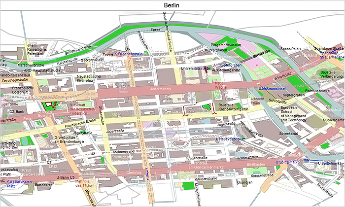
MindFusion WinForms Street maps
Resize table columns and rows
Columns and rows of a TableNode can now be resized interactively if its AllowResizeColumns or AllowResizeRows properties are enabled. In order to resize, move the mouse pointer to the border line on column’s right side or row’s bottom side until it shows resize cursor and start dragging.
Barcode nodes
The BarcodeNode class displays EAN, UPC or QR barcodes as node’s content. In-place edit operations let users enter new numeric codes for 1D codes or text strings for QR codes.
Miscellaneous
 MindFusion.Mapping
Street maps
You can render street maps in OpenStreetMap format by adding a StreetMapLayer instance to the MapView. In order to load a street map, create a new StreetMapLayer > object and call its Map‘s LoadFromXml method to load the corresponding *.osm file.
Zoom control
The ZoomControl class lets user change interactively the current zoom level and scroll position of a MapView. To set it up, add a ZoomControl to the form, place it anywhere over a MapView, and set the control’s Target property to that view.
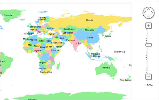
Multiple selection
Now it’s possible to select multiple decorations or map shapes by drawing a selection rectangle. To enable that, set the Behavior property to Select. Selected elements are stored in the Selection collection of respective layer objects.
API changes
 MindFusion.Reporting
Barcodes
MindFusion.Reporting reports can now display UPC-A, UPC-E, EAN-8, EAN-13, and QR barcodes. The barcodes are represented by the new Barcode report item.
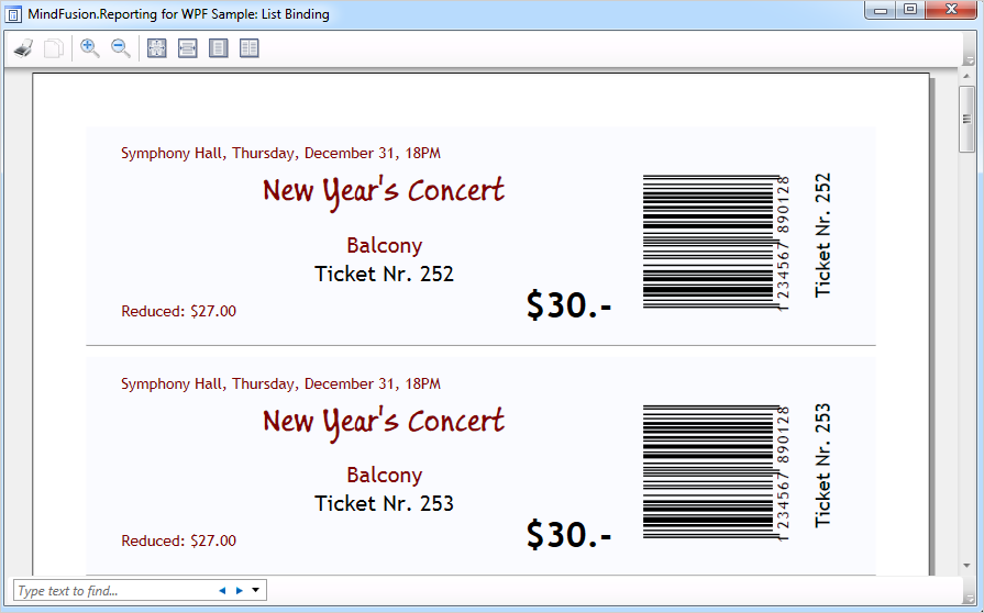
WinForms Reporter: Barcode Report Items
Miscellaneous
 MindFusion.Scheduling
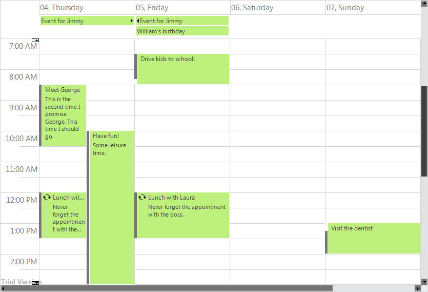
Improved List View
The List view can now display an additional header and a footer. To turn them on, set the appropriate flag to the HeaderStyle property of the ListViewSettings class. The FooterFormat and MainHeaderFormat properties let you customize the text in the respective header. The text can also be customized through the CustomizeText event of the Calendar class. The size of the headers can be specified through the MainHeaderSize and FooterSize properties. Interactive Recurrence Rescheduling Recurrences can be rescheduled interactively by holding down the RescheduleRecurrenceKey while dragging a recurrent item. The control tries to preserve the current pattern of the recurrence when possible.
New Theme
A new built-in theme is available in MindFusion.Scheduling – the Light theme. It is available through the ThemeType enumeration.
The new ‘Light’ theme
New Properties
Several new properties have been added to the control:
Miscellaneous
 MindFusion.Spreadsheet
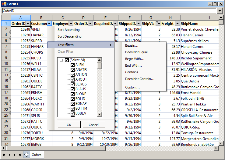
Autofiltering
Worksheets now support autofiltering. To enable it, call the AutoFilter method of the CellRange class. To specify autofiltering criteria for individual columns, use the AutoFilter overload.
Multiple Selection
MindFusion.Spreadsheet now supports selection of multiple cell ranges. Cell ranges can be added to the selection interactively, by holding down the CTRL key while dragging with the mouse, or programmatically, by using one of the new methods of the Selection class: Add, AddRow, and AddColumn.
Miscellaneous
Installer for the latest version can be downloaded at https://www.mindfusion.eu/WinFormsTrial.zip
Updated assemblies are also available as MindFusion.Pack NuGet package.
About MindFusion.WinForms Pack: A set of five WinForms programming components that provide your application with a rich choice of diagramming, charting, scheduling, mapping, reporting and gauge features. The tools are very easy to implement and use. They boast intuitive API and various step-by-step tutorials to get you started. Both online and offline documentation is available.
A sample browser presents you with all the samples for each control to let you easily navigate to what you need. You can check some of the features of each component right now if you look at the online demos:
Visit the features – page of the components for more information about their capabilities:
You can check the prices and licensing scheme here. All components are royalty-free.
MindFusion announceс а неш release of our WebForms suite of components. Here is an overview of the most important new features:
Licensing
We no longer make separate trial build of the control assemblies. Instead there is a new LicenseKey property, which disables a component’s evaluation mode. If your application contains more than one control by MindFusion, you could call MindFusion.Licensing.LicenseManager.AddLicense(key) to specify the key once instead of setting it per each control. License key strings are listed on the Keys & Downloads page at MindFusion’s customer portal.
Zoom control
The ZoomControl class from MindFusion.Common.WebForms lets users change interactively the current zoom level and scroll position of a DiagramView or a MapView. To set it up, add a ZoomControl element to the page and set the control’s TargetId property to the id of the view. The control has numerous properties for customizing its appearance.
ASP.NET Diagrammer: The Zoom control
Visual Studio 2015 Toolbox Support
MindFusion.WebForms components can now be installed automatically into Visual Studio 2015 toolbox palette.
 MindFusion.Charting
Custom Formatting of Labels for Line charts
Line charts now support custom formatting of labels. To use custom formatting, set LabelFormat to NumberFormat.Custom and use LabelCustomFormat.
Sorted Bars
The algorithm for sorting of bars has been improved. Bars in a series or in clusters can be sorted in ascending or descending order – use the SortOrder property. You can also sort each series/cluster with the SortSeriesBy property. Bar can be sorted with their colors preserved if SortColor is set to true.
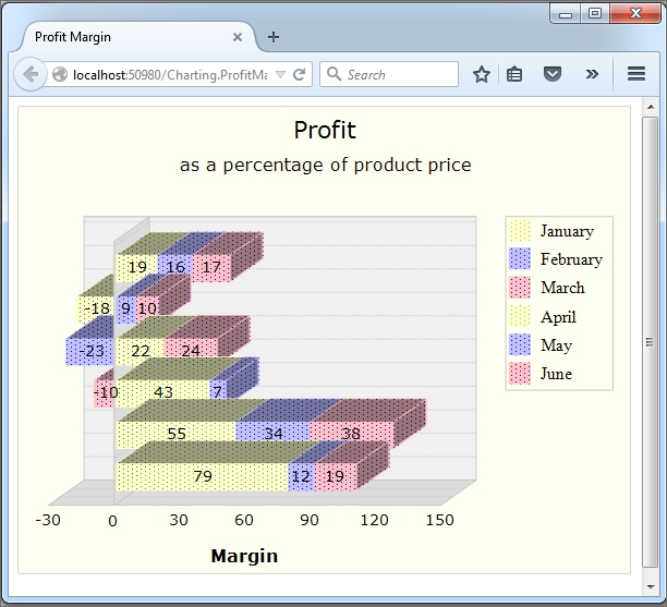
ASP.NET Chart: The Bar chart control
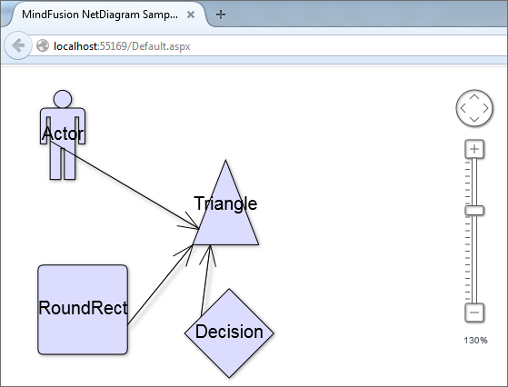
MindFusion.Diagramming
Canvas mode improvements
Styled text in Canvas mode
The EnableStyledText property of ShapeNode allows using HTML-like formatting tags to apply various attributes to the node’s text. At this time the component supports the following formatting tags:
<b> specifies bold text
<i> specifies italic text
<u> specifies underlined text
<color=value> specifies text color
<br /> specifies line break
Zoom control
(not available in JavaApplet mode)
The ZoomControl class lets users change interactively the current zoom level and scroll position of a DiagramView. To set it up, add a ZoomControl element to the page and set the control’s TargetId property to the id of a DiagramView. The control offers numerous customization properties like ZoomStep, ScrollStep and various appearance setting properties such as Fill, BorderColor, CornerRadius and TickPosition.
 MindFusion.Gauges
Linear and oval gauge controls have been added to MindFusion.WebForms pack. The gauges are drawn on client side using HTML Canvas API. Users can change gauge values interactively by dragging their elements.
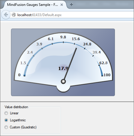
The ASP.NET Gauge control
MindFusion.Scheduling
Horizontal Timetable view
Horizontal layout has been added to the Timetable view. The horizontal timetable view displays a collection of rows where each row represents the allotment of resources to distinct hours of a day; the rows in this view represent dates, tasks, locations, contacts or resources.
 MindFusion.UI
The bundled jQuery version has been upgraded to 1.11.2.
You can read further details about the release at the announcement page at MindFUsion discussion board.
The trial version of the new MindFusion.WebForms Pack is available for direct download from this link:
Download MindFusion ASP.NET Pack 2015.R1
About MindFusion.WebForms Pack: A set of WebForms components that add great variety of features to your ASP.NET application with a few mouse clicks. The pack contains advanced components for diagramming, scheduling, charting and UI (Accordion, ColorPicker, TabControl, Window, WindowHost, DockControl, Button, Slideshow, Zoom and more). Each tool boasts easy to learn and use API and is quickly integrated into any web application that targets the ASP.NET platform. The controls support numerous options for styling, data import / export, user interaction and offer rich event set. There are plenty of samples and step-by-step tutorials as well detailed documentation.
Use the features page for each of the tools to find out more about its capabilities and the numerous ways it can boost your performance and speed up the development of your application:
Visit the buy page for details on the licensing scheme and prices. If you have questions please contact us. We shall be happy to assist you.
All MindFusion components for WinForms, WPF and Silverlight are now available as NuGet packages. The following table lists the NuGet IDs of the individual products:
The complete list of MindFusion products on NuGet can be found here: https://www.nuget.org/profiles/MindFusion.
The NuGet manager is available for Visual Studio 2010, Visual Studio 2012, and Visual Studio 2013 and can be downloaded from here: https://www.nuget.org/.
To install a package, run the following command in the Package Manager Console (accessible from the Visual Studio menu: Tools → NuGet Package Manager → Package Manager Console):
PM> Install-Package
Where <id> is the NuGet ID of the package. For example, to install MindFusion.Diagramming for WinForms, use:
PM> Install-Package MindFusion.Diagramming
Enjoy!