Using MindFusion ToolStrip Library in JavaScript

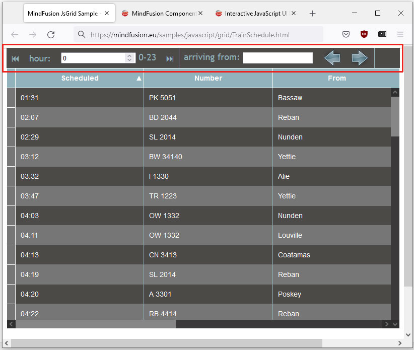
In this blog post we are going to look at the way you can build the ToolStrip that you see at the image below. We use the ToolStrip control, which is part of MindFusion Pack for JavaScript. Here is the final result:

We will go through the process of creating the toolstrip step-by-step, from scratch, clarifying the most important details.

You can run the sample online at https://mindfusion.eu/samples/javascript/grid/TrainSchedule.html

Continue reading

Multi-tabs Form in JavaScript with Validation

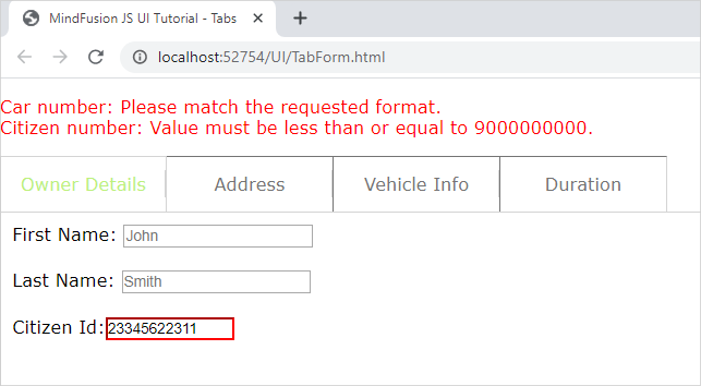
In this blog post we will create a form that spans over several tabs. Each tab contains input fields for a specific type of information. There are placeholders and restrictions for each input field. If the provided data is not correct we display a guiding message and select the first tab that has wrong data. All incorrect fields are outlined with red.

I. General Settings

We will use two files for our form – one is a web page and the other a JavaScript file that will hold all JavaScript code for the sample. They both are names TabForm.

In the web page we add references to the css file that holds the theme we’ve chosen:

<link rel="stylesheet" type="text/css" href="themes/light.css">

This is the CSS for the light theme of the MindFusion JavaScript UI controls. There are various themes provided out-of-the-box with the library and you can choose another one.

Then, at the bottom of the web page, before the closing BODY tag we add references to the three JavaScript files that we want to use:

<div style="position: absolute; top: 0px; left: 0; right: 0; bottom: 0;">
    <div id="host">
    </div>
</div>

The first two of them point to the libraries of the UI controls: MindFusion.Common and MindFusion.UI. The other is a reference to the JS code-behind file.

In order to render the TabControl we need a DIV element. So, we create one and give it an id – that is important:

We also add a paragraph with an id and red stroke – it will render text, that describes the error fields and the validation message for each one – if the user has provided wrong data.

II. Creating the Tab Control and the Tab Pages

In the code-behind file we first add mappings to the two namespaces we want to use:

var ui = MindFusion.UI;
var d = MindFusion.Drawing

Then we create an instance of the TabControl in code this way:

// Create a new TabControl.
var host = new ui.TabControl(document.getElementById("host"));
host.width = new ui.Unit(70, ui.UnitType.Percent);
host.height = new ui.Unit(70, ui.UnitType.Percent);
host.theme = "light";

We use the id of the DIV element in the constructor of the TabControl Then we use the theme property to refer to the theme that we want to use. The value of the theme property should be the same as the name of the CSS ile that we referenced in the web page. It can point to a custom theme that you have created as long as the names of the file and the property value match.

We create the first TabPage as an instance of the TabPage class:

// Create four templated tab pages and add them to the host's tabs collection.
var tab1 = new ui.TabPage("Owner Details");
// The HTML of the specified page will be set as the innerHTML of a scrollable div inside the tab content element.
tab1.templateUrl = "page1.html";
host.tabs.add(tab1);

We provide the string that will render in the title of the TabPage in the constructor. Then we set the content that the TabPage will have as a url to the web page that contains it e.g. the TabPage loads a content from a page specified with templateUrl Here is the code for the first page:


In terms of HTML, we have provided each input element with an id, a placeholder value and the necessary restrictions that will validate its content. We strictly use and follow the Validation API of JavaScript, which you can check here: https://www.w3schools.com/js/js_validation_api.asp and here https://developer.mozilla.org/en-US/docs/Web/Guide/HTML/HTML5/Constraint_validation.

III. Data Submission and Validation

On the last tab of the form, we have placed a submit button:

We wire the event handler of the click action for this button in the contentLoad event of the fourth tab, where the button is:

tab4.contentLoad.addEventListener(tabLoad);
..........................
..........................
function tabLoad(sender, args) {

    let current_datetime = new Date();
    let formatted_date = current_datetime.getFullYear() + "-" + (current_datetime.getMonth() + 1) + "-" + current_datetime.getDate();
    sender.element.querySelector("#start").value = formatted_date;
    sender.element.querySelector("#submit").addEventListener("click", function () {
    submitData(sender);
    });
}

In the event handler we get the current date and format it the way the default DateTime picker HTML control expects to get it. We get each input control through its id and the querySelector of the HTML Document object. The sender in this case is the fourth tab or tab4.

The method that validates the content is submitData:

function submitData(sender) {
    var txt = "";

    var inputObj = tab4.element.querySelector("#start");

    if (!inputObj.checkValidity()) {
        txt += inputObj.name + ": ";
        txt += inputObj.validationMessage + "
";
        inputObj.style["border-color"] = "red";
        host.selectedItem = tab4;
        dataIsCorrect = false;
    } else
        inputObj.style["border-color"] = "gray";
        ....................................

We use querySelector once again to get the input fields on each page one by one. For each one we see if the validity check has failed. If yes, we outline this field in red and append the validation message to a text variable.

We walk through all tabs and all input fields in this same manner and in reverse order. Our aim is that the first tab with error gets selected, even if there are errors in fields further in the form.

Note that if the field is OK we set its border to the default color. This way we reset the appearance of fields that were previously wrong but the user has corrected.

Finally, we assign the text to the content of the paragraph that renders text in red:

...............................
document.getElementById("error").innerHTML = txt;  

    if (txt.length === 0)
        confirmData();

If no errors have been detected – that means the error text is an empty string – we submit the data. The data submission is handled by the confirmData method:

function confirmData() {

    //first tab
    tab1.element.querySelector("#fname").value = "";
    tab1.element.querySelector("#lname").value = "";
    tab1.element.querySelector("#citizen_id").value = "";
    ........................................
    ........................................
     //fourth tab
    tab4.element.querySelector("#duration").value = "";
    let current_datetime = new Date();
    let formatted_date = current_datetime.getFullYear() + "-" + (current_datetime.getMonth() + 1) + "-" + current_datetime.getDate();
    tab4.element.querySelector("#start").value = formatted_date;

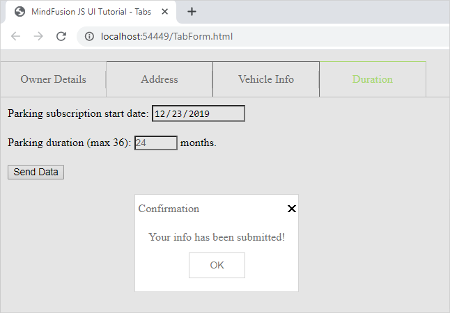
    ui.Dialogs.showInfoDialog("Confirmation", "Your info has been submitted!", null, host.element, host.theme);

}

We reset the values of all input fields and we show an instance of MindFusion InfoDialog to inform the user that their data has been successfully collected.

You can download the source code of the sample and all MindFusion themes and libraries used from this link:

https://mindfusion.eu/samples/javascript/ui/TabForm.zip

You can ask technical question about MindFusion JavaScript developer tools at the online forum at https://mindfusion.eu/Forum/YaBB.pl.

About MindFusion JavaScript UI Tools: MindFusion UI libraries are a set of smart, easy to use and customize JavaScript UI components. Each control boasts an intuitive API, detailed documentation and various samples that demonstrate its use. The rich feature set, multiple appearance options and numerous events make the UI controls powerful tools that greatly facilitate the programmers when building interactive JavaScript applications. MindFusion UI for JavaScript is part of MindFusion JavaScript Pack. You can read details at https://mindfusion.eu/javascript-pack.html.

Creating custom CompositeNode components

In this post we’ll examine how CompositeNode components work in MindFusion.Diagramming for Windows Forms, and in the process create a custom radio button component. You can find the completed sample project here: RadioComponent.zip

CompositeNode was created as alternative of the ControlNode class, which lets you present any Windows Forms control as a diagram node. ControlNode has many advantages, such as letting you design the hosted user controls using Visual Studio designer, reusing them in other parts of the user interface, and including complex framework or third-party controls as their children. From the fact that each user control creates a hierarchy of Win32 windows come some disadvantages too:

  • ControlNodes cannot mix with other diagram elements in the Z order but are always drawn on top
  • performance deteriorates if showing hundreds of nodes
  • mouse events might not reach the diagram if hosted controls capture mouse input
  • print and export might not be able to reproduce the appearance of hosted controls without additional work (handling PaintControl event)

On the other hand, CompositeNode does all its drawing in DiagramView control’s canvas and is not affected by the issues listed above. CompositeNode lets you build node’s UI by composing hierarchy of components derived from ComponentBase class. Pre-defined components include layout panels, read-only or editable text fields, images, borders, buttons, check-boxes and sliders. If the UI component you need isn’t provided out of the box, you could still implement it as a custom class that derives from ComponentBase or more specific type and overriding the GetDesiredSize, ArrangeComponents and Draw methods. Lets see how that works using a RadioButtonComponent as an example.

Derive RadioButtonComponent from CheckBoxComponent so we reuse its IsChecked and Content properties:

class RadioButtonComponent : CheckBoxComponent
{
}

CompositeNode relies on a dynamic layout system that lets components determine their size by overriding GetDesiredSize method, and arranging children in allocated size by means of ArrangeComponents method. For radio button we’ll call its base class to measure content size and add enough space for drawing the radio graphics element (a circle) horizontally, while fitting it in measured height:

float RadioSize(SizeF size)
{
	return Math.Min(size.Width, size.Height);
}

public override SizeF GetDesiredSize(SizeF availableSize, IGraphics graphics)
{
	var s = base.GetDesiredSize(availableSize, graphics);
	s.Width += RadioSize(s);
	return s;
}

ArrangeComponents calls the base class to arrange its content on the right side of available space:

public override void ArrangeComponents(RectangleF availableSpace, IGraphics graphics)
{
	var radioSize = RadioSize(availableSpace.Size);
	availableSpace.X += radioSize;
	availableSpace.Width -= radioSize;
	base.ArrangeComponents(availableSpace, graphics);
}

Now override Draw and render standard radio button graphics on the left side of the component, and content on the right side:

public override void Draw(IGraphics graphics, RenderOptions options)
{
	var radioSize = RadioSize(Bounds.Size);
	var r = radioSize / 2 - 1;
	var cr = r - 1;

	graphics.FillEllipse(Brushes.White, Bounds.X + 1, Bounds.Y + 1, 2 * r, 2 * r);
	using (var pen = new System.Drawing.Pen(Color.Black, 0.1f))
		graphics.DrawEllipse(pen, Bounds.X + 1, Bounds.Y + 1, 2 * r, 2 * r);
	if (IsChecked)
		graphics.FillEllipse(Brushes.Black, Bounds.X + 2, Bounds.Y + 2, 2 * cr, 2 * cr);

	GraphicsState s = graphics.Save();
	graphics.TranslateTransform(radioSize - 1 + Bounds.X, Bounds.Y);
	Content.Draw(graphics, options);
	graphics.Restore(s);
}

We’ll want only one radio from a group to be selected. For our purposes we can count all radio buttons placed inside same stack panel as part of same group. Override the OnClick method to unselect all buttons in parent panel and select the clicked one:

protected override void OnClicked(EventArgs e)
{
	var parentStack = Parent as StackPanel;
	if (parentStack != null)
	{
		foreach (var child in parentStack.Components)
		{
			var radio = child as RadioButtonComponent;
			if (radio != null)
				radio.IsChecked = false;
		}
	}
	this.IsChecked = true;
}

That’s it, the radio button component is ready with just a screenful of code 🙂 Let’s check how it works by creating an OptionNode class that shows a group of radio buttons and exposes a property to access or change selected one:

class OptionNode : CompositeNode
{
}

You could create the stack panel and radio buttons from code if you need more dynamic configuration, e.g. one with variable number of radio buttons. For this example we’ll just load a fixed template consisting of four buttons from XML:

const string Template = @"
	<simplepanel>

        <shape name="" shape""="" shape="" roundrect""="">

		<border padding="" 2""="">

			<stackpanel name="" radiogroup""="" orientation="" vertical""="" spacing="" 1""="" horizontalalignment="" center""="">
				<radiobuttoncomponent padding="" 2""="">
					<radiobuttoncomponent.content>
						<text text="" option="" 1""="" font="" verdana,="" 3world,="" style="Bold&quot;&quot;">
					</text></radiobuttoncomponent.content>
				</radiobuttoncomponent>
				<radiobuttoncomponent padding="" 2""="">
					<radiobuttoncomponent.content>
						<text text="" option="" 2""="" font="" verdana,="" 3world,="" style="Bold&quot;&quot;">
					</text></radiobuttoncomponent.content>
				</radiobuttoncomponent>
				<radiobuttoncomponent padding="" 2""="">
					<radiobuttoncomponent.content>
						<text text="" option="" 3""="" font="" verdana,="" 3world,="" style="Bold&quot;&quot;">
					</text></radiobuttoncomponent.content>
				</radiobuttoncomponent>
				<radiobuttoncomponent padding="" 2""="">
					<radiobuttoncomponent.content>
						<text text="" option="" 4""="" font="" verdana,="" 3world,="" style="Bold&quot;&quot;">
					</text></radiobuttoncomponent.content>
				</radiobuttoncomponent>
			</stackpanel>

		</border>

    </shape></simplepanel>";

The template can be loaded using the XmlLoader class. We’ll also store a reference to the stack panel so we can access its child radio buttons:

public OptionNode()
{
	Load();
}

public OptionNode(Diagram d)
	: base(d)
{
	Load();
}

private void Load()
{
	Components.Add(XmlLoader.Load(Template, this, null));

	radioGroup = FindComponent("RadioGroup") as StackPanel;
}

StackPanel radioGroup;

Now implement a SelectedOption property that lets us select a radio button by its index. Define it as nullable integer so we can represent missing select too:

public int? SelectedOption
{
	get
	{
		for (int i = 0; i < radioGroup.Components.Count; i++)
		{
			var radioButton = (RadioButtonComponent)radioGroup.Components[i];
			if (radioButton.IsChecked)
				return i;
		}
		return null;
	}
	set
	{
		for (int i = 0; i < radioGroup.Components.Count; i++)
		{
			var radioButton = (RadioButtonComponent)radioGroup.Components[i];
			radioButton.IsChecked = value == i;
		}
	}
}

Let’s try it – create a few nodes and run the application, you’ll see the screen shown below:

var node1 = new OptionNode();
node1.Bounds = new RectangleF(20, 20, 30, 40);
node1.SelectedOption = 0;
diagram.Nodes.Add(node1);

var node2 = new OptionNode();
node2.Bounds = new RectangleF(90, 20, 30, 40);
node2.SelectedOption = 1;
diagram.Nodes.Add(node2);

var node3 = new OptionNode();
node3.Bounds = new RectangleF(20, 80, 30, 40);
node3.SelectedOption = null;
diagram.Nodes.Add(node3);

var node4 = new OptionNode();
node4.Bounds = new RectangleF(90, 80, 30, 40);
node4.SelectedOption = 3;
diagram.Nodes.Add(node4);

for (int i = 0; i < diagram.Nodes.Count - 1; i++)
	diagram.Factory.CreateDiagramLink(
		diagram.Nodes[i], diagram.Nodes[i + 1]);
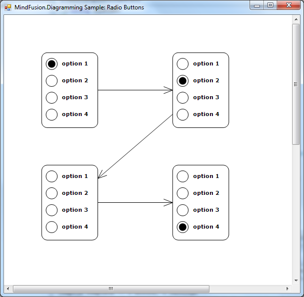
Radio buttons in MindFusion diagram nodes

To be fair, this kind of nodes is simple enough to implement using standard TableNode class where radio button graphics are either custom drawn or set as Image inside table cells in first column, and text displayed in second column. However the radio buttons can be mixed with other components in CompositeNodes to implement more complex user interfaces than ones possible with tables.

For more information on MindFusion flow diagramming libraries for various desktop, web and mobile platforms, see MindFusion.Diagramming Pack page.

Enjoy!
Layout Management with the WinForms Dock Control

In this post we will show you how to build a sample application with customizable layout based on the WinForms Dock control, which is part of MindFusion WinForms pack. You can find further details about the control at its web page.

For the purpose of the demonstration we’ve chosen an entertaining topic – a cooking recipes electronic book. Our book so far has only three recipes, all for sweets. Lets start by looking at the

I. Architecture of the sample.

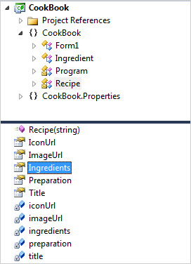
The sample has two custom classes – Ingredient and Recipe. Each Ingredient has quantity, name and an image, which illustrates it. The Recipe class holds a strongly typed list with Ingredient objects, the title for each recipe, an image for the recipe, an icon for the recipe and preparation instructions.

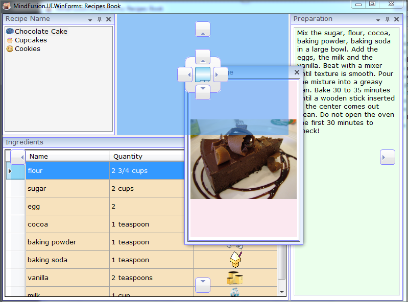
The application consists of the dock control, which contains four DockItem-s : for the recipes, for their images, for their ingredients and with the preparation instructions. Any dock item can be dragged, dropped, aligned, minimized, hidden etc.

The API of the cook book application

The API of the cook book application

II. The Dock Control.

We create an empty WinForms project and add the Dock control from the toolbox. The dock control fills the entire client area:

this.dockControl1.Dock = System.Windows.Forms.DockStyle.Fill;         
this.dockControl1.Location = new System.Drawing.Point(0, 0);           
this.dockControl1.Size = new System.Drawing.Size(784, 562);

These properties are set in the Property grid.

Each dock item is created with a title and id, which helps us identify it.

titleItem = new DockItem() { Header = "Recipe Name", Id = "Name" };
titleItem.DockStyle = DockStyle.Left;      
titleItem.Content = GetContent("Name");

The DockStyle property is responsible for the initial layout of the dock item. You can choose among various dock styles – fill, bottom, top and more.

The GetContent method is very important. It prepares the controls that will be placed into each dock item and returns the appropriate one according to the parameter.

Once the dock item is created, let’s not forget to add it:

dockControl1.Items.Add(titleItem);

III. Creating the Content.

Let’s see how the content for a dock item is created. Let’s take the grid with the ingredients. It is identified with the “Ingredients” id:

private Control GetContent(string contentType)
{
  Control control = null;
  ....
  else if (contentType == "Ingredients")
         {                
             grid = new DataGridView();
             grid.DefaultCellStyle.BackColor = Color.FromArgb(247, 226, 189);
             grid.Dock = DockStyle.Fill;
             grid.MultiSelect = false;
             grid.DataSource = selectedRecipe.Ingredients;
             grid.RowTemplate.MinimumHeight = 35;
            
             grid.RowHeadersWidthSizeMode =
            DataGridViewRowHeadersWidthSizeMode.DisableResizing;
             grid.ColumnHeadersHeightSizeMode = DataGridViewColumnHeadersHeightSizeMode.DisableResizing;
             grid.AutoSizeColumnsMode = DataGridViewAutoSizeColumnsMode.Fill;
             grid.SelectionMode = DataGridViewSelectionMode.FullRowSelect;
             grid.BackgroundColor = Color.FromArgb(253, 244, 247);

             control = grid; 
         }
...
return control;

The idea is clear: you create the control, which will be rendered in the dock item and assign it to DockItem.Content. Here we make different customization for the grid – we change the color of table rows, adjust the height, turn off multiple row select and more.

IV. Changing the Content.

We change the content by handling the SelectedIndexChanged event for the ListView, which lists our recipes. When the user selects a new list item, we extract its Recipe and change the content of the other DockItem-s:

selectedRecipe = recipes[recipesListView.SelectedIndices[0]];
tb.Text = selectedRecipe.Preparation;
grid.DataSource = selectedRecipe.Ingredients;
pictureBox.Image = Image.FromFile(selectedRecipe.ImageUrl);

Here is the final output of the sample application:

MindFusion WinForms Dock COntrol

A Sample electronic cook book based on MindFusion WinForms Dock Control

You can download the sample directly from this link:

MindFusion WinForms Layout Control Sample: Electronic Cook Book in C#

MindFusion WinForms Layout Control Sample: Electronic Cook Book in VB.NET

Enjoy the fast, easy and straight-forwarded manner in which you can create a WinForms application with a flexible layout and multiple panels.