This post shows how to add custom graphics to a chart by inheriting the SeriesRenderer class. We’ll use it to show marker lines on top of an area chart, which could be used to emphasize important values (e.g. dates on a timeline).


This post shows how to add custom graphics to a chart by inheriting the SeriesRenderer class. We’ll use it to show marker lines on top of an area chart, which could be used to emphasize important values (e.g. dates on a timeline).
In this post we’ll show how to implement Visio-like dynamic pagination of the diagram canvas, expanding or shrinking it while users draw nodes interactively, and rendering custom page borders. This is demonstrated using MindFusion Windows Forms Diagram control, but equivalent APIs are provided by MindFusion diagramming libraries for other platforms.
Continue readingIn this blog post we will build a simple scheduler with several timelines. We are using MindFusion Scheduling library for WinForms and Visual Studio with .NET6.0
I. Project Setup and General Settings
We create a new empty WinForms project in Visual Studio. We choose .NET6.0. Then we open the Form Editor. From the Visual Studio top menu bar we click “Project -> Manage NuGet Packages…”. In the Browse tab we search for “MindFusion.Scheduling”. You can install either the Scheduling package or the whole MindFusion.Pack.Winforms, if you plan to use more MindFusion controls.
MindFusion suite of WinForms controls has just been released and boasts a variety of new features to make you build WinForms applications faster and easier. Here is a review of the new version:
 MindFusion.Charting
New data model
Data that should be drawn in charts is read through an interface called Series, whose instances can be assigned to the Series properties of Chart and SeriesRenderer classes. You can implement this interface in your own model classes to avoid duplicating data. The library includes several pre-defined series classes that let you specify data via IList or array objects.
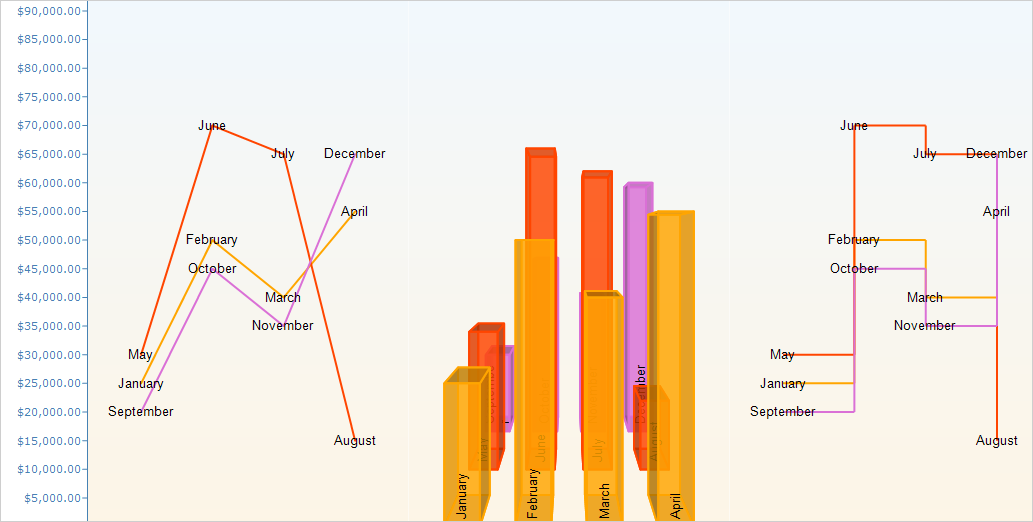
The new data model allows adding different series types to a single plot
New rendering model
Chart graphics are drawn inside Plot components by SeriesRenderer-derived objects. Each plot can contain multiple series renderers from same or different types. For example, you can draw area, line and bar graphics in same plot by adding AreaRenderer, LineRenderer and BarRenderer objects to its SeriesRenderers collection. Chart controls automatically generate a series renderer of appropriate type for their Series.
Dashboard
The Dashboard control can contain multiple plots, axes, legends, images, gauges and text blocks arranged in dynamic layout. Individual components can be added to dashboard’s default RootPanel or LayoutPanel containers, or for more complex layouts add intermediary panels such as GridPanel and StackPanel to the default ones. To show different types of chart graphics, add Plot2D to draw in 2D Cartesian coordinate system, Plot3D for 3D Cartesian system, and PolarPlot for polar coordinate system. To draw horizontal or vertical axes, add respectively XAxisRenderer and YAxisRenderer objects. To show gauges, add LinearGaugeRenderer or OvalGaugeRenderer, whose Gauge property contains the gauge model definition.
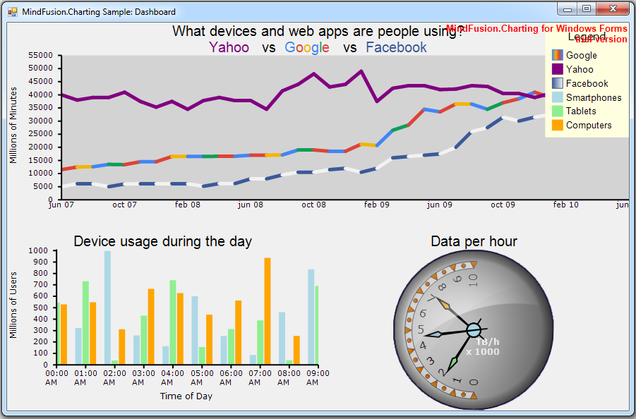
The new WinForms Chart has a built-in dashboard control.
Print and export
The Dashboard control and Chart controls that derive from it expose Print and PrintPreview methods for printing on paper. Call the ExportImage and CreateImage methods to generate bitmap image of the dashboard. The ExportPdf method exports the chart to a PDF (Portable Document Format) file. The ExportSvg method exports the chart to an SVG (Scalable Vector Graphics) file.
Styling
Values of appearance properties can come from several places in the component hierarchy. SeriesRenderer-derived objects can use attributes from their local SeriesStyle, from plot’s SeriesStyle, or from the *Series properties in current Theme. Component classes use either their local properties or ones defined in the theme. By default, appearance properties in SeriesRenderer > and Component > classes have null values, which makes the drawing code use values from the theme.
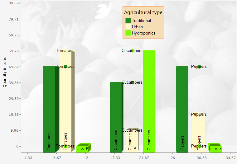
A rich choice of styling options are available
 MindFusion.Diagramming
Free-form nodes
A FreeFormNode collects all points from users’ mouse or touch input and displays them as node’s outline. To let users draw free-form nodes interactively, set Behavior to DrawFreeForms or LinkFreeForms. Use the Points property of FreeFormNode to get or set outline points programmatically. If the Closed property is set, the node is drawn as a closed shape and its interior filled, or otherwise the node is drawn as a poly-line. If the distance between first and last points drawn by user is shorter than AutoCloseDistance, the node’s Closed property is automatically set to true.
Free form nodes: just draw the node with the mouse and the control understands the shape you want
LinkLabel edit events
LinkTextEditing and LinkTextEdited events are now raised also when the user edits a LinkLabel. The Label property of the respective event-arguments class identifies the LinkLabel that is being edited. Label is a null reference if the user is editing link’s Text value.
 MindFusion Virtual Keyboard
MindFusion Virtual Keyboard has been initially added to MindFusion Pack for WinForms.
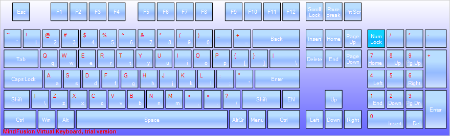
The WinForms virtual keyboard control: extended layout
 MindFusion.Reporting
Improved charts
MindFusion.Reporting now uses the new MindFusion charting engine to display charts in reports. The presentation of the charts has been greatly improved (particularly when resizing the charts).
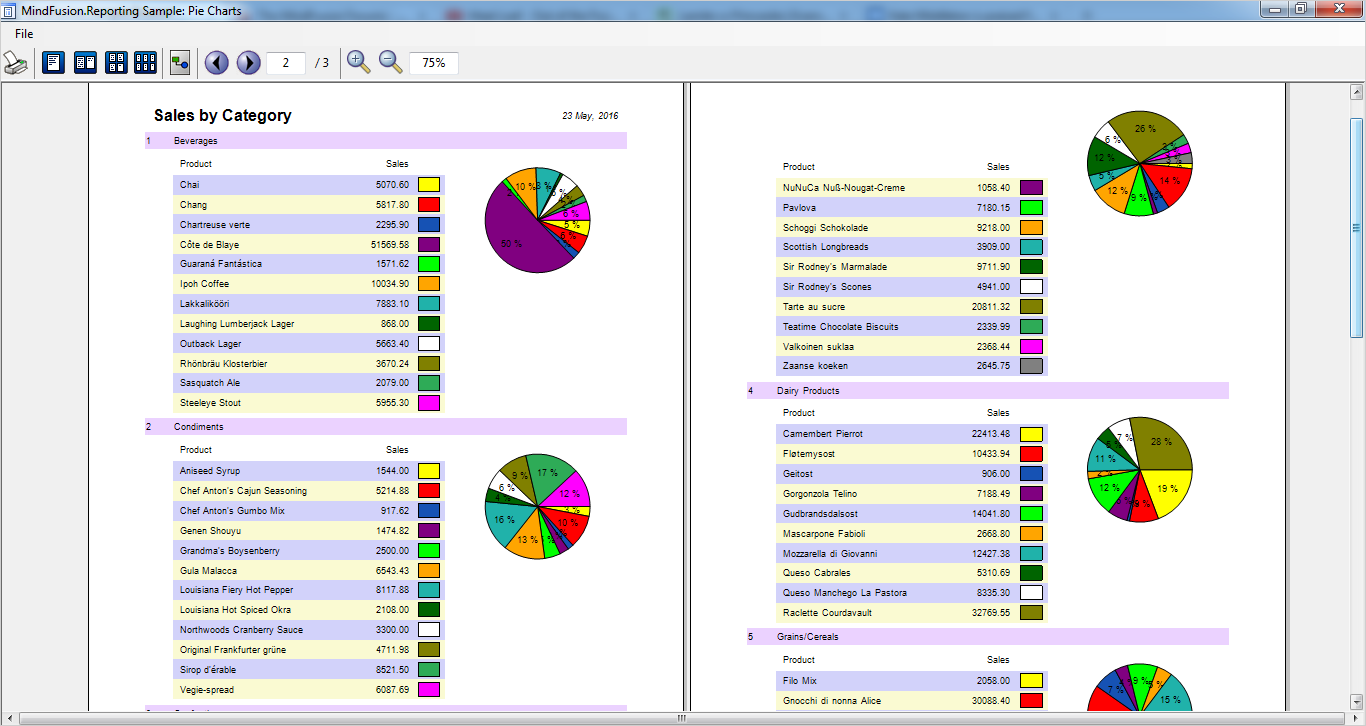
Pie charts in a WinForms report
 MindFusion.Spreadsheet
New and improved charts
MindFusion.Spreadsheet now uses the new MindFusion charting engine to display charts in worksheets. Along with the improved appearance (particularly when resizing the charts), the following new features have been added:
Zoom
The worksheets can now be zoomed in and out through the new Zoom property.
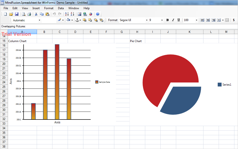
The new chart engine makes spreadsheets even more appealing
MindFusion clients can download the installer for the latest version from the clients area on MindFusion website.
A direct link to download the WinForms pack is available from here:
Download MindFusion WinForms Pack 2016.R2
Updated assemblies are also available as MindFusion.Pack NuGet package.
About MindFusion.WinForms Pack: A rich set of programming components that provide WinForms developers with the complete list of features to build even the most complicated business applications fast and easy. The components integrate seamlessly and provide with a mouse click functionality that takes months to develop. Each control boasts various samples and tutorials, extensive documentation and numerous customization options that make it suitable for every type of software and scenario.
Further details about each component in the pack are available from MindFusion website:
Use this link to buy a license online. All components are royalty-free.
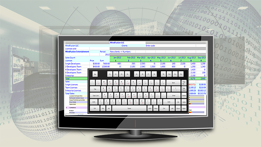
MindFusion UI controls suite now includes a virtual keyboard.
Dear MindFusion current and future clients,
Dear FreezePro clients,
MindFusion is pleased to announce that as of April 2016 it has acquired FreezePro Virtual Keyboard components, which will be released as part of MindFusion WinForms/WPF controls suites. We want to use this opportunity to thank all MindFusion and FreezePro clients for the loyalty – you’ve chosen us over multiple competitive products and we believe you are satisfied with your choice.
To please you even more we offer you special prices for upgrading to MindFusion WinForms/WPF pack. You get a 30% discount on the difference between the price of a component’s license you own and the price of the WinForms/WPF pack license you want to buy. MindFusion clients who already own a WinForms/WPF Pack license get the Virtual Keyboard component free of charge.
If you want to use the preferential upgrade prices please send an e-mail to info@mindfusion.eu no later than May 31st, 2016.
If you have technical questions about any of the components please contact MindFusion at support@mindfusion.eu. Use the same email for questions about licensing or transfer of intellectual property rights.
Welcome to the bigger MindFusion family!
