
In this blog post we are going to walk through the steps necessary to build the beautiful doughnut chart that you see at the image below:
We are going to use MindFusion Charting library for Blazor and Visual Studio as the IDE for the project.
I. Project Setup
We create a new Blazor Project – a Web Assembly.

This is the easiest way to integrate the Charting library. You can also go with a Blazor Web App, the details on how to use the chart with this type of project are described in details in the online documentation.
Once you have followed the project wizard steps, you end up with a new project, named after your wish. Then you need to add the charting library. Open the NuGet package manager and search for “MindFusion Blazor Chart”. When you find the project, install it. Upgrade any other packages that prompt for update.

II. Create the Chart
Open the Home.razor file and import the namespaces you are going to need:
@using System.Collections.ObjectModel
@using System.Reflection

@using Microsoft.Maui.Graphics

@using MindFusion.Drawing
@using MindFusion.Charting
@using MindFusion.Charting.Blazor
Then we declare the <PieChart> blazor element, where we adjust some properties, which are exposed as attributes:
<PieChart @ref="pieChart"
		  Doughnut="true"
		  ShowLegend="false"
		  ShowDataLabels=LabelKinds.All
		  AllowRotate="true"
		  StartAngle=10
		  OuterLabelPadding=20 />
You can read the full list of the properties supported by the PieChart control at the members list of the class in the online documentation. The Doughnut attribute makes the pie be rendered as a doughnut. We also hid the legend, allow rotation and specify that the doughnut is going to render all types of labels – inner and outer. The last two attributes are for specifying the start angle and the padding of the outer labels.
III. Specifying the Data
Data for every type of chart is specified with the Series property. For a pie chart the Series accepts a single object instance of a class that implements the Series interface. For other type of charts, the Series property can be of type list.
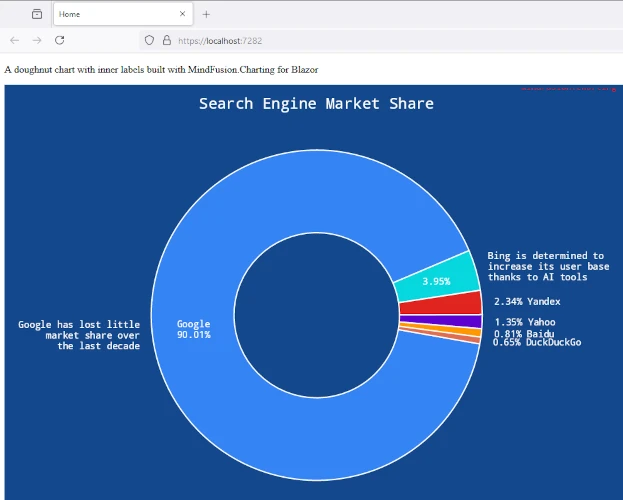
var values = new List{ 90.01, 3.95, 2.34, 1.35, 0.81, 0.65 }; pieChart.Series = new PieSeries( values, new List<string>() { "Google\n90.01%", "3.95%", "", "", "", "" }, new List<string>() { "Google has lost little\nmarket share over\nthe last decade", "Bing is determined to\nincrease its user base\nthanks to AI tools", "2.34% Yandex", "1.35% Yahoo", "0.81% Baidu", "0.65% DuckDuckGo" } );
The PieSeries class has a constructor that accepts three lists: one for the data, one for the inner labels and one for the outer labels. If you want to miss a certain type of labels, you can provide null instead of a list.
IV. Styling and Appearance Properties
The next we are going to do for our chart is add a Title. The title is an arbitrary chunk of text and can be styled in a variety of ways using the designated properties:
pieChart.Title = "Search Engine Market Share";
pieChart.TitleBrush = new SolidBrush(Colors.White);
pieChart.TitleFontSize = 18;
pieChart.TitleFontName = "Sans-serif";
pieChart.TitleMargin = new Margins(0, 20, 0, 0);
You have TitleBrush, TitleFontSize and TitleFontName, all of which customize the looks of the title. The TitleMargin property sets the space around the title label. The same set of properties is available for the Subtitle , if you want to add one.
We then specify a transparent HighlightStroke for the chart. The HighlightStroke is used to paint the outline of the element over which the mouse hovers.
We would like to paint white labels on a dark background. FOr that purpose we set the BackgroundColor to a deep blue and we use the DataLabelsBrush property to set the colour of the labels – both inner and outer – to white. Here is the code:
pieChart.Theme.HighlightStroke = new SolidBrush(Colors.Transparent);
pieChart.Theme.DataLabelsBrush = new SolidBrush(Colors.White);
pieChart.Theme.DataLabelsFontSize = 11;
pieChart.Theme.DataLabelsFontName = "Sans-serif";
pieChart.BackgroundColor = Color.FromRgb(20, 72, 140);
Last but not least comes the SeriesStyle The SeriesStyle property specify how the visual elements that represent the chart series are painted and outlined. There are several predefined SeriesStyle instances, which you can check in the online documentation. In our sample we use the PerElementSeriesStyle class, which tells the chart that each brush/stroke from the provided lists is for just one element to be painted with. If the count of the brushes/strokes is less than the element, the controls cycles through them again.
pieChart.Plot.SeriesStyle = new PerElementSeriesStyle()
{
	Fills = new List>()
	{
		new List<MindFusion.Drawing.Brush>()
		{
			new SolidBrush(Color.FromRgb(52, 132, 244)),
			new SolidBrush(Color.FromRgb(7, 215, 222)),
			new SolidBrush(Color.FromRgb(224, 36, 31)),
			new SolidBrush(Color.FromRgb(95, 1, 209)),
			new SolidBrush(Color.FromRgb(255, 151, 0)),
			new SolidBrush(Color.FromRgb(223, 110, 79))
		}
	},
	Strokes = new List<List<MindFusion.Drawing.Brush>>()
	{
		new List<MindFusion.Drawing.Brush>()
		{
			new SolidBrush(Colors.White)
		}
	}
};
And with that our chart is ready. Congratulations, you’ve just built a beautiful doughnut chart in .NET Blazor. Use the link below to download the full source code of the project:
Download Charting for .NET Blazor Sample
You can write at MindFusion discussion board for technical inquiries.
About Charting for Blazor: MindFusion Charting library for Blazor is a reusable web component that allows you to create any type of chart and dashboard fast and easy. Built around a flexible and versatile API, the component allows creating standard charts as well as assembling dashboards and charts from separate components: axes, plots, labels and renderers of different series. The data is provided through Series-derived classes and you have the option to create a custom Series-based class to handle your specific type of data and label requirements. The control offers a huge variety of appearance options. Themes allow the re-use of appearance settings.
Charting for Blazor is a commercial product. The trial version has no time limits. Licenses are sold per developer seat. No royalties are charged. Small companies, freelancers, academic institutions and others are eligible for a discount – details here.