In this blog post we are going to walk through the steps necessary to build the beautiful doughnut chart that you see at the image below:
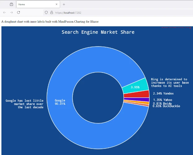
We are going to use MindFusion Charting library for Blazor and Visual Studio as the IDE for the project.

In this blog post we are going to walk through the steps necessary to build the beautiful doughnut chart that you see at the image below:
We are going to use MindFusion Charting library for Blazor and Visual Studio as the IDE for the project.
In this tutorial we will build the following pie chart using MindFusion Charts and Gauges for WinForms library:

This is a PieChart with a custom Series class that extends the capabilities of a standard PieSeries We need to create a custom Series class because we want the inner labels to follow a special format and we want the outer labels to be rendered as legend items not near pie pieces.
You can download the source code of the sample together with the MindFusion libraries used from the link at the bottom of the post.
I. General Setup
We create an empty WinForms application in C# with Visual Studio. We create a folder called References and there we copy the MindFusion.*.dll -s that we will need. They are:
MindFusion.Charting.dll
MindFusion.Charting.WinForms.dll
MindFusion.Common.dll
We reference those files in our project: we right-click the References folder in the Solution Explorer and click on “Add Reference”. Then we browse to our local References folder and add the 3 dll-s.

We have installed MindFusion Charts and Gauges from the website: http://mindfusion.eu/ChartWinFormsTrial.zip and now we need only to find the PieChart control, drag and drop it onto the WinForms Form of our application.

II. The Custom Pie Series
When you create a custom series you need to implement the Series interface. You need to declare several methods and properties, and one event. Let’s start with the constructor.
We need our chart to use one array with data and one array with labels. We declare two class variables for that and assign to them the values that we receive for them in the constructor. We name the new class CustomPieSeries:
public class CustomPieSeries : Series
{
	public CustomPieSeries(IList data, IList legendLabels )
	{
		values = data;
		_legendLabels = legendLabels;

		//sum up all pie data
		total = 0.0;
		for (int i = 0; i < data.Count; i++)
			total += data[i];
	}

	IList values;
	IList _legendLabels;
        double total = 0L;
}
We have added a new class variable called total. It is needed to keep the sum of all data for the chart. We will use this variable when we calculate the percent value of each pie piece.
The SupportedLabels property of type LabelKinds is the way to set which labels will be rendered by the new series. We want tooltips, inner labels and legend labels. There is no special enum field for legend labels. You just set which labels form the series should be rendered as legend items. We decide to use for this the ZAxisLabel, because it is not drawn anywhere on the pie chart and we won’t see it doubled by the legend labels. So, we say that the chart supports ZAxisLabels and we will tell the series that the ZAxisLabels must be rendered in the legend. We will do this later.
public LabelKinds SupportedLabels
{
	get { return LabelKinds.InnerLabel | LabelKinds.ToolTip | LabelKinds.ZAxisLabel; }
}
The GetLabel method is the place where we must return the correct label according to the type and position of the label, which are provided as arguments.
public string GetLabel(int index, LabelKinds kind)
{
	double percent = (values[index] / total) * 100;
	if (kind == LabelKinds.InnerLabel)
		return percent.ToString("F2") + "%\n" + values[index].ToString();
	if (kind == LabelKinds.ToolTip)
		return "Number of interns: " + values[index].ToString("F0") +
			"\nPercent of total: " + percent.ToString("F2") + "%";

	if (kind == LabelKinds.ZAxisLabel)
		return _legendLabels[index].ToString();

	return null;
}
Here we have the chance to work over the raw data that we have for the series and return the desired labels as a string. We want the inner label to appear as the data value together with its percent representation. We calculate the percent thanks to the total variable and format it in an appropriate way:
 if (kind == LabelKinds.InnerLabel)
	return percent.ToString("F2") + "%\n" + values[index].ToString();
We do the same with the tooltips. We add an explanation text to the tooltip of each piece:
if (kind == LabelKinds.ToolTip)
	return "Number of interns: " + values[index].ToString("F0") +
		"\nPercent of total: " + percent.ToString("F2") + "%";
The ZAxisLabel is the easiest to do. It will be used by the legend and we perform no special formatting upon it – we just return the label corresponding to the given index.
if (kind == LabelKinds.ZAxisLabel)
		return _legendLabels[index].ToString();
Among the other notable members of the Series interface are the Dimensions and Title properties. Dimensions is the property that specifies how many data dimensions the series has. They are 1 for charts that use one array of data, 2 for axes that use X and Y data, and 3 for 3D charts, which need X, Y and Z data. In our case we return 1 as property value because pie charts, just like radar charts, use only one data array.
public int Dimensions
{
	get { return 1; }
}
The Title property returns the Series title. This is an important property but in our case we will not use it. A common use case for Title is to be rendered in legends. We will not render the Series title in the legend, so we return an empty string.
public string Title
{
	get { return ""; }
}
Building the CustomPieSeries is an easy task:
var values = new List { 23, 54, 17, 9 };
pieChart1.Series = new CustomPieSeries(
	values,
	new List()
	{
		" <1 month", " <=3 months", " <=6 months", " >6 months"
	}
);
We create a new instance of our new class and assign it to the Series property of the PieChart control. We provide a list with the data and the labels that we want to appear as a legend.
III. The Legend
The legend in the PieChart control is regulated by the LegendRenderer property. We set the ShowSeriesElements property to true to let the chart know that we want the data from the series to be rendered as labels and not the title:
pieChart1.LegendRenderer.ShowSeriesElements = true;
Then we use the ElementLabelKind property to specify which labels we want to use in the legend. These are the ZAxisLabels:
pieChart1.LegendRenderer.ElementLabelKind = LabelKinds.ZAxisLabel;
The other properties are self-explanatory. We use the Title property to set the legend title and set a transparent brush for both the Background and the BorderStroke = “Duration”;
pieChart1.LegendRenderer.Background = new SolidBrush(Color.Transparent);
pieChart1.LegendRenderer.BorderStroke = new SolidBrush(Color.Transparent);
IV. Styling
Styling the chart is done through the Theme property and through styles. There are different style classes available and in our case we will use the PerElementSeriesStyle class. This class accepts as arguments for the brushes and strokes lists with lists that contain the brushes. Then, it colors each element in each series with the corresponding brush in the array at the corresponding index. Our PieChart needs just one list with brushes and strokes. The stroke thicknesses are also added as nested arrays:
pieChart1.Plot.SeriesStyle = new PerElementSeriesStyle()
{
	Fills = new List<List>()
	{
		new List()
		{
			new SolidBrush(Color.FromArgb(158, 212, 224)),
			new SolidBrush(Color.FromArgb(187, 236, 247)),
			new SolidBrush(Color.FromArgb(212, 204, 196)),
			new SolidBrush(Color.FromArgb(245, 210, 179))					         }
	},

	Strokes = new List<list>()
	{
		new List()
		{
			new SolidBrush(Color.White)

		}
	},
	StrokeThicknesses = new List<list>()
	{
		new List()
		{
			3.0
		}
	}
};
We also set some appearance properties through the Theme field:
pieChart1.Theme.DataLabelsFontSize = 10;
pieChart1.Theme.HighlightStroke = new SolidBrush(Color.FromArgb(237, 175, 120));
pieChart1.Theme.HighlightStrokeThickness = 4;
The HighlightStroke is used to mark the selected chart element by mouse hover. The DataLabelsFontSize is used not only by painting the inner labels but also by painting the labels in the legend.
Finally we set the Title of the chart:
pieChart1.Title = "Internship Statistics";
And that is the end of this tutorial. You can download the code for the chart together with the MindFusion.*.dll libraries used from this link:
Pie Chart with Custom Labels Source Code Download
You can refer to MindFusion helpful support team with any technical questions regarding the WinForms Charts & Gauges control. Use the forum at: https://mindfusion.eu/Forum/YaBB.pl?board=mchart_disc
About MindFusion Charts and Gauges for WinForms: MindFusion Charts and Gauges for WinForms offers a long list of features that enables developer to build any type of chart, gauge or dashboard. The smart API of the library provides the option different chart elements like plots, axes, labels, and series to be combined and arranged in order to build any type of custom looking chart. The library also supports out of the box the most common chart types together with a set of their widely used properties. The gauge control is indispensable part of the library and offers a linear and oval gauge together with a variety of samples that provide you with the most common types of gauges used: clock, compass, thermometer, car dashboard and more. More about MindFusion Charts and Gauges for WinForms at: https://mindfusion.eu/winforms-chart.html.
In this post we discuss how to create a drill down chart with the MindFusion.Charting for WPF tool. Our main chart will be a pie chart, where each peace shows some aggregate data. When clicked, a new chart pops up – a bar chart, which shows details about the clicked piece.
The Data
For the data we use an ObservableCollection called CompanyExpenses. It contains objects of type Expenses. The Expenses class implements INotifyPropertyChanged. Here is a code snippet:
public class Expenses : INotifyPropertyChanged
    {
  public Expenses(string corporationName, double marketing, double salaries,
            double rawMaterials, double logistics, double administration, double production)
        {
            this.corporationName = corporationName;
            this.marketing = marketing;
            this.salaries = salaries;
            this.rawMaterials = rawMaterials;
            this.logistics = logistics;
            this.administration = administration;
            this.production = production;

}

.............
}
We have properties for the various company expenses and a property for the name of the corporation. We have a special Sum property, which gives us the total of all expenses for the corporation. This property will be used by the main chart – the pie chart:
public double Sum
        {
            get { return sum; }
            set
            {
                sum = value;
                OnPropertyChanged("Sum");
            }
        }
The Pie Chart
The pie chart displays the expenses of all 5 corporations – together with their name and their share. We use data binding, the ComapnyExpenses list provides the DataSource:
CompanyExpenses data = new CompanyExpenses();
 pieChart1.DataSource = data;
In order to show the name of the company as an outer label, we must set the OuterLabelType to CustomText and bind Expenses.CorporationName to the OuterLabelPath property. We do this in XAML:
my:PieSeries OuterLabelOffset="30" OuterLabelPath="CorporationName" OuterLabelType="CustomText" DataPath="Sum" InnerLabelType="Percents" Name="pieSeries1" DetachedPiecesList="20"
The Sum property, which we mentioned above, provides data for the chart. The brushes are set with the brush editor in the property grid.
Hit Testing
We use the charting component’s HitTest method to detect when a piece was clicked and to show a bar chart with the respective data. PiePiece.PieceIndex gives us the index of the clicked piece. We use the Control.MouseDown event to detect mouse clicks.
private void pieChart1_MouseDown(object sender, MouseButtonEventArgs e)
        {
            List result =
                pieChart1.HitTest(e.GetPosition(pieChart1));

            if (result.Count > 0 && result[0] is MindFusion.Charting.Wpf.PiePiece)
            {
                MindFusion.Charting.Wpf.PiePiece piece =
                    result[0] as MindFusion.Charting.Wpf.PiePiece;

                Details d = new Details(data[piece.PieceIndex]);
                d.Show();
            }
        }
The HitTest method returns a collection of ChartElement objects. In our case we don’t have several ChartElements that overlap each other and might be clicked simultaneously, that’s why we take the first ChartElement.
The Detailed Chart
The detailed chart is a bar chart that displays the data for a single Expenses object. We set the labels at the X-axis to display the type of the expense:
barChart1.XAxisSettings.LabelType = MindFusion.Charting.Wpf.LabelType.CustomText;
            barChart1.XLabels = new List() { "Marketing", "Salaries", "Raw Materials", "Logistics", "Administration", "Production"};
            barChart1.XAxisSettings.LabelRotationAngle = 30;
            barChart1.XAxisSettings.CustomLabelPosition = MindFusion.Charting.Wpf.CustomLabelPosition.ChartDataPoints;
When we create the Details window, we pass as argument the Expenses object the chart refers to:
public Details( Expenses expenses)
{
barSeries1.YData = expenses.ExpensesList;
…
}
The data for the bar chart comes from the list of the expenses, which is a DoubleCollection.
Here is a screenshot of the final drill down chart:
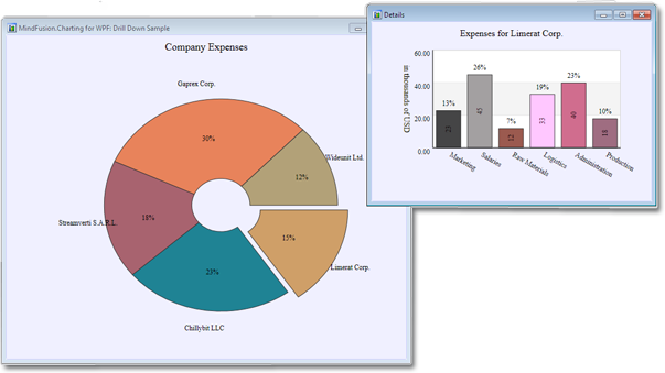
The main pie chart with the bar chart that shows details for the clicked pie piece.
You can download the complete source code for the project from this link: