
In this blog post we will create a Google-like interactive monthly calendar where users will be able to create, edit and delete appointments in real time. We
will use the JavaScript Scheduler. Here is a screenshot of the finished application:
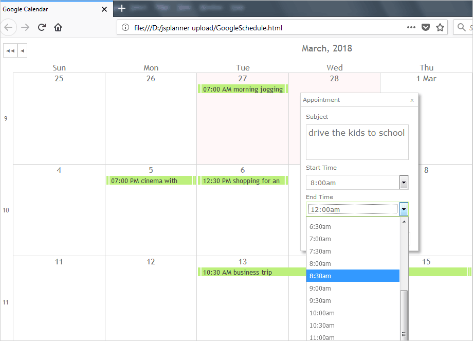
JavaScript Schedule That Mirrors the Google Calendar Features
And you can run the sample online from this link.
I. Project Setup
We need a reference to the following file to start development:
- MindFusion.Scheduling.js
- light.css
The JavaScript file provides the scheduling functionality. The CSS file is responsible for the styling of our calendar. We create a subfolder named “themes” and we place the light.css file there.
We create an HTML file, a blank web page called GoogleSchedule and in the head section we place a reference to the CSS file:
<link href="themes/light.css" rel="stylesheet">
The reference to the JavaScript file goes at the bottom of the page, right before the closing body tag.
<a href="http://MindFusion.Scheduling.js">http://MindFusion.Scheduling.js</a>
We need a element that will represent the calendar, we create one in HTML code and assign it an id:
<div id="calendar" style="height: 100%; width: 100%;"></div>
We want the calendar to take the whole page, that’s why width and height are 100%.
II. Create and Customize the Scheduler
Now we are ready to do the real JavaScript programming of the calendar library. We create an empty JS file called “GoogleSchedule.js” and add a reference to it in the web page, at the bottom:
<a href="http://GoogleSchedule.js">http://GoogleSchedule.js</a>
In this JavaScript file we first create a mapping to the MindFusion.Scheduling namespace:
var p = MindFusion.Scheduling;
Then we create a Calendar instance using the Calendar DOM element from the web page:
// create a new instance of the calendar
var calendar = new p.Calendar(document.getElementById("calendar"));
We set the calendar view to CalendarView .SingleMonth, which means the calendar shows one month at a time. We also set the theme that we referenced in the CSS file:
calendar.currentView = p.CalendarView.SingleMonth;
calendar.theme = "light";
Another customization we make – we use the itemSettings.titleFormat property to add a prefix before each event subject. The prefix is the start time of this event. here is how you set it:
calendar.itemSettings.titleFormat = "%s[hh:mm tt] %h";
Finally, we render the calendar:
//visualize the calendar
calendar.render();
III. Custom Form
By default, the form that renders when the user clicks on a cell or selection of cells in the calendar allows edit of the dates, but not hours. We will render our custom form, derived from BaseForm to change that. Our form will offer the users a list with hours for the selected dates.
We create a new, empty JavaScript file “TimeForm.js”. There we override the constructor of the BaseForm:
 TimeForm = function (calendar, item, type)
{
	p.BaseForm.call(this, calendar, item);

	this._id = "TimeForm";
	this._type = type;
	this.headerText = "Appointment";

}
As you can see from the constructor each BaseForm provides data for the calendar and the item that is created or edited. We will use that information later on. We create a prototype of our form and assign the constructor:
TimeForm.prototype = Object.create(p.BaseForm.prototype);
TimeForm.prototype.constructor = TimeForm;
TimeForm will be a simple one – it just renders a text area and two combo boxes with the possible hours for the start and end of the appointment. The combo boxes require a list with the members to be rendered. We create a list as a global variable:
var hoursList;
Then, in a new method we fill the list with the hours from 12 to 1, divided in intervals of 30 minutes:
// create an array of objects to fill the hours drop-down
TimeForm.prototype.getHourLabels = function ()
{
	hoursList = [];
	hoursList.push({ value: 0, text: "12:00am" });
	hoursList.push({ value: 1, text: "12:30am" });

	let index = 1;

	for(var i = 1; i < 12; i++)
	{
		hoursList.push({ value: index+1, text: i.toString() + ":00am" });
	    hoursList.push({ value: index+2, text: i.toString() + ":30am" });

		index += 2;
	}

	//add the first afternnon hours
	hoursList.push({ value: index + 1, text: "12:00pm" });
	hoursList.push({ value: index + 2, text: "12:30pm" });

	index += 2;

	for(i = 1; i < 12; i++)
	{
		hoursList.push({ value: index+1, text: i.toString() + ":00pm" });
	    hoursList.push({ value: index+2, text: i.toString() + ":30pm" });

		index += 2;
	}

	return hoursList;
}
The next step is to override the drawContent function of BaseForm:
TimeForm.prototype.drawContent = function ()
{
	p.BaseForm.prototype.drawContent.call(this);

	var content = this.getContent();
.....
}
First, we create the text area:
var row = this.row();
	row.innerHTML = this.localInfo.subjectCaption;
	content.appendChild(row);

	// create a text-area for the item subject
	var textArea = this.createTextArea({ id: "subject", initValue: this.item.subject, events: { keydown: this._areaKeyDown} });
	textArea.element.style.width = "200px";
	this.addControl(textArea);

	row = this.row();
	row.appendChild(textArea.element);
	content.appendChild(row);
Before the text area we place a label with “Subject” on it. The createTextArea method requires several parameters. The first one is the id, then the initial content to be rendered and the events. We want the text area to be 200px wide. The row element places a row of controls in the BaseForm. We use it every time we want to start a new row with elements.
The text area reads its initial content from the value of the subject field in the item object that we receive as reference. After that we create a new row with elements: the drop-down with the hours for the start time:
       // create a drop-down list for start hours
	row = this.row();
	row.innerHTML = "Start Time";
	content.appendChild(row);

	var control = this.createDropDownList({ id: "start_time", items: this.getHourLabels(), initValue: this.getStartTimeIndex(), addEmptyValue: false });
	control.element.style.width = "200px";
	this.addControl(control);

	row = this.row();
	row.appendChild(control.element);
	content.appendChild(row);
The code is almost identical to the code for the text area, but here we call the getHourLabels method that returns the array with time values. There is one other new method: getStartTimeIndex(). It’s task is to check the start time of the item and to set the initial value of the drop-down control to that time.
Here is the method:
// get the index of the current item's index to set the value of the startTime drop-down:
TimeForm.prototype.getStartTimeIndex = function ()
{
	if (this.item != null && this.item.startTime != null)
	{

		let index  = this.item.startTime.__getHours() * 2;
		if(this.item.startTime.__getMinutes() > 0)
			index++;
		return index;

	}
	return -1;
}
The method checks the hour value of the start time and multiplies it by two because for each hour we show two values in the drop-down: 9:00 and 9:30. If the user has selected half an hour we increment the index with 1.
We use almost the same code to create the endTime drop-down control, so we won’t discuss it here. You can check its code from the download with the source code files for this sample.
Our form needs two buttons – Save and Cancel. We create them in the drawButtons method:
// override BaseForm's drawButtons method to create form buttons
TimeForm.prototype.drawButtons = function ()
{
	var thisObj = this;

	var btnSave = this.createButton({
		id: "btnSave",
		text: this.localInfo.saveButtonCaption,
		events: { "click": function click(e)
		{
			return thisObj.onSaveButtonClick(e);
		}
		}
	});

	var btnCancel = this.createButton({
		id: "btnCancel",
		text: this.localInfo.cancelButtonCaption,
		events: { click: function click(e)
		{
			return thisObj.onCancelButtonClick(e);
		}
		}
	});

	var buttons = this.row();
	buttons.classList.add("mfp-buttons-row");
	buttons.appendChild(btnSave.element);
	buttons.appendChild(btnCancel.element);

	return buttons;
};
The BaseForm.createButton() method is similar to the methods that create text area and drop-down lists. We specify here that we will handle the click event for the two buttons. We place the buttons in a new row. Note that you don’t have to call the createButtons function anywhere – it is called automatically by BaseForm.
What happens when the user presses “Save”? Well, we’ll have to read the data from the hour drop-down controls and adjust the start and end time of the newly created Item:
TimeForm.prototype.onSaveButtonClick = function (e)
{
	// update the item with the form data
	 // update the item with the form data
   var startIndex = +this.getControlValue("start_time");
   var startTime = this.item.startTime.date.clone().addHours(startIndex * 0.5);

   var endIndex = +this.getControlValue("end_time");
   var endTime = this.item.endTime.date.clone().addHours(endIndex * 0.5);

   // if end time is specified, decrease it by one day
   if (endIndex != 0 && this.item.endTime.hour == 0)
    endTime.addDays(-1);

   // check for inconsistent start/end time
   if (startTime.valueOf() > endTime.valueOf())
         endTime = startTime.clone().addHours(1);

   // apply changes
   this.item.subject = this.getControlValue("subject");
   this.item.startTime = startTime;
   this.item.endTime = endTime;

   // if a new item is created, add it to the schedule.items collection
   if (this.type === "new")
     this.calendar.schedule.items.add(this.item);

   // close the form
   this.closeForm();

   // repaint the calendar
   this.calendar.repaint(true);
};
First, we get the value of the startTime drop-down list and we calculate the amount of time to add to the startTime of an Item. A new Item always has a startTime at midnight. Then, we check the number of days the user has selected and calculate how many hours the event actually takes. We assign end time to a copy of the start time and add the calculated event duration to the value. Finally, if the event is new – we add it to the collection of item sin the schedule, if it’s old – we correct its data. Then we close the form and repaint the calendar.
IV. Using the Custom TimeForm
In order to use our custom form we have to add a reference to it in the HTML page, as we did with the other two files:
<script src="TimeForm.js" type="text/javascript"></script>
Then we edit the GoogleSchedule.js file First, we need to disable the built-in forms with the useForms property.
// disable this built-in forms for item creation and modification
calendar.useForms = false;
Then we have to handle the onSelectionEnd and onItemDoubleClick events to render our form. First, we wire up the events:
// handle the itemDoubleClick event to show the custom form for item editing
calendar.itemDoubleClick.addEventListener(handleItemDoubleClick);

// handle the selectionEnd event to show the custom form for item creation
calendar.selectionEnd.addEventListener(handleSelectionEnd);
Then we render the forms, below is the code that shows the TimeForm when a new item is created:
function handleSelectionEnd(sender, args)
{
	// create a new item with the start and end time of the selection
	var item = new p.Item();
	item.startTime = args.startTime;
	item.endTime = args.endTime;

	// create and show the custom form
	var form = new TimeForm(sender, item, "new");
	form.showForm();
}
We copy the start and end time of the selection from the event arguments. Then we use them in the constructor of the BaseForm.
And that’s the end of this tutorial. Here is a link to download the complete source code of the sample:
Download the Google Calendar in JavaScript Sample
About MindFusion JavaScript Scheduler: MindFusion Js Scheduler is the complete solution for all applications that need to render interactive timetables, event schedules or appointment calendars. Fully responsive, highly customizable and easy to integrate, you can quickly program the JavaScript scheduling library according to your needs. Find out more at https://mindfusion.eu/javascript-scheduler.html