
MindFusion.RealTimeCharting for WPF assembly lets you visualize huge (and by that we mean huge) amounts of data with no special load on the machine it runs on. We drew inspiration from a popular chart in molecular biology – Real-time PCR, which:
“can provide a simple and elegant method for determining the amount of a target sequence or gene that is present in a sample.”
More on the topic here.
Since we self-generate our data, the result graphics are not that much the real thing but they demonstrate the algorithm of building the chart pretty well. Let’s start:
1. Create the chart
Drag the RealTimeChart from the toolbox or add a reference to the MindFusion.RealTimeCharting.Wpf assembly. The chart has no initial data so we start with a simple X-axis on the screen. We name our chart “rtChart”.
2. Customizing the X-axis
The X-axis is accessible via the rtChart.XAxis property. It exposes many appearance settings, from which we start with Interval, Length and Origin – they will define our axis. When data accumulates, the initial axis labels shall be replaced with their updated values.
   rtChart.XAxis.Title = "Cycle";
   rtChart.XAxis.Interval = 2;
   rtChart.XAxis.Length = 50;
   rtChart.XAxis.Origin = 0;
   rtChart.XAxis.LabelFormat = "0";
   rtChart.XAxis.PinLabels = false;
It’s worth noting that we don’t pin labels e.g. they will move along the axis as new data is added. We need no trailing zeros, so the LabelFormat is “0”.
3. The Y-axes
There is no limit on how many Y-axis we will create. In our sample we will use two: one at each side of the chart plot area. We need two instances of the Axis class, which we add to YAxisCollection and Y2AxisCollection respectively. Before we add them, we set their appearance. We want tick marks and rotated title. Note that we align the second axis (Y2) to the right.
   Axis yAxis = new Axis();
   yAxis.Origin = 0.0;
   yAxis.Length = 1;
   yAxis.Interval = 0.1;
   yAxis.Title = "ΔRn";
   yAxis.TitleRotationAngle = -90.0;
   yAxis.TitleFontFamily = new FontFamily("Verdana");
   yAxis.LabelFontFamily = new FontFamily("Verdana");
   yAxis.TickLength = 5;
   yAxis.TitleOffset = 10;
   rtChart.YAxisCollection.Add(yAxis);

   yAxis = new Axis();
   yAxis.Origin = 0.0;
   yAxis.Length = 100;
   yAxis.Interval = 10;
   yAxis.Title = "Fluorescene";
   yAxis.TitleRotationAngle = -90.0;
   yAxis.TitleFontFamily = new FontFamily("Verdana");
   yAxis.LabelFontFamily = new FontFamily("Verdana");
   yAxis.TickLength = 5;
   yAxis.TitleOffset = 10;
   yAxis.LabelHorizontalAlignment = HorizontalAlignment.Right;
   rtChart.Y2AxisCollection.Add(yAxis);
4. Chart series
We need four series – two of them will be bound to Y and two – to Y2. It’s important to note that axes must be initialized before the series, because each series is associated with a given Y-axis when created.
Each chart series is an instance of the Series class. We want to show scatters at each series – for that we use the ScatterType property. Since we plan to show a legend, it’s important to set the Title of each series – because this title will be used as a legend label. Here is sample code for the first series:
  series1 = new Series(rtChart.YAxisCollection[0])
  {
      Stroke = new SolidColorBrush(Colors.Green),
      ScatterStroke = new SolidColorBrush(Colors.Green),
      Fill = new SolidColorBrush(Colors.Green),
      ScatterType = ScatterType.Diamond,
      Title = "Sample 1",
      TitleFontFamily = new FontFamily("Verdana"),
      TitleFontSize = 12

   };

    .......
   rtChart.SeriesCollection.Add(series1);
5. Data
Data is added directly to the Series.Data property. You can add a batch of points or one point at a time. The property requires that you add a Point e.g. you must set the X and Y values simultaneously:
Point[] points1 = new Point[clusterSize];

//generate some dummy data
...

series1.Data.AddRange(points1);
rtChart.Commit(minNewX);
Don’t forget to call the Commit() method in one of its overloads – it signals to the chart that new data has been added and refresh is needed.
6. Final adjustments
We want a legend and we turn on ShowLegend. The initial result is a legend in 4 rows, which does not look beautifully on our chart. We plat for a while with LegendWidth and LegendHeight and come up with a satisfactory outlook for our legend – in two columns, centered below the plot area.
Adding a tooltip is also easy – we set ShowFallbackTooltip to true. Since the chart might have numerous Y-axis we must choose, which axis the tooltip is bound to. In our case it’s the first one:
    rtChart.TooltipVisibility = Visibility.Visible;
    rtChart.ShowFallbackTooltip = true;
    rtChart.TooltipAxis = rtChart.YAxisCollection[0];

    rtChart.ShowLegend = true;
    rtChart.LegendHeight = 70;
We adjust the grid according to the data we have:
    rtChart.MajorGridSizeY = 50;
    rtChart.MajorGridSizeX = 2;
7. That’s it
Here is the final result:
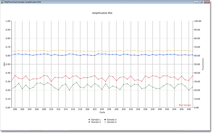
Real-time chart: amplification plot sample.
Of course, there are many other settings and possibilities in the control. You can download the sample and expand its functionality and appearance:
Real-time Chart – Amplification Plot Sample Download
MindFusion.RealTimeCharting for WPF is part of MindFusion.Charting for WPF component, which also includes MindFusion.Gauges for WPF. Check the trial version for more practical, beautiful and easy to build charts and gauges.
About MindFusion.RealTimeCharting for WPF: A WPF programming component, which has been designed and developed to render real-time charts with huge amounts of data in a fast and efficient manner. The component uses innovative approach to draw the chart graphics, which forgoes the traditional constructing of a tree with the visual elements in WPF. This way CPU load remains minimal and graphics of tens of thousands of points are rendered with impressive speed. The tool supports unlimited number of Y and Y2 axes, legend, tooltip, background image, grid and more.
About MindFusion.Charting for Wpf: A programming component that combines powerful charting capabilities with an elegant API and easy use. Among the features of the control are fully customizable grid, positive and negative values on all chart axes, 3D charts, gauges and many more – read a detailed list here.
The control provides detailed documentation and various samples that demonstrate how to customize every type of chart. It supports a wide range of 2D and 3D charts including bar, line, radar, bubble pie etc. You can add tooltips, define themes, perform hit testing, zoom and more.