Tutorial 4: Dashboard Layout
This tutorial assumes you have added the JChart.jar reference as described in Getting Started guide. The complete example project is available under Samples subfolder of library's distribution.
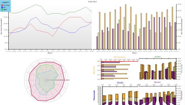
The Dashboard class represents a container of visual components such as plots, line graphics and text labels. Initially the dashboard contains two Panel classes to which its components should be added:
Let's start by adding a Dashboard component to the frame.
Java
 Copy Code Copy Code
|
|---|
Dashboard createDashboard() |
In createDashboard function, add a TextComponent that will display the dashboard's title. As LayoutPanel arranges its children in a vertical stack by default, the title will show at the top of the dashboard if it's the first component added. The following code creates and adds the title component, as well setting a few appearance properties:
| Java
Copy Code
|
|---|
TextComponent title = new TextComponent(); |
We want to divide the remaining space in two rows and two columns, creating four cells in total. For that purpose, add a GridPanel, which can host multiple components in each of its cells. Its default constructor creates one GridRow and one GridColumn, i.e. it defines a single cell. We'll add one more row and column to respective collection properties of the panel:
| Java
Copy Code
|
|---|
GridPanel grid = new GridPanel(); |
Now that we have defined our layout, lets create sample data series. MindFusion.Charting offers multiple classes you could use to represent data. All of them implement the Series interface, which you could implement in your own model classes if you prefer. The data class we'll use in this example is BarSeries; it takes a list of values to display as bar height, and automatically assigns bar positions at equal distances. It is convenient for creation of barcharts, but can actually be used with any other type of SeriesRenderer.
| Java
Copy Code
|
|---|
BarSeries data1 = new BarSeries( |
You can see that BarSeries has two overloaded constructors. They let you specify different kinds of labels for the bars. MindFusion.Charting supports six kinds of labels displayed at various locations of rendered graphics. BarSeries lets you define inner labels drawn inside bars, top labels drawn above their bars, and X axis labels drawn along the axis. In the example above we'll only show axis labels, passing null for the other arguments. The Title values will be drawn by a LegendRenderer we are going to add later.
For visualizing the data, you must create an instance of a class derived from SeriesRenderer, each drawing a different kind of graphics. In this tutorial we'll see how several of them work, starting with a LineRenderer:
| Java
Copy Code
|
|---|
LineRenderer lineRenderer = new LineRenderer( |
Apart from the kind of graphics drawn, a SeriesRenderer lets you specify styling attributes for the graphic primitives, such as stroke and fill colors:
| Java
Copy Code
|
|---|
PerSeriesStyle lineStyle = new PerSeriesStyle(); |
SeriesRenderer objects must be placed inside Plot components. In this tutorial we'll use three different kinds of plots: Plot2D and Plot3D for drawing in 2D and 3D Cartesian coordinate systems respectively, and RadarPlot for drawing in polar coordinate system. For the LineRenderer we defined above, create a Plot2D and set its background:
| Java
Copy Code
|
|---|
Plot2D linePlot = new Plot2D(); |
Add the line renderer to plot's SeriesRenderers collection:
| Java
Copy Code
|
|---|
linePlot.getSeriesRenderers().add(lineRenderer); |
The data points renderered inside a Plot2D are scaled relatively to the Axis ranges defined via its XAxis and YAxis properties. For each Axis you can define its first and last visible values by setting MinValue and MaxValue properties. If their values are not specified, the control will calculate them automatically to fit all data provided through plot's SeriesRenderer objects. In adition, the Interval property lets you specify the distance between coordinate labels. The Axis class also has a Title property that lets you show description for the measure represented by an axis:
| Java
Copy Code
|
|---|
linePlot.setXAxis( |
If you want to show coordinates for the values drawn inside a plot, you must also add XAxisRenderer and YAxisRenderer components to the dashboard. Each of them can optionally display Axis coordinates and Title, ticks and data labels. In order to display data labels from a series, you must also set the LabelsSource property to either a SeriesRenderer or a Plot:
| Java
Copy Code
|
|---|
XAxisRenderer xRenderer = XAxisRenderer.with() |
In order to align axes to their plot, we'll add an intermediate GridPanel inside the top-left cell of the parent grid. We can do this on a couple of lines of code with the help of LayoutBuilder. That class lets us build layout fragments from several components and add them to a parent panel. In this case we'll call the createPlotWithBottomAndLeftAxes method to automatically create a GridPanel and add specified components to it. Other variants of this method can also automatically add the created panel to dashboard's LayoutPanel, but in this tutorial we'll add the result to our custom child panel.
| Java
Copy Code
|
|---|
LayoutBuilder builder = new LayoutBuilder(dashboard); |
We want to display this fragment inside top-left cell of the GridPanel we created earlier. This can be done by setting the GridRow and GridColumn properties defined in base Component class, which specify respectively the row or column index of a cell inside parent grid panel. The index is zero-based, so we set both properties to zero:
| Java
Copy Code
|
|---|
panel1.setGridColumn(0); |
Following the same approach, we can display same data using a different kind of graphics and with different appearance attributes. Lets draw bars this time:
| Java
Copy Code
|
|---|
BarRenderer barDataRenderer = new BarRenderer( |
We'll specify a different fill color for each series of bars by providing a list of colors to PerSeriesStyle class.
| Java
Copy Code
|
|---|
PerSeriesStyle barStyle = new PerSeriesStyle(); |
You could add the BarRenderer to the same plot that now draws line graphics to create a mixed chart, but lets create a new plot for drawing bars only:
| Java
Copy Code
|
|---|
Plot2D barPlot = new Plot2D(); |
Lets show axes for this plot too. Note that we are assigning same range properties as for the linechart, but through a new Axis instance. If you reused the Axis instance, by calling barPlot.setXAxis(linePlot.getXAxis()), the plots would scroll together when the user pans any of them.
| Java
Copy Code
|
|---|
barPlot.setXAxis( |
| Java
Copy Code
|
|---|
barPlot.getSeriesRenderers().add(barDataRenderer); |
Use LayoutBuilder again to align axes to plot and add them to a grid panel:
| Java
Copy Code
|
|---|
GridPanel panel2 = builder.createPlotWithBottomAndRightAxes( |
Now lets draw a radar chart using RadarRenderer:
| Java
Copy Code
|
|---|
RadarRenderer radarDataRenderer = new RadarRenderer( |
Set the AreaOpacity property to fill the radar polygons using a semi-transparent fill:
| Java
Copy Code
|
|---|
radarDataRenderer.setAreaOpacity(0.2); |
Set the stroke and fill colors:
| Java
Copy Code
|
|---|
PerSeriesStyle radarStyle = new PerSeriesStyle(); |
Create a RadarPlot and set its data range:
| Java
Copy Code
|
|---|
RadarPlot radarPlot = new RadarPlot(); |
Set axis appearance attributes:
| Java
Copy Code
|
|---|
radarPlot.setAxisOptions( |
Add the radar renderer to its plot:
| Java
Copy Code
|
|---|
radarPlot.getSeriesRenderers().add(radarDataRenderer); |
Add the plot to lower-left cell of parent grid:
| Java
Copy Code
|
|---|
radarPlot.setGridColumn(0); |
We now have one last unused cell in our parent grid - lets add four more plots to it using third-level grid panel. In its first cell we'll show horizontal bars. In other ones we'll show 3D bars and also show how to set them up to scroll together. We'll again show the same data as in previous plots:
| Java
Copy Code
|
|---|
BarRenderer horizontalBarDataRenderer = new BarRenderer( |
Set their fills:
| Java
Copy Code
|
|---|
PerSeriesStyle bar3dStyle = new PerSeriesStyle(); |
Set the bars orientation:
| Java
Copy Code
|
|---|
horizontalBarDataRenderer.setHorizontalBars(true); |
Add the horizontal bar renderer to a plot:
| Java
Copy Code
|
|---|
Plot2D plot4 = new Plot2D(); |
Set up plot's axes:
| Java
Copy Code
|
|---|
plot4.setYAxis( |
Specify that this plot should scroll vertically:
| Java
Copy Code
|
|---|
plot4.setVerticalScroll(true); |
Create a container panel for the horizontal bars plot, while also initializing axis renderers and their appearance:
| Java
Copy Code
|
|---|
GridPanel panel6 = builder.createPlotWithTopAndLeftAxes( |
Now let's create some 3D bars:
| Java
Copy Code
|
|---|
BarRenderer3D bar3DDataRenderer = new BarRenderer3D( |
Create a plot for 3D bars:
| Java
Copy Code
|
|---|
Plot3D plot3d1 = new Plot3D(); |
Set up axes. We'll reuse these Axis instances later in order to implement synchronized scrolling in several plots:
| Java
Copy Code
|
|---|
Axis xAxis3d = new Axis(); |
Add last plot and axes to the layout:
| Java
Copy Code
|
|---|
GridPanel panel3 = builder.createPlotWithTopAndRightAxes( |
Create a BarOverlayRenderer3D instance, which draws each series as a different row of bars:
| Java
Copy Code
|
|---|
BarOverlayRenderer3D barOverlay3DRenderer = new BarOverlayRenderer3D( |
Create a plot and reuse axes of previous one:
| Java
Copy Code
|
|---|
Plot3D plot3d3 = new Plot3D(); |
Add this plot and new axis renderers to the layout:
| Java
Copy Code
|
|---|
GridPanel panel5 = builder.createPlotWithTopAndRightAxes( |
And the last one will show data series as 3D bar stacks:
| Java
Copy Code
|
|---|
BarStackRenderer3D barStack3DRenderer = new BarStackRenderer3D( |
Here we want a different Y axis range because the stacks will get higher than standalone bars from older plots:
| Java
Copy Code
|
|---|
plot3d2.setYAxis( |
Add a panel for the last plot and axes:
| Java
Copy Code
|
|---|
GridPanel panel4 = builder.createPlotWithTopAndLeftAxes( |
Set the grid positions for all child panels:
| Java
Copy Code
|
|---|
panel3.setGridColumn(1); |
Finally, arrange them in a grid in the lower-right corner of parent grid:
| Java
Copy Code
|
|---|
GridPanel miniGrid = new GridPanel(); |
Now create a legend and the dashboard is complete. The legend will display the series titles we assigned earlier:
| Java
Copy Code
|
|---|
LegendRenderer legend = new LegendRenderer(); |
If you run the application, you should now see this image: