
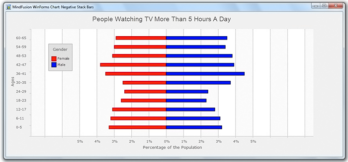
Thia post will demonstrate how to create a horizontal stacked bar chart with negative values. We will use the Charting for WinForms component and the final chart looks like this:
Negative Stacked Bar Chart in WinForms with the Chart Control
I. Data
The chart will use four series. The first two series are the ones that you clearly see – the red and blue one. We initialize two data arrays with random values that represent the data:
var firstBarX = new List(11);
var secondBarX = new List(11);

Random r = new Random();

for(int i = 0; i < 11; i++)
   {
       firstBarX.Add(2.2 + r.NextDouble());
       secondBarX.Add(2.4 + r.NextDouble());
    }
We need a list with data values that are exactly the same as the first series, but are negative. They will provide a transparent initial series, whose bars will offset the first, red, series as much as the value of the red bar should be:
//generate data for the transparent series
var transparentBarX = new List(firstBarX.Count);

for (var i = 0; i < firstBarX.Count; i++)
    transparentBarX.Add(0 - firstBarX[i]);
The data for the Y-axis is very simple. We just need a list with the numbers from 1 to 12:
//data for the Y-axis
var barY = new List();
for (int i = 1; i < 12; i++)
	barY.Add(i);
II. Labels
We will create two lists with the labels that we will show – for the two axis. The labels for the Y-axis will be used as tooltips as well. We just initialize two string lists:
//initialize labels for the X axis
var ageLabels = new List() { "0-5", "6-11", "12-17", "18-23", "24-29", "30-35",
		   "36-41", "42-47", "48-53", "54-59", "60-65" };

//initialize labels for the Y axis.
var percentageLabels = new List { "5%", "4%", "3%", "2%", "1%", "0%", 				"1%", "2%", "3%", "4%", "5%", };
We will use this label lists in the next section, when we create the series.
III. Series
We will use 4 series, of type Series2D. This series is useful for its SupportedLabels property – it allows us to specify what the labels of the series would be used for. We start with the transparent series. Its labels will be used for custom labels at the Y-axis:
var seriesTransparent = new MindFusion.Charting.Series2D(transparentBarX, barY, ageLabels);
seriesTransparent.SupportedLabels = MindFusion.Charting.LabelKinds.YAxisLabel;
seriesTransparent.Title = "";
We use for X-data the negative values you remember from the previous paragraph. The age labels are those that provide the data for the axis.
Then we initialize the two series for the chart data:
var seriesFirst = new MindFusion.Charting.Series2D(firstBarX, barY, ageLabels);
seriesFirst.SupportedLabels = MindFusion.Charting.LabelKinds.ToolTip;
seriesFirst.Title = "Female";

var seriesSecond = new MindFusion.Charting.Series2D(secondBarX, barY, ageLabels);
seriesSecond.SupportedLabels = MindFusion.Charting.LabelKinds.ToolTip;
seriesSecond.Title = "Male";
The last series that we create is just to provide data for the X-axis and we set its SupportedLabels property to MindFusion.Charting.LabelKinds.XAxisLabel. The X-data for this series corresponds to the coordinates of the X-labels, that’s why set the numbers from -5 to 5 as X-data:
var firstParamList = new List();
      for (int i = -5; i < 6; i++)
	 firstParamList.Add(i);
The Y-data could be all zeros, we won’t use them anyway.
var secondParamList = new List();
    for (int i = 0; i < 12; i++)
	secondParamList.Add(0);
And we create the series this way:
//the purpose of this series is to only supply the Xaxis labels, it is transparent.
var seriesThird = new MindFusion.Charting.Series2D(firstParamList, secondParamList, percentageLabels);
seriesThird.SupportedLabels = MindFusion.Charting.LabelKinds.XAxisLabel;
seriesThird.Title = "";
After you have created all series, you should add them to the Series collection of the BarChart:
barChart.Series = new ObservableCollection
	{ seriesTransparent, seriesFirst, seriesSecond, seriesThird };
IV. Axes and Grid
We need to fix the divisions of the X-axis if we want to show a grid and the grid to be neatly aligned with the axes. We will set the min value to be -6, the interval 1 and the max value to be 6:
barChart.XAxis.Interval = 1;
barChart.XAxis.MinValue = -6;
barChart.XAxis.MaxValue = 6;
We will use three more properties to hide the interval labels at both axes, show ticks on them and set a title for each axis:
barChart.XAxis.Title = "Percentage of the Population";
barChart.YAxis.Title = "Ages";

barChart.ShowYCoordinates = false;
barChart.ShowXCoordinates = false;

barChart.ShowXTicks = true;
barChart.ShowYTicks = true;
Finally, we have to set the grid and specify that the bars are horizontal:
barChart.GridType = GridType.Vertical;
barChart.HorizontalBars = true;
V. Styling
Styling the chart is done though the SeriesSyle property of the Plot. You can assign to it different series types, you can check the list at the ISeriesStyle interface page in the documentation:
barChart.Plot.SeriesStyle = new PerSeriesStyle()
{
	Strokes = new List {
		firstBrush, new SolidBrush(Color.FromArgb(179, 0, 0)),
                new SolidBrush(Color.FromArgb(0, 0, 102)), firstBrush
		},
		StrokeThicknesses = new List {
			 0,2,2,0
		},
		Fills = new List()
		{
			firstBrush, secondBrush, thirdBrush, firstBrush
	}
};
This style indicates that each brush from its collection will be used for one series in the chart. We assign to it 4 brushes and 4 strokes. The first brush is transparent, the second one is red, the other is blue and the last one is black – we won’t draw with it anyway.
The Theme property of the chart holds a lot of options for customizing the appearance. Here are just a few of them:
barChart.Theme.LegendBorderStrokeThickness = 1;
barChart.Theme.LegendBorderStroke = new SolidBrush(Color.Black);
barChart.Theme.GridColor2 = Color.White;
barChart.Theme.GridColor1 = Color.FromArgb(250, 250, 250);
barChart.Theme.GridLineColor = Color.FromArgb(153, 153, 153);
barChart.Theme.PlotBackground = new SolidBrush(Color.FloralWhite);
...........
..........
And that’s the end of this step-by-step guide. You can download the sample together will all necessary libraries from this link:
Download Negative Stack Bar Chart in CS Sample
About MindFusion Charting for WinForms: A versatile dashboard component that provides your WinForms application with the ability to create fascinating charts, interactive dashboards and practical gauges. The component combines a flexible API that allows custom combination of chart components to build any type of chart you want. You can add as many axes of any type you want, combine various chart series into a single chart with different data providers each. The control also supports pan and zoom, scroll, unlimited number of legends, grid and a dashboard panel. Linear and oval gauges complete the tool set and guarantee every feature you might need to build the perfect gauge, chart of any type or dashboard in WinForms is right at your fingertips. Learn more at https://mindfusion.eu/winforms-chart.html