In this blog post we will look on how to build ControlNode -s with Mindusion Diagramming library for JavaScript. We will create a web page that creates a template for cooking recipes. Each recipe is a DiagramNode . Rows in the table with ingredients can be added or removed dynamically with buttons. When you click on the recipe image, a browse dialog appears and you can point to another one.
You can test the page yourself:
I. General Settings
We need a blank HTML page and a blank JavaScript file, which will hold the code for the application.
We add links to three JavaScript files. We add them at the end of the web page, right before the closing BODY tag:
<script src="MindFusion.Common.js" type="text/javascript"></script>
<script src="MindFusion.Diagramming.js" type="text/javascript"></script>
<script src="RecipeNodes.js" type="text/javascript"></script>
In the web page we need two Canvas elements: one for the diagram and one for an overview control. The Overview control shows a mini-version of the diagram. It is convinient but not necessary in order to render a flowchart.
<div id="content" style="top: 60px; bottom: 24px;">
        <div style="position: absolute; left: 0px; top: 0px; bottom: 0px; width: 200px; border-right: 1px solid #e2e4e7;
			overflow: hidden; vertical-align: top;">
            <!-- The Overview component is bound to the canvas element below -->
            <div style="position: absolute; top: 0px; bottom: 0px; right: 0px; width: 200px;
				height: 200px; border-bottom: 1px solid #e2e4e7; background-color: #c0c0c0;">
                <canvas id="overview" width="200" height="200">
                </canvas>
            </div>
        </div>
        <!-- The Diagram component is bound to the canvas element below -->
        <div style="position: absolute; left: 200px; top: 0px; right: 0px; bottom: 0px; overflow: auto;">
            <canvas id="diagram" width="2100" height="2100">
                This page requires a browser that supports HTML 5 Canvas element.
            </canvas>
        </div>
        <!-- The ZoomControl component is bound to the canvas element below -->
        <div style="width: 50px; height: 300px; position: absolute; top: 20px; right: 35px;
			width: 50px; height: 300px;z-index:3;">
            <canvas id="zoomer" width="50" height="300">
            </canvas>
        </div>
    </div>
We also add a ZoomControl control and we provide all HTML controls with an id. This is important because we need this id to refer to the Canvas elements from JavaScript code.
We’ve also added some CSS styling options to the web page. They are meant to make the HTML controls that we will embed in our
control node prettier.
II. The Controls
Now that we have set up all code in the web page, we start coding the JavaScript code-behind file. We add some namespace mappings, to make the code shorter. If you are using Visual Studio Code, you can add the TypeScript definitions of the Diagram library. This will enable IntelliSense support while you code.

We handle the DOMCOntentLoaded event of the initial HTML document to initialize the MindFusion controls.
document.addEventListener("DOMContentLoaded", function ()
{
	 // create a Diagram component that wraps the "diagram" canvas
    var diagram = Diagram.create(document.getElementById("diagram"));
    diagram.setVirtualScroll(true);
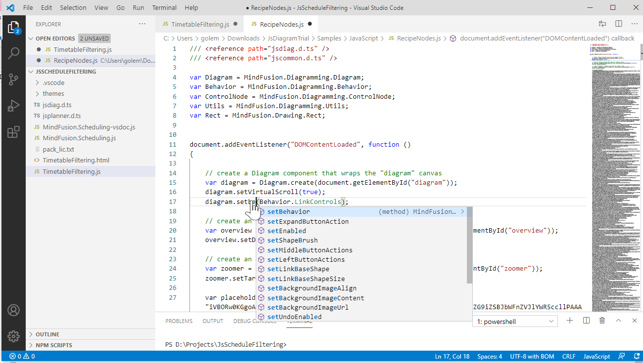
    diagram.setBehavior(Behavior.LinkControls);

    // create an Overview component that wraps the "overview" canvas
    var overview = MindFusion.Diagramming.Overview.create(document.getElementById("overview"));
    overview.setDiagram(diagram);

    // create an ZoomControl component that wraps the "zoomer" canvas
    var zoomer = MindFusion.Controls.ZoomControl.create(document.getElementById("zoomer"));
    zoomer.setTarget(diagram);
}});
We get the HTML element that corresponds to each of the three Canvas elements that we have created in the web page. We use the document.getElementById of the Web API. You see now that we query the document using the id-s of the Canvas elements, which we have previously specified.
The Overview and ZoomControl instances use the setDiagram and setTarget methods prespectively, to specify the Diagram instance, to which they should be bound.
III. The Node Template
The ControlNode class allows us to use plain HTML in order to initialize the look of a ControlNode This is done with the setTemplate method. You can specify different templates for each instance of ControlNode that you create.
var node1 = new MindFusion.Diagramming.ControlNode(diagram);
        node1.setTemplate(`<input value="Cupcakes" data-interactive="true"></input>
	<div style="padding:10px"><img width="70" height="70" title="Click to choose picture" style="float:left" src="data:image/png;base64,${placeholderBase64}" data-interactive="true" data-event-click="placeholderClick" /><table width="50%"><tr><td contenteditable='true' data-interactive="true">softened butter</td><td contenteditable='true' data-interactive="true">110g</td></tr><tr><td contenteditable='true' data-interactive="true">golden caster sugar</td><td contenteditable='true' data-interactive="true">110g</td></tr><tr><td contenteditable='true' data-interactive="true">large eggs</td><td contenteditable='true' data-interactive="true">2</td></tr><tr><td contenteditable='true' data-interactive="true">vanilla extract</td><td contenteditable='true' data-interactive="true">½ tsp</td></tr>
<tr><td contenteditable='true' data-interactive="true">self-raising flour</td><td contenteditable='true' data-interactive="true">110g</td></tr></table></div>
	<button data-interactive="true" data-event-click="addRow">Add Ingredient</button>
	<button data-interactive="true" data-event-click="removeRow">Remove Ingredient</button>
	<div style="width: 100%;"><textarea id="w3review" name="w3review"  rows="4" columns="50" data-interactive="true">
  Using an electric whisk beat 110g softened butter and 110g golden caster sugar together until pale and fluffy then whisk in 2 large eggs, one at a time, scraping down the sides of the bowl after each addition.
Add ½ tsp vanilla extract, 110g self-raising flour and a pinch of salt, whisk until just combined then spoon the mixture into the cupcake cases.
  </textarea></div>`);
        node1.setBounds(new Rect(40, 20, 100, 100))
        diagram.addItem(node1);
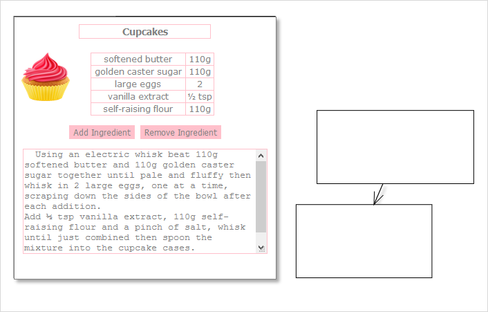
We also use setBounds to specify the location of the new DiagramNode on the diagram’s work area. It is also important to add the new node to the collection of DiagramItem -s with addItem if we open the web page in browser, we will see the recipe node for cupcakes. If we create new nodes, however, we will see that they render as default white rectangles:

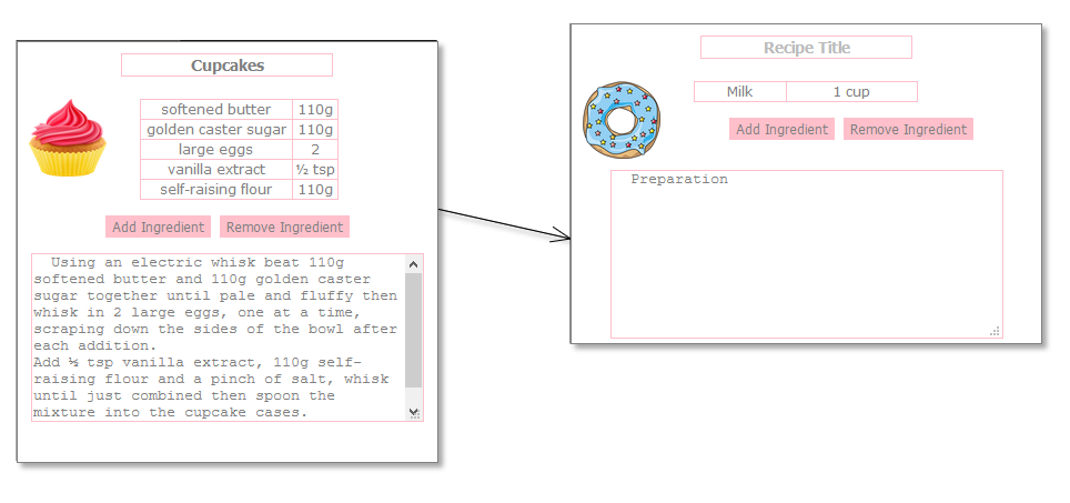
In order to change that we need to replace the default templates for nodes of the Diagram with a custom one: our recipe node. Here is the new template:
 var defaultTemplate = `
<input placeholder="Recipe Title" data-interactive="true"></input>
	<div style="padding:10px"><img width="70" height="70" title="Click to choose picture" style="float:left" src="data:image/png;base64,${placeholderBase64}" /><table width="50%"><tr><td contenteditable='true' data-interactive="true">Milk</td><td contenteditable='true' data-interactive="true">1 cup</td></tr></table></div>

	<div><button>Add Ingredient</button>
	<button>Remove Ingredient</button>
	<div><textarea id="w3review" name="w3review"  rows="4" columns="50" data-interactive="true">
  Preparation
  </textarea></div>`;
Now we can call the setDefaultControlTemplate method to tell the Diagram that from now on, when new DiagramNode -s are created, they will have this template:
diagram.setDefaultControlTemplate(defaultTemplate);
IV. Interactivity
When we create a new node, the table renders with a sample row, which you cannot edit. The same is with the title. If we want to make the controls editable we need to set the data-interractive atribute:
<div><button data-interactive="true" data-event-click="addRow">Add Ingredient</button>
As a rule each ControlNode exposes various attributes, which are accessible through the following syntax:
data-attributeName="value"
As you see from the code above, there is data-event-click attribute. This attribute specifies the event handler of the click event for the button that is rendered in the node. Here it is:
function addRow(e, sender)
{
	var table = sender.getContent().getElementsByTagName("table")[0];


	  var rows = table.getElementsByTagName('tr');
	  if(rows.length > 0)
      {
		   var clone = rows[rows.length - 1].cloneNode(true);
           table.appendChild(clone);
	  }
	  else
	  {
		  var tr = document.createElement('tr');

          var td = document.createElement('td');
         td.appendChild(document.createTextNode('Milk'))
         td.setAttribute('contenteditable', 'true');
		 td.setAttribute('data-interactive', 'true');
         tr.appendChild(td);

		 td = document.createElement('td');
         td.appendChild(document.createTextNode('1 cup'))
         td.setAttribute('contenteditable', 'true');
		 td.setAttribute('data-interactive', 'true');
         tr.appendChild(td);

		 table.appendChild(tr);
      }
}
In the event handler we check if there are rows in the table, and if yes – we copy the first one. If there are no rows, we add a new row with default data. The data-event-eventName is the syntax to handle any event that is available on the HTML control that you have included in the ControlNode is how we specify that the image of a cupcake is clickable:
<img width="70" height="70" title="Click to choose picture" style="float:left" src="data:image/png;base64,${placeholderBase64}" data-interactive="true" data-event-click="placeholderClick" />
As you see, it is interactive and we handle the click event on it. Once we click on the image, a dialog renders and we can choose a new image:
function placeholderClick(e, sender)
{
    var input = document.createElement("input");
    input.type = "file";
    var img = e.target;
    input.addEventListener('change', e =>
    {
        Utils.toDataUrl(URL.createObjectURL(e.target.files[0]), function (base64str)
        {
            img.src = base64str;
            sender.setTag(base64str);
            sender.createImage();
        });
    })
    input.click();
}
When a new image is chosen, we assign its Base64 represenation as source to the image element that is in our ControlNode template, which represents cooking recipes.
And these were all the steps you need to make in order to get interactive, recipe nodes with customizable count of ingredients, title and image.
You can download the source code from:
Download Recipe Nodes JavaScript Diagram Sample
Technical support is available through MindFusion forum here.
About Diagramming for JavaScript: This native JavaScript library provides developers with the ability to create and customize any type of diagram, decision tree, flowchart, class hierarchy, graph, genealogy tree, BPMN diagrams and much more. The control offers rich event set, numerous customization options, animations, graph operations, styling and themes. You have more than 100 predefined nodes, table nodes and more than 15 automatic layout algorithms. Learn more about Diagramming for JavaScript at https://mindfusion.eu/javascript-diagram.html.

