
A list of downloadable samples that demonstrate various features of the WPF Chart component.

The demo program presents you with an overview of the control's capabilities and is a fast and efficient way to find out how to reproduce the most common chart scenarios. You are guided step by step through the major chart types supported by the component and have options to customize each type. Then you can see various data sources used to provide values for the charts. A demonstration of the chart elements is followed by samples of user interaction. The demo ends with a list of the special features of the chart control presented through various charts.
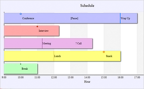
Charting for WPF lets you add annotations of different type to a bar. The annotations can contain different types of graphic marks and a label with arbitrary text. It's up to you to decide where and how many annotations to place. Both horizontal and vertical bars support the feature no matter their type.
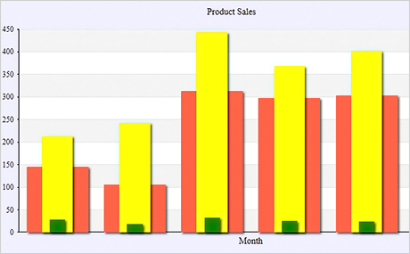
Bars are among of the major chart types supported by WPF Chart and here you can see a demonstration of all 2D bar types - single series, groups, overlay series and stacked bars. You can easily switch between different bar types and change bar orientation. The sample gets you visually acquainted with the available bar types and helps you choose, which type is best for your needs.
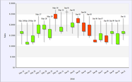
A candlestick chart is created fast and easy with the control. The CandlestickSeries and StockPrice classes are designated to do just that and this sample illustrates how they should be used. Here you see a traditional candlestick chart with labels at each stick and two colors that show whether the closing value was above or below the opening one. The chart also renders DateTime values as X-labels and uses a horizontal grid.
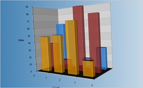
Get to know the fantastic capabilities of the chart control to render 3D graphics. This sample lets you experience the numerous settings available in a 3D bar and see how they affect appearance and performance. Play with the size of the 3D model, alter the chart behaviour or add new series - the bar control responds swiftly to any changes you made and is the perfect fit for every type of software.
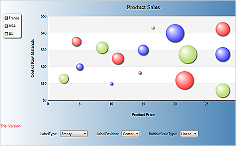
If you look for an interactive bubble chart this example will teach you how to achieve this. Here you have a bubble chart where the method used when calculating the bubble sizes is customizable. You can also add labels to bubbles and choose the position where the labels shall be drawn. Bubbles can be dragged with the mouse.
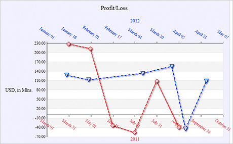
Reading DateTime data is done easy with the control - you just need to provide lists with the DateTime values as you would do with any other numerica data type. The control parses the DateTime values and renders labels in format set by you. The sample also uses an X2- axis and renders the line series with scatters at data points and dashed pens.

The control provides a convenient HitTest method for all chart types. The method returns the element clicked by the user - or an array of chart elements if the mouse is over overlaying bars for instance. The returned chart element provides detailed information about its labels, data, location so you can precisely identify it and respond to the user's action as required by the logic of your application.

Bar Chart With Mixed Data And Cross Hair
All charts that use the Cartesian coordinate system - and bar charts in particular - can render both positive and negative data on any chart axis. In this sample you get acquainted with two other chart features - the cross hair and mouse drag. Use your mouse to change the value of a bar by dragging its top edge. The cross hair, when enabled, tracks the mouse and lets you measure precisely the height of any bar or the location of any element on the plot area.
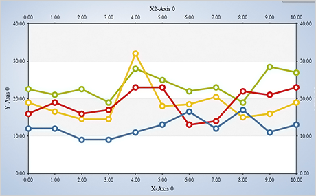
One of the most practical features of the Wpf Chart control is its support for unlimited number of axes of all types in graphics that use the Cartesian coordinate system. You can add as many X, X2, Y and Y2 axes as your application needs - and customize them separately from each other. Each series exposes properties, which identify the X/X2 and Y/Y2 axes the series uses. There's no need for a given axes to have a Series bound to it - you can add it just to help your users make sense of the chart data with a single glance.
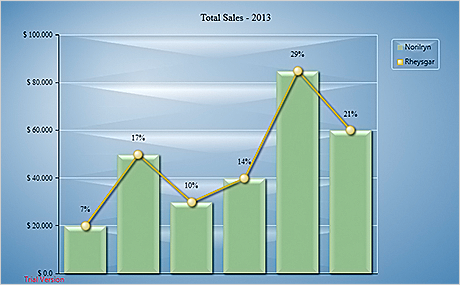
Combining bar and line series of any type is intuitive in MindFusion Wpf Chart. You just add the desired series to the Series collection. The control renders equally well both types of series on a single coordinate system. Each series preserves its own properties for data and appearance. Thus you can combine a bar series with a line series that has scatters on data points just like this sample demonstrates. A combination chart supports all other chart elements - like title, legends and background grid of your choice.

Pie charts are among the most popular and the control provides you with the complete set of features to create the perfect pie chart for the most demanding WPF applications. You can specify the size and tension of a pie chart, how many detached pieces it has and which exactly are they. Labels inside and outside pie pieces let you render valuable data that will make your chart even more informative. A pie chart turns into doughnut with an arbitrary thickness with the help of a single property.
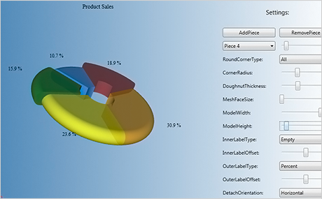
The 3D pie chart is far more than a flat pie chart in perspective. A 3D pie exposes properties, that let you choose how both detached and undetached pieces are rendered. You control every detail on how the 3D model is rendered - the size of the mesh, the depth of the model, the corner radius of pie pieces. This sample treats you to two types of pie behaviour - ChangePerspective or ChangeValue. This makes your 3D pie chart not only beautiful but also interactive.
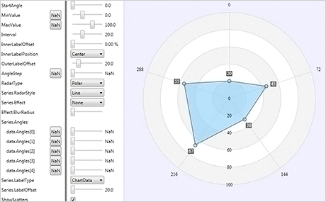
MindFusion radar charts have been developed to include every single feature you might ever need in such chart and this sample demonstrates most of the settings. You can change the alignment, offset and type of all types of labels - at the axes and on radar sections. Series can take a variety of styles and render scatters at data points. You can choose the start angle of the radar, the values on the numeric axes and even apply a visual effect to make the radar series look more polished.

Polar Chart With Custom Angles
One of the amazing features of the polar chart control is the support of custom angles for data points. In this scenario you control precisely where a radar point appears - once with its radius, which is calculated based on the data for the point. Second time you set its angle via a separate property and have the freedom to place radar points anywhere on the chart and not only at the axes.
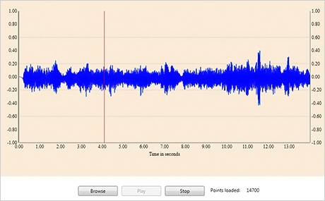
The Real-time chart control has been designed and developed to render huge data sets without delay in performance. This sample parses data of a wav file as points and displays a vertical line that follows the location in the song that is currently being played. You can test yourself how easy the control handles big data when you load a music file of your choice no matter how long.
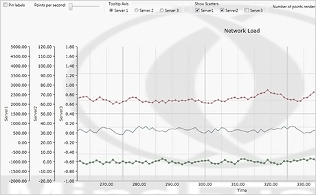
Real-time Chart: Network Server Load
The sample presents you with a typical scenario where a real time chart is needed - network server load graph. Here you can dynamically increase the number of points rendered per second, or add scatters - in both cases you'll see performance remains stable and speedy. This sample also uses the ability of the real-time chart control to render unlimited number of axes - there is a total of 5 axes on this chart. A few other UI controls let you play with the chart settings and test the various ways to customize a real time chart.
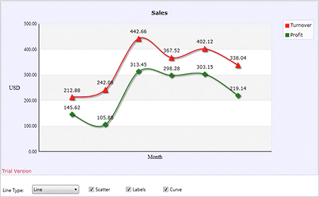
Here you see a standard line chart that draws two series. A set of UI controls let you change the settings of the graphic and test the various line types supported by the control. You can also apply interpolation and add labels at data points. The sample is a nice, simple introduction to the basics you need to know to create a line chart.

Here you see a standard line chart that draws two series. A set of UI controls let you change the settings of the graphic and test the various line types supported by the control. You can also apply interpolation and add labels at data points. The sample is a nice, simple introduction to the basics you need to know to create a line chart.
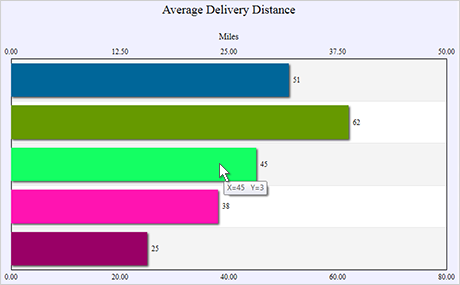
Chart With Second X / Second Y Axis
The sample presents you with a typical bar chart, which uses top labels to render bar data and horizontal grid to make the chart easier to understand. The chart uses an additional axis - an Y2 axis, to display the auto scale in different measure units. The bar chart changes orientation with a mouse click and the Y2 axis turns into X2 axis.

Learn more about the various ways you can render the legend. The control supports unlimited number of legends, which can be placed wherever you find appropriate on the chart. The grid, in contrast is just one but it supports so many ways to adjust its appearance that you can surely find the best one in your particular application. This sample features a block of UI controls, which let you experiment with the grid and legend settings and see how they can be changed.
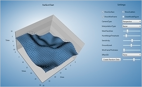
This sample is an overview of the surface chart and presents you with a control panel where all major properties of the surface control are displayed. From there you can change the chart settings and test how chart appearance is affected. The sample is the perfect way to give you an idea of the huge capabilities of the 3D surface chart control.
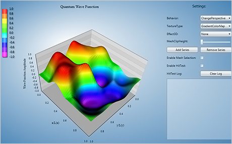
A colourful surface map presents your users with a clear way to analyze data fluctuation over a chosen period. The surface chart control lets you choose the colours of the map and how it's rendered - in gradients or exact colours. A surface chart with colour map supports detailed hit testing like any other MindFusion chart control - the sample lets you check this. You also have a variety of properties to adjust how the mesh is rendered and which 3D effects are applied at the chart.
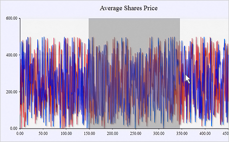
Charts with tightly rendered points will definitely benefit from the advanced zoom features available in the control. The chart component lets you zoom by selecting the area with the mouse e.g. with an arbitrary amount. Each zoom step is saved so you can go back to the original chart state step-by-step. The control even supports chart restore, which gets back the initial chart with a single method call.