
MindFusion Chart library for Java Swing is so much more than the average programming tool for rendering diagrams. It is a smart component that lets you combine and arrange chart, gauge and UI elements to create advanced data visualization solutions.
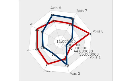
The chart library ships with a set of predefined charts, which you can easily populate with data and adjust in appearance. Pie and doughnut charts, radar, polar and bar charts with various orientation - all of them are at your disposal together with a funnel chart, a bubble chart and many more. If you prefer 3D charts you can use the BarChart3D to arrange 3D bars in groups or stacks.
The chart library supports two types of animation to choose from - per series or per elements. Each animation is bound to a given timeline that lets you control its speed and duration. A timeline can have multiple animations and you can combine them creatively to achieve a truly impressive rendering for your charts and dashboards.
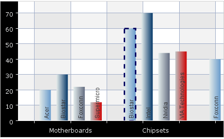
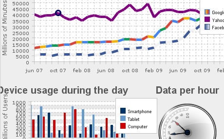
Combine and adjust various chart and UI elements as well gauges to create the dashboard that most precisely meets the needs of your Swing application. The flexible API of the library provides you various options to arrange and style a dashboard. You have various layout panels, labels, border and plot elements, legends and charts which you can customize as you wish. The dashboard control places no restrictions on the number of elements that you add so you are free to implement virtually any data visualization scenario you want.
Online Tutorial: A Horizontal Stacked Bar Chart in Java Swing
API Reference: Chart and Dashboard Components
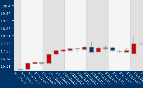
Use the special CandlestickRenderer to add candlestick financial charts to your business application. Together with the StockPriceSeries and StockPrice classes they provide the perfect set of tools to render a precise diagram of the stock fluctuations for a given company over any period of time. In addition, the CandlestickSeriesStyle provides your financial chart with the complete set of appearance settings.
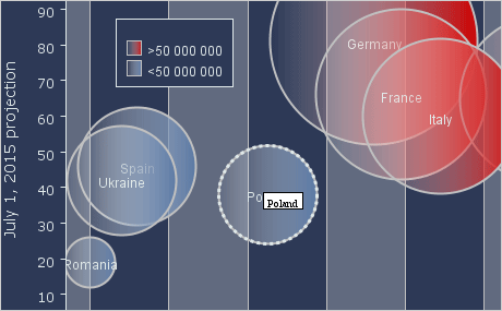
Data for the charts in this Java Swing library comes from classes that implement the Series interface. The control provides a rich collection with predefined Series classes for numeric arrays, DateTime values, XML data, Stock data etc. The Series interface is public and you are free to implement it to create native data classes that contain the exact type of data you need. There are several samples packed with the chart control that show you how to do it.
Built with the MindFusion Java chart library, the users of your application would have a lot of options to interact with each dashboard. Grid can be scrolled and grid labels can be moved along or pinned in place. Each legend can be dragged to an arbitrary place at the top. Charts can be panned and hit testing is supported for all chart types. The selected chart element is highlighted with a pen and brush of your choice.
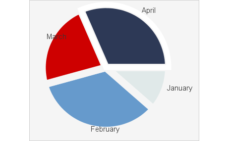

You can style your charts and gauges in several different levels. On the top level there is the Theme class and you can create and serialize dashboard themes by using the graphical theme editor. You also have styling options for each chart control and on the micro level - each chart element supports its own set of appearance settings. The settings on the lower level override those set on higher levels.
The library includes a pair of polar and linear gauge controls, which offer endless options for styling and customizing. You can adjust their pointers, scales and colors. Each gauge has three different types of ticks - major, middle and minor. You can render labels on all of them. You can also choose the range on the scale, the pointer position and use custom drawing to give your gauge the exact look you want.
