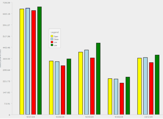
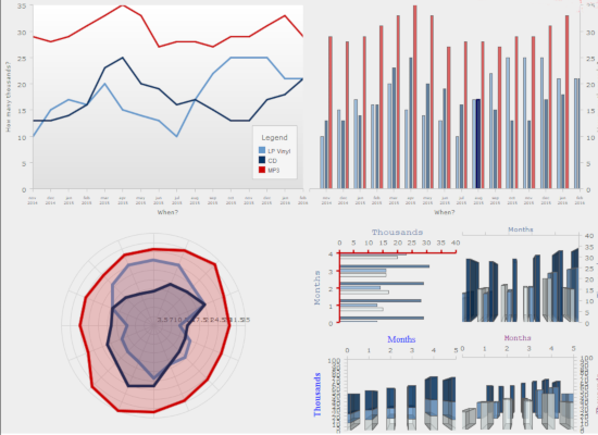
Bar Chart
The sample shows a bar chart and various UI controls that let you change different options of the chart. You can experiment and see how you can customize the chart.
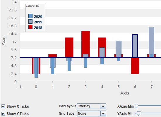
Bar Chart 3D
A demonstration of the 3D bar chart, which supports various options for layout, axes, legend and behaviour. You can use the UI controls to experiment with them.
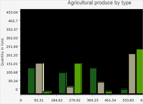
Bubble Chart
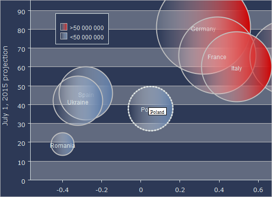
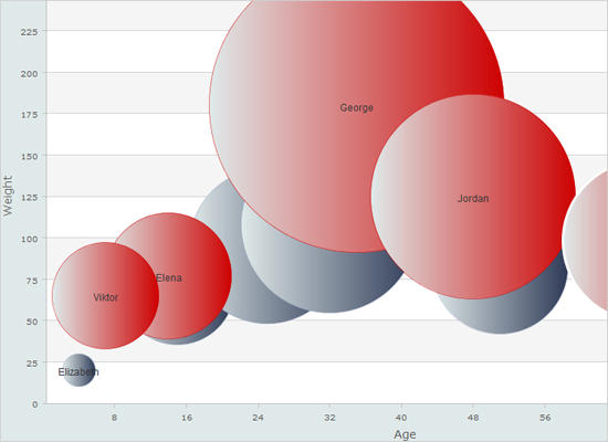
The sample demonstrates the Bubble chart control with its various options for customization of the appearance, grid, legend and user behaviour.
Candlestick Chart
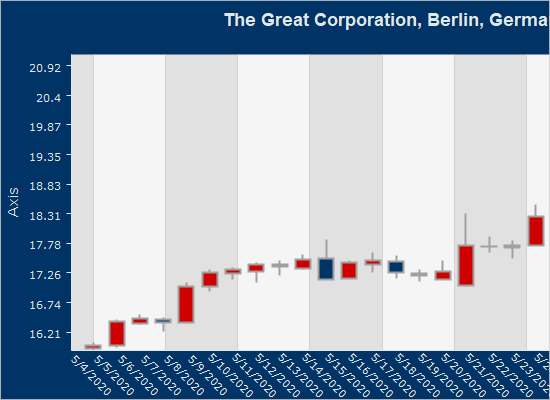
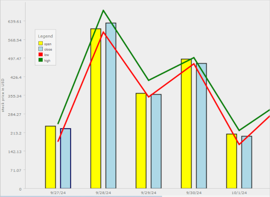
The candlestick chart is rendered with options for customization: date format, custom date format, zoom widgets and behavior.
Car Gauges
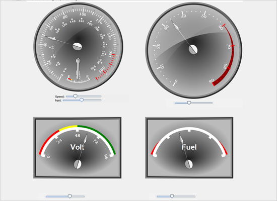
A set of two oval and two rectangular gauges that are made to look as the dashboard of a car. You can change the gauge values by dragging the sliders.
Clock
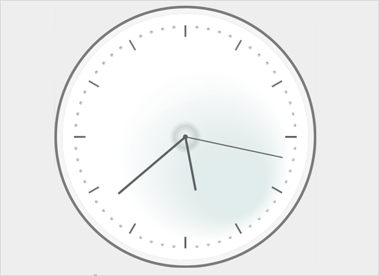
The oval gauge is used here to render an analogue clock, which shows the correct time and renders a seconds hand with the help of a timer.
Custom Data
This sample uses a custom data series with object instances to render a bubble chart with a legend and tooltips.
Dashboard
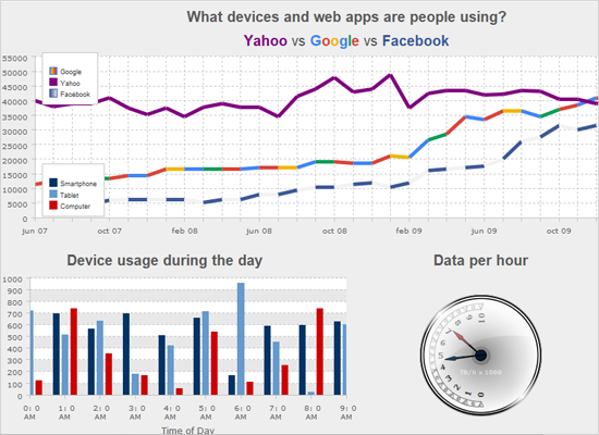
The Dashboard component supports several layout panels and has dynamic positioning of elements. The elements include charts, gauges, labels, borders, images.
Dynamic Dashboard
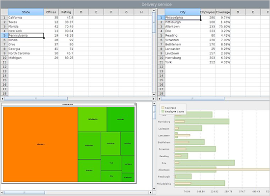
A dashboard that contains a spreadsheet, a treemap diagram and an overlay bar chart. The data is provided through XML. The diagram and chart are updated when the user changes the cell selection in the first spreadsheet.
Functions
The quadratic gauge is used to render the scale of various mathematical functions: logarithmic, linear or quadratic.

Funnel Chart
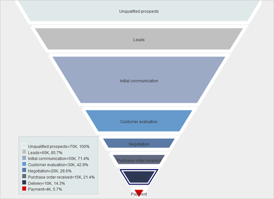
The funnel chart control allows you to change the stem width of the funnel, the spacing between segments, hide data labels and more.
Group Labels
Here we use annotations to place labels under each group of bars. The annotations are rendered by the AnnotationRenderer.
Interactivity
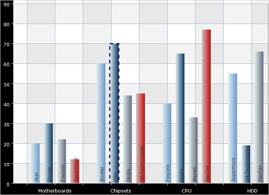
The chart control supports pan and drag with the mouse as well as zoom. The sample demonstrates these features on two types of charts: bar and pie.
Line Chart
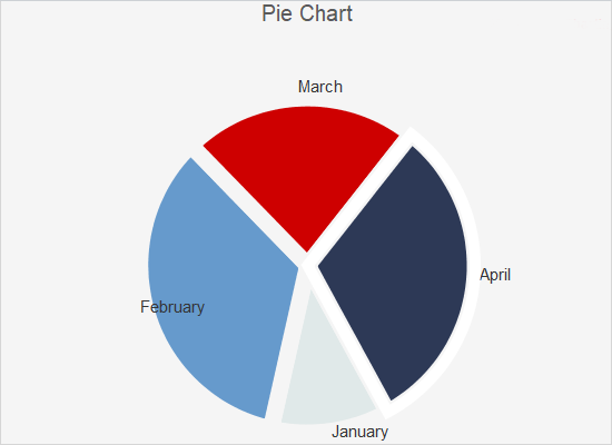
The LineChart control exposes various properties for customizing the appearance of line charts and different options how to draw them: as step charts, curves or lines. The sample demonstrates many of the line chart features.
Min App
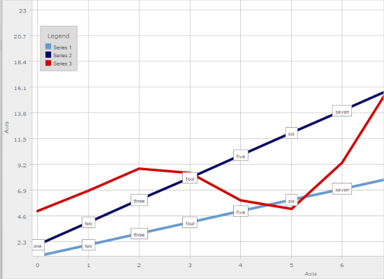
This example demonstrates the minimal setup that lets you display a Chart component in a Java Swing application.
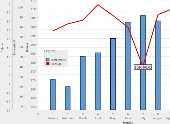
Multiple Axes
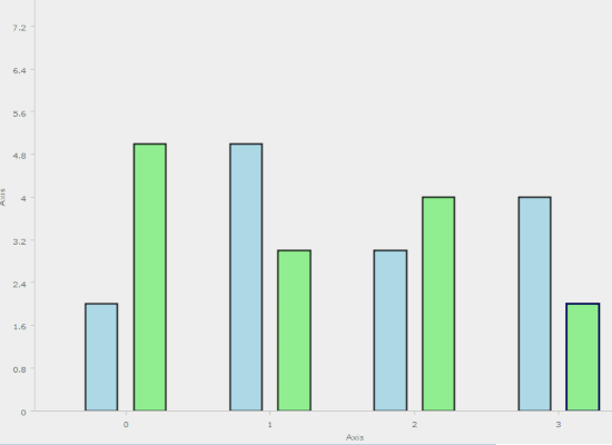
The chart control supports unlimited number of axes anywhere on the chart: X, X2, Y or Y2. Each axes can have its own scale, labels, title and other appearance settings.
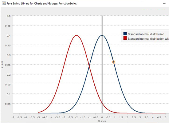
Normal Distribution Graph
The FunctionSeries class is used to build a line chart that renders two graphs of normal distribution with different medians.
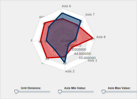
Radar Chart
Both radar and polar charts are supported in JChart. Each chart has a variety of customization settings, which are demonstrated in this sample. Play with the controls to see how the chart gets changed.
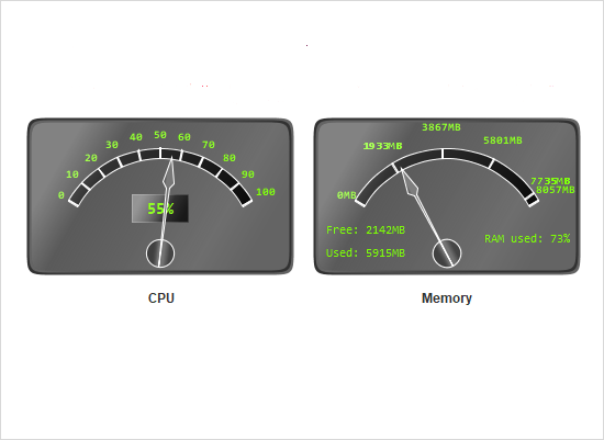
Resource Monitor
A set of two rectangular gauges that are bound to the CPU and Memory load indicators of your computer.
Scripted Series
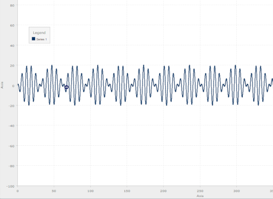
The chart can render the graphics of a mathematical function in a given numeric interval. The sample shows you how.
Stacked Bar Chart
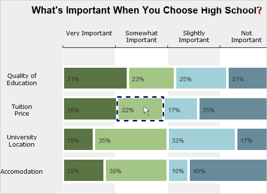
The sample builds a horizontal stacked bar charts with labels inside bars and labels at the X2 axis.
Tower Chart
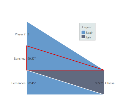
This sample demonstrates demonstrates the properties of the TowerChart control and lets you change them and see the effect in real time.
Tutorial 2
This example demonstrates how to feed custom data to a chart by implementing the Series interface, instead of copying data to built-in series classes.
Tutorial 3
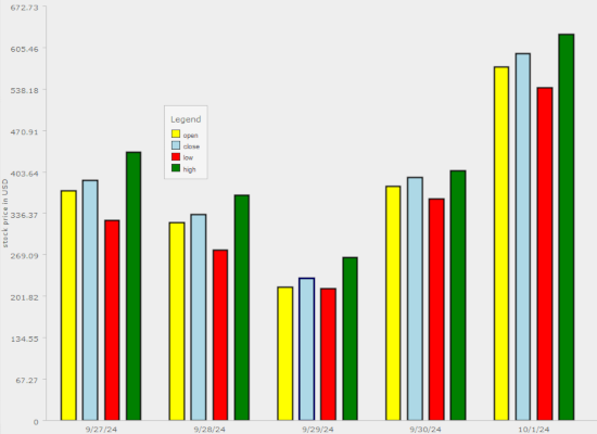
This example demonstrates how to add different types of chart graphics to the plot.
 Run
Run
 Download
