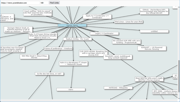
PERT network charts in WPF

In this post we show how to build a PERT network chart using MindFusion.Diagramming for WPF.

First, create a new WPF project and add a mindfusion.diagramming.wpf.dll reference. Add the appropriate Xaml namespace to the window Xaml file:

xmlns:diag="http://mindfusion.eu/diagramming/wpf"

Add a ScrollViewer and Diagram to the window markup:

<ScrollViewer>
	<diag:Diagram x:Name="diagram" />
</ScrollViewer>

There are two conventions for drawing PERT networks: activity on arrow and activity on node. Activity on arrow shows activity information on arrows, and the nodes they connect represent project milestones. Activity on node shows activity information on nodes and the arrows between them display relationships. We will use the first convention.

Let’s define a model class to hold activity data:

public class Activity
{
	// activity name
	public string Name { get; set; }

	// start milestone name
	public string From { get; set; }

	// end milestone  name
	public string To { get; set; }

	// time in months
	public int Time { get; set; }
}

Define a simple PERT project consisting of five milestones and six activities:

var network = new[]
{
	new Activity { Name = "A", From = "10", To = "30", Time = 3 },
	new Activity { Name = "B", From = "10", To = "20", Time = 4 },
	new Activity { Name = "C", From = "20", To = "50", Time = 3 },
	new Activity { Name = "D", From = "30", To = "40", Time = 1 },
	new Activity { Name = "E", From = "30", To = "50", Time = 3 },
	new Activity { Name = "F", From = "40", To = "50", Time = 3 }
};

Create a diagram node for each milestone in the project:

// create diagram nodes for each milestone
foreach (var activity in network)
{
	if (diagram.FindNodeById(activity.From) == null)
	{
		var node = diagram.Factory.CreateShapeNode(bounds, Shapes.Ellipse);
		node.Id = node.Text = activity.From;
	}

	if (diagram.FindNodeById(activity.To) == null)
	{
		var node = diagram.Factory.CreateShapeNode(bounds, Shapes.Ellipse);
		node.Id = node.Text = activity.To;
	}
}

Create a diagram link for each activity and display the activity name and estimated time as link labels:

// create a diagram link for each activity
foreach (var activity in network)
{
	var link = diagram.Factory.CreateDiagramLink(
		diagram.FindNodeById(activity.From),
		diagram.FindNodeById(activity.To));

	var label1 = link.AddLabel(activity.Name);
	label1.RelativeTo = RelativeToLink.Segment;
	label1.Index = 0;
	label1.VerticalOffset = -20;
	label1.TextBrush = new SolidColorBrush(Colors.Red);

	var label2 = link.AddLabel(string.Format("t={0}mo", activity.Time));
	label2.RelativeTo = RelativeToLink.Segment;
	label2.Index = 0;
	label2.VerticalOffset = 10;
	label2.TextBrush = new SolidColorBrush(Colors.Blue);
}

Use automatic graph layout algorithm to arrange the PERT network chart:

// arrange the diagram from left to right
var layout = new LayeredLayout();
layout.Margins = new Size(100, 100);
layout.EnforceLinkFlow = true;
layout.Orientation = Orientation.Horizontal;
layout.Arrange(diagram);

The final result is displayed below.
PERT network chart

For more information on the PERT methodology, see this Wikipedia article:
http://en.wikipedia.org/wiki/PERT

The complete sample project is available for download here:
http://mindfusion.eu/_samples/PertNetwork.zip

All MindFusion.Diagramming libraries expose the same programming interface, so most of the sample code shown above will work with only a few modifications in Windows Forms, ASP.NET, Silverlight and Java versions of the control.

Enjoy!

Diagramming for ActiveX 4.7

MindFusion has released a beta version of its Diagramming for ActiveX component. Here is an overview of the new features:

Glass and Aero Effects

You can now apply Glass and Aero visual effects to nodes with the AddGlassEffect and AddAeroEffect methods, which are added to the Box, Table and Flowchart classes. You must be in the GDI+ mode to use effects.

Here is an overview of the four glass-reflection effects, which you can apply with AddGlassEffect:

The various types of glass effects.

The various types of glass effects.

The AddAeroEffect method aplies semi-transparency to nodes and emphasizes their outline by adding a shade and an inner stroke.

The aero effect.

The aero effect.

Miscellaneous

  • The new SelectionOptions.FramePadding property specifies the distance between the selected items and the selection frame.
  • SelectionOptions.ShowItemHandles property specifies whether handles for individual items are drawn in a multiple selection.
  • Arrow.Segments can be set even on self-loop arrows or when auto routing is enabled.
  • You can set custom shapes for self-loop arrows.
  • and more.

You can read further details about the new features and this release of FlowChartX at the news section of the forum. The beta version of the control in both 32 and 64-bit builds is available for download from here:

Download FlowChartX 4.7 Beta Version

Technical support

MindFusion puts special effort in providing excellent customer support to all developers who use our components. You can write at the forum, help desk or use e-mail support@mindfusion.eu. All questions are usually answered within hours of being received.

About MindFusion.Diagramming for ActiveX: An ActiveX programming component that lets you create with ease every type of diagram, flowchart, scheme, chart, hierarchy, tree etc. The control supports rich user interaction model with advanced features like tool tips, grid alignment, docking points for nodes, scrolling and zooming and many more. FlowChartX implements 7 automatic layouts as well arrow routing. The appearance if each flowchart is completely customizable. Nodes can hold both images and text, their Z-order can be changed and there are tens of predefined shapes to choose from. Nodes support aero and glass visual effects.

The control also includes detailed documentation and many samples for a variety of languages and
platforms. You can find more about the features of the tool at the features page or check the licensing scheme and the prices here.

post by Diana Jovova | | Closed

Line Chart with DateTime Data in ASP.NET

In this post we demonstrate how to use MindFusion.Charting for ASP.NET component to create a line chart that shows the number of unique visitors to a store/website in a period of 6 weeks.

Data

The data for the X-axis are DateTime values. We create an array with the DateTime values that we’ll use and add it to the XData property of our chart. Before that we have to delete the predefined array that is added when the control is dropped at the form:

DateTime dt1 = new DateTime(2013, 6, 14);
DateTime dt2 = new DateTime(2013, 6, 7);
DateTime dt3 = new DateTime(2013, 5, 31);
DateTime dt4 = new DateTime(2013, 5, 24);
DateTime dt5 = new DateTime(2013, 5, 17);
DateTime dt6 = new DateTime(2013, 5, 10);

ArrayList data = new ArrayList() { dt1, dt2, dt3, dt4, dt5, dt6 };
LineChart1.XData.Clear();
LineChart1.XData.Add(data);

Next, we must make some adjustments in the settings for the X-axis to tell the control that DateTime data is used. We set the DataFormat property to DateTime and we specify the time range for the axis. This is how we do this:

LineChart1.XAxisSettings.DataFormat = MindFusion.Charting.DataFormat.DateTime;

LineChart1.XAxisSettings.StartDateTime = new DateTime(2013, 5, 3);
LineChart1.XAxisSettings.EndDateTime = new DateTime(2013, 6, 20);
//set the interval to one week - 7 days
LineChart1.XAxisSettings.TimeSpan = new TimeSpan(7, 0, 0, 0);

The data for the Y-axis are numbers. We can set them through the property grid or set them in code.

LineChart1.YData.Clear();
ArrayList data1 = new ArrayList() { 56, 13, 45, 17, 82, 22 };
LineChart1.YData.Add(data1);

The X-axis

First, we must change the LabelType property of XAxisSettings from “ChartData”, which is the default to “AutoScale”. This will make the axis show the time range we’ve set in code above. Then, we change how the DateTime values will be formatted. The Default DateTimeFormat shows the full time and date and is not suitable. We change it to “LongDate”, which does not draw any time.

XAxisSettings-DateTimeFormat="LongDate" 
XAxisSettings-DrawTicksUniformly="False" XAxisSettings-DrawZero="True" 
XAxisSettings-LabelBrush="s:#FF696969" XAxisSettings-LabelOffset="10" 
XAxisSettings-LabelType="AutoScale" XAxisSettings-TitleLabel="Week" 
XAxisSettings-TitleLabelBrush="s:#FF696969" XAxisSettings-TitleLabelOffset="10" 

We type “Week” as TitleLabel for the axis and set the DrawZero property to true to show the first label, which is otherwise omitted.

Upon preview we notice that the labels are too close to the axis, that’s why we use LabelOffset and TitleLabelOffset to add some space before them. Finally, we change the color of the labels, to make them dark gray rather than black.

The Y-axis

Customizing the Y-axis is rather simple. We change the interval with AxisDelta to 5 and increase the MaxValue to 100. We don’t need decimal fractions for the labels, that’s why we change the NumberFormat. We add a TitleLabel and change its orientation with TitleLabelOrientation. Finally we use LabelBrush and TitleLabelBrush to change the colors of the labels – we use the same brushes as for the X-axis.

YAxisSettings-AxisDelta="5" 
YAxisSettings-LabelBrush="s:#FF696969" 
YAxisSettings-MaxValue="100" YAxisSettings-NumberFormat="Fixed_point_0Digits" 
YAxisSettings-TitleLabel="Unique Visitors" 
YAxisSettings-TitleLabelBrush="s:#FF696969" 
YAxisSettings-TitleLabelOrientation="BottomToTop"

The Grid

Initially the chart shows no grid – but we want to show a grid. That’s why we change GridType to “Crossed” and set a GridPen. The dark gray background of the plot area together with its outlining are set with PlotAreaOutlinePen and PlotAreaBrush.

GridPen="n:0/#FFE1E1E1/0/0/0//0/0/10/" GridType="Crossed" PlotAreaBrush="s:#FFC0C0C0" 
PlotAreaOutlinePen="n:0/#FF787878/0/0/0//0/0/10/"

This is the code that was generated by the designer because we set the properties through the property grid. If we set them with code, it will be:

LineChart1.GridPen = new MindFusion.Drawing.Pen(Color.FromArgb(225,225,225));
LineChart1.GridType = MindFusion.Charting.GridType.Crossed;
LineChart1.PlotAreaBrush = new MindFusion.Drawing.SolidBrush(Color.FromArgb(192, 192, 192));
LineChart1.PlotAreaOutlinePen = new MindFusion.Drawing.Pen(Color.FromArgb(120, 120, 120));


The Line Series

We want scatters at data points and we want to show labels above those scatters. The LabelType property lets us set the type to be both line and scatters:

LineChart1.LineType = MindFusion.Charting.LineTypes.Line | MindFusion.Charting.LineTypes.Scatter;

This is the default type, so you don’t need to set it if you have not changed it before. We use ShapeBrushes, ShapePens and ShapeSizes to set the brushes and size of the scatters. We can do this in the property grid or in code. Finally, we want to show labels above scatters. We use LabelType and LabelFormat to set what kind of labels are drawn and since our labels are numbers – how they are formatted.

LabelBorder="RoundedRect" LabelBorderBackground="s:#FFFFFFE0" LabelBorderOutline="n:0/#FF787878/0/0/0//0/0/10/" LabelFormat="Fixed_point_0Digits" LabelType="Data"

In code you write:

LineChart1.LabelBorder = MindFusion.Charting.Border.RoundedRect;
LineChart1.LabelBorderBackground = new MindFusion.Drawing.SolidBrush(Color.FromArgb(255, 255, 224));
LineChart1.LabelBorderOutline = new MindFusion.Drawing.Pen(Color.FromArgb(120, 120,120));
LineChart1.LabelFormat = MindFusion.Charting.NumberFormat.Fixed_point_0Digits;
LineChart1.LabelType = MindFusion.Charting.LabelType.Data;

Here is the final chart:

Line chart with DateTime values in ASP.NET

Line chart with DateTime values in ASP.NET

You can download the sample from this link:

Download Line Chart for ASP.NET Sample

The trial version of the component is available from here:

MindFusion.Charting for ASP.NET Trial Version Download

post by Diana Jovova | | Closed

Charting for Silverlight 1.2

We have released Charting for Silverlight 1.2 with the following new features:

Styles and Themes

The appearance of each chart element – axis, legend, series – is defined by a style. Each ChartTheme is a collection of styles. Charting for Silverlight 1.2 lets you:

  • create themes based on the appearance of an existing chart
  • create themes with the ThemeEditor tool
  • save themes to XML files
  • load themes from XML files
  • use a number of predefined themes.

You can read detailed instructions on how to save, load and edit themes in the “Working with Themes” tutorial.

The green theme applied at a bar chart in Silverlight.

The green theme applied at a bar chart in Silverlight.

Better Design Time Support

Charting for Silverlight lets you now edit all collection properties – like series, legends and brushes – in the property grid. In addition we have added converters that let you edit label and data collection in XAML.

Axis Intervals

The new AxisSettings.IntervalCount property lets you specify the count of intervals at the numeric axis. When IntervalCount is set, the Interval property is not considered and the axis is calculated based on AxisSettings.Min, AxisSettings.Max and AxisSettings.IntervalCount.

A bar chart with two Y-axes.

A bar chart with two Y-axes.

API Changes

There are a number of changes in the control’s API mainly the type of some properties that were collections is changed to accommodate the new design-time features. Check the “What’s New in This Release” section in the control’s documentation for further details.

You can find out more about the new release at the news page in the Charting for Silverlight section on our forum. The trial version is available for download from here:

Charting for Silverlight 1.2 Trial Version Download

You are welcome to contact us with any questions, problems or inquiries about the control or any other of our products. You can use the discussion board, the help desk or the contact form. MindFusion has always put special emphasis on providing excellent customer support and we usually answer your questions within hours of receiving them.

About MindFusion.Charting for Silverlight: A programming component that combines powerful charting capabilities with a simple API and easy use. Among the features of the control are fully customizable grid, multiple legends, positive and negative values on all chart axes, second X and second Y axis, gauges and many more – read them here.

The control provides detailed documentation and many different samples that show how to customize it. It supports all major chart types – bar, line, radar and pie, as well different modifications of them – column, doughnut, polar, area charts etc. Licenses are counted per user, distribution is royalty free. Each license guarantees full technical support. The source code is also available.

post by Diana Jovova | | Closed

Diagramming for WinForms V.6.0.3

MindFusion has just released a new version of its popular Diagramming component for WinForms. The new features are mostly requested by the users. Here is a list:

ContainerNode Improvements

  • Each container now draws its child nodes. When containers overlap, the children of the lower container can’t appear above the children of the upper container any more.
  • The ClipChildren property indicates whether to clip child items to container’s boundaries
  • The ZIndex property no longer changes automatically when dropping nodes into a container
  • and more
Container nodes

Container nodes

PdfExporter Improvements

  • Clip regions are handled better in custom drawing code
  • PDF shadings now include all colors from a ColorBlend
  • More precise character width when text includes both eastern glyphs and Latin characters.
  • and more.

New events

  • The SetSelfLoopShape event is raised when a link becomes a self-loop, giving you a chance to set a custom shape for the link.
  • The QueryAlignTarget event is raised to determine if a node should be used as alignment guide target when AutoAlignNodes is enabled.
Differently formatted text.

Differently formatted text.

As well other new properties, methods and features – you can read the full list here.

A trial version of the component is available from this link:

Diagramming for WinForms 6.0.3

If you have questions or run into problems using the component you can use the Diagramming for WinForms forum, the help desk or write us at support@mindfusion.eu. Our support team will be pleased to help you.

About MindFusion.Diagramming for WinForms: A programming component that provides any WinForms application with a full set of features for creating and customizing all types of diagrams, flowcharts, schemes, hierarchies, trees, graphs etc. The control provides numerous ways to save and load a diagram, six auxiliary controls and more than 10 automatic graph layout algorithms. Diagram elements include scrollable tables, container nodes, multi-segment arrows, custom diagram item types and many more. Further details here.

Diagramming for WinForms is a royalty-free component, clients get 12 month upgrade subscription when buying a license. The source code is also available for purchase. Visit the buy page for a list with the current license prices.

post by Meppy Palas | | Closed

Custom items in Silverlight reports

In this post we will examine how to use custom items in MindFusion reports in Silverlight. The report in question will display the revenue of several companies, sorted in descending order. The custom items will visualize the relative revenue value of each company as a graphics similar to a chart.

To start off, we will define our business objects – a CompanyInfo class with two properties – Name and Revenue, of type string and double respectively.

public class CompanyInfo
{
  public string Name { get; set; }
  public double Revenue { get; set; }
}

Then we will declare sample data – an array of several companies, sorted by revenue:

var companyInfo = new CompanyInfo[]
{
  new CompanyInfo { Name = "My company", Revenue = 12500 },
  new CompanyInfo { Name = "Blue skies enterprise", Revenue = 33200 },
  new CompanyInfo { Name = "Futures & Co.", Revenue = 5800 },
  new CompanyInfo { Name = "Gazettes", Revenue = 21000 },
  new CompanyInfo { Name = "Tiger Bros LLC.", Revenue = 60000 },
}.OrderByDescending(info => info.Revenue);

The actual report is placed inside Resource Dictionary (named MyReport.xaml). The report contains a title and a single data range with three columns – for company name, revenue graphics and revenue value respectively. The actual report is omitted for brevity, but the code of the custom item representing the revenue graphics is shown below:

<report:CustomReportItem Location="50%,0" Size="40%,6" Value="[100*Revenue/Max(&quot;Revenue&quot;)]">
  <report:CustomReportItem.Template>
    <DataTemplate>
      <Grid>
        <Grid.ColumnDefinitions>
          <ColumnDefinition Width="{Binding Converter={StaticResource gridLengthConverter}}" />
          <ColumnDefinition Width="{Binding Converter={StaticResource gridLengthConverter}, ConverterParameter='-'}" />
        <ColumnDefinition />
        <Border BorderBrush="#C0C0F0" BorderThickness="1" Background="#C8C8F4" Margin="3" />
      </Grid>
    </DataTemplate>
  </report:CustomReportItem.Template>
</report:CustomReportItem>

The value of the custom item is calculated as the percentage of the company revenue relative to the maximum revenue amongst all companies. The content of the custom item represents a grid with two columns. The first column contains the border that is used as the representation of the revenue graphics. The width of the columns is calculated according to the item value by using a custom value converter – GridLengthConverter. The GridLengthConverter basically converts the value to a GridLength object with GridUnitType set to Star.

The report is loaded from the resource dictionary using the helper Report.FromDictionary method, then setup with the data and run:

var report = Report.FromDictionary(new Uri("ReportingLiteCustomItems;component/MyReport.xaml", UriKind.Relative), "myReport");
report.DataContext = companyInfo;
report.QueryDetails += (s, e) => e.Details = companyInfo;
report.Run()

Note, that the sample handles the QueryDetails event. This is done in order to supply data to the Max aggregate function used inside the CustomReportItem.Value expression.

Finally, the report is selected inside a ReportViewer on the main form:

viewer.Document = report;

The following image shows the running sample:

reporting-customitems

The source code is available for download from here:

Download the Complete Source Code for the Sample

You can get the trial version of MindFusion.Reporting for Silverlight from this link:

Download MindFusion.Reporting for Silverlight Trial Version

post by Diana Jovova | | Closed

Working Hours Bar Chart in WinForms

In this post we will explore how to create a bar chart that shows the weekly working hours for each
member of a team. We use MindFusion.Charting for WinForms component.

The Type of the Bar Chart

We decide to use a horizontal bar chart, which will give a clear visual representation of the data in this case. We use the BarType property to choose the bar type and set the Horizontal property:

barChart1.Horizontal = true;
barChart1.BarType = MindFusion.Charting.BarType.Single3D;

A 3D chart would look more sophisticated so we choose “Single3D” for a BarType.

The Data

We don’t need to set data for both axes – one is enough. The control automatically sets values for the
other axis to make the bars equally distributed. We can write the data by hand or use the built-in
design time collection editor:


barChart1.Data.Add(new List() { 82, 60, 73, 45, 19, 34, 58, 23, 69, 17 });

The data collection editor

The data collection editor

The Axes

The X-axis shows a scale of the total working hours for the week. We set its LabelType to “AutoScale
and set the interval to 10:

barChart1.XAxisSettings.LabelType = MindFusion.Charting.AxisLabelType.AutoScale;
barChart1.XAxisSettings.AxisDelta = 10;

This is the only axis that shows numbers on the chart, so we show the starting zero number:

barChart1.XAxisSettings.DrawZero = true;

We want to show whole numbers at the axis – no decimal fractions – and we use the NumberFormat property to set this:

barChart1.XAxisSettings.NumberFormat = MindFusion.Charting.NumberFormat.Fixed_point_0Digits;

Finally, we set the title:

barChart1.XAxisSettings.TitleLabel = "Total Weekly Hours";

For the Y-axis we want to show custom labels – the name of each employee. We use the YLabels property to specify the labels and set YAxisSettings.LabelType to the appropriate value:

barChart1.YAxisSettings.LabelType = MindFusion.Charting.AxisLabelType.CustomText;
barChart1.YLabels.Add(new List() { "Mary Johnson", "Tim Davidson", "Alan Hank", "Elisa Labate", "Boris Foster", "Tim Carnes", "Olivia Beverling", "Mark Buchanan", "Ron Callary", "Cindy Peterson" });

The Grid

A vertical grid will help us identify the value of each bar. The GridType property, together with the
GridBrush and AltGridBrush help use set the type and colors of the grid. We outline the plot area with PlotAreaOutline:

GridType = MindFusion.Charting.GridType.VertScale;
barChart1.GridBrush = new MindFusion.Drawing.SolidBrush(Color.White);
barChart1.AltGridBrush = new MindFusion.Drawing.SolidBrush(Color.FromArgb(240, 240, 240));
PlotAreaOutlinePen = new MindFusion.Drawing.Pen(Color.FromArgb(220, 220, 220));

The Bar Colors

We use ChartBrushes and ChartPens to specify how our bars will be colored. Here is the final chart:

3D BarChart in .NET WinForms

3D BarChart in .NET WinForms

Scrolling the chart:

We set the ResizeType to “Scrollable“. This way we can scroll to see all data on the chart without the need to increase the size of the chart and let it take too much space.

barChart1.ResizeType = MindFusion.Charting.WinForms.ResizeType.Scrollable;

The sample is available for download from here:

Download WinForms Working Hours Bar Chart Sample

A trial version of MindFusion.Charting for WinForms is available from here:

Download MindFusion.Charting for WinForms

post by Meppy Palas | | Closed

Implementing drag & drop in MindFusion.Scheduling for WPF

In this post we will discuss how to implement drag & drop using MindFusion.Scheduling for WPF. The goal is to enable users to create appointments by dragging items from an external source and dropping them onto the Calendar control surface.

The source

For the purposes of this sample the drag & drop source would be a simple ListBox control. The following XAML declares a ListBox with several predefined items:

<ListBox x:Name="taskList">
  <ListBoxItem>Task #1</ListBoxItem>
  <ListBoxItem>Task #2</ListBoxItem>
  <ListBoxItem>Task #3</ListBoxItem>
  <ListBoxItem>Task #4</ListBoxItem>
  <ListBoxItem>Task #5</ListBoxItem>
  <ListBoxItem>Task #6</ListBoxItem>
</ListBox>

The calendar

To enable the Calendar control to be the target of drag & drop operations, set its AllowDrop property to true. The following XAML snippet illustrates the definition of the Calendar control:

<planner:Calendar x:Name="calendar" Grid.Column="1" CurrentView="ResourceView" GroupType="GroupByResources" Theme="Silver" AllowDrop="True">
  <planner:Calendar.ItemResources>
    <planner:Resource Name="Resource #1" />
    <planner:Resource Name="Resource #2" />
    <planner:Resource Name="Resource #3" />
  </planner:Calendar.ItemResources>
</planner:Calendar>

The calendar is set up to display three resources in a Resource view.

The drag & drop

The drag & drop operation is initiated by calling the DragDrop.DoDragDrop static method and passing a reference to the dragged data. In our case we would want to initiate drag & drop when the user clicks on an item in the ListBox and starts dragging. Because the MouseDown event is consumed by the ListBox when the mouse is pressed over an item, we need to handle the PreviewMouseDown event. The following C# code displays the handlers of the PreviewMouseDown and MouseMove events:

private void taskList_PreviewMouseDown(object sender, MouseButtonEventArgs e)
{
  mouseDown = e.LeftButton == MouseButtonState.Pressed;
}

private void taskList_MouseMove(object sender, MouseEventArgs e)
{
  if (taskList.SelectedItem != null &amp;&amp; mouseDown)
  {
    mouseDown = false;
    string data = ((ListBoxItem)taskList.SelectedItem).Content.ToString();
    DragDrop.DoDragDrop(taskList, data, DragDropEffects.Copy);
  }
}

To give visual feedback to the user when the mouse moves over the Calendar control during drag & drop operation, handle the DragOver event:

private void calendar_DragOver(object sender, DragEventArgs e)
{
  e.Effects = DragDropEffects.None;
  if (e.Data.GetDataPresent(typeof(string)))
  {
    DateTime? date = calendar.GetDateAt(e.GetPosition(calendar));
    if (date != null)
      e.Effects = DragDropEffects.Copy;
  }
}

This handler checks whether the dragged data matches the expected type and whether the location under the mouse cursor represents a valid date.

Finally, handle the Calendar.Drop event. This event is raised when the user releases the mouse over the Calendar control during a drag & drop operation.

private void calendar_Drop(object sender, DragEventArgs e)
{
  if (e.Data.GetDataPresent(typeof(string)))
  {
    Point point = e.GetPosition(calendar);
    DateTime? date = calendar.GetDateAt(point);
    Resource resource = calendar.GetResourceAt(point);
    if (date != null && resource != null)
    {
      string task = (string)e.Data.GetData(typeof(string));
      Appointment appointment = new Appointment();
      appointment.HeaderText = task;
      appointment.StartTime = date.Value;
      appointment.EndTime = appointment.StartTime.AddDays(2);
      appointment.Resources.Add(resource);
      calendar.Schedule.Items.Add(appointment);
    }
  }
}

The following image shows the running sample with several created appointments:

Drag & drop

The source code is available for download from here:

Download the Complete Source Code for the Sample

You can get the trial version of MindFusion.Scheduling for WPF from this link:

Download MindFusion.Scheduling for WPF Trial Version

post by Diana Jovova | | Closed

Line Chart in Silverlight with Two Legends, Scatters and Custom Labels

In this post we are discussing how to build a line chart with multiple series, scatters in custom colors,
two legends and custom labels at the X-axis. We are building the chart in Silverlight, using the
MindFusion.Charting for Silverlight tool.

Data

The data for the chart is taken from an ObservableCollection, where each member represents sales for a
given month.

lineChart1.DataSource = sales;

The Axes

The Y-axis shows an auto scale. This is the default LabelType so we don’t need to change it. But we want custom title label and intervals of 100. Here is how we set this:

lineChart1.YAxisSettings.Interval = 100L;
lineChart1.YAxisSettings.TitleOffset = 10.0;
lineChart1.YAxisSettings.Title = "USD";

The X-axis requires more customization. We want to show custom labels, that’s why we must set them and change the LabelType to show them:

lineChart1.XAxisSettings.LabelType = LabelType.CustomText;
lineChart1.XAxisSettings.CustomLabelPosition = CustomLabelPosition.ChartDataPoints;

We use the XLabelPath property to bind the Month field in our DataSource to the X-labels of the chart. We also set the maximum value at the X-axis and draw pointers to the labels by setting the Tick property.


lineChart1.XAxisSettings.MaxValue = sales.Count + 1;
lineChart1.XAxisSettings.Tick = 5.0;

The Series

The data for each series comes from a specific field in the DataSource collection:

lSeries1.YDataPath = "Turnover";
lSeries2.YDataPath = "Profit";

We want to show scatters and we use the ScatterType property to set the type. By default the type is “None” and no scatters are drawn. We need to change that:

lSeries1.ScatterType = ScatterType.Diamond;
lSeries1.ScatterSize = 20;

The brushes for the scatters are set with a BrushCollection:

BrushCollection sBrushes1 = new BrushCollection();
sBrushes1.Add(new SolidColorBrush(Colors.Red));
sBrushes1.Add(new SolidColorBrush(Colors.Yellow));
sBrushes1.Add(new SolidColorBrush(Colors.Green));

lSeries1.ScatterFills = sBrushes1;

Finally, don’t forget to add your LineSeries to the chart:

lineChart1.Series.Add(lSeries1);
lineChart1.Series.Add(lSeries2);

Legends

In this chart we need two legends – one is for the scatters and one for the series. They are both of
type SeriesLegend, which gives us control over the brushes and labels used.

The legend for the scatters is docked to the bottom and is aligned in the center.

MindFusion.Charting.Silverlight.SeriesLegend legend =
new MindFusion.Charting.Silverlight.SeriesLegend();
legend.LabelsSource = new List() { "Higher than expected", "Lower than expected", "Meets expectations"};
legend.BorderBrush = new SolidColorBrush(Colors.LightGray);
LayoutPanel.SetDock(legend, Dock.Bottom);
legend.HorizontalAlignment = System.Windows.HorizontalAlignment.Center;

Here is how we set the brushes:

BrushCollection brushes = new BrushCollection();
brushes.Add(new SolidColorBrush(Colors.Green));
brushes.Add(new SolidColorBrush(Colors.Red));
brushes.Add(new SolidColorBrush(Colors.Yellow));
legend.BrushesSource = brushes;
lineChart1.Legends.Add(legend);

The code for the other legend is similar, but we dock it to the right and align it to the top:

LayoutPanel.SetDock(sLegend, Dock.Right);
sLegend.VerticalAlignment = System.Windows.VerticalAlignment.Top;

Finally, don’t forget to add the two legends to the chart:

lineChart1.Legends.Add(legend);
lineChart1.Legends.Add(sLegend);

Here is the final result:

Line chart with scatters, two legends and custom labels. The platform is Silverlight.

Line chart with scatters, two legends and custom labels. The platform is Silverlight.

The source code is available for download from here:

Download the Complete Source Code for the Sample

You can get the trial version of MindFusion.Charting for Silverlight from this link:

Download MindFusion.Charting for Silverlight Trial Version

post by Diana Jovova | | Closed

Diagramming for ASP.NET MVC 1.5

A new version of MindFusion diagramming tool for ASP.NET MVC is released. Here is a list of the new features:

Node Effects

You can now apply two visual effects – the GlassEffect and AeroEffect to nodes. To apply an effect,
you must create an instance of the GlassEffect or AeroEffect classes, adjust its properties and add the instance to the Effects collection of the node. You should use Diagram.NodeEffects if you want to apply the effects on all nodes. Effects can be applied at any time and this will immediately affect the
appearance of the diagram. You can apply more than one effect of the same type as well effects of
different types simultaneously.

Sample themes for your diagrams.

Sample themes for your diagrams.

Radial Gradients

You can set gradient brushes for nodes with the setBrush method. If your gradient blends only two
colors, you can use the color1 and color2 fields to specify them. For more colors you have colorStops.

Multiple Labels per Link

Use the LinkLabel class to set multiple captions on a single DiagramLink object. Link labels provide a set of properties that allow full customization of their appearance and position. Labels support automatic arrangement to avoid overlapping nodes and other labels – set LinkLabel.AutoArrange to true.

A network chart.

A network chart.

New Events

As well other new methods and features. Read the full list at the news page on the MvcDiagram forum
section.
The trial version of the new release is available for download from the following link:

Download MindFusion.Diagramming for ASP.NET MVC 1.4

Technical Support

If you have any questions about Diagramming for ASP.NET MVC you can post them at the forum, the
help desk, or per e-mail at support@mindfusion.eu. Excellent customer support is one of MindFusion top
priorities and we try to provide competent and detailed answers to your questions within hours of
receiving them.

About Diagramming for ASP.NET MVC Component: It is a multi-purpose diagramming tool that consists of
two parts: a .NET class library running on the server and a client side control implemented in JavaScript.

The server side .NET library implements a flow-diagramming object model that lets you define structures
such as trees, flowcharts and graphs. Every element in the diagram is easily accessible and the whole
diagram is rendered as part of an HTML page by just calling the DiagramView extension method.

On the client the diagram is rendered by a DiagramView JavaScript control that draws its content on an
HTML Canvas. The user is able to add nodes and links simply by drawing them with the mouse. There is
also a NodeListView control, which lets users create new nodes via drag and drop.

MvcDiagram also supports various automatic layout algorithms that will make every diagram easy to
understand and beautiful to look at. The diagram can also be easily serialized in binary or XML format.
Exporting is done in a variety of formats including Pdf, Svg, Visio and more. You can read details about
the components at the MvcDiagram features page.