This post is a step-by-step tutorial in how to create a combination chart in android with the Charting for Android library.
I. Project configuration
Let’s create a new project. In Eclipse, we choose File -> New -> Android Application Project. We write “CombinationChart” as an application name. The package is called com.mindfusion.combinationchart. The other settings remain unchanged.
II. Adding the jar file.
With project created, it’s time to add the libraries. Copy the droidchart.jar from the libs directory of the sample project (download file here) to the libs directory of your project. Then right-click on your project and choose Properties -> Java Build Path -> Libraries -> Add JARs. Navigate to the libs folder and add the droidchart.jar.
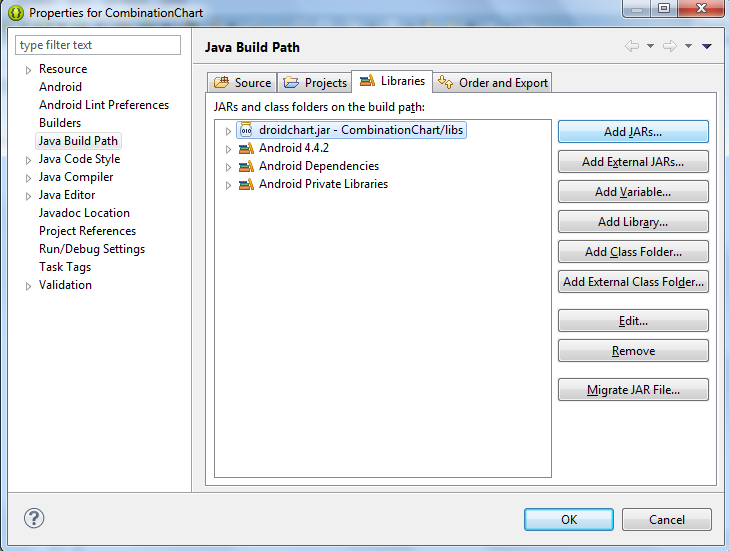
Adding a JAR library to an Android application project
III. Declaring the chart
Time to declare the chart in the layout of the application. We build a simple application, where the chart will be the only thing that shows. So, we edit the activity_main.xml file, which is found in res -> layout folder in the project tree for the CombinationChart application.
We change the layout to Linear and we introduce a new xml node – chart. The chart node refers to a class found in the com.mindfusion.charting namespace.
<LinearLayout xmlns:android="http://schemas.android.com/apk/res/android"

xmlns:tools="http://schemas.android.com/tools"

xmlns:chart="http://schemas.android.com/apk/lib/com.mindfusion.charting"

...
Then we declare the chart:
<com.mindfusion.charting.AxesChart
android:id=”@+id/combi_chart”
android:layout_width=”fill_parent”
android:layout_height=”wrap_content”
chart:gridType=”horizontal”
chart:titleOffset=”40dp”
chart:titleHeight=”40dp”
chart:labelHeight=”12dp”
tools:context=”.MainActivity” />
We name it combi_chart. This is important because we’ll use the name to retrieve the chart object in the next step.
IV. General chart settings.
In this step we’ll set the general chart settings. First, we get the chart object, which is declared in the layour (see previous step).
private AxesChart chart;

....

chart = (AxesChart)findViewById(R.id.combi_chart);
Then we set the title and the offset of the title e.g. the space between the title and the plot are for the chart. We also set the height of the font for the title labels and the other labels at the chart.
chart.setTitle("Visitors in Paradise Hotels");

chart.setTitleOffset(50f);

chart.setTitleHeight(30f);

chart.setLabelHeight(20f);
V. The grid.
Our chart has a crossed grid with light gray grid stripes. This is set with the following code:
ArrayList gridStrokes = new ArrayList();

gridStrokes.add(Color.rgb(207, 207, 207));

chart.setGridStrokeColors(gridStrokes);
chart.setGridType(GridType.Crossed);
VI. The axes.
The X-axis has 10 intervals. Each division has its own label. We set the label type to custom text, specify the labels and customize the min and max numbers to be shown:
chart.xAxisSettings.setMin(0f);

chart.xAxisSettings.setMax(10f);

chart.xAxisSettings.setInterval(1f);

chart.xAxisSettings.setLabelType(AxisLabelType.Custom);
ArrayList xLabels = new ArrayList();

Collections.addAll(xLabels, "2005", "2006", "2007", "2008", "2009", "2010", "2011", "2012", "2013", "2014");

chart.xAxisSettings.setLabels(xLabels);
The Y-axis has no custom labels, it just shows the value intervals. But it has a title. Here is how we set it:
chart.yAxisSettings.setMin(0f);

chart.yAxisSettings.setMax(30f);

chart.yAxisSettings.setInterval(10f);

chart.yAxisSettings.setLabelType(AxisLabelType.Scale);

chart.yAxisSettings.setTitle("in thousands");
VII. The bar series.
The first series is a bar series. We create a new instance of the BarSeries class and add 10 x and y float numbers, which will be used to calculate the size and location of the bars:
BarSeries series1 = new BarSeries();
ArrayList xData = new ArrayList();
for(int i = 0; i < 10; i++)
xData.add((float)i);
series1.setXData(xData);
ArrayList yData1 = new ArrayList();

Collections.addAll(yData1, 15f, 17f, 18f, 19f, 18.4f, 16.4f, 12f, 17f, 18.7f, 19.1f  );

series1.setYData(yData1);
The next thing to do is to specify the colors for the bars and their outlining. The library has the FillColors and StrokeColors property, which we use:
ArrayList fillColors1 = new ArrayList();

fillColors1.add(Color.rgb(174, 200, 68));

series1.setFillColors(fillColors1);
ArrayList strokeColors1 = new ArrayList();

strokeColors1.add(Color.rgb(115, 133, 45));

series1.setStrokeColors(strokeColors1);
Let’s not forget to add the ready series to the collection of series.
chart.addSeries(series1);
VIII. The line series with scatters.
The line series is an instance of the LineSeries class, where we set the ScatterType and LineType properties:
LineSeries series2 = new LineSeries();

series2.setScatterType(ScatterType.Circle);

series2.setLineType(LineType.Line);

series2.setScatterSize(20f);

...

chart.addSeries(series2);
The ScatterFillColors and ScatterStrokeColors are used for setting the colors of the scatters. The properties for the line are the same as with the bar series: StrokeColors.
IX The area series.
The area series has a different line type than the scatter series. We don’t set the scatter type here since its set to “None” by default.
The data in both line series is set in the same way as in the bar series and we don’t cite it again.
LineSeries series3 = new LineSeries();

series3.setLineType(LineType.Area);

...

chart.addSeries(series3);
Here is the final chart:
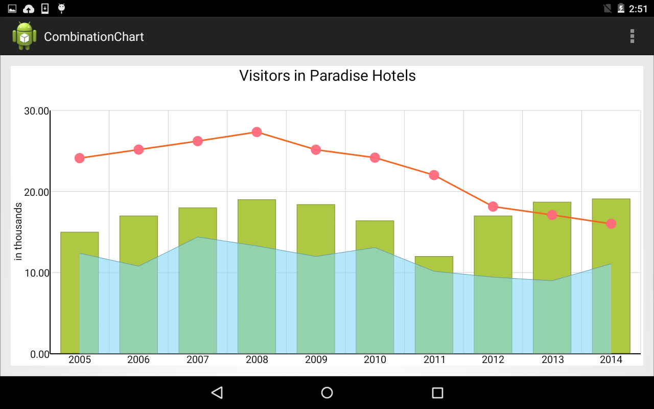
An elegant combination chart for Android mobile devices.
The sample is available for download from here:
Download Android Combination Chart Sample
Read more about MindFusion Charting for Android library here.