In this blog post we are going to look at the most common adjustments in the appearance of a timetable that developers want to make based on the questions we have received regarding MindFusion Scheduler library for Java Script.
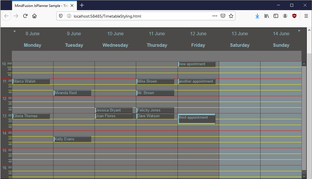
Here is how our timetable will look at the end:

I. General Looks
The overall appearance of the scheduling library is controlled by themes. MindFusion Scheduler comes with a collection of 9 predefined themes. In order to apply a theme you need to:
- add a reference to the CSS file in the web page where you want the calendar to appear:
<link rel="stylesheet" type="text/css" href="themes/gray.css">
- assign the name of the theme to the theme property of the Calendar class:
calendar.theme = "gray";
Themes can change dramatically the color scheme of the control including the forms that appear for item creation. We recommend that you choose the theme that is most closely related to the colors you want to see and customize it, if necessary.

Each of the themes is in a CSS file and you can search by the color code and replace the occurrences of a given color with another one to fine-tune the color scheme.
II. Timetable Settings
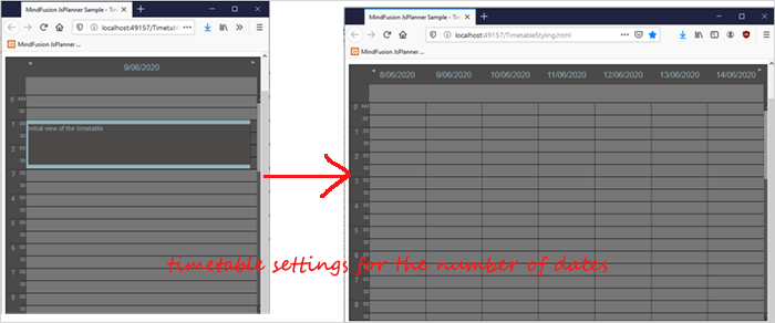
Initially, a timetable renders only one day – today. The timetableSettings property, just like the *settings properties for all views supported by the Calendar (—SingleMonth, RespurceView, MonthRange etc.) expose the properties that let you customize the look of the calendar.
In the case with the timetableView, the number of columns that are rendered depends on the number of dates added to the dates propеrty of timetableSettings In our case we want to show the week, so we add 7 dates:
//get the current date
var currDay = schedule.DateTime.today();
calendar.timetableSettings.dates.clear();

for (var i = 1; i < 8; i++) {
	calendar.timetableSettings.dates.add(currDay.addDays(-1 * currDay.dayOfWeek + i));
	}
}

We also want to scroll week by week. By default the timetable scrolls with one day. In order to scroll more you need to set the scrollStep property to a bigger number:
calendar.timetableSettings.scrollStep = 7;
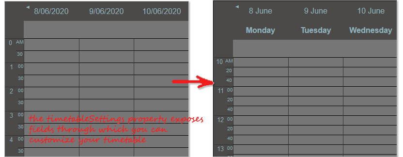
The next thing that we need is to change the time scale. We want the scales to be per 20 minutes and we want to cover the time interval from 10 to 16 o’clock. These is regulated with the startTime and endTime fields of timetableSettings These properties take as an argument the number of minutes. So, if you want your day to start at 8 o’clock your start time needs to be 8×60=480 minutes or you need to assign 480 as value to the startTime property.
// set the start time to 10:00 AM
calendar.timetableSettings.  = 600;
// set the end time to 16:00 PM
calendar.timetableSettings.endTime = 1020;
What we want to specify is the format of the header. The default format is based on the locale settings of the user that runs the application. In our application the date in the timetable header renders as DD/MM/YYYY. We will use the titleFormat property. We also use cellTime to change the time scales between each two hours. The default value is 30 minutes. We change it to 20 with the cellTime property.
calendar.timetableSettings.titleFormat = "d MMMM
 dddd";
calendar.timetableSettings.cellTime = schedule.TimeSpan.fromMinutes(20);
calendar.timetableSettings.cellSize = 20;

We also increase the cell size – this is the height of rows that are defined by each 20-minute interval. The calendar also shows just one header – that with the dates. We want to render the days header, which shows the day of the week. The property for that is showDayHeader
calendar.timetableSettings.showDayHeader = true;
III. CSS Styling
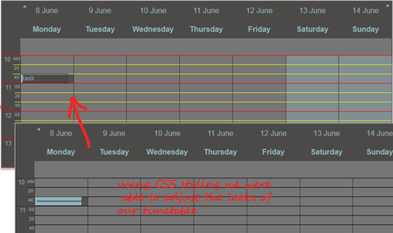
We’ve customized our timetable as much as we could through the properties and fields of the Calendar control. We would like to add some additional styling, which can be done through css. We use the style inspector of the browser to identify the styles that are applied on the elements that interest us. We would like to show the lines that separate 20 minute cells in yellow and the lines that separate hours in red. Let’s start with the hour lines. The css to render them in red is this one:
.mfp-timetable-view .mfp-content .mfp-column .mfp-cell-wrap:nth-child(3n+1) .mfp-cell {
			border-top: 1px solid red;
}
The class that styles cells is called mfo-cell-wrap. This class regulates the styling for all cells, so we need to apply red border only on the cells that interest us, and they are the 1st, 4th, 9th etc. cell. We want the rest of the cells to be yellow. This is done with the CSS “not” keyword:
.mfp-timetable-view .mfp-content .mfp-column .mfp-cell-wrap:not(:nth-child(3n+1)) .mfp-cell {
			border-top: 1px solid yellow;
	}
This colors the rows of the timetable red/yellow but does not color the delimeters between the time scales. They are regulated by another CSS class and are div elements:
.mfp-timetable-view.gray .mfp-header-timeline .mfp-group-time div:not(:first-child)
	{

		border-top: solid 1px yellow;
	}

	.mfp-timetable-view.gray .mfp-header-timeline .mfp-hour
	{
		border-top: solid 1px red;
	}
Note that the CSS style names are with the suffix “gray”. This is the name of the theme. In many cases the class that needs to be changed is bound to a certain theme.
The last thing that we want to add as styling is a background for the weekend days. We use again the nth-child CSS property. This time the “children” are the 6th and 7th element, so we define styles for them:
.mfp-timetable-view .mfp-content .mfp-column:nth-child(5n + 6), .mfp-column:nth-child(5n + 7) {
			background-color: rgba(145, 179, 188, 0.4);
		}
We note one more thing. When we create an appointment, the text of the subject is not visible because the line height is too small for the item styling. We have two options: either to increase the cell height, which is set with cellSize and is 20 or to style the item, so that the subject is visible. We choose the latter. We will make the resize line-s smaller because that’s what hiding the subject: the big resize lines:
.mfp-item-vertical-detail .mfp-subject {
	flex-shrink: 0 !important;
}

.mfp-item-vertical-detail .mfp-resize-start,
.mfp-item-vertical-detail .mfp-resize-end {
	flex-shrink: 1 !important;
}
Here is the final result:

You can download the sample with all libraries ued and the full source code from this link:
Styling a Timetable in the JavaScript Scheduler
You can post technical questions, comments and recommendations about MindFusion Scheduling for JavaScript at the library online forum.
About Scheduling for JavaScript: MindFusion Js Scheduler is the right solution for all applications that need to render interactive timetables, rich event calendars, lists with appointments or resources. Fully responsive, highly customizable and easy to integrate, you can quickly program the JavaScript scheduling library according to your needs. The library supports a variety of export options, styling through themes, 6 calendar views and much more. Find out more at https://mindfusion.eu/javascript-scheduler.html
