A Poll Chart: A Stacked Bar Chart in Java Swing that Represents Results of a Survey – II

Here is a link to Part I: Overview of chart elements, the dashboard, plot and axes.

I. Bars Rendering

The bar graphics is rendered by a BarStackRenderer. It requires a collection of Series and we add four:

private ObservableList createSeries()
   {
      // Important series
	BarSeries series1 = new BarSeries(
	Arrays.asList(40.0, 30.0, 52.0, 62.0),
	Arrays.asList("20%", "15%", "26%", "31%"),
	null /* no top labels */);
        
        ............

  }

Each BarSeries has a list with the data, a list with the inner labels and no top labels. The BarStackRenderer renders in a single bar the values from the same index in each BarSeries e.g. the first bar renders the first double value in all BarSeries, the second bar renders the values on the second position in the series and so on. The BarRenderer itself has a few customizations:

barRenderer = new BarStackRenderer (createSeries());
barRenderer.setHorizontalBars(true);
barRenderer.setBarSpacingRatio(0.3);
barRenderer.setYAxis(yAxis);
barRenderer.setXAxis(xAxis);
barRenderer.setShowDataLabels(EnumSet.of(LabelKinds.InnerLabel));
barRenderer.setLabelFontSize(12.0);

Let’s not forget to add it to the Plot2D:

plot.getSeriesRenderers().add(barRenderer);

II. The Annotations

The labels at the X and Y axis are actually annotations – they are created by AnnotationRenderer instances. An AnnotationRenderer needs a collection of Series. For the Y-axis we use a SimpleSeries instance, which is created and used for the annotations and does not provide data for the bars:

private ObservableList createAxisLabels()
{
   return FXCollections.observableList(Arrays.asList(
	new SimpleSeries(null, null)
	{
        	public String getLabel(int index, LabelKinds kind)
		{
			return axisLabels[index];
		}
	
		public double getValue(int index, int dimension) { return index; }
			
		public int getSize() { return axisLabels.length; }

		public int getDimensions() { return 1; }

		public EnumSet getSupportedLabels() {
	        	return EnumSet.of(LabelKinds.YAxisLabel);
		}
				
		final String[] axisLabels = {
			"Accomodation", "University\nLocation", "Tuition\nPrice", "Quality of\nEducation" };
		}
	));
}

Here we indicate that this SimpleSeries provides labels for the YAxis with the getSupportedLabels override, which in our case returns LabelKinds.YAxisLabel. The label is returned by the getLabel method.

The annotations on the X-axis are rendered by a special class called CustomBarSeries. We implement the Series interface to return a set of predefined labels for each data value in this series:

public CustomBarSeries(List values, List innerLabels, List topLabels) {
	super(values, innerLabels, topLabels);
		
	this._values = values;
	double sum = 0;
	_stackedValues = new ArrayList(values.size());
		
	for(double val : values)
	{
	   sum += val;
	  _stackedValues.add(sum);
	}
	this._innerLabels = innerLabels;
	
}

We also take into consideration that the values rendered by the bar chart where this class is used are stacked – so we sum them and return the summed value when asked:

public double getValue(int index, int dimension) { 
		
	if( dimension == 0)
	  return _stackedValues.get(index);
	
        return _values.get(index);			
}

Then we return the predefined label at the given position and :

public String getLabel(int index, LabelKinds kind)
  {
	if(kind.equals(LabelKinds.InnerLabel))
	{
		return _innerLabels.get(index);
	}

	//else return the labels
	return axisLabels[index];
}
	
       final String[] axisLabels = {
		"Very Important", 
		"Somewhat\nImportant", "Slightly\nImportant", 
		"Not\nImportant" };

We create an instance of this CustomBarSeries and we assign it to the new AnnotationRenderer, that is responsible for the labels at the X-axis:

List sl = new ArrayList();
	sl.add(new CustomBarSeries(
	        Arrays.asList(25.0, 50.0, 50.0, 50.0),
		null,
		null));
	javafx.collections.ObservableList olss = FXCollections.observableList(sl);
	annotationRenderer1 = new AnnotationRenderer(olss);
	annotationRenderer1.setSeries(olss);

Let’s not forget to bind the AnnotationRenderer to the X-axis:

annotationRenderer1.setXAxis(xAxis);
annotationRenderer1.setShowDataLabels(EnumSet.of(LabelKinds.XAxisLabel));

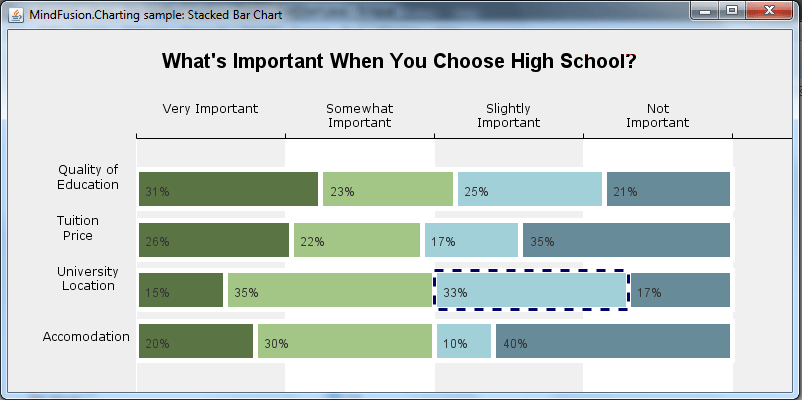
Here is the final chart:

A stacked bar chart in Java Swing

Poll chart in Java Swing

That’s the end of this tutorial. Here is the link to download the full sample.

Download The Stacked Bar Chart in Java Sample

About Charting for Java: MindFusion.Charting for Java Swing is a multipurpose graphics library that lets you create and customize a large variety of chart types: bar, column, pie, doughnut, radar, polar etc., candlestick financial charts, gauges and dashboards with dynamic layout of their components. The library boasts a smart API which lets you combine and arrange multiple lots, axes, legends, images and other chart components. The chart appearance can be customized on multiple levels – from properties applied on a single element to global themes reused by all charts and series. Charts use a uniform Series interface for reading data and labels. You can implement the interface and create custom Series that matches your data source. Written in pure Java, this tool provides every type of Java Swing application with powerful charting capabilities. Read more about the component from here.

Ticket Booking System

In this blog post we will create a sample ticketing software that will allow users to select events and book tickets for them. We will use the MindFusion Diagramming and Scheduling components for WinForms. The tutorial is divided int two parts:

I. The Controls

We create a WinForms application in VisualStudio and add a new folder ‘Assemblies’ with the dll-s that we want to use. There we copy:

  • MindFusion.Common.dll
  • MindFusion.Common.WinForms.dll
  • MindFusion.Diagramming.dll
  • MindFusion.Diagramming.WinForms.dll
  • MindFusion.Licensing.dll
  • MindFusion.Scheduling.dll

Then we click on the Toolbox pane -> Choose Items -> Browse and we add the MindFusion.Diagramming.WinForms and MindFusion.Scheduling dll-s. They add a list of components, but we select the DiagramView and the Calendar controls and drop them onto the form. The DiagramView creates automatically the diagram instance that it renders.

II. The Hall Layout

The hall layout is rendered by the flowchart control. We use a special method that we’ve named CreateSection to create and arrange a section in the hall. The declaration of the method is:

void CreateSection(int[] seatsPerRow,
            float topY, float seatWidth, float seatHeight,
            float xPadding, float yPadding, float arcRadius)

We provide the method with an array of integers that indicate the number of seats on each row in the section. Then is the offset to the top and the size of each seat. The xPadding and yPadding arguments indicate the space between two adjacent seats. The last argument indicates how curved the row of seats is.

What the method generally does is calculate the location of each seat and generate a node with these coordinates and given size:

 float y = topY;
     for (int r = seatsPerRow.Length - 1; r >= 0; r--)
        {
           var c = new PointF(0, y + arcRadius);
           int seats = seatsPerRow[r];
           float rowWidth = seats * seatWidth + (seats - 1) * xPadding;
           float x = -rowWidth / 2;
     
           for (int s = 0; s  0)
                  {
                     float angle = 0;
                     float radius = 0;
                     MindFusion.Geometry.Geometry2D.Convert.CartesianToPolar(
                         c, new PointF(x, y), ref angle, ref radius);
                     adjustedY = c.Y - arcRadius * Math.Sin(angle * Math.PI / 180);
                  }
                 diagram.Factory.CreateShapeNode(
                     x, (float)adjustedY, seatWidth, seatHeight);
                     x += seatWidth + xPadding;
               }
               y += seatHeight + yPadding;
           }

The nodes are created with Factory.CreateShapeNode method which uses the Factory helper class of the diagram component. The CreateShapeNode method creates and adds the newly created nodes to the Nodes collection of the diagram.

III. The Calendar

The default settings of the Scheduling control give us exactly the month view with events we want to get. However we still need to add some customizations:

First, we won’t allow users to perform in-place edit of events on the calendar:

calendar.AllowInplaceEdit = false;

Then we will change the brushes for the calendar items and will hide the clock icons that appear at the header of events:

calendar.ItemSettings.Size = 10;            
calendar.ItemSettings.ShowClocks = MindFusion.Scheduling.WinForms.ShowClocks.Never;
calendar.ItemSettings.Style.Brush = new MindFusion.Drawing.SolidBrush (Color.FromArgb(102, 154, 204));
calendar.ItemSettings.Style.BorderBottomColor = calendar.ItemSettings.Style.BorderLeftColor =
                calendar.ItemSettings.Style.BorderRightColor = calendar.ItemSettings.Style.BorderTopColor = Color.FromArgb(192, 192, 192);
calendar.ItemSettings.SelectedItemStyle.Brush = new MindFusion.Drawing.SolidBrush (Color.FromArgb(206, 0, 0));
calendar.Selection.SelectedElementsStyle.Brush = new MindFusion.Drawing.SolidBrush(Color.FromArgb(224, 233, 233));

Now let’s create a few items:

Appointment event1 = new Appointment();
event1.StartTime = new DateTime(2017, 5, 2, 16, 0, 0);
event1.EndTime = new DateTime(2017, 5, 2, 18, 30, 0);
event1.HeaderText = "";
event1.DescriptionText = "Swan Lake";
event1.Tag = EventType.Ballet;
event1.Style.Brush = new MindFusion.Drawing.SolidBrush(Color.FromArgb(102, 154, 204));

calendar.Schedule.Items.Add(event1);

Our Appointment-s have a start and end time, description, brush according to the EventType and tag that indicates the type of event that is rendered. It would be nice to have tooltips that provide details about the event:

calendar.ShowToolTips = true;

This turns on tooltips on all calendar items. We want tooltips just on our events so we use the TooltipDisplaying event to hide the tooltips on items that are not events:

calendar.TooltipDisplaying += Calendar_TooltipDisplaying;
.....

}

private void Calendar_TooltipDisplaying(object sender, MindFusion.Scheduling.WinForms.TooltipEventArgs e)
{
  if(e.Element.GetType() != typeof(Appointment))
     {
       e.Tooltip = "";
     }
}

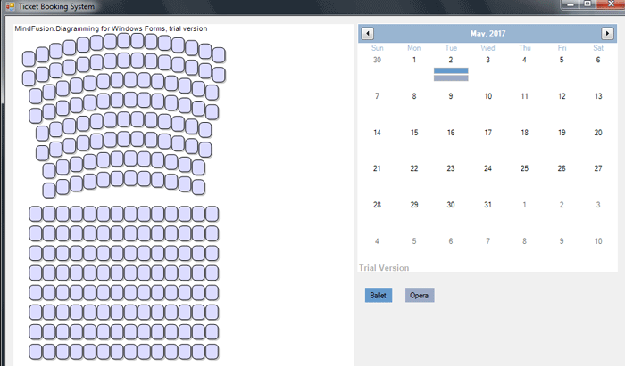
Here is a screenshot of the event ticketing system so far:

Event Ticket System with MindFusion WinForms Controls

Event Ticket System with MindFusion WinForms Controls

A download of the project with all necessary dll-s is available from this link:

Ticket Booking System in WinForms

The Scheduling for WinForms and Diagramming for WinForms components are part of MindFusion WinForms control suite – the perfect set of tools to help you build any type of WinForms software fast and easy. Find out more about MindFusion WinForms pack here.

A Poll Chart: A Stacked Bar Chart in Java Swing that Represents Results of a Survey

Part I: Overview of chart elements, the dashboard, plot and axes.

Part II : Bar series and their drawing, rendering of custom labels with AnnotationRenderer-s.

In this blog post we will build a horizontal stacked bar chart in Java. To build the chart we use the Java chart library. We want to add a few custom elements to the chart and that’s why we will use the Dashboard control that gives us complete control over the chart elements that we use and how to arrange them.

I. Chart Elements

We use the following chart elements:

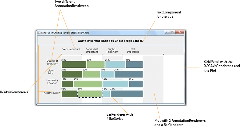
The image below gives you a visual presentation on how the components used are arranged:

The chart elements that build this stacked bar chart

The chart elements that build this stacked bar chart

The GridPanel has two rows and two columns. On the first row is the XAxisRenderer , that renders the X-axis, on the second row is the YAxisRenderer and the Plot with the BarStackRenderer .

II. The Dashboard

First, we create the Dashboard and add some styling to it with a Theme . The Theme class allows us to specify all appearance settings of a chart. We set only those that we want to use: the grid, the font:

Dashboard board = new Dashboard();
						
// set up appearance
Theme theme = board.getTheme();
theme.setPlotBorderStrokeThickness(0);
theme.setTitleBrush(new SolidBrush(Color.black));
theme.setGridColor1(Color.white);
theme.setGridColor2(new Color(240, 240, 240));
theme.setGridLineColor(new Color(255, 255, 255));

We add the TextComponent for the title and the GridPanel to the LayoutPanel of the Dashboard . The LayoutPanel is a vertical StackPanel and it arranges the elements exactly as we want them to appear:

board.getLayoutPanel().getChildren().add(title);
board.getLayoutPanel().getChildren().add(panel);

getContentPane().setLayout(new BorderLayout());
getContentPane().add(board, BorderLayout.CENTER);

We make sure the ContentPane of the JFrame that our Swing application uses applies the BorderLayout on the Dashboard and places it in the center which means it will stretch automatically when the user changes the size of the JFrame.

III. The Plot

The plot for the Chart is a Plot2D control. It will hold the BarRenderer and the two AnnotationRenderer -s. First, we set some general options: that the plot allows span, that it stretches in both directions and it will render a vertical grid.

//create the Plot2D
Plot2D out = new Plot2D();	
out.setAllowPan(true);
out.setHighlightStrokeDashStyle(DashStyle.Dash);
out.setHorizontalAlignment(LayoutAlignment.Stretch);
out.setVerticalAlignment(LayoutAlignment.Stretch);
out.setGridType(GridType.Vertical);

Then we go on with the styling options. The colors for the bars are set by a SeriesStyle class. We use an instance of the PerSeriesStyle which assings one brush and one fill for all elements in a single Series. We also set the HighlightStroke, which is the Brush that is used to highlight the bar that is selected:

List fills = fill();
List strokes = stroke();
out.setBackground(new SolidBrush(Color.white));
out.setVerticalScroll(true);
out.setSeriesStyle(new PerSeriesStyle(fills, strokes, Arrays.asList(5.0), null));		
out.setHighlightStroke(new SolidBrush(new Color(0, 0, 99)));

Finally we indicate the location of the plot in the GridPanel (more about the grid later):

//position in the grid
out.setGridColumn(1);
out.setGridRow(1);

IV. Axes

The axes are two – X and Y. The Y axis is present, but not visible. The X-axis is visible, aligned to the top and does not draw labels. The Axis are instances of the Axis class. They both use AxisRenderer instances to be drawn:

xAxis = new Axis();
xAxis.setMinValue(0.0);
xAxis.setMaxValue(300.0);
xAxis.setInterval(50);		
xAxis.setTitle("");		

The intervals of the axis are important because they determine the location of the grid stripes. The Axis sets some apperance properties like brush and font for the labels.

//the xAxisRenderer is bound to the xAxis
xAxisRenderer = new XAxisRenderer(xAxis);			
xAxisRenderer.setAxisStroke(new SolidBrush(Colors.Black));
xAxisRenderer.setAxisStrokeThickness(1.0);
xAxisRenderer.setLabelFontSize(12.0);
xAxisRenderer.setLabelBrush(new SolidBrush(Colors.Black));

Then comes the importnat part: we must tell this Axis that its labels come from an AnnotationRenderer , that it must not draw its intervals and that the labels are drawn above, rather than below the axis line:

//axis labels will be rendered by an AnnotationRenderer
xAxisRenderer.setLabelsSource(annotationRenderer1);
xAxisRenderer.setShowCoordinates(false);		
xAxisRenderer.setPlotBottomSide(false);

Finally, we specify its location and stretch settings:

//stretch this horizontal axis
xAxisRenderer.setHorizontalAlignment(LayoutAlignment.Stretch);
   	
//position in the Grid
xAxisRenderer.setGridColumn(1);
xAxisRenderer.setGridRow(0); 

The Y-axis is similar to the X-axis, so we won’t describe its settings here. Here is the final chart:

A stacked bar chart in Java Swing

Poll chart in Java Swing

This is the end of the Part I of this tutorial. In part II we’ll cover the BarRenderer with the BarSeries and the AnnotationRenderer-s. We will also briefly discuss the GridPanel.

You can download the complete source code of the sample from here:

Download The Stacked Bar Chart in Java Sample

About Charting for Java: MindFusion.Charting for Java Swing is a multipurpose graphics library that lets you create and customize a large variety of chart types: bar, column, pie, doughnut, radar, polar etc., candlestick financial charts, gauges and dashboards with dynamic layout of their components. The library boasts a smart API which lets you combine and arrange multiple lots, axes, legends, images and other chart components. The chart appearance can be customized on multiple levels – from properties applied on a single element to global themes reused by all charts and series. Charts use a uniform Series interface for reading data and labels. You can implement the interface and create custom Series that matches your data source. Written in pure Java, this tool provides every type of Java Swing application with powerful charting capabilities. Read more about the component from here.
A Funnel Chart in JavaScript

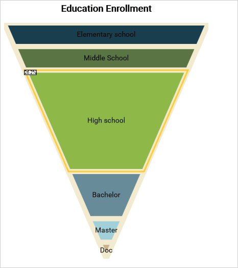
In this blog post we will create a funnel chart that demonstrates education enrollment. We will use the JavaScript chart library.

I. Chart Setup.

The Charting library requires a few JavaScript files, which we copy in a folder named Scripts. The files are:

  • config.js
  • MindFusion.Charting.js
  • MindFusion.Common.js
  • MindFusion.Gauges.js
  • require.js

Those files are redistributed with the chart library. If you plan to use different directory structure in your project you must edit the config.js file.

Now we create two files – an HTML page FunnelChart.html and a funnelchart.js file, which will contain the code for the chart. In the FunnelChart.html file we add two references:

<script type="text/javascript" src="Scripts/config.js"></script>
<script data-main="funnelchart" src="Scripts/require.js"></script>

One to the config file and the other to the require.js file. Note that the data-main attribute points exactly to the name of the javascript code-behind file that we’ll use to create and customize the chart.

II. Create the Chart

The chart needs a canvas and we add one to the web page:

<canvas id="funnelChart" width="400" height="500"></canvas>

The size determines the size of the chart, the id is important because we’ll use it to access the canvas from code.

The code for each JavaScript chart is in a single method:

define(["require", "exports", 'MindFusion.Charting'], function (require, exports, m) {
    "use strict";
    var Charting = m.MindFusion.Charting;
    var Controls = m.MindFusion.Charting.Controls;
    var Collections = m.MindFusion.Charting.Collections;
    var Drawing = m.MindFusion.Charting.Drawing;

    //create the chart
    var funnelChartEl = document.getElementById('funnelChart');
	
    var funnelChart = new Controls.FunnelChart(funnelChartEl);

     .......
     //chart customization
     .......
     .......
     funnelChart.draw();
});


The chart object is created with the help of the FunnelChart canvas element, which we get from the html page using the id.

III. Data

Data for the funnel chart is a single list with values. That is why we use the SimpleSeries class. It takes two arguments – one list with the data and one with the labels. We initialize the two arrays:

//initialize data and labels
var data = new Collections.List([100, 90, 80, 37, 17, 7]);
var labels = new Collections.List(["Elementary school", "Middle School", "High school", "Bachelor", "Master", "Doc"]);


Then we create the series and assign it to the series property of the funnelChart object.

//assign a series
funnelChart.series = new Charting.SimpleSeries(data, labels); 


IV. Appearance Customization

We don’t need a legend for the chart that is why we set:

funnelChart.showLegend = false;


A chart needs a title and we set one:

funnelChart.title = "Education Enrollment";


MindFusion JavaScript chart library has a flexible styling model, which allows us to customize the pens and brushes of a chart either directly through the theme property or through styles. A combination of both is possible and that’s what we’ll use. First, we will use the PerElementSeriesStyle for coloring the chart element. This style uses each of the Brush-es that were added to it to paint just one element from the chart. If necessary, the control cycles through the provided Brush -es.

var brushes = new Collections.List([	
	new Drawing.Brush("#193e4e"),
        new Drawing.Brush("#5a7444"),
        new Drawing.Brush("#8eb848"),
        new Drawing.Brush("#678b99"),
        new Drawing.Brush("#a1d0d8"),
        new Drawing.Brush("#c5b28a"),
		
	]);
	
	var seriesBrushes = new Collections.List();
	seriesBrushes.add(brushes);


The PerElementSeriesStyle expects a nested list with Brushes – because a chart can have many series with many elements into it. The same is true for the strokes, but we will add just one Brush, because we want all elements to have one common outlinig:

var strokes = new Collections.List([
	new Drawing.Brush("#f2ebcf"),
        ]);
	
var seriesStrokes = new Collections.List();
seriesStrokes.add(strokes);


We repeat the process for StrokeThickness-es and then we create the style object:

funnelChart.plot.seriesStyle = new Charting.PerElementSeriesStyle(seriesBrushes, seriesStrokes, serieStrokeThicknesses);


The theme property exposes many fields that help us customize our chart. We adjust the font and change the highlight stroke, which renders when a chart element is selected:

funnelChart.theme.titleFontSize = 18;
funnelChart.theme.titleFontName = "Roboto";
funnelChart.theme.titleFontStyle = Drawing.FontStyle.Bold;
	
funnelChart.theme.dataLabelsFontName = "Roboto";
funnelChart.theme.dataLabelsFontSize = 14;
	
funnelChart.theme.highlightStroke = new Drawing.Brush("#ffcc33");


V. Tooltips

We want our chart to render tooltips. The SimpleSeries does not include tooltips by default and we must do some code twisting to make it show them. First, we create a field tooltips, that is assigned to a list with the desired tooltips:

var tooltips = new Collections.List(["32.7%", "29.5%", "26.2%", "12%", "5%", "2%"]);
funnelChart.series.tooltips = tooltips; 


Then we have to override the supportedLabels property of the Series class to make it return LabelKinds.ToolTip in addition to LabelKinds.InnerLabel.

Object.defineProperty(m.MindFusion.Charting.SimpleSeries.prototype, "supportedLabels", {
            get: function () { return m.MindFusion.Charting.LabelKinds.InnerLabel | m.MindFusion.Charting.LabelKinds.ToolTip; },
            enumerable: true,
            configurable: true
 });


Finally, we must return the appropriate tooltip and the appropriate label, when asked. This is done by overriding the getLabel method of the SimpleSeries class.

m.MindFusion.Charting.SimpleSeries.prototype.getLabel = function (index, kind) {
	if ((kind & m.MindFusion.Charting.LabelKinds.ToolTip) != 0 && this.tooltips)
		return this.tooltips.items()[index];
	
	if (this.labels == null)
		return null;
	return this.labels.items()[index];
};


With that the work on our funnel chart is done and we can enjoy the result:

A Funnel chart in JavaScript

A Funnel chart in JavaScript

Complete source code including the libraries is available for direct download from the link below:

Download the Funnel Chart Sample

About MindFusion JavaScript Chart Library: MindFusion JS Chart is an interactive library for charts and gauges written purely in JavaScript. It supports all common chart types, multiple series, custom data,financial charts, funnel charts, a large selection of gauges and rich styling capabilities. The elegant architecture of the library allows you to create dashboards, charts with multiple different types of series in a single plot, unlimited number of axes, reusable styling themes, various oval and linear gauges. The innovative approach to data lets you define your own data classes by implementing a single interface.
The library also boasts a rich event set, zoom, pan, dragging of the legend and a set of many popular gauges. It is designed and implemented to provide JS developers with the perfect tool to create beautiful, interactive dashboards fast and easy. Download trial directly at http://mindfusion.eu/JavaScript.Chart.zip Get your license today at http://www.javascript-chart-buy.html

A Class Diagram Tool in Java with the Flowchart Library – II

This is the second part of MindFusion step-by-step tutorial on how to create a Java application that reads the contents of a *.jar file and renders class diagram of its API. In the previous blog post we looked at the UI elements that build the application – the UI, the legend panel, the diagram elements. Now we continue with reading the class data and building the class diagram.

I. Reading the Data

The data that we need – the name of the API member, its fields, its type – enum, class, interface as well inherited classes – is stored in a helper class that we’ve created for the purpose and that is called MemberInfo.java. It is a simple class that does nothing else than storing data:

 public MemberInfo( String name, String fullName )
    {
        this.name = name;
        this.fullName = fullName;

        //lists for the methods, fields and constructors.
        methods = new ArrayList();
        fields = new ArrayList();
        constructors = new ArrayList();
        inheritsFrom = "";
        packageName = "";
        isInterface = false;
        isEnum = false;
    }

There is a list with the methods, fields and constructors, as well properties for the name of the package, the class this class inherits from as well boolean values that indicate if this is an enum or interface.

For reading the data we use only classes and methods from the official Java packages – no third party tools or libraries:

      try
        {
            //try to open the jar
            JarFile jarFile = new JarFile(pathToJar);

            //explore the elements found in the *.jar.
            Enumeration e = jarFile.entries();

            URL[] urls = {new URL("jar:file:" + pathToJar + "!/")};
            URLClassLoader cl = URLClassLoader.newInstance(urls);
            //if a class is found - read its data
            while (e.hasMoreElements())
            {
                JarEntry je = e.nextElement();
                if (je.isDirectory() || !je.getName().endsWith (".class")) {
                    continue;
                }
                // -6 because of .class file extension.
                String className = je.getName().substring(0, je.getName().length() - 6);
                className = className.replace('/', '.');
                .....

In a cycle we read all classes in the jar, parse the data we are interested in and filter data that is no relevant to us – private methods, abstract classes etc. The data we acquire for each class is stored in a new MemberInfo object that we add to a collection.

II. Diagram Elements

The diagram elements that we use to render each class are TableNode-s. We use the caption field to show the name of the class. In addition, we use the capabilities of the Java diagram library to render formatted text and add to the caption the name of the package – drawn on a new line.

            //create the TableNode
            TableNode _table = diagram.getFactory().createTableNode(10, 10, 5, 5, 2, info.memberCount());
            //set the name of the member and the package as table caption.
            String caption = "" + info.getName() + "";
            if(info.getPackageName().length() > 0)
                caption += "\n" + info.getPackageName();
            _table.setCaption(caption);
            //center the caption
            _table.setCaptionFormat((new TextFormat(Align.Center, Align.Center)));
            //increase the default caption height
            _table.setCaptionHeight(10f);
           .....

It is important to note here that we add an identifier for each table – this will help us find the right TableNode when we later create connections:


 _table.setId(info.getFullName());

By default TableNode-s are drawn with blue. We check if the current object is enum or interface and change the color scheme accordingly:

            //add enums to the list and paint them green
            if(info.isEnum()) {
                _table.setBrush(new SolidBrush(new Color((int) 210, (int) 250, (int) 208)));
                enums.add(_table);
            }//add interfaces to the list and paint them yellow
            else if(info.isInterface()) {
                _table.setBrush(new SolidBrush(new Color((int) 250, (int) 235, (int) 140)));
                interfaces.add(_table);
            }
            else //the class nodes are blue
                _table.setBrush(new SolidBrush(new Color((int)197, (int)223, (int)238)));

Then we add table rows for the constructors, methods and fields. Each row has a cell for the image and for the definition of the member:

            //fill the first cells with data for the constructors.
            for (String constructor : info.getConstructors())
            {
                _table.getCell(0, index).setImage(constructorImage);
                _table.getCell(1, index).setText(constructor);
                index++;
            }

Finally, we look at all MemberInfo objects and draw DiagramLink between each class and the class it derives from, if any:

  for (MemberInfo info : membersList)
        {
            if(!info.getParent().isEmpty())
            {
                DiagramNode node = diagram.findNodeById (info.getFullName());
                DiagramNode parent = diagram.findNodeById( info.getParent());

                //add inheritance link
                if(node != null && parent != null)
                {
                    DiagramLink link = diagram.getFactory ().createDiagramLink(node, parent);

                .......

III. Containers

Interfaces and enums are drawn in groups at the end of the TableNode-s for classes. This is done using ContainerNode-s. First, we calculate the dimensions of the ContainerNode by measuring all TableNode-s that must fit into it:

            //calculate the location of the node
            int side = (int)Math.ceil(Math.sqrt(tables.size()));
            int rows = (int)Math.ceil((double)tables.size() / side);
            double singleWidth = tables.get(0).getBounds().getWidth();
            double width = 5 * (side + 1) * coef + singleWidth * side;
            double height = (5 * (rows + 1) + 5) * coef;

            double[] rowHeights = new double[rows];
            for (int i = 0; i < tables.size(); i++)
                rowHeights[i / side] = Math.max(tables.get(i).getBounds().getHeight(), rowHeights[i / side]);

            for (double h : rowHeights)
                height += h;


            //initialize the container
            ContainerNode b = diagram.getFactory().createContainerNode (0, 0, width, height);
            ....

Here the variable tables is a list with the TableNode-s that must fit into the container. After the ContainerNode is created, the tables must be added and positioned in it:

            int index = 0;
            for (TableNode e : tables)
            {
                b.add(e);

                double x = (index % side) * (5 + singleWidth);
                double y = 0;

                for (int r = 0; r < index / side; r++)
                    y += 5 * coef + rowHeights[r];

                //adjust the size of the node
                e.setBounds(new Rectangle2D.Double(x + 5 * coef, y + 10 * coef,                   e.getBounds().getWidth(), e.getBounds ().getHeight()));

                index++;
            }

Finally we adjust the appearance of the ContainerNode to make it look better and in line with the TableNode-s:

            //customize the container
            b.setCaption(name);
            b.setCaptionFormat((new TextFormat(Align.Center,  Align.Center)));
            b.setHandlesStyle( HandlesStyle.HatchHandles3 );
            b.setFont(new Font("Verdana", Font.BOLD, 4));
            b.setIgnoreLayout(true);
            b.setTag(tag);
            //no shadow
            b.setShadowOffsetX(0f);
            b.setShadowOffsetY(0f);

It’s important to note that the bounds of the container must be updated for the changes to take effect:

            //update the container size.
            b.updateBounds();

IV. Diagram Layout

The last part of the application deals with diagram layout. This is very important because in the common scenario we expect to read *.jar files with tens of classes and proper visual arrangement of the flowchart is the key to its usability.

We decide to use the TreeLayout, which is meant exactly to arrange diagrams with nodes on several levels as we expect the class hierarchies to be. It is easy to apply the layout – we create an instance of it and after setting some initial customization we call its arrange method:

         TreeLayout layout = new TreeLayout();

        //the layout type is Centered
        layout.setType(TreeLayoutType.Centered);
        //allow reversed links
        layout.setReversedLinks(true);
        //the type of links will be cascading
        layout.setLinkStyle(TreeLayoutLinkType.Cascading3);
        //specify the distance between levels of tree nodes
        layout.setLevelDistance(25);
        //groups must be preserved.
        layout.setKeepGroupLayout(true);

        layout.arrange(diagram);

It is easy to understand the type of the settings we’ve used – thanks to the self-explanatory names of the layout class you can see that we specify that the TreeLayout will be centered, the links will be reversed, then we change the link style and the distance between levels. Finally, we specify that the layout of groups must be preserved.

The interesting part is at the end. We must find the ContainerNode-s with the enums and interfaces and move them to the end of the diagram. Here is how:

        // Place enums and delegates at the end
        DiagramNode enums = diagram.findNode(":enums");
        DiagramNode delegates = diagram.findNode(":interfaces");

        double x = 0;
        //calculate the location of each node to find out the last one
        for (DiagramNode node : diagram.getNodes())
        {
        	if (node instanceof TableNode)
            {
        		x = Math.max(x, node.getBounds().getX() +  node.getBounds().getWidth());
            }
        }

        //move enums to the right of the last class node.
        if (enums != null)
        {
            enums.moveTo((float)x + 5f, (float)5);
            x = enums.getBounds().getX() + enums.getBounds().getWidth ();
        }

        if (delegates != null)
        {
            delegates.moveTo((float)x + 5, 5);
        } 

We cycle through each TableNode and always move the containers to the end of the rightmost TableNode that we find. Let’s not forget to resize the diagram after we are done:

 
diagram.resizeToFitItems(5);

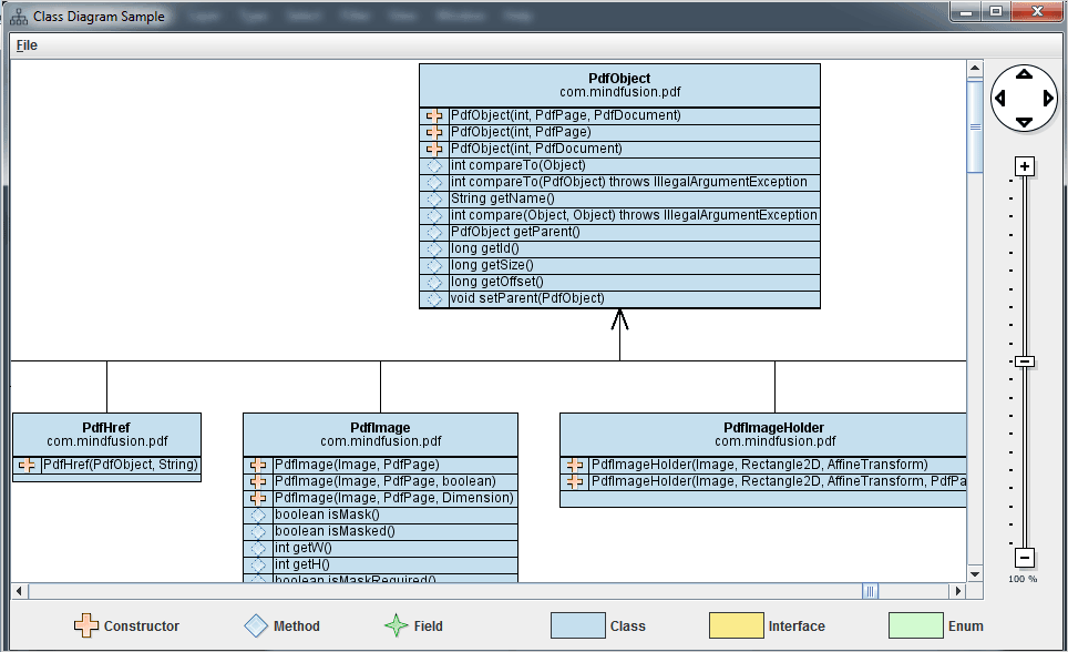
With this our application is ready and we test it with an arbitrary *.jar file. Here is the result:

Class Diagram Application in Java

Class Diagram Application in Java

You can download the complete source code of the sample from here:

Download the Class Diagram Tool in Java Application

MindFusion support team welcomes your questions about the Java diagram library or any other of our programming tools at the discussion board or per e-mail at support@mindfusion.eu

About Diagramming for Java Swing: MindFusion.Diagramming for Java Swing provides your Java application with all necessary functionality to create and customize a diagram. The library is very easy to integrate and program. There are numerous utility methods, rich event set, more than 100 predefined shapes. The tool supports a variety of ways to render or export the diagram, advanced node types like TreeView nodes, hierarchical nodes, tables, container nodes and many more. There are 15 automatic layouts, various input / output options and fully customizable appearance. A detailed list with JDiagram’s features is uploaded here. You can check the online demo to see some of the functionality implemented.

Diagramming for Java Swing is royalty free, there are no distribution fees. Licenses depend on the count of developers using the tool – check here the prices.