Multi Series Line Chart With Custom ToolTips in JavaScript

In this blog post we will build a line chart with 4 different series and custom labels on both axes. The chart renders tooltips with custom formatting. You can see the chart online here:

I. Initial Setup

We start by creating a blank HTML page and there we initialize the HTML Canvas element that will be needed by the Js Chart library.

<canvas id="chart" style="width: 100%; height: 100%; display: block;">

You can initialize the canvas as you want – there are no special requirements as to the size, position, scroll settings or anything else. What is important is that you add an id for that canvas – it will be used by the chart library. At the bottom of the page, right before the closing BODY tag we add a reference to the charting JavaScript files that represent the chart library:

<script type="text/javascript" src="Scripts/MindFusion.Common.js"></script>
<script type="text/javascript" src="Scripts/MindFusion.Charting.js"></script>

We also add a reference to another JavaScript file called LineChartTooltips.js. We haven’t created it yet, but this will be the file that will hold the JavaScript code for our chart.

<script type="text/javascript" src="LineChartTooltips.js">

II. Initializing the Line Chart In the LineChartTooltips JavaScript file we first include a reference to the Intellisense file so we can use code completion.

/// <reference path="Scripts/jspack-vsdoc.js"></reference>

Then we add mappings to the namespaces that we want to use:

var Controls = Charting.Controls;
var Collections = Charting.Collections;
var DateTimeSeries = Charting.DateTimeSeries;
var Drawing = Charting.Drawing;
var ToolTip = Charting.ToolTip;

Now we create the JavaScript chart object. We need a reference to the HTML canvas element, which we get using its id:

var chartEl = document.getElementById('chart');
chartEl.width = chartEl.offsetParent.clientWidth;
chartEl.height = chartEl.offsetParent.clientHeight;

We use the clientWidth and clientHeight properties of the offsetElement for the chart to give the chart its size.

Next we create the LineChart control and set its title and subtitle.

// create the chart
var lineChart = new Controls.LineChart(chartEl);
lineChart.title = "Women as a percentage in all S&E occupations";
lineChart.subtitle = "1993-2010";

III. Labels

The labels for the X and Y axes are set with two lists:

var xlabels = new Collections.List([
    "1993", "1995", "1997", "1999", "2003", "2006",
    "2008", "2010"]);

var ylabels = new Collections.List([
    "0%", "10%", "20%", "30%", "40%", "50%",
    "60%", "70%"]);

By default the labels at the axes are the intervals. We can replace them with the labels of a given chart series by using the supportedLabels property. This property tells the control at which chart element the labels of the series should be rendered – X or Y axis, tooltip, data labels etc. The members are from the LabelKinds enumeration.

The LineChart control uses series that support X and Y values. The best match is the Series2D class. This class supports one list with labels, which are always drawn at the data points. The easiest thing for us to do is to customize the Series2D and make it accept two lists with labels, which we will show them on both axes. Here is how we create the custom class by inheriting from Series2D

SeriesWithAxisLabels = function (xValues, yValues, xLabels, yLabels) {
    this.yLabels = yLabels;
    Charting.Series2D.apply(this, [xValues, yValues, xLabels]);
};

SeriesWithAxisLabels.prototype = Object.create(Charting.Series2D.prototype);

Our custom class is called SeriesWithAxisLabels. It accepts two lists with labels in the constructor. With one of them we call the constructor of the base class. The other we assign to a new property called yLabels.

Now we need to override the getLabel method and return the right label for the X and Y axis.

SeriesWithAxisLabels.prototype.getLabel = function (index, kind) {
    if ((kind & Charting.LabelKinds.XAxisLabel) != 0 && this.labels)
        return this.labels.items()[index];

    if ((kind & Charting.LabelKinds.YAxisLabel) != 0 && this.yLabels)
        return this.yLabels.items()[index];
   
    return "";
};

The getLabel method is responsible for providing the correct label according to the kind of labels that is requested. Here we check if we are asked for a label at the X or Y axis and return the label with the correct index from the xLabels or yLabels arrays. Here is how we create that series, which serves only to provide labels for the axes:

var series0 = new SeriesWithAxisLabels(
    new Collections.List([1, 2, 3, 4, 5, 6, 7, 8]),
    new Collections.List([0, 10, 20, 30, 40, 50, 60, 70]),
    xlabels, ylabels
);
series0.supportedLabels = Charting.LabelKinds.XAxisLabel | Charting.LabelKinds.YAxisLabel;
lineChart.series.add(series0);

Note that the data for the X and Y values of series0 corresponds to the positions on the axes where the labels should be rendered.

IV. Data

The data for the chart is provided by two series. They are also of type Series2D However, we do not want them to render the labels at the data points, which is their default behaviour. We would customize once again the Series2D class and make the labels be used for tooltips and not the data points.

We define a new SeriesWithToolTip class that overrides Series2D

SeriesWithToolTip = function (xValues, yValues, labels) { 
    Charting.Series2D.apply(this, [xValues, yValues, labels]);
};

SeriesWithToolTip.prototype = Object.create(Charting.Series2D.prototype);

The difference is the getLabel method. When asked for a label for the tooltip it returns the label at the given position from the series’ labels list:

SeriesWithToolTip.prototype.getLabel = function (index, kind) {
    if ((kind & Charting.LabelKinds.ToolTip) != 0 && this.labels)
        return this.labels.items()[index];   

    return Charting.Series2D.prototype.getLabel.apply(this, [index, kind]);
};

We create a data series from the SeriesWithToolTip kind this way:

//first series
var series1 = new SeriesWithToolTip(
    new Collections.List([1, 2, 3, 4, 5, 6, 7, 8]),
    new Collections.List([21.3, 21.5, 21.7, 23, 26.3, 26.1, 26.3, 27.5])
);

series1.title = "All S&E occupations";
var tooltips = new Collections.List();

for (let step = 0; step < series1.yData.count(); step++) {
    tooltips.add(series1.title + " for " + xlabels.items()[step] + ": " +
        series1.yData.items()[step] + "%");
}
series1.labels = tooltips;
series1.supportedLabels = Charting.LabelKinds.ToolTip;
lineChart.series.add(series1);

We generate the tooltip in a list, because we want the text to combine data from the xLabels and its yData list.

V. Styling the Chart

the JavaScript Chart library supports several styles to be applied on the chart depending on what you want to achieve. In our case the best choice is the PerSeriesStyle class, which colours all the elements of a Series with the subsequent brush from its strokes and fills collections.

// create line brushes
var firstBrush = new Drawing.Brush("transparent");
var secondBrush = new Drawing.Brush("#EA3F36");
var thirdBrush = new Drawing.Brush("#1A3D95"); 
var fourthBrush = new Drawing.Brush("#717173");
var fifthBrush = new Drawing.Brush("#407D39");

var style = new Charting.PerSeriesStyle();
style.fills = style.strokes = new Collections.List([firstBrush, secondBrush, thirdBrush, fourthBrush, fifthBrush]);
style.strokeDashStyles = new Collections.List([Drawing.DashStyle.Dash, Drawing.DashStyle.Dash,
Drawing.DashStyle.Dash, Drawing.DashStyle.Dash, Drawing.DashStyle.Dash]);
style.strokeThicknesses = new Collections.List([2, 2, 2, 2, 2]);
lineChart.plot.seriesStyle = style;

The PerSeriesStyle class also provides us with properties to specify the DashStyle and the strokeThickness of the brushes.

The styling of the axes and the fonts is done via the properties of the Theme class. Each chart has a theme property of type Theme. You can use it to customize many properties of the chart:

lineChart.legendTitle = "";
lineChart.gridType = Charting.GridType.Horizontal;
lineChart.theme.axisTitleFontSize = 14;
lineChart.theme.axisLabelsFontSize = 12;
lineChart.theme.subtitleFontStyle = Charting.Drawing.FontStyle.Bold;
lineChart.theme.titleFontStyle = Charting.Drawing.FontStyle.Bold;
lineChart.theme.subtitleFontSize = 16;
lineChart.theme.dataLabelsFontSize = 12;

Note the dataLabelsFontSize property here. It regulates the font not only for the data labels but for the labels of the legend. That is why we set it, though we do not render data labels. There are several dataLabels properties like dataLabelsFontName, which customize different aspects of the labels at chart series and legend.

VI. Legend

You can show the legend with showLegend property, which is true by default. The legendTitle property sets the title of the legend, which we set to an epty string. The labels for each series are taken from the series’ title property:

lineChart.legendTitle = "";

series1.title = "All S&E occupations";
.................
series2.title = "Computer/mathematical scientists";
..................
series3.title = "Engineers";

We can customize the background and border of the legend through properties of the theme or the LegendRenderer:

lineChart.legendRenderer.background = new Drawing.Brush("#f2f2f2");
lineChart.legendRenderer.borderStroke = new Drawing.Brush("#c0c0c0");

VII. ToolTips

The tooltips are automatically rendered when the user hovers over a data point. We make the data points visible by setting showScatter to true:

lineChart.showScatter = true;

Then we set different properties of the TooltTip class to achieve the desired look of the tooltips:

ToolTip.brush = new Drawing.Brush("#fafafa");
ToolTip.pen = new Drawing.Pen("#9caac6");
ToolTip.textBrush = new Drawing.Brush("#717173");
ToolTip.horizontalPadding = 6;
ToolTip.verticalPadding = 4;
ToolTip.horizontalOffset = -6;
ToolTip.verticalOffset = -4;
ToolTip.font = new Charting.Drawing.Font("Arial", 12, Charting.Drawing.FontStyle.Bold);

The ToolTip class is a static class and we can set the properties directly.

At the end, we should always call draw() to see the chart correctly rendered on the screen:

lineChart.draw();

You can download the sample with the JavaScript chart libraries and the Intellisense file from this link:

https://mindfusion.eu/samples/javascript/chart/JsLineChartTooltips.zip

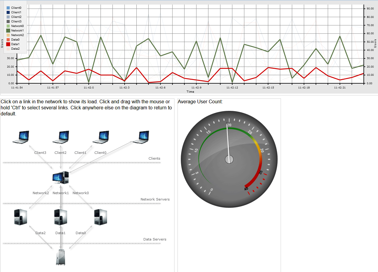
About Charting for JavaScript: MindFusion library for interactive charts and gauges. It supports all common chart types including 3D bar charts. Charts can have a grid, a legend, unlimitd number of axes and series. Scroll, zoom and pan are supported out of the box. You can easily create your own chart series by implementing the Series interface.
The gauges library is part of Charting for JavaScript. It supports oval and linear gauge with several types of labels and ticks. Various samples show you how the implement the gauges to create and customize all popular gauge types: car dashboard, clock, thermometer, compass etc. Learn more about Charting and Gauges for JavaScript at https://mindfusion.eu/javascript-chart.html.

A JavaScript Application for Server Load Monitoring (Continued)

We continue the ServerLoad tutorial with the diagram.

I. Create and Style The Diagram

We create a new JavaScript file named diagram.js in the Scripts folder of the project and reference it in the HTML.

<a href="http://Scripts/MindFusion.Diagramming.js">http://Scripts/MindFusion.Diagramming.js</a>

Now, in this file we make some namespace mapping to access easy the classes we need:

var Diagram = MindFusion.Diagramming.Diagram;
var DiagramLink = MindFusion.Diagramming.DiagramLink;
var ShapeNode = MindFusion.Diagramming.ShapeNode;
var Style = MindFusion.Diagramming.Style;
var DashStyle = MindFusion.Drawing.DashStyle;
var Alignment = MindFusion.Diagramming.Alignment;

var Rect = MindFusion.Drawing.Rect;
var LayeredLayout = MindFusion.Graphs.LayeredLayout;
var LayoutDirection = MindFusion.Graphs.LayoutDirection;

// a shortcut to the Events class
var Events = MindFusion.Diagramming.Events;

The code for the diagram does not need to be in a single method call, so we’ll use the document.ready event handler:

$(document).ready(function () {

// create a Diagram component that wraps the "diagram" canvas
diagram = MindFusion.AbstractionLayer.createControl(Diagram, null, null, null, $("#diagram")[0]);
//set both base and head link shape size
diagram.setLinkHeadShapeSize(2);
diagram.setLinkBaseShapeSize(2);
diagram.setLinkBaseShape(MindFusion.Diagramming.Shape.fromId("Arrow"));
................

});

As with the line chart, we create a diagram object using the canvas id from the html page. Then we make some link customization: we set the base and head shape with setBaseShape and setHeadShape to “Arrow” to indicate that data flows in two directions between servers.

Now let’s use a Style instance to set the stroke, text color and font name. Then we set the link style this way:

//customize the link appearance
var linkStyle = new Style();
linkStyle.setStroke("#c0c0c0");
linkStyle.setTextColor("#585A5C");
linkStyle.setFontName("Verdana");
linkStyle.setFontSize(3);
diagram.setStyle(linkStyle);

When users click on the diagram it is important not to allow them to create new links and nodes. That’s why we use setBehavior to change the default way the diagram responds to user actions:

//diagram items can only be selected
diagram.setBehavior(MindFusion.Diagramming.Behavior.SelectOnly);

We create the graph in the buildDiagram method. First, we call clearAll to remove all diagram items to make sure only nodes we’ve created are visible:

//generate diagram nodes
function buildDiagram() {
 diagram.clearAll();

};

II. Diagram Items

Let’s create the diagram nodes. We use png icons we’ve saved in an “icons” folder in the website. The background of each node is transparent ( setTransparent ), which means only the image will be visible. Then we add the node to the items of the diagram:

var rect = new Rect(0, 0, 15, 15);

var node = new ShapeNode(diagram);
node.setBounds(rect);
//the web server
node.setImageLocation("icons/web_server.png");
node.setTransparent(true);
diagram.addItem(node);

We create similar nodes for the data server, the clients and the network servers. The links are created with the DiagramLink class. The constructor takes the origin and target node of the link as parameters. We set an setId to the links, which is important and we add a label :

//add a link between the client and the server
var link = new DiagramLink(
       diagram, node, diagram.nodes[0]);
//same as the title of a given chart series
link.setId("Client" + i);
link.addLabel("Client" + i);
diagram.addItem(link);

Let’s not forget to emphasize the two links that correspond to the two series that are initially emphasized on the chart:

//bolden the two major links
diagram.links[5].setStrokeThickness(2.0);
diagram.links[8].setStrokeThickness(2.0);

III. Layout

We’ve created the diagram items but we need to arrange them. We use the LayeredLayout algorithm:

//the layeredLayout arranges the diagram properly - into layers
function applyLayeredLayout() {
    var layout = new LayeredLayout();
    layout.direction = LayoutDirection.TopToBottom;
    layout.siftingRounds = 0;
    layout.nodeDistance = 20;
    layout.layerDistance = 20;
    diagram.arrange(layout);
    diagram.resizeToFitItems();
}

As you see it is very easy to apply a layout with the diagramming control. You just create an instance of the layout, set the properties of your choice and call arrange (). In our case we need the layout direction to be LayoutDirection.TopToBottom We also adjust the nodeDistance and layerDistance and set the number of siftingRounds (attempts to unwind split links) to 0.

IV. Events

The diagram is meant to be interactive. We use the linkSelected and clicked events to handle selection of links and click on an area of the diagram, unoccupied by any items.

// add listeners
diagram.addEventListener(Events.linkSelected, onLinkSelected);
diagram.addEventListener(Events.clicked, onClicked);

When a link is selected, we need to emphasize the line graphic that corresponds to this link. We also emphasize the link itself. In addition, we must adjust the stroke and thickness of the other line graphs and diagram links. We do this in the onLinkSelected method:

//handle the linkSelected event
function onLinkSelected(sender, args) {

    //get the style of the series
    var seriesStyle = lineChart.plot.seriesStyle;
    seriesStyle.strokeThicknesses.clear();

    //thicken just the selected series, the others should be transparent
    for (var j = 0; j < lineChart.series.count() ; j++) {
        seriesStyle.strokeThicknesses.add(0.15);
        diagram.links[j].setStrokeThickness(1.0);
    }
.....
}


First we get the series style and then we use setStrokeThickness to reset the thickness of diagram links and series to their default values. After we’ve done that we need to get the selected links and emphasize them:

//bolden all selected links in the diagram as well
for (var m = 0; m < diagram.selection.links.length; m++) {
     var clickedLinkId = diagram.selection.links[m].getId();
     diagram.selection.links[m].setStrokeThickness(3.0);

When we’ve done that we need to find the series that correspond to these links and emphasize them as well:

//find the series that correspond to the selected links
for (var i = 0; i < lineChart.series.count() ; i++) {
      var _series = lineChart.series.item(i);


      //adjust the stroke thicknesses
      if (_series.title == clickedLinkId) {

          seriesStyle.strokeThicknesses.removeAt(i);
          seriesStyle.strokeThicknesses.insert(i, 3);
      }

   }

All this is followed by a call to the draw method that repaints the chart.

//repaint the chart
lineChart.draw();

The next event handler – the onClicked method resets the thicknesses to their default values:

//reset the chart thicknesses
function onClicked(sender, args) {
    resetThicknesses();

}

This is done in the resetThicknesses method, which uses the seriesStyle field of the line chart:

/* bolden the two major series, the others should be very thin.
bolden the two major diaglinks as well. */
function resetThicknesses() {
   var seriesStyle = lineChart.plot.seriesStyle;
   seriesStyle.strokeThicknesses.clear();

   for (var j = 0; j < 5; j++) {
      seriesStyle.strokeThicknesses.add(0.15);
      diagram.links[j].setStrokeThickness(1.0);
   }
.......
}


V. Tyre Separators

The diagram is divided into three parts by three separator lines. These lines are unconnected DiagramLink instances that have no head and base shape and have a custom position for the label. We use absolute positioning to locate the arrows. To do this we need to know the current size of the diagram:

//add the separators for the tyres
//first get the size of the diagram
var width = diagram.getBounds().width;
var height = diagram.getBounds().height;

Then the separator link is created with both origin and destination node being null:

//separator for the Clients tyre
//the link starts from the left edge and eds to the right edge of the digram
var link = new DiagramLink(
		diagram, new MindFusion.Drawing.Point(2, (height / 3.5)),
        new MindFusion.Drawing.Point(width, (height / 3.5)));
link.setShadowOffsetX(0);
link.setShadowOffsetY(0);
link.setStrokeDashStyle(DashStyle.Dash);
link.setStroke("#DCDCDC");
//remove the shapes at both ends
link.setHeadShape(null);
link.setBaseShape(null);
//do not allow this link to be selected
link.setLocked(true);
//move the link label to the right
var linkLabel = link.addLabel("Clients");
linkLabel.setControlPointPosition(1, -5, 0);
diagram.addItem(link);

Note that we’ve used the setLocked property of the link and have set it to true. This means the link cannot participate in user interaction – it can’t be selected, moved, resized. That’s what we want.

And with this our sample server load application is ready. Once again, here is how it looks:

Server Load Application in JavaScript

Server Load Application in JavaScript

Run The Application

Use this link to download the full sample with all necessary libraries and scripts.

Download Source Code

You can also fork it from GitHub.

Visit the web pages of the diagramming and charting (with gauges) JavaScript libraries to learn more about these tools. Visit the MindFusion forums if you need technical support or want to ask further questions about MindFusion developer tools.

A Funnel Chart in JavaScript

In this blog post we will create a funnel chart that demonstrates education enrollment. We will use the JavaScript chart library.

I. Chart Setup.

The Charting library requires a few JavaScript files, which we copy in a folder named Scripts. The files are:

  • config.js
  • MindFusion.Charting.js
  • MindFusion.Common.js
  • MindFusion.Gauges.js
  • require.js

Those files are redistributed with the chart library. If you plan to use different directory structure in your project you must edit the config.js file.

Now we create two files – an HTML page FunnelChart.html and a funnelchart.js file, which will contain the code for the chart. In the FunnelChart.html file we add two references:

<script type="text/javascript" src="Scripts/config.js"></script>
<script data-main="funnelchart" src="Scripts/require.js"></script>

One to the config file and the other to the require.js file. Note that the data-main attribute points exactly to the name of the javascript code-behind file that we’ll use to create and customize the chart.

II. Create the Chart

The chart needs a canvas and we add one to the web page:

<canvas id="funnelChart" width="400" height="500"></canvas>

The size determines the size of the chart, the id is important because we’ll use it to access the canvas from code.

The code for each JavaScript chart is in a single method:

define(["require", "exports", 'MindFusion.Charting'], function (require, exports, m) {
    "use strict";
    var Charting = m.MindFusion.Charting;
    var Controls = m.MindFusion.Charting.Controls;
    var Collections = m.MindFusion.Charting.Collections;
    var Drawing = m.MindFusion.Charting.Drawing;

    //create the chart
    var funnelChartEl = document.getElementById('funnelChart');
	
    var funnelChart = new Controls.FunnelChart(funnelChartEl);

     .......
     //chart customization
     .......
     .......
     funnelChart.draw();
});


The chart object is created with the help of the FunnelChart canvas element, which we get from the html page using the id.

III. Data

Data for the funnel chart is a single list with values. That is why we use the SimpleSeries class. It takes two arguments – one list with the data and one with the labels. We initialize the two arrays:

//initialize data and labels
var data = new Collections.List([100, 90, 80, 37, 17, 7]);
var labels = new Collections.List(["Elementary school", "Middle School", "High school", "Bachelor", "Master", "Doc"]);


Then we create the series and assign it to the series property of the funnelChart object.

//assign a series
funnelChart.series = new Charting.SimpleSeries(data, labels); 


IV. Appearance Customization

We don’t need a legend for the chart that is why we set:

funnelChart.showLegend = false;


A chart needs a title and we set one:

funnelChart.title = "Education Enrollment";


MindFusion JavaScript chart library has a flexible styling model, which allows us to customize the pens and brushes of a chart either directly through the theme property or through styles. A combination of both is possible and that’s what we’ll use. First, we will use the PerElementSeriesStyle for coloring the chart element. This style uses each of the Brush-es that were added to it to paint just one element from the chart. If necessary, the control cycles through the provided Brush -es.

var brushes = new Collections.List([	
	new Drawing.Brush("#193e4e"),
        new Drawing.Brush("#5a7444"),
        new Drawing.Brush("#8eb848"),
        new Drawing.Brush("#678b99"),
        new Drawing.Brush("#a1d0d8"),
        new Drawing.Brush("#c5b28a"),
		
	]);
	
	var seriesBrushes = new Collections.List();
	seriesBrushes.add(brushes);


The PerElementSeriesStyle expects a nested list with Brushes – because a chart can have many series with many elements into it. The same is true for the strokes, but we will add just one Brush, because we want all elements to have one common outlinig:

var strokes = new Collections.List([
	new Drawing.Brush("#f2ebcf"),
        ]);
	
var seriesStrokes = new Collections.List();
seriesStrokes.add(strokes);


We repeat the process for StrokeThickness-es and then we create the style object:

funnelChart.plot.seriesStyle = new Charting.PerElementSeriesStyle(seriesBrushes, seriesStrokes, serieStrokeThicknesses);


The theme property exposes many fields that help us customize our chart. We adjust the font and change the highlight stroke, which renders when a chart element is selected:

funnelChart.theme.titleFontSize = 18;
funnelChart.theme.titleFontName = "Roboto";
funnelChart.theme.titleFontStyle = Drawing.FontStyle.Bold;
	
funnelChart.theme.dataLabelsFontName = "Roboto";
funnelChart.theme.dataLabelsFontSize = 14;
	
funnelChart.theme.highlightStroke = new Drawing.Brush("#ffcc33");


V. Tooltips

We want our chart to render tooltips. The SimpleSeries does not include tooltips by default and we must do some code twisting to make it show them. First, we create a field tooltips, that is assigned to a list with the desired tooltips:

var tooltips = new Collections.List(["32.7%", "29.5%", "26.2%", "12%", "5%", "2%"]);
funnelChart.series.tooltips = tooltips; 


Then we have to override the supportedLabels property of the Series class to make it return LabelKinds.ToolTip in addition to LabelKinds.InnerLabel.

Object.defineProperty(m.MindFusion.Charting.SimpleSeries.prototype, "supportedLabels", {
            get: function () { return m.MindFusion.Charting.LabelKinds.InnerLabel | m.MindFusion.Charting.LabelKinds.ToolTip; },
            enumerable: true,
            configurable: true
 });


Finally, we must return the appropriate tooltip and the appropriate label, when asked. This is done by overriding the getLabel method of the SimpleSeries class.

m.MindFusion.Charting.SimpleSeries.prototype.getLabel = function (index, kind) {
	if ((kind & m.MindFusion.Charting.LabelKinds.ToolTip) != 0 && this.tooltips)
		return this.tooltips.items()[index];
	
	if (this.labels == null)
		return null;
	return this.labels.items()[index];
};


With that the work on our funnel chart is done and we can enjoy the result:

A Funnel chart in JavaScript

A Funnel chart in JavaScript

Complete source code including the libraries is available for direct download from the link below:

Download the Funnel Chart Sample

About MindFusion JavaScript Chart Library: MindFusion JS Chart is an interactive library for charts and gauges written purely in JavaScript. It supports all common chart types, multiple series, custom data,financial charts, funnel charts, a large selection of gauges and rich styling capabilities. The elegant architecture of the library allows you to create dashboards, charts with multiple different types of series in a single plot, unlimited number of axes, reusable styling themes, various oval and linear gauges. The innovative approach to data lets you define your own data classes by implementing a single interface.
The library also boasts a rich event set, zoom, pan, dragging of the legend and a set of many popular gauges. It is designed and implemented to provide JS developers with the perfect tool to create beautiful, interactive dashboards fast and easy. Download trial directly at http://mindfusion.eu/JavaScript.Chart.zip Get your license today at http://www.javascript-chart-buy.html

JavaScript Chart Library, V1.1 Released

The new version of the JavaScript Chart library contains the following new features:

FunnelChart

Funnel charts are often used to represent stages in a sales process and show the amount of potential revenue at each stage. In MindFusion.Charting for JavaScript funnel charts can be created by utilizing the FunnelChart or FunnelRenderer classes. FunnelChart inherits from the base Chart class and offers additional customization through its segmentSpacing and bottomBase properties.

Funnel chart in JavaScript

Funnel chart in JavaScript

Theme XML serialization
Themes now can be serialized to and from XML through the use of the respective loadFrom and saveTo methods.

Miscellaneous

Download the latest version directly from here:

Download JavaScript Chart Library, V1.1 Trial

Technical support is available at the JS Chart forum, per email at support@mindfusion.eu or at the HelpDesk. Either way MindFusion attentive support team would be glad to answer your questions.

About MindFusion JavaScript Chart Library: MindFusion JS Chart is an interactive library for charts and gauges written purely in JavaScript. It supports all common chart types, multiple series, custom data,financial charts, funnel charts, a large selection of gauges and rich styling capabilities. The elegant architecture of the library allows you to create dashboards, charts with multiple different types of series in a single plot, unlimited number of axes, reusable styling themes, various oval and linear gauges. The innovative approach to data lets you define your own data classes by implementing a single interface.
The library also boasts a rich event set, zoom, pan, dragging of the legend and a set of many popular gauges. It is designed and implemented to provide JS developers with the perfect tool to create beautiful, interactive dashboards fast and easy. Download trial directly at http://mindfusion.eu/JavaScript.Chart.zip Get your license today at http://www.javascript-chart-buy.html