Custom appearance of WPF Resource view

Continuing from the previous post we will now customize the appearance of the Resource view to achieve a more aesthetically pleasing presentation. The appearance of the view is customized by setting various properties of the Calendar.ResourceViewSettings object.

We will build our presentation on the Silver theme by reducing the sharpness and contrast of colors and making the font uniform across the entire view. The customization process is divided to the following steps:

Customize the view background.

calendar.ResourceViewSettings.CalendarStyle.Background = Brushes.White;

Customize the row headers.

calendar.ResourceViewSettings.ExpandableRows = false;
calendar.ResourceViewSettings.HeaderStyle.FontFamily = headerFont;
calendar.ResourceViewSettings.HeaderStyle.FontSize = 13;
calendar.ResourceViewSettings.HeaderStyle.Foreground = new SolidColorBrush(Color.FromArgb(255, 64, 64, 64));
calendar.ResourceViewSettings.HeaderStyle.Background = Brushes.White;
calendar.ResourceViewSettings.HeaderStyle.BorderBrush = borderBrush;
calendar.ResourceViewSettings.HeaderStyle.BorderThickness = new Thickness(0, 0, 0, 1);

Customize the view cells.

calendar.ResourceViewSettings.CellStyle.Background = Brushes.White;
calendar.ResourceViewSettings.CellStyle.BorderBrush = borderBrush;
calendar.ResourceViewSettings.WeekendStyle.Background = new SolidColorBrush(Color.FromArgb(255, 250, 250, 250));
calendar.ResourceViewSettings.WeekendStyle.BorderBrush = borderBrush;

Customize the view timelines.

calendar.ResourceViewSettings.BottomTimelineSettings.CalendarStyle.Background = Brushes.White;
calendar.ResourceViewSettings.BottomTimelineSettings.CalendarStyle.BorderBrush = borderBrush;
calendar.ResourceViewSettings.BottomTimelineSettings.CalendarStyle.FontFamily = headerFont;
calendar.ResourceViewSettings.BottomTimelineSettings.CalendarStyle.FontSize = 13;
calendar.ResourceViewSettings.BottomTimelineSettings.CalendarStyle.FontWeight = FontWeights.Normal;
calendar.ResourceViewSettings.BottomTimelineSettings.NowFillBrush = Brushes.Transparent;
calendar.ResourceViewSettings.MiddleTimelineSettings.CalendarStyle.Background = Brushes.White;
calendar.ResourceViewSettings.MiddleTimelineSettings.CalendarStyle.BorderBrush = borderBrush;
calendar.ResourceViewSettings.MiddleTimelineSettings.CalendarStyle.FontFamily = headerFont;
calendar.ResourceViewSettings.MiddleTimelineSettings.CalendarStyle.FontSize = 13;
calendar.ResourceViewSettings.MiddleTimelineSettings.CalendarStyle.FontWeight = FontWeights.Normal;
calendar.ResourceViewSettings.MiddleTimelineSettings.NowFillBrush = Brushes.Transparent;

Note that the font, headerFont and borderBrush variables are defined as follows:

FontFamily font = new FontFamily("Segoe UI");
FontFamily headerFont = new FontFamily("Segoe UI Light");
Brush borderBrush = new SolidColorBrush(Color.FromArgb(255, 224, 224, 224));

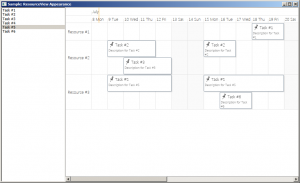
The final result is displayed below.

scheduling-resourceviewappearance

The complete sample project is available for download here:
https://mindfusion.eu/_samples/WpfPlannerResourceViewAppearance.zip

You can get the trial version of MindFusion.Scheduling for WPF from this link:
https://mindfusion.eu/WpfPlannerTrial.zip

Enjoy!

Custom items in WPF Calendar

Expanding on the previous post we will now modify the appearance of the calendar items through the use of a custom item presenter. To define the new presenter, simply create a new Style resource with TargetType set to ItemPresenter and place this Style somewhere in the resource look-up path – for example in the application’s or the window’s resource dictionaries. The Style must contain a setter for the Template property that defines the appearance of the item:

<style targettype="{x:Type planner:ItemPresenter}">
  <Setter Property="Template">
    <Setter.Value>
      <ControlTemplate TargetType="{x:Type planner:ItemPresenter}">
        <Grid>
        ...
        </Grid>
      </ControlTemplate>
    </Setter.Value>
  </Setter>
</style>

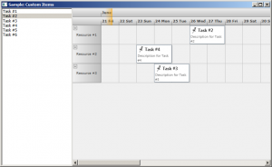
In this particular case the presenter represents a grid with two rows. The top row contains an icon and the header text of the item. The bottom row contains the description text. Note, that the TextBlock displaying the header text of the item has a name – HeaderBlock. The element with this name defines the position of the TextBox when the item is in-place edited.

Various appearance properties are also customized – such as FontFamily, Background and BorderBrush, by assigning new values to the respective properties of the Calendar.ItemSettings.CalendarStyle object:

calendar.ItemSettings.CalendarStyle.FontFamily = new FontFamily("Segoe UI");
calendar.ItemSettings.CalendarStyle.Background = Brushes.White;
calendar.ItemSettings.CalendarStyle.BorderBrush = Brushes.SlateGray;

Finally, the size of the calendar lanes is increased to accommodate the new appearance of the items:

calendar.ResourceViewSettings.LaneSize = 54;

The final result is displayed below.

scheduling-customitems

The complete sample project is available for download here:
https://mindfusion.eu/_samples/WpfPlannerCustomItems.zip

You can get the trial version of MindFusion.Scheduling for WPF from this link:
https://mindfusion.eu/WpfPlannerTrial.zip

Enjoy!
Custom items in Silverlight reports

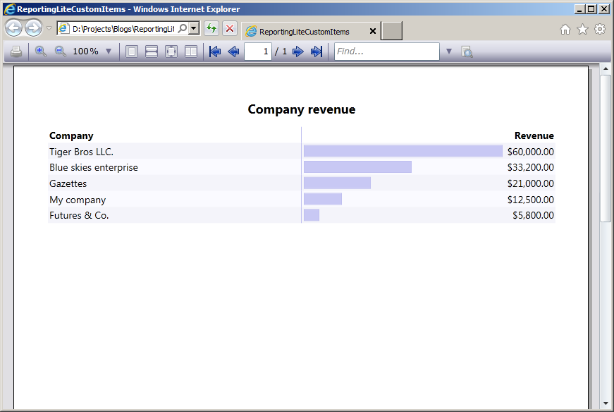
In this post we will examine how to use custom items in MindFusion reports in Silverlight. The report in question will display the revenue of several companies, sorted in descending order. The custom items will visualize the relative revenue value of each company as a graphics similar to a chart.

To start off, we will define our business objects – a CompanyInfo class with two properties – Name and Revenue, of type string and double respectively.

public class CompanyInfo
{
  public string Name { get; set; }
  public double Revenue { get; set; }
}

Then we will declare sample data – an array of several companies, sorted by revenue:

var companyInfo = new CompanyInfo[]
{
  new CompanyInfo { Name = "My company", Revenue = 12500 },
  new CompanyInfo { Name = "Blue skies enterprise", Revenue = 33200 },
  new CompanyInfo { Name = "Futures & Co.", Revenue = 5800 },
  new CompanyInfo { Name = "Gazettes", Revenue = 21000 },
  new CompanyInfo { Name = "Tiger Bros LLC.", Revenue = 60000 },
}.OrderByDescending(info => info.Revenue);

The actual report is placed inside Resource Dictionary (named MyReport.xaml). The report contains a title and a single data range with three columns – for company name, revenue graphics and revenue value respectively. The actual report is omitted for brevity, but the code of the custom item representing the revenue graphics is shown below:

<report:CustomReportItem Location="50%,0" Size="40%,6" Value="[100*Revenue/Max(&quot;Revenue&quot;)]">
  <report:CustomReportItem.Template>
    <DataTemplate>
      <Grid>
        <Grid.ColumnDefinitions>
          <ColumnDefinition Width="{Binding Converter={StaticResource gridLengthConverter}}" />
          <ColumnDefinition Width="{Binding Converter={StaticResource gridLengthConverter}, ConverterParameter='-'}" />
        <ColumnDefinition />
        <Border BorderBrush="#C0C0F0" BorderThickness="1" Background="#C8C8F4" Margin="3" />
      </Grid>
    </DataTemplate>
  </report:CustomReportItem.Template>
</report:CustomReportItem>

The value of the custom item is calculated as the percentage of the company revenue relative to the maximum revenue amongst all companies. The content of the custom item represents a grid with two columns. The first column contains the border that is used as the representation of the revenue graphics. The width of the columns is calculated according to the item value by using a custom value converter – GridLengthConverter. The GridLengthConverter basically converts the value to a GridLength object with GridUnitType set to Star.

The report is loaded from the resource dictionary using the helper Report.FromDictionary method, then setup with the data and run:

var report = Report.FromDictionary(new Uri("ReportingLiteCustomItems;component/MyReport.xaml", UriKind.Relative), "myReport");
report.DataContext = companyInfo;
report.QueryDetails += (s, e) => e.Details = companyInfo;
report.Run()

Note, that the sample handles the QueryDetails event. This is done in order to supply data to the Max aggregate function used inside the CustomReportItem.Value expression.

Finally, the report is selected inside a ReportViewer on the main form:

viewer.Document = report;

The following image shows the running sample:

The source code is available for download from here:

Download the Complete Source Code for the Sample

You can get the trial version of MindFusion.Reporting for Silverlight from this link:

Download MindFusion.Reporting for Silverlight Trial Version

Implementing drag & drop in MindFusion.Scheduling for WPF

In this post we will discuss how to implement drag & drop using MindFusion.Scheduling for WPF. The goal is to enable users to create appointments by dragging items from an external source and dropping them onto the Calendar control surface.

The source

For the purposes of this sample the drag & drop source would be a simple ListBox control. The following XAML declares a ListBox with several predefined items:

  Task #1
  Task #2
  Task #3
  Task #4
  Task #5
  Task #6

The calendar

To enable the Calendar control to be the target of drag & drop operations, set its AllowDrop property to true. The following XAML snippet illustrates the definition of the Calendar control:

<planner:calendar x:name="calendar" grid.column="1" currentview="ResourceView" grouptype="GroupByResources" theme="Silver" allowdrop="True">
  <planner:calendar.itemresources>
    <planner:resource name="Resource #1">
    <planner:resource name="Resource #2">
    <planner:resource name="Resource #3">
  </planner:resource></planner:resource></planner:resource></planner:calendar.itemresources>
</planner:calendar>

The calendar is set up to display three resources in a Resource view.

The drag & drop

The drag & drop operation is initiated by calling the DragDrop.DoDragDrop static method and passing a reference to the dragged data. In our case we would want to initiate drag & drop when the user clicks on an item in the ListBox and starts dragging. Because the MouseDown event is consumed by the ListBox when the mouse is pressed over an item, we need to handle the PreviewMouseDown event. The following C# code displays the handlers of the PreviewMouseDown and MouseMove events:

private void taskList_PreviewMouseDown(object sender, MouseButtonEventArgs e)
{
  mouseDown = e.LeftButton == MouseButtonState.Pressed;
}

private void taskList_MouseMove(object sender, MouseEventArgs e)
{
  if (taskList.SelectedItem != null && mouseDown)
  {
    mouseDown = false;
    string data = ((ListBoxItem)taskList.SelectedItem).Content.ToString();
    DragDrop.DoDragDrop(taskList, data, DragDropEffects.Copy);
  }
}

To give visual feedback to the user when the mouse moves over the Calendar control during drag & drop operation, handle the DragOver event:

private void calendar_DragOver(object sender, DragEventArgs e)
{
  e.Effects = DragDropEffects.None;
  if (e.Data.GetDataPresent(typeof(string)))
  {
    DateTime? date = calendar.GetDateAt(e.GetPosition(calendar));
    if (date != null)
      e.Effects = DragDropEffects.Copy;
  }
}

This handler checks whether the dragged data matches the expected type and whether the location under the mouse cursor represents a valid date.

Finally, handle the Calendar.Drop event. This event is raised when the user releases the mouse over the Calendar control during a drag & drop operation.

private void calendar_Drop(object sender, DragEventArgs e)
{
  if (e.Data.GetDataPresent(typeof(string)))
  {
    Point point = e.GetPosition(calendar);
    DateTime? date = calendar.GetDateAt(point);
    Resource resource = calendar.GetResourceAt(point);
    if (date != null && resource != null)
    {
      string task = (string)e.Data.GetData(typeof(string));
      Appointment appointment = new Appointment();
      appointment.HeaderText = task;
      appointment.StartTime = date.Value;
      appointment.EndTime = appointment.StartTime.AddDays(2);
      appointment.Resources.Add(resource);
      calendar.Schedule.Items.Add(appointment);
    }
  }
}

The following image shows the running sample with several created appointments:

Drag & drop

The source code is available for download from here:

Download the Complete Source Code for the Sample

You can get the trial version of MindFusion.Scheduling for WPF from this link:

Download MindFusion.Scheduling for WPF Trial Version