ASP.NET Bar Chart with Custom Labels

In this blog post we will look on how to build a bar chart with multiple series, custom X-labels and inner labels using MindFusion.Charting for ASP.NET control.

1. General Appearance of the Chart

We want to show three data series and we want to show the first values of each series in a cluster, then second cluster with the second values of each series etc. In order to render the bars in this order we set the BarType property to BarType.Clustered3D. We correct the Depth3D to make the bars less thick and increase the distance between each series with DistBtwBars. We make the bars wider, setting BarWidth to 30.

    //general appearance
    BarChart1.BarType = MindFusion.Charting.BarType.Clustered3D;
    BarChart1.BarWidth = 30f;        
    BarChart1.Depth3D = 15f;
    BarChart1.DistBtwBars = 10f;

2. Grid

Our bars are vertical e.g. it is a column chart, so we would like to have a horizontal grid. We set the GridType property to GridType.HorScale and we set the AltGridBrush and GridBruh to different gray colors to give us nice alternating grid stripes. For the outlining of the whole plot area we use the PlotAreaOutlinePen.

    //grid settings
    BarChart1.GridBrush= new MindFusion.Drawing.SolidBrush(System.Drawing.Color.FromArgb(242, 239, 224));
    BarChart1.GridPen= new MindFusion.Drawing.Pen(System.Drawing.Color.FromArgb(204, 196, 185));
    BarChart1.GridType = MindFusion.Charting.GridType.HorScale;
    BarChart1.PlotAreaOutlinePen = new MindFusion.Drawing.Pen(System.Drawing.Color.FromArgb(204, 196, 185));

3. Labels Inside Bars

The labels inside bars show the data of each bar – this is done by setting the InnerLabelType property to LabelType.Data. We use a white LabelBrush to draw the labels and set their InnerLabelBorder to Border.RoundedRect. The background of the inner labels is set to gray.

    //inner labels settings
    BarChart1.InnerLabelBackground = new MindFusion.Drawing.SolidBrush(System.Drawing.Color.FromArgb(112, 128, 144));
    BarChart1.InnerLabelBorder = MindFusion.Charting.Border.RoundedRect;
    BarChart1.InnerLabelType = MindFusion.Charting.LabelType.Data; 
    BarChart1.LabelBrush = new MindFusion.Drawing.SolidBrush(System.Drawing.Color.FromArgb(255, 255, 255));

4. Title

We want not only title but also second title – or a subtitle. That’s why we use both the TitleText and SubTitleText properties. We leave no distance between them – we set SubTitleOffset to 0. But we would like the two titles to be well above the plot area, that’s why we set bigger TitleOffset.

    //title and subtitle
    BarChart1.SubTitleOffset = 30;
    BarChart1.SubTitleText = "all major continents";
    BarChart1.TitleOffset = 0;
    BarChart1.TitleText = "Sales";

5. Labels at the Axes

The X-labels are custom text – we set them with XLabels. The title of the Y-axis is rotated, so we use LabelOrientation.BottomToTop.

    //axes labels settings
    BarChart1.XAxisSettings.LabelSeriesIndex = 1;
    BarChart1.XLabels.Clear();
    BarChart1.XLabels.Add(new List(){ "Europe", "Asia", "North America", "South America"});
    
    BarChart1.YAxisSettings.TitleLabel = "in mlns. USD";
    BarChart1.YAxisSettings.TitleLabelOrientation = MindFusion.Charting.LabelOrientation.BottomToTop;

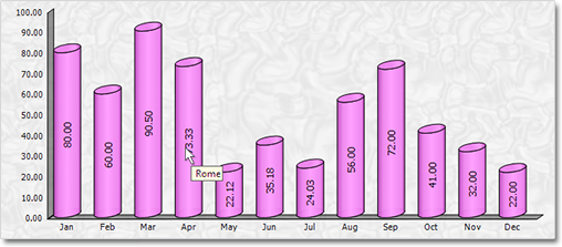
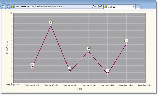
Here is a screenshot of the final chart:

ASP.NET Bar Chart with Custom Labels

ASP.NET Bar Chart with Custom Labels

The sample can be downloaded from here:

Download ASP.NET Bar Chart with Labels Sample

The trial version of MindFusion.Charting for ASP.NET can be downloaded directly from the link below. It contains many more samples and tutorials:

Download MindFusion.Charting for WebForms Trial Version

About MindFusion.Charting for WebForms: A powerful WebForms control that lets programmers add compelling charts in any ASP.NET application. With the component you can design and create any bar, column, line, area, scatter, bubble, radar, polar, doughnut and pie chart. Its elegant API includes data binding, themes, hit-testing, zoom, drill-down, wizards and many more.

The control takes advantage of the rich capabilities of Microsoft WebForms but its functionality does not bring excess complexity. The API is very easy to understand, all the features are duly documented. Numerous samples and step-by-step tutorials let you learn quickly how to tailor the tool in order to meet best your needs.

Details about the various features of the control are provided here. The online demo will give you an overview of the control’s rich capabilities. Licenses, prices and discounts are listed at the buy page.

Charting for WinForms 3.5

MindFusion has released a new version of its charting component for WinForms. Here is an overview of the new features:

Mouse Dragging in Pies
You can click on the border between any two pieces in a pie chart and drag it to change the values of those pieces. The sum of the values for the two pieces stays the same.

Support for Undefined Values
If your data contains null, double.NaN or other data that is not defined you have three ways to handle it – ignore it, replace it with 0 or with the average of the two neighbouring values. Use the HandleEmptyValue property to choose how undefined values are handled.

ToolTips
All chart types support tool tips. Area charts can show a different tooltip for the region between each two values.

Tool tips in a 3D cylinder chart.

Tool tips in a 3D cylinder chart.

Themes
Chart themes are represented by XML files that can be saved and loaded with the SaveTheme and LoadTheme methods. At your disposal is a special theme editor tool that helps you create, edit and save themes fast and easy.

Major and Minor Axis Ticks
Axis ticks are drawn more precisely now – you can draw major and minor ticks. The count of minor ticks is customizable. You can set the pen and length of both ticks. Ticks are supported for all chart axes.

Miscellaneous
Hit testing has been greatly improved. All chart types support the DataIndex and SeriesIndex properties, which let you know the exact location of the hittMindFusion has released a new version of its charting component for WinForms. Here is an overview of the new features:

Mouse Dragging in Pies
You can click on the border between any two pieces in a pie chart and drag it to change the values of those pieces. The sum of the two piece values stays the same.

Support for Undefined Values
If your data contains null, double.NaN or other data that is not defined you have three ways to handle it – ignore it, replace it with 0 or with the average of the two neighbouring values. Use the HandleEmptyValue property to choose how undefined values are handled.

ToolTips
All chart types support tool tips. Area charts can show a different tooltip for the region between each two values.

Themes
Chart themes are represented by XML files that can be saved and loaded with the SaveTheme and LoadTheme methods. At your disposal is a special theme editor tool that helps you create, edit and save themes fast and easy.

Major and Minor Axis Ticks
Axis ticks are drawn more precisely now – you can draw major and minor ticks. The count of minor ticks is customizable. You can set the pen and length of both ticks. Ticks are supported for all chart axes.

Major and minor axis ticks in a scatter chart.

Major and minor axis ticks in a scatter chart.

Miscellaneous
Hit testing has been greatly improved. All chart types support the DataIndex and SeriesIndex properties, which let you know the exact location of the hi value in the arrays with data values for the chart. There are also other new and improved features regarding the hit testing of a chart.

Some changes were necessary to keep the API simple and elegant – we have renamed several existing properties – please check the documentation.

Read more about the new features at the Charting for WinForms forum.

The trial version is available for direct download from this link:

Download MindFusion.Charting for WinForms 3.5

Technical support is available at the forum, help desk or at e-mail support@mindfusion.eu. All inquiries are answered within hours of being received.

About MindFusion.Charting for WinForms: a professional programming component for WinForms, which lets you create remarkable charts fast and easy. The tool supports all major chart types – line, pie, radar and bar – and numerous variations of them – column, area, bubble, polar, doughnut etc. 3D charts are supported as well.

Charting for WinForms supports a rich user interaction model with features like zoom, hit testing, drill down, mouse dragging and more. You can use delegates to present mathematical functions, undefined values are also acceptable. Values can be data arrays or retrieved through a database.

The appearance of each chart is fully customizable. The control offers strong design-time support with custom collection editors and chart wizards. At your disposal is a set of predefined appearance themes and a theme editor tool. A full list of the features can be read here.

Line Chart with a Separator in WinForms

In today’s post we’ll show how to build a line chart with several line series and a separator line. The separator line is drawn at a given height and divides the chart into two halves.

The Line Series

The line series are three, so we must add three lists with data to the XData and YData properties. We can do this in three ways: type the values in design time, write them in code or use data binding. In design time we use the built-in collection editors of the control:

The Series collection editor

The Series collection editor

In code we make lists with the data and add them to XData or YData:

lineChart1.YData.Clear();
lineChart1.YData.Add(new List { 45, 64, 38.2, 33.03, 56, 68, 39, 42 });
lineChart1.YData.Add(new List { 34, 42, 28, 42, 35, 31, 62, 55 });
lineChart1.YData.Add(new List { 22, 19, 32, 28, 17, 25, 31, 36 });

If you want to use data binding then set DataSource to the name of the data source, DataMember to specify the name of the table which will supply the data and XDataFields/YDataFields to provide the name(s) of the fields. In this case we will require three data base columns for each of the three series – separate the names with a comma e.g.

lineChart1.YDataFields = "Sales1,Sales2,Sales3";

For XData we use the same list because we want the series to appear exactly under each other:

lineChart1.XData.Clear();
lineChart1.XData.Add(new List { 10, 20, 30, 40, 50, 60, 70, 80 });

The Series

We set LineType to Line and Scatter because we want to show scatters at data points:

lineChart1.LineType = MindFusion.Charting.LineTypes.Line |  
MindFusion.Charting.LineTypes.Scatter;

The LineTypes enumeration allows bit wise combining of its members. We use ChartPens to set the pens for the line series. ShapesPens and ShapeBrushes set the pens for the outline and the brushes for filling the scatters:

lineChart1.ChartPens.Add(new MindFusion.Drawing.Pen(Color.FromArgb(102, 205, 170), 6));
lineChart1.ShapePens.Add(new MindFusion.Drawing.Pen(Color.FromArgb(102, 205, 170), 2));   

The pens for the series are thicker than the pens for the scatters. The fill brush is slightly lighter:

lineChart1.ShapeBrushes.Add(new MindFusion.Drawing.SolidBrush(Color.FromArgb(175, 251, 175)));

Finally – we set the size of the shapes and their type:

lineChart1.Shapes.Add(MindFusion.Charting.Shape.Circle);
lineChart1.ShapeSizes.Add(10);

The Separator

There are two ways to draw the separator line.

The first is to add a custom summary value. In this case the separator line will be drawn from the
smallest X-data value to the biggest one, parallel to the axes.

lineChart1.AddCustomSummary(40.0, "");

The summary line is drawn with shapes at both ends, but we can hide them by setting their size to 0:

lineChart1.SummaryBrushes.Add(new MindFusion.Drawing.SolidBrush(Color.Gray));
lineChart1.SummaryShapeSizes.Add(0);

The second way to draw the separator line is to add it as a 4th series in the XData and YData lists and add a pen for it in the ChartPens list. The advantage is that we can make the line as long as we want, in our case – as long as the length of the X-axis:

lineChart1.XData.Add(new List { 0, 90 });

The Legend

We use LegendLabels to add the labels for the line series:

lineChart1.LegendLabels = new List() { "2010", "2011", "2012" };

We set the background of the legend, but we don’t have to add any brushes or shapes for the legend items – they are taken automatically from the line series settings:

lineChart1.LegendBackgroundBrush = new MindFusion.Drawing.SolidBrush(Color.FromArgb(253, 253,  
253));


The Grid

The GridType is GridType.HorScale. We use GridBrush, AltGridBrush and GridPen to set the colors for the grid.

lineChart1.GridPen = new MindFusion.Drawing.Pen(Color.FromArgb(200, 200, 200));
lineChart1.GridPen.DashStyle = System.Drawing.Drawing2D.DashStyle.Dash;
lineChart1.GridType = MindFusion.Charting.GridType.HorScale;

If you make the changes to the chart in code, don’t forget to call UpdateChart() to make sure the
control knows changes have happened and the chart must be updated.

Here is the final chart:

A line chart with a separator line.

A line chart with a separator line.

The sample is available for download from here:

Download Line Chart with Separator Line Sample

You can download the trial version of the component with extensive documentation and many other samples from here:

Download MindFusion.Charting for WinForms Trial Version

Line Chart with DateTime Data in ASP.NET

In this post we demonstrate how to use MindFusion.Charting for ASP.NET component to create a line chart that shows the number of unique visitors to a store/website in a period of 6 weeks.

Data

The data for the X-axis are DateTime values. We create an array with the DateTime values that we’ll use and add it to the XData property of our chart. Before that we have to delete the predefined array that is added when the control is dropped at the form:

DateTime dt1 = new DateTime(2013, 6, 14);
DateTime dt2 = new DateTime(2013, 6, 7);
DateTime dt3 = new DateTime(2013, 5, 31);
DateTime dt4 = new DateTime(2013, 5, 24);
DateTime dt5 = new DateTime(2013, 5, 17);
DateTime dt6 = new DateTime(2013, 5, 10);

ArrayList data = new ArrayList() { dt1, dt2, dt3, dt4, dt5, dt6 };
LineChart1.XData.Clear();
LineChart1.XData.Add(data);

Next, we must make some adjustments in the settings for the X-axis to tell the control that DateTime data is used. We set the DataFormat property to DateTime and we specify the time range for the axis. This is how we do this:

LineChart1.XAxisSettings.DataFormat = MindFusion.Charting.DataFormat.DateTime;

LineChart1.XAxisSettings.StartDateTime = new DateTime(2013, 5, 3);
LineChart1.XAxisSettings.EndDateTime = new DateTime(2013, 6, 20);
//set the interval to one week - 7 days
LineChart1.XAxisSettings.TimeSpan = new TimeSpan(7, 0, 0, 0);

The data for the Y-axis are numbers. We can set them through the property grid or set them in code.

LineChart1.YData.Clear();
ArrayList data1 = new ArrayList() { 56, 13, 45, 17, 82, 22 };
LineChart1.YData.Add(data1);

The X-axis

First, we must change the LabelType property of XAxisSettings from “ChartData”, which is the default to “AutoScale”. This will make the axis show the time range we’ve set in code above. Then, we change how the DateTime values will be formatted. The Default DateTimeFormat shows the full time and date and is not suitable. We change it to “LongDate”, which does not draw any time.

XAxisSettings-DateTimeFormat="LongDate" 
XAxisSettings-DrawTicksUniformly="False" XAxisSettings-DrawZero="True" 
XAxisSettings-LabelBrush="s:#FF696969" XAxisSettings-LabelOffset="10" 
XAxisSettings-LabelType="AutoScale" XAxisSettings-TitleLabel="Week" 
XAxisSettings-TitleLabelBrush="s:#FF696969" XAxisSettings-TitleLabelOffset="10"

We type “Week” as TitleLabel for the axis and set the DrawZero property to true to show the first label, which is otherwise omitted.

Upon preview we notice that the labels are too close to the axis, that’s why we use LabelOffset and TitleLabelOffset to add some space before them. Finally, we change the color of the labels, to make them dark gray rather than black.

The Y-axis

Customizing the Y-axis is rather simple. We change the interval with AxisDelta to 5 and increase the MaxValue to 100. We don’t need decimal fractions for the labels, that’s why we change the NumberFormat. We add a TitleLabel and change its orientation with TitleLabelOrientation. Finally we use LabelBrush and TitleLabelBrush to change the colors of the labels – we use the same brushes as for the X-axis.

YAxisSettings-AxisDelta="5" 
YAxisSettings-LabelBrush="s:#FF696969" 
YAxisSettings-MaxValue="100" YAxisSettings-NumberFormat="Fixed_point_0Digits" 
YAxisSettings-TitleLabel="Unique Visitors" 
YAxisSettings-TitleLabelBrush="s:#FF696969" 
YAxisSettings-TitleLabelOrientation="BottomToTop"

The Grid

Initially the chart shows no grid – but we want to show a grid. That’s why we change GridType to “Crossed” and set a GridPen. The dark gray background of the plot area together with its outlining are set with PlotAreaOutlinePen and PlotAreaBrush.

GridPen="n:0/#FFE1E1E1/0/0/0//0/0/10/" GridType="Crossed" PlotAreaBrush="s:#FFC0C0C0" 
PlotAreaOutlinePen="n:0/#FF787878/0/0/0//0/0/10/"

This is the code that was generated by the designer because we set the properties through the property grid. If we set them with code, it will be:

LineChart1.GridPen = new MindFusion.Drawing.Pen(Color.FromArgb(225,225,225));
LineChart1.GridType = MindFusion.Charting.GridType.Crossed;
LineChart1.PlotAreaBrush = new MindFusion.Drawing.SolidBrush(Color.FromArgb(192, 192, 192));
LineChart1.PlotAreaOutlinePen = new MindFusion.Drawing.Pen(Color.FromArgb(120, 120, 120));


The Line Series

We want scatters at data points and we want to show labels above those scatters. The LabelType property lets us set the type to be both line and scatters:

LineChart1.LineType = MindFusion.Charting.LineTypes.Line | MindFusion.Charting.LineTypes.Scatter;

This is the default type, so you don’t need to set it if you have not changed it before. We use ShapeBrushes, ShapePens and ShapeSizes to set the brushes and size of the scatters. We can do this in the property grid or in code. Finally, we want to show labels above scatters. We use LabelType and LabelFormat to set what kind of labels are drawn and since our labels are numbers – how they are formatted.

LabelBorder="RoundedRect" LabelBorderBackground="s:#FFFFFFE0" LabelBorderOutline="n:0/#FF787878/0/0/0//0/0/10/" LabelFormat="Fixed_point_0Digits" LabelType="Data"

In code you write:

LineChart1.LabelBorder = MindFusion.Charting.Border.RoundedRect;
LineChart1.LabelBorderBackground = new MindFusion.Drawing.SolidBrush(Color.FromArgb(255, 255, 224));
LineChart1.LabelBorderOutline = new MindFusion.Drawing.Pen(Color.FromArgb(120, 120,120));
LineChart1.LabelFormat = MindFusion.Charting.NumberFormat.Fixed_point_0Digits;
LineChart1.LabelType = MindFusion.Charting.LabelType.Data;

Here is the final chart:

Line chart with DateTime values in ASP.NET

Line chart with DateTime values in ASP.NET

You can download the sample from this link:

Download Line Chart for ASP.NET Sample

The trial version of the component is available from here:

MindFusion.Charting for ASP.NET Trial Version Download

Charting for Silverlight 1.2

We have released Charting for Silverlight 1.2 with the following new features:

Styles and Themes

The appearance of each chart element – axis, legend, series – is defined by a style. Each ChartTheme is a collection of styles. Charting for Silverlight 1.2 lets you:

  • create themes based on the appearance of an existing chart
  • create themes with the ThemeEditor tool
  • save themes to XML files
  • load themes from XML files
  • use a number of predefined themes.

You can read detailed instructions on how to save, load and edit themes in the “Working with Themes” tutorial.

The green theme applied at a bar chart in Silverlight.

The green theme applied at a bar chart in Silverlight.

Better Design Time Support

Charting for Silverlight lets you now edit all collection properties – like series, legends and brushes – in the property grid. In addition we have added converters that let you edit label and data collection in XAML.

Axis Intervals

The new AxisSettings.IntervalCount property lets you specify the count of intervals at the numeric axis. When IntervalCount is set, the Interval property is not considered and the axis is calculated based on AxisSettings.Min, AxisSettings.Max and AxisSettings.IntervalCount.

A bar chart with two Y-axes.

A bar chart with two Y-axes.

API Changes

There are a number of changes in the control’s API mainly the type of some properties that were collections is changed to accommodate the new design-time features. Check the “What’s New in This Release” section in the control’s documentation for further details.

You can find out more about the new release at the news page in the Charting for Silverlight section on our forum. The trial version is available for download from here:

Charting for Silverlight 1.2 Trial Version Download

You are welcome to contact us with any questions, problems or inquiries about the control or any other of our products. You can use the discussion board, the help desk or the contact form. MindFusion has always put special emphasis on providing excellent customer support and we usually answer your questions within hours of receiving them.

About MindFusion.Charting for Silverlight: A programming component that combines powerful charting capabilities with a simple API and easy use. Among the features of the control are fully customizable grid, multiple legends, positive and negative values on all chart axes, second X and second Y axis, gauges and many more – read them here.

The control provides detailed documentation and many different samples that show how to customize it. It supports all major chart types – bar, line, radar and pie, as well different modifications of them – column, doughnut, polar, area charts etc. Licenses are counted per user, distribution is royalty free. Each license guarantees full technical support. The source code is also available.