WPF Spreadsheet With Conditional Formatting and Sum Function

In this step-by-step guide we will create a spreadsheet in WPF, which represents a  template with the monthly bills.

I. Setup of the Project.

We create a new WPF project and add the following dlls:
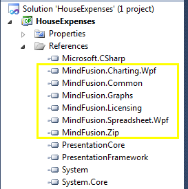
Spreadsheet for WPF: referenced dll-s.

Spreadsheet for WPF: referenced dll-s.

Then, in XAML, we map the spreadsheet namespace to the prefix “ss”:

xmlns:ss="http://mindfusion.eu/spreadsheet/wpf"

Finally, we create a WorkbookView and Workbook instances, which we’ll use later in code.

 <ss:WorkbookView x:Name="workbookView">
            <ss:Workbook x:Name="workbook" />
        </ss:WorkbookView>

II. Header.

The next step is to add a sheet to our workbook like this:

            var activeSheet = workbook.Worksheets.Add();
            workbookView.ActiveWorksheet = activeSheet;
            activeSheet.BeginInit();

Now, we can start to build the actual house bills template. First, we define the global formatting for the worksheet:

var globalStyle = activeSheet.CellRanges[0, 0, 
     activeSheet.Columns.Count - 1, activeSheet.Rows.Count - 1].Style;
            globalStyle.FontName = "Tahoma";
            globalStyle.FontSize = 10;

We get all cells from the active sheet and set the font name and font size, which we’ll be used when we edit them.

Then, we define the header of the bills template.

     //initialize header label and style
      var heading = activeSheet.CellRanges["A3:H3"];
      heading.Merge();
      activeSheet.Rows[2].Height = "40pt";
      activeSheet.Columns[0, 8].Width = "80pt";
      activeSheet.Cells["A3"].Data = "Bills for March, 2016";

The header is at the second row and spans from the first to the eighth cell e.g. from A3 to H3. We merge the cells and increase the height. We also increase the width of the first eight columns because we want larger cells to fit the bill content. Last but not least we set the label. The label is assigned to the first cell of the merged cells.

Next, we’ll do some styling of the font and label of the title:

     
      var headingStyle = heading.Style;            
      headingStyle.FontSize = 14;
      headingStyle.FontBold = true;            
      headingStyle.VerticalAlignment = MindFusion.Spreadsheet.Wpf.VerticalAlignment.Middle;
      headingStyle.PaddingLeft = "5pt";
      headingStyle.TextBrush = Brushes.LightSlateGray;

Here we get the Style object of the header, increase the font size and set the font style to bold, vertically align the title in the middle and add some padding to it. We use a slate gray brush for the heading. The underscore is done using two BorderBottom properties:

        headingStyle.BorderBottomBrush = Brushes.DarkGreen;
        headingStyle.BorderBottomSize = "2pt";

III. Description Block.

The description block is made of six cells:

string[] headerLabels = new string[] { "Description", "Start Date",
 "Due Date", "Amount", "Date Paid", "Remarks" };
            for (int i = 0; i < headerLabels.Length; i++)
                activeSheet.Cells[i, 4].Data = headerLabels[i];

Each cell describes certain data we’ll need for the house bills table. We want to apply some formatting to indicate this is a header row. We make the font bold and italic, align text in the middle, add a top border and gray background:

         heading = activeSheet.CellRanges["A5:H5"];
         headingStyle = heading.Style;
         headingStyle.HorizontalAlignment = 
MindFusion.Spreadsheet.Wpf.HorizontalAlignment.Center;
         headingStyle.Background = Brushes.LightGray;
         headingStyle.BorderTopBrush = Brushes.Gray;
         headingStyle.BorderTopSize = "1pt";
         headingStyle.FontItalic = true;
         headingStyle.FontBold = true;
         headingStyle.FontSize = 10;       

The description column will hold presumably more text and we merge three cells for it:

      //merge the cells with the description
      for (int i = 4; i < 15; i++)
        {
           var description = activeSheet.CellRanges[5, i, 7, i];
           description.Merge();
        }

Some of our cells show DateTime values. We want to format the data to show entries like “12-January-2016”. Here is how this is done:

       //format cells that hold date values
       activeSheet.CellRanges["B6:C15"].Style.Format = "dd-mmmm-yy";
       activeSheet.CellRanges["E6:E15"].Style.Format = "dd-mmmm-yy";

IV. Formulas.

We want to have a cell that sums all the current bills to give us an overview how much we have to pay this month. We’ll use the SUM function, which is just one of the many functions Spreadsheet for WPF supports – you can check the list here.

      activeSheet.Cells["D17"].Data = "=SUM(D6:D15)";
      activeSheet.Cells["D17"].Style.Format = "$##.##";

V. Conditional Formatting.

The last feature we want to add is to paint in red those bills whose sum is for more than 100 USD. That is done with conditional formatting:

      var billsStyle = activeSheet.CellRanges[3, 5, 3, 14].Style;
      billsStyle.Format = "$##.##";
      var format1 = billsStyle.ConditionalFormats.Add();
      format1.Type = 
         MindFusion.Spreadsheet.Wpf.ConditionalFormatType.CellValue;
      format1.Operator = 
         MindFusion.Spreadsheet.Wpf.ComparisonOperator.GreaterThan;
      format1.Second = "100";
      format1.Style.TextBrush = Brushes.Red;

We select the cells that render the sums and add a new IConditionalFormat object. It users the operator “greater than” and changes the text brush to red if the data of the cells gets higher than 100.

This is the final type of customization we’ve performed on this workbook. We call

activeSheet.EndInit();

to signalize that initialization for this worksheet is over. Here is the result:
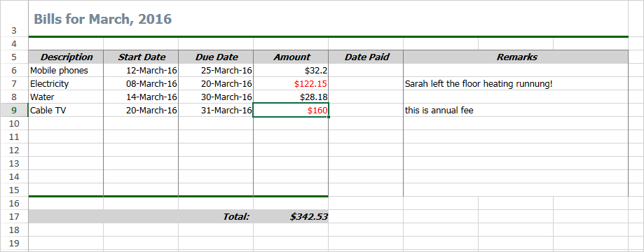
Spreadsheet for WPF Sample: Bills Template

Spreadsheet for WPF Sample: Bills Template

The sample is available for download from this link:

WPF Spreadsheet Control: House Expenses Template

The control’s libraries are included in the archive.

Technical support is available at the discussion board, per e-mail or at the help desk. We are happy to assist you.

About WPF Spreadsheet control from MindFusion: A native WPF component, which provides every single feature you’ll need to create an Excel-like spreadsheet in your own application in a matter of hours. The control is packed with a versatile chart library, which let’s you enhance your spreadsheets with compelling graphs of any type. The various user interaction options fit perfectly with the high demands of today’s application of performance and flexibility. Achieving the desired look and feel is easily accomplished with the efficient style system and the numerous appearance properties. The control provides a line of auxiliary forms, which enable programmers to easily edit and organize the spreadsheet data for the best and fastest possible results.

WPF Spreadsheet control is part of MindFusion WPF Pack of components – the tools that make WPF development fast and easy. Details here.


MindFusion.WPF Pack, 2016.R1

The new release of MindFUsion WPF Control Suite lists many new features, aimed to empower developers to create compelling business applications with even less efforts. The pack also includes new samples and tutorials. Below are the details:

License keys
There is no separate trial build of the control assemblies anymore. Instead, set the LicenseKey property of the controls to disable their evaluation mode and stop displaying trial messages. If your application contains more than one control by MindFusion, you could call MindFusion.Licensing.LicenseManager.AddLicense(key) from application start-up code to specify the key once instead of setting it per each control.

Visual Studio 2015 support
MindFusion Pack for WPF now includes support for Visual Studio 2015. The installer can create VS2015 toolbox palette for the component.

Barcodes
The new BarcodeLabel class allow displaying EAN, UPC or QR barcodes.

BarcodeLabel: QR barcodes

BarcodeLabel: QR barcodes

MindFusion Chart ControlMindFusion.Charting for WPF

Multiple Axes
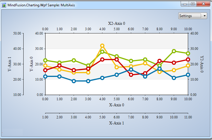
The chart control enables developers to create unlimited number of axes of each type – X, X2, Y and Y2. Each axis is an instance of the Axis class and has its own set of properties for complete customization – label style, brush, tick length etc. You can set the X and Y axes of each ChartSeries to a series of your choice and thus bind each chart series to different axes, if you wish.

Multiple axes in the WPF chart control.

Multiple axes in the WPF chart control.

Improved Zooming
Selected area with width smaller than MinZoomSpan does not evoke any action in the control. In addition, the new ZoomChanged event fires whenever zoom occurs and provides useful data for the zoom action with its ZoomChangedArgs.

Cross Hair Improvements
The cross hair control has been improved with several new properties, a method and an event. The properties are:

The new CrossHairPosition method returns the current location of the cross hair. For more precise handling of cross hair movements a new event is available – CrossHairPositionChanged.

Greatly Improved 3D Charts
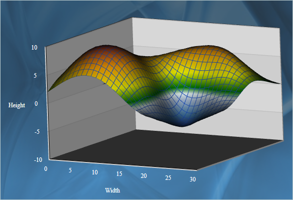
3D charts have received plenty of improvements, new properties and performance optimizations:

  • PointMergeThreshold – The property sets the radius of an area around a given point where no other points are drawn. The result is better performance especially in charts with numerous points, which happen to be close to one another.
  • InterpolationType.None – A new InterpolationType has been added to the InterpolationType, which does not interpolation but adds data directly and connects the points with triangulation.

The SurfaceType enum has been replaced with three bool properties, which makes the API easier to understand and use.

ScatterFaceSize – the property regulates the size of the polygons that build a 3D scatter. Bigger values lead to bigger polygons, which results in faster performance and more rough scatter mesh.

Effect3D.ShaderEffect – the property can be applied to all 3D chart elements, including scatters and performs much faster.

3D surface chart with color map and wire frame.

3D surface chart with color map and wire frame.

Exporting Images
Two new methods have been added for exporting the chart as an image – CreateImage and ExportImage.

Custom Formatting of Labels in Real-time Charts
A new property has been added to the RealTimeChart library – Axis.LabelFormatProvider. Use it to specify custom formatting of numeric labels. If required, you can specify format arguments for your format classes with Axis.LabelFormat.

MindFusion WebForms DiagrammerMindFusion.Diagramming for WPF

Free-form nodes
A FreeFormNode collects all points from users’ mouse or touch input and displays them as node’s outline. To let users draw free-form nodes interactively, set Diagram.Behavior to DrawFreeForms or LinkFreeforms. Use the Points property of FreeFormNode to get or set outline points programmatically. If the Closed property is set, the node is drawn as a closed shape and its interior filled, or otherwise the node is drawn as a poly-line. If the distance between first and last points drawn by user is shorter than Diagram.AutoCloseDistance, the node’s Closed property is automatically set to true . AutoCloseDistance default value is Double.MaxValue , so free-form nodes are always closed.

Wpf Diagram: Free Shapes

Wpf Diagram: Free Shapes

Shape control points
Shape formulas can now be parameterized by associating control points with Shape objects. Each control point is passed to the shape script as a named variable. Apart from the name, you can specify the default, min and max coordinates for each parameter via the ShapeControlPoint constructor, and whether to treat its values as percents or fixed offset.

Resize table columns and rows
Columns and rows of a TableNode can now be resized interactively if its AllowResizeColumns or AllowResizeRows properties are enabled. In order to resize, move the mouse pointer to the border line on column’s right side or row’s bottom side until it shows resize cursor and start dragging. The control raises TableColumnResizing and TableRowResizing events to let you validate new size or prevent resizing some elements.

Barcode nodes
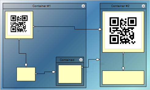
The BarcodeNode class displays EAN, UPC or QR barcodes as node’s content. In-place edit operations let users enter new numeric codes for 1D codes or text strings for QR codes. The barcode format is specified via the Format property, the encoded number or text is set via Content, and color of 1D bars / 2D modules via BarColor.

Barcode diagram nodes

Barcode diagram nodes

Support for Visio stencils
The diagram can now display shapes from stencil files in Visio 2003 XML stencil format (.vsx). To load a stencil file, use an instance of the VisioStencil class. The shapes are displayed in the diagram through VisioNode objects.

ShapeDesigner improvements

  • The ShapeDesigner control supports undo. Call its Undo or Redo methods to respectively undo or redo a change done to the designed shape.
  • ZoomFactor property added to ShapeDesigner. It also supports interactive zoom in/out via mouse wheel.
  • The SelectedElement property exposes the graphic element currently selected in ShapeDesigner canvas. You can bind to its stroke and brush properties to create alternative user interface for editing element attributes.

AnchorPatern improvements

  • The XUnit and YUnit properties allow specifying the coordinates of an AnchorPoint as a fixed offset from the node’s top-left corner rather than in percentage, so that the point position does not change when the node is resized.
  • The AnchorPattern property of Shape class lets you associate anchor points with shape definitions. If a ShapeNode instance does not contain its own AnchorPattern, it will derive the one defined by the node’s Shape.
  • The RowAnchorPattern property lets you specify default AnchorPattern for all table rows.

Map-16x16MindFusion.Mapping for WPF

Zoom control
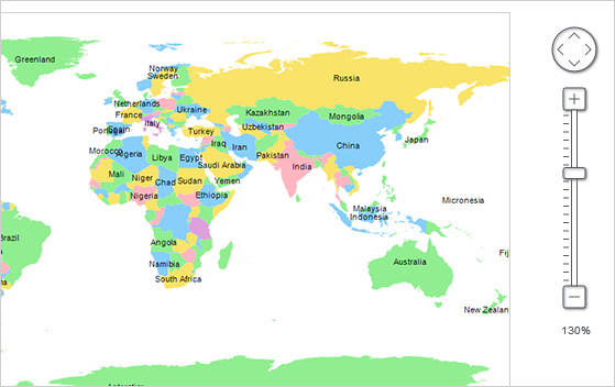
The ZoomControl class lets user change interactively the current zoom level and scroll position of a MapView. To set it up, add a ZoomControl to the page, place it anywhere over a MapView, and set the control’s Target property to that view. Set the ZoomStep and ScrollStep properties to specify the amount added to view’s zoom level or scroll position by ZoomControl’s buttons.

map-control-zooming

Miscellaneous

  • The new Behavior property lets users select multiple map elements interactively.

WPF Reporting ToolMindFusion.Reporting for WPF

Report Parameters
Parameters can now be added to a report through the new Parameters collection of the Report class. The parameters provide name, description and value and can be of any type, including expression. For more information about parameters, check the Report Parameters topic.

Barcodes
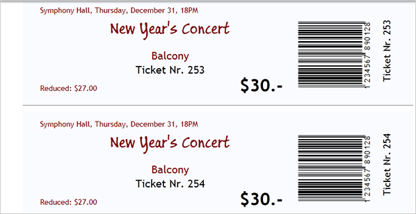
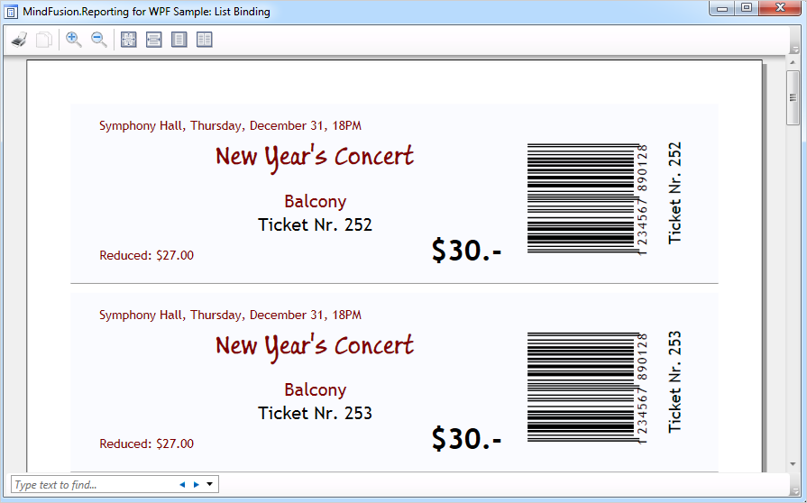
MindFusion.Reporting for WPF reports can now display UPC-A, UPC-E, EAN-8, EAN-13, and QR barcodes. The barcodes are represented by the new Barcode report item.

wpf_barcode_report_items

Schedule ControlMindFusion.Scheduling for WPF

Interactive Recurrence Rescheduling
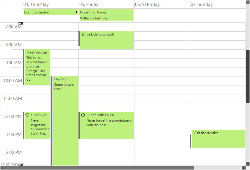
Recurrences can be rescheduled interactively by holding down the RescheduleRecurrenceKey while dragging a recurrent item. The control tries to preserve the current pattern of the recurrence when possible.

New Theme
A new built-in theme is available in MindFusion.Scheduling for WPF – the Light theme. It is available through the ThemeType enumeration.

The new 'Light' theme

The new ‘Light’ theme

New Members
Several new properties and events have been added to the control:

You can read details about the new features of the pack at the news page on the forum. The trial version is available for direct download from this link:

Download MindFusion.Pack for WPF 2016.R1

About MindFusion.Wpf Pack: A set of advanced WPF components that help you build your business application easy and on time. The tools provide you with a complete set of features to create, edit and render complex flowcharts, charts, diagrams, calendars, schedules, maps and reports. A set of gauges and UI elements is also included. Each component offers various samples, tutorials and detailed documentation. The controls offer simple and intuitive API, completely customizable appearance, numerous input/output options and a rich event set. Each tool has been thoroughly tested to guarantee that you and your application get the high quality and performance you deserve.

You can read more about the capabilities of each component at its features page:

Prices and licenses are explained in details at the buy page.

MindFusion.WinForms Pack, 2016.R1

MindFusion Pack for WinForms, 2016.R1 has been released. Here is an overview of the new features. You can find details about each new feature here.

Visual Studio 2015 support
MindFusion Pack for WinForms now includes support for Visual Studio 2015. The installer can create VS2015 toolbox palette for the components.

Barcodes
The new BarcodeLabel and BarcodePrinter classes allow displaying and printing EAN, UPC or QR barcodes.

BarcodeLabel:  QR barcodes

BarcodeLabel: QR barcodes

MindFusion WebForms DiagrammerMindFusion.Diagramming

Street maps
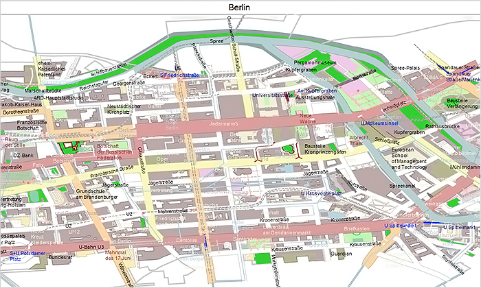
MapNodes can render street maps in OpenStreetMap format. Call FromXml method of MapContent to load an .osm file.

MindFusion WinForms  Street maps

MindFusion WinForms Street maps

Resize table columns and rows
Columns and rows of a TableNode can now be resized interactively if its AllowResizeColumns or AllowResizeRows properties are enabled. In order to resize, move the mouse pointer to the border line on column’s right side or row’s bottom side until it shows resize cursor and start dragging.

Barcode nodes
The BarcodeNode class displays EAN, UPC or QR barcodes as node’s content. In-place edit operations let users enter new numeric codes for 1D codes or text strings for QR codes.

Miscellaneous

  • Support for .NET 2 has been dropped; the minimum supported .NET framework version now is 3.5.
  • Distribution now includes a set of digitally-signed assemblies.
  • Undo/redo records for in-place edit operations are now created automatically. They are represented by instances of the EditTextCmd class.
  • CompositeNode supports vertical scrolling in EditComponent (only via keyboard).
  • Support for FromPage and ToPage properties of PrinterSettings .
  • CreateBarcodeNode methods added to the Factory class.
  • The BarcodeNodeStyle property of Diagram defines the default appearance of BarcodeNodes.
  • Improved speed when dragging large hierarchies of grouped nodes.
  • ZoomControl can now be used with other components by MindFusion and has been moved to MindFusion.Common.WinForms assembly and namespace.
  • and much more.

Map-16x16MindFusion.Mapping

Street maps
You can render street maps in OpenStreetMap format by adding a StreetMapLayer instance to the MapView. In order to load a street map, create a new StreetMapLayer > object and call its Map‘s LoadFromXml method to load the corresponding *.osm file.

Zoom control
The ZoomControl class lets user change interactively the current zoom level and scroll position of a MapView. To set it up, add a ZoomControl to the form, place it anywhere over a MapView, and set the control’s Target property to that view.

map-control-zooming

Multiple selection
Now it’s possible to select multiple decorations or map shapes by drawing a selection rectangle. To enable that, set the Behavior property to Select. Selected elements are stored in the Selection collection of respective layer objects.

API changes

  • The type of MapElement‘s Label property has been changed from string to Label class. The FontName and FontSize properties have been moved from MapElement to Label.
  • Type of Layers property changed from List to ObservableCollection .

WPF Reporting ToolMindFusion.Reporting

Barcodes
MindFusion.Reporting reports can now display UPC-A, UPC-E, EAN-8, EAN-13, and QR barcodes. The barcodes are represented by the new Barcode report item.

WinForms Reporter: Barcode Report Items

WinForms Reporter: Barcode Report Items

Miscellaneous

WebForms Scheduler by MindFusionMindFusion.Scheduling

Improved List View
The List view can now display an additional header and a footer. To turn them on, set the appropriate flag to the HeaderStyle property of the ListViewSettings class. The FooterFormat and MainHeaderFormat properties let you customize the text in the respective header. The text can also be customized through the CustomizeText event of the Calendar class. The size of the headers can be specified through the MainHeaderSize and FooterSize properties. Interactive Recurrence Rescheduling Recurrences can be rescheduled interactively by holding down the RescheduleRecurrenceKey while dragging a recurrent item. The control tries to preserve the current pattern of the recurrence when possible.

New Theme
A new built-in theme is available in MindFusion.Scheduling – the Light theme. It is available through the ThemeType enumeration.

The new 'Light' theme

The new ‘Light’ theme

New Properties
Several new properties have been added to the control:

Miscellaneous

Spreadsheet-16x16MindFusion.Spreadsheet

Autofiltering
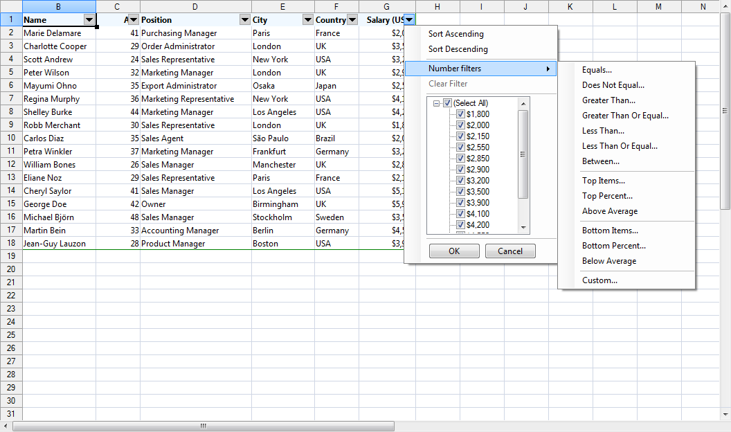
Worksheets now support autofiltering. To enable it, call the AutoFilter method of the CellRange class. To specify autofiltering criteria for individual columns, use the AutoFilter overload.

WinForms Spreadsheet: Auto filtering

Multiple Selection
MindFusion.Spreadsheet now supports selection of multiple cell ranges. Cell ranges can be added to the selection interactively, by holding down the CTRL key while dragging with the mouse, or programmatically, by using one of the new methods of the Selection class: Add, AddRow, and AddColumn.

Miscellaneous

Installer for the latest version can be downloaded at https://www.mindfusion.eu/WinFormsTrial.zip

Updated assemblies are also available as MindFusion.Pack NuGet package.

About MindFusion.WinForms Pack: A set of five WinForms programming components that provide your application with a rich choice of diagramming, charting, scheduling, mapping, reporting and gauge features. The tools are very easy to implement and use. They boast intuitive API and various step-by-step tutorials to get you started. Both online and offline documentation is available.

A sample browser presents you with all the samples for each control to let you easily navigate to what you need. You can check some of the features of each component right now if you look at the online demos:

Visit the features – page of the components for more information about their capabilities:

You can check the prices and licensing scheme here. All components are royalty-free.

Spreadsheet for WinForms, V1.4

MindFusion is happy to announce the Scheduling for WinForms, V1.4 is out. Here is a list of the new features:

Licensing

Spreadsheet for WinForms is the next MindFusion component that no longer has separate trial build of the control assemblies. Instead, set its LicenseKey property to disable the evaluation mode and stop displaying trial messages. If your application contains more than one control by MindFusion, you could call MindFusion.Licensing.LicenseManager.AddLicense(key) to specify the key once instead of setting it per each control. License key strings are listed on the Keys & Downloads page at MindFusion’s customer portal. Don’t forget to add a reference to the MindFusion.Licensing dll if it’s not already present in your project.

Visual Studio 2015 support

MindFusion.Spreadsheet for WinForms now includes support for Visual Studio 2015. The installer can create VS2015 toolbox palette for the component.

Autofiltering

Worksheets now support autofiltering. To enable it, just call the AutoFilter method of the CellRange class. You can specify autofiltering criteria for individual columns with the the AutoFilter overload. You also have the convenience to specify these criteria interactively, through the drop-down buttons inside the headers of each column in the target range.

Spreadsheet for WinForms: Auto Filtering

Spreadsheet for WinForms: Auto Filtering

Multiple Selection

Extend the functionality of your WinForms spreadsheet application by allowing users to select multiple cell ranges. You can

    • even add cell ranges interactively, by holding down the CTRL key while dragging with the mouse. You can also do it programmatically, by using one of the new methods of the Selection class: Add, AddRow, and AddColumn.
Spreadsheet for WinForms: Multiple Selection

Spreadsheet for WinForms: Multiple Selection

Miscellaneous

      • The new EnableTypeInference property can be used to suppress automatic type inference in the workbook.
      • The tooltips displayed when the user resizes rows and columns can now be turned off through the ShowResizeHeaderToolTips property. The format of these tooltips can be specified through the ResizeColumnToolTipFormat and ResizeRowToolTipFormat properties.

You can download the trial version from the link below:

Download MindFusion.Spreadsheet for WinForms V1.4 Trial Version

If you require technical support, you can post a message at the forum, send us an e-mail at support@mindfusion.eu. or use the help desk. MindFusion takes special effort in providing fast and detailed answers to all inquiries that we receive.

About MindFusion.Spreadsheet for WinForms: An easy-to-use programming component suitable for building all types of spreadsheets fast and easy. The tool supports formulas, tool-tips, cell annotations, cell spanning, scrolling and many more. You can add charts and images as well use the flexible style system to design the perfect spreadsheet. The component supports full undo and redo as well copy and paste from Windows clipboard.
You can import spreadsheet data from CSV, XLSX or ODS files and export the final spreadsheet in a number of formats – as images, PDF or CSV, XLSX or ODS files. Various auxiliary forms help you quickly adjust the data and appearance of your spreadsheet. Read more about the features of the component here or check the license prices at the buy page.

Spreadsheet for WinForms is part of MindFusion Pack for WinForms, which offers other useful components that are of great use when you build any type of WinForms application – from a diagramming library to map control to gauges: check them here.

WinForms Spreadsheet Auto-Filtering

In this post we will discuss how to use the auto-filtering feature in MindFusion.Spreadsheet for WinForms.

Introduction

We start off by creating a new Windows Forms Application in Visual Studio, adding a WorkbookView control to the main form and adding the Northwind database (nwind.mdb) as a data source. For simplicity we only add the Orders table. After compiling the application we can add the DataSource and the OrdersTableAdapter as components to the main form.

Loading the data

We traverse the rows in the data source and populate the spreadsheet by assigning the data to the Data property of the respective worksheet cells. The first cell in each column is set to the name of the corresponding database field. Finally, the columns are resized to fit their contents through the ResizeColumnsToFit method of the view. The complete code of the data loading can be found in the LoadData method.

Turning auto-filtering on

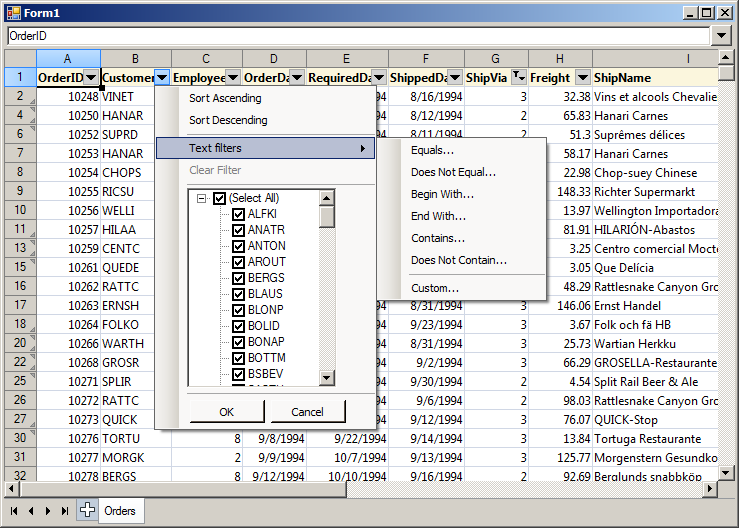
Auto-filtering is enabled by calling the AutoFilter method of the CellRange class. If the CellRange represents a range of cells, then auto-filtering is applied to that range. If the CellRange represents a single cell, then auto-filtering is applied to the rectangular area of data cells, which includes this cell. In this application, we enable auto-filtering on the loaded data, by calling AutoFilter on cell A1. In addition, we apply auto-filtering criteria on the 6-th column (ShipVia) by calling the AutoFilter overload.

workbook1.Worksheets[0].CellRanges["A1"].AutoFilter();
workbook1.Worksheets[0].CellRanges["A1"].AutoFilter(
    6, "<>1", AutoFilterOperator.Or, null, true);

The following image shows the running sample:
spreadsheet-autofilter

The source code is available for download from here:
https://mindfusion.eu/_samples/SpreadsheetAutoFilter.zip

MindFusion.Spreadsheet for WinForms can be downloaded from here:
MindFusion.Spreadsheet for WinForms

About MindFusion.Spreadsheet for WinForms: A powerful .net spreadsheet component with great capabilities for editing, styling and formatting large amounts of data.