In this post we demonstrate how to use MindFusion.Charting for ASP.NET component to create a line chart that shows the number of unique visitors to a store/website in a period of 6 weeks.
Data
The data for the X-axis are DateTime values. We create an array with the DateTime values that we’ll use and add it to the XData property of our chart. Before that we have to delete the predefined array that is added when the control is dropped at the form:
DateTime dt1 = new DateTime(2013, 6, 14);
DateTime dt2 = new DateTime(2013, 6, 7);
DateTime dt3 = new DateTime(2013, 5, 31);
DateTime dt4 = new DateTime(2013, 5, 24);
DateTime dt5 = new DateTime(2013, 5, 17);
DateTime dt6 = new DateTime(2013, 5, 10);

ArrayList data = new ArrayList() { dt1, dt2, dt3, dt4, dt5, dt6 };
LineChart1.XData.Clear();
LineChart1.XData.Add(data);
Next, we must make some adjustments in the settings for the X-axis to tell the control that DateTime data is used. We set the DataFormat property to DateTime and we specify the time range for the axis. This is how we do this:
LineChart1.XAxisSettings.DataFormat = MindFusion.Charting.DataFormat.DateTime;

LineChart1.XAxisSettings.StartDateTime = new DateTime(2013, 5, 3);
LineChart1.XAxisSettings.EndDateTime = new DateTime(2013, 6, 20);
//set the interval to one week - 7 days
LineChart1.XAxisSettings.TimeSpan = new TimeSpan(7, 0, 0, 0);
The data for the Y-axis are numbers. We can set them through the property grid or set them in code.
LineChart1.YData.Clear();
ArrayList data1 = new ArrayList() { 56, 13, 45, 17, 82, 22 };
LineChart1.YData.Add(data1);
The X-axis
First, we must change the LabelType property of XAxisSettings from “ChartData”, which is the default to “AutoScale”. This will make the axis show the time range we’ve set in code above. Then, we change how the DateTime values will be formatted. The Default DateTimeFormat shows the full time and date and is not suitable. We change it to “LongDate”, which does not draw any time.
XAxisSettings-DateTimeFormat="LongDate"
XAxisSettings-DrawTicksUniformly="False" XAxisSettings-DrawZero="True"
XAxisSettings-LabelBrush="s:#FF696969" XAxisSettings-LabelOffset="10"
XAxisSettings-LabelType="AutoScale" XAxisSettings-TitleLabel="Week"
XAxisSettings-TitleLabelBrush="s:#FF696969" XAxisSettings-TitleLabelOffset="10"
We type “Week” as TitleLabel for the axis and set the DrawZero property to true to show the first label, which is otherwise omitted.
Upon preview we notice that the labels are too close to the axis, that’s why we use LabelOffset and TitleLabelOffset to add some space before them. Finally, we change the color of the labels, to make them dark gray rather than black.
The Y-axis
Customizing the Y-axis is rather simple. We change the interval with AxisDelta to 5 and increase the MaxValue to 100. We don’t need decimal fractions for the labels, that’s why we change the NumberFormat. We add a TitleLabel and change its orientation with TitleLabelOrientation. Finally we use LabelBrush and TitleLabelBrush to change the colors of the labels – we use the same brushes as for the X-axis.
YAxisSettings-AxisDelta="5"
YAxisSettings-LabelBrush="s:#FF696969"
YAxisSettings-MaxValue="100" YAxisSettings-NumberFormat="Fixed_point_0Digits"
YAxisSettings-TitleLabel="Unique Visitors"
YAxisSettings-TitleLabelBrush="s:#FF696969"
YAxisSettings-TitleLabelOrientation="BottomToTop"
The Grid
Initially the chart shows no grid – but we want to show a grid. That’s why we change GridType to “Crossed” and set a GridPen. The dark gray background of the plot area together with its outlining are set with PlotAreaOutlinePen and PlotAreaBrush.
GridPen="n:0/#FFE1E1E1/0/0/0//0/0/10/" GridType="Crossed" PlotAreaBrush="s:#FFC0C0C0"
PlotAreaOutlinePen="n:0/#FF787878/0/0/0//0/0/10/"
This is the code that was generated by the designer because we set the properties through the property grid. If we set them with code, it will be:
LineChart1.GridPen = new MindFusion.Drawing.Pen(Color.FromArgb(225,225,225));
LineChart1.GridType = MindFusion.Charting.GridType.Crossed;
LineChart1.PlotAreaBrush = new MindFusion.Drawing.SolidBrush(Color.FromArgb(192, 192, 192));
LineChart1.PlotAreaOutlinePen = new MindFusion.Drawing.Pen(Color.FromArgb(120, 120, 120));
The Line Series
We want scatters at data points and we want to show labels above those scatters. The LabelType property lets us set the type to be both line and scatters:
LineChart1.LineType = MindFusion.Charting.LineTypes.Line | MindFusion.Charting.LineTypes.Scatter;
This is the default type, so you don’t need to set it if you have not changed it before. We use ShapeBrushes, ShapePens and ShapeSizes to set the brushes and size of the scatters. We can do this in the property grid or in code. Finally, we want to show labels above scatters. We use LabelType and LabelFormat to set what kind of labels are drawn and since our labels are numbers – how they are formatted.
LabelBorder="RoundedRect" LabelBorderBackground="s:#FFFFFFE0" LabelBorderOutline="n:0/#FF787878/0/0/0//0/0/10/" LabelFormat="Fixed_point_0Digits" LabelType="Data"
In code you write:
LineChart1.LabelBorder = MindFusion.Charting.Border.RoundedRect;
LineChart1.LabelBorderBackground = new MindFusion.Drawing.SolidBrush(Color.FromArgb(255, 255, 224));
LineChart1.LabelBorderOutline = new MindFusion.Drawing.Pen(Color.FromArgb(120, 120,120));
LineChart1.LabelFormat = MindFusion.Charting.NumberFormat.Fixed_point_0Digits;
LineChart1.LabelType = MindFusion.Charting.LabelType.Data;
Here is the final chart:
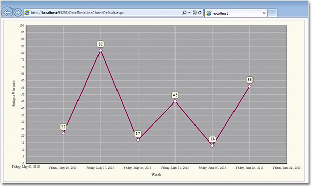
Line chart with DateTime values in ASP.NET
You can download the sample from this link:
Download Line Chart for ASP.NET Sample
The trial version of the component is available from here: