In this post we are discussing how to build a line chart with multiple series, scatters in custom colors,
two legends and custom labels at the X-axis. We are building the chart in Silverlight, using the
MindFusion.Charting for Silverlight tool.
Data
The data for the chart is taken from an ObservableCollection, where each member represents sales for a
given month.
lineChart1.DataSource = sales;
The Axes
The Y-axis shows an auto scale. This is the default LabelType so we don’t need to change it. But we want custom title label and intervals of 100. Here is how we set this:
lineChart1.YAxisSettings.Interval = 100L;

lineChart1.YAxisSettings.TitleOffset = 10.0;

lineChart1.YAxisSettings.Title = "USD";
The X-axis requires more customization. We want to show custom labels, that’s why we must set them and change the LabelType to show them:
lineChart1.XAxisSettings.LabelType = LabelType.CustomText;

lineChart1.XAxisSettings.CustomLabelPosition = CustomLabelPosition.ChartDataPoints;
We use the XLabelPath property to bind the Month field in our DataSource to the X-labels of the chart. We also set the maximum value at the X-axis and draw pointers to the labels by setting the Tick property.
lineChart1.XAxisSettings.MaxValue = sales.Count + 1;

lineChart1.XAxisSettings.Tick = 5.0;
The Series
The data for each series comes from a specific field in the DataSource collection:
lSeries1.YDataPath = "Turnover";

lSeries2.YDataPath = "Profit";
We want to show scatters and we use the ScatterType property to set the type. By default the type is “None” and no scatters are drawn. We need to change that:
lSeries1.ScatterType = ScatterType.Diamond;

lSeries1.ScatterSize = 20;
The brushes for the scatters are set with a BrushCollection:
BrushCollection sBrushes1 = new BrushCollection();

sBrushes1.Add(new SolidColorBrush(Colors.Red));

sBrushes1.Add(new SolidColorBrush(Colors.Red));

sBrushes1.Add(new SolidColorBrush(Colors.Yellow));

sBrushes1.Add(new SolidColorBrush(Colors.Green));
lSeries1.ScatterFills = sBrushes1;
Finally, don’t forget to add your LineSeries to the chart:
lineChart1.Series.Add(lSeries1);

lineChart1.Series.Add(lSeries2);
Legends
In this chart we need two legends – one is for the scatters and one for the series. They are both of
type SeriesLegend, which gives us control over the brushes and labels used.
The legend for the scatters is docked to the bottom and is aligned in the center.
MindFusion.Charting.Silverlight.SeriesLegend legend =

new MindFusion.Charting.Silverlight.SeriesLegend();

legend.LabelsSource = new List() { "Higher than expected", "Lower than expected", "Meets expectations"};

legend.BorderBrush = new SolidColorBrush(Colors.LightGray);

LayoutPanel.SetDock(legend, Dock.Bottom);

legend.HorizontalAlignment = System.Windows.HorizontalAlignment.Center;
Here is how we set the brushes:
BrushCollection brushes = new BrushCollection();

brushes.Add(new SolidColorBrush(Colors.Green));

brushes.Add(new SolidColorBrush(Colors.Red));

brushes.Add(new SolidColorBrush(Colors.Yellow));

legend.BrushesSource = brushes;

lineChart1.Legends.Add(legend);
The code for the other legend is similar, but we dock it to the right and align it to the top:
LayoutPanel.SetDock(sLegend, Dock.Right);

sLegend.VerticalAlignment = System.Windows.VerticalAlignment.Top;
Finally, don’t forget to add the two legends to the chart:
lineChart1.Legends.Add(legend);

lineChart1.Legends.Add(sLegend);
Here is the final result:
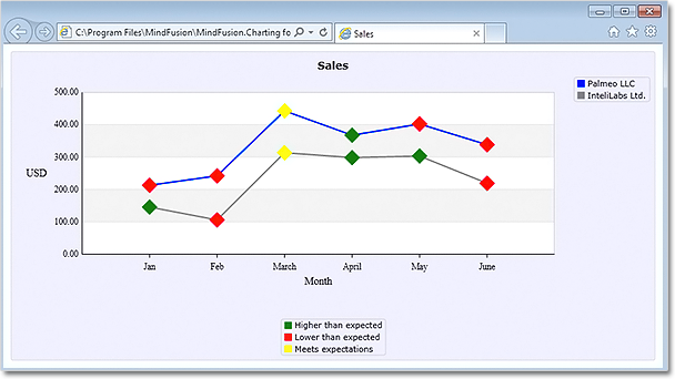
Line chart with scatters, two legends and custom labels. The platform is Silverlight.
The source code is available for download from here:
Download the Complete Source Code for the Sample
You can get the trial version of MindFusion.Charting for Silverlight from this link: