MindFusion is happy to announce the new version of the Java Diagramming library. The release offers useful new features and improvements.
What’s New in Version 4.1.4
Resize table columns and rows
Columns and rows of a TableNode can now be resized interactively if its AllowResizeColumns or AllowResizeRows properties are enabled. In order to resize, move the mouse pointer to the border line on column’s right side or row’s bottom side until it shows resize cursor and start dragging. The control raises tableColumnResizing and tableRowResizing events to let you validate new size or prevent resizing some elements. The tableColumnResized and tableRowResized events are raised after the operation completes.
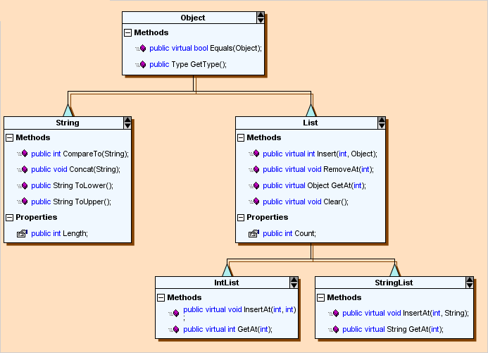
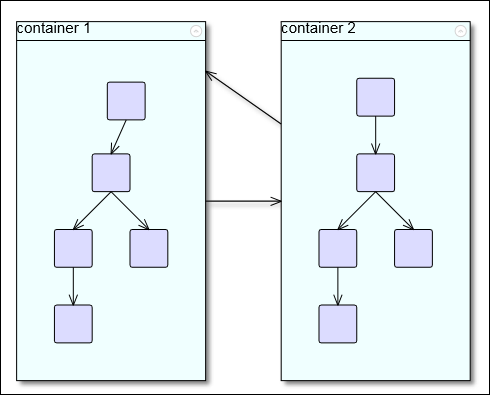
Java Diagram Library: Table Nodes
License keys
There is no separate trial build of the control’s JAR archive provided anymore. Instead, call the setLicenseKey method of DiagramView to disable the component’s evaluation mode and stop displaying trial messages. setLicenseKey > is static and you can call it just once before creating any views. License key strings are now listed on the Keys & Downloads page at MindFusion’s customer portal.
Miscellaneous
- Undo/redo records for in-place edit operations are now created automatically.
- KeepInsideDiagram constraint prevents a node from leaving diagram boundaries during user interaction (the older RestrictItemsToBounds property does not stop nodes from leaving diagram area but returns them to original position if dropped outside).
- Dashed selection frames are now drawn in two colors and should be visible on both the default white background and custom darker backgrounds. You can change the second dash color via DashBackground property of HandlesVisualStyle.
- Improved mouse capture for composite controls hosted inside ControlNodes.
- StartPoint and EndPoint properties provide a shortcut to setting the first and last control points of a DiagramLink.
Fixed bugs
- Fixed text clipping problem when magnifier is over TreeViewNode.
- Links to contained nodes were left visibly disconnected from them after deleting a folded ContainerNode.
- Lasso selection could not select strictly horizontal or vertical straight-line links when IncludeItemsIfIntersect is disabled.
The trial version is available for download from the following link:
Download MindFusion.Diagramming for Java Swing, V4.1.4 Trial Version
Technical support
MindFusion puts special effort in providing high quality technical support to all its clients and evaluators. You can post your questions about Diagramming for Java or any other of our components at the forum, help desk or at support@mindfusion.eu. All support inquiries are usually answered within hours of being received.
About Diagramming for Java Swing: MindFusion.Diagramming for Java Swing provides your Java application with all necessary functionality to create and customize a diagram. The library is very easy to integrate and program. There are numerous utility methods, rich event set, more than 100 predefined shapes. The tool supports a variety of ways to render or export the diagram, advanced node types like TreeView nodes, hierarchical nodes, tables, container nodes and many more. There are 15 automatic layouts, various input / output options and fully customizable appearance. A detailed list with JDiagram’s features is uploaded here. You can check the online demo to see some of the functionality implemented.
Diagramming for Java Swing is royalty free, there are no distribution fees. Licenses depend on the count of developers using the tool – check here the prices.