JS DateTimePicker
An intuitive way to choose date and time.
A JavaScript DateTimePicker control with a rich API
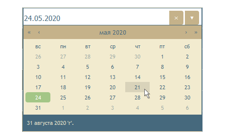
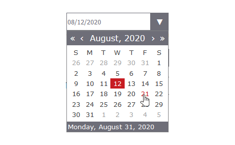
The DateTimePicker control provides a convenient and stylish user interface for selecting a date, a time or both.
Three Modes
The DateTimePicker control lets you choose between three modes: only time, only date and both. They are easily switched by means of a single property.
Online Documentation: The Mode Property
Formatting
You can specify the format of the rendered date and time. The interval for the time can be changed as well. If the user has provided incomplete input the control will try to parse it and adjust it to a valid value. It is possible to set only specify time interval to be selected.
Online Sample: DataGrid with a Localized DropDown Calendar
Customization
You can specify the style of the buttons or render no buttons at all. You can also control the offset and width of the drop-down portion of the calendar.
Online Sample: A DateTimePicker Demo
Styling
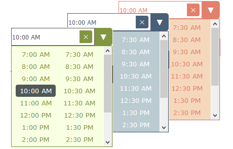
Styling is done through CSS themes and the control comes with a set of 10 eye-catching themes. You can edit each one of them or create your own themes. There are CSS classes for each portion of the DateTimePicker and you can fully control its look.
Events
The event set includes notifications for any actions performed on the DateTimePicker control: when the drop down is rendered or closed, when the value or its state is changed. An event is fired before the value is officially changed and you have the option to cancel the event.
Online Documentation: DateTimePicker Class Members


