We continue the ServerLoad tutorial with the diagram.
I. Create and Style The Diagram
We create a new JavaScript file named diagram.js in the Scripts folder of the project and reference it in the HTML.
<a href="http://Scripts/MindFusion.Diagramming.js">http://Scripts/MindFusion.Diagramming.js</a>
Now, in this file we make some namespace mapping to access easy the classes we need:
var Diagram = MindFusion.Diagramming.Diagram;
var DiagramLink = MindFusion.Diagramming.DiagramLink;
var ShapeNode = MindFusion.Diagramming.ShapeNode;
var Style = MindFusion.Diagramming.Style;
var DashStyle = MindFusion.Drawing.DashStyle;
var Alignment = MindFusion.Diagramming.Alignment;

var Rect = MindFusion.Drawing.Rect;
var LayeredLayout = MindFusion.Graphs.LayeredLayout;
var LayoutDirection = MindFusion.Graphs.LayoutDirection;

// a shortcut to the Events class
var Events = MindFusion.Diagramming.Events;
The code for the diagram does not need to be in a single method call, so we’ll use the document.ready event handler:
$(document).ready(function () {

// create a Diagram component that wraps the "diagram" canvas
diagram = MindFusion.AbstractionLayer.createControl(Diagram, null, null, null, $("#diagram")[0]);
//set both base and head link shape size
diagram.setLinkHeadShapeSize(2);
diagram.setLinkBaseShapeSize(2);
diagram.setLinkBaseShape(MindFusion.Diagramming.Shape.fromId("Arrow"));
................

});
As with the line chart, we create a diagram object using the canvas id from the html page. Then we make some link customization: we set the base and head shape with setBaseShape and setHeadShape to “Arrow” to indicate that data flows in two directions between servers.
Now let’s use a Style instance to set the stroke, text color and font name. Then we set the link style this way:
//customize the link appearance
var linkStyle = new Style();
linkStyle.setStroke("#c0c0c0");
linkStyle.setTextColor("#585A5C");
linkStyle.setFontName("Verdana");
linkStyle.setFontSize(3);
diagram.setStyle(linkStyle);
When users click on the diagram it is important not to allow them to create new links and nodes. That’s why we use setBehavior to change the default way the diagram responds to user actions:
//diagram items can only be selected
diagram.setBehavior(MindFusion.Diagramming.Behavior.SelectOnly);
We create the graph in the buildDiagram method. First, we call clearAll to remove all diagram items to make sure only nodes we’ve created are visible:
//generate diagram nodes
function buildDiagram() {
 diagram.clearAll();

};
II. Diagram Items
Let’s create the diagram nodes. We use png icons we’ve saved in an “icons” folder in the website. The background of each node is transparent ( setTransparent ), which means only the image will be visible. Then we add the node to the items of the diagram:
var rect = new Rect(0, 0, 15, 15);

var node = new ShapeNode(diagram);
node.setBounds(rect);
//the web server
node.setImageLocation("icons/web_server.png");
node.setTransparent(true);
diagram.addItem(node);
We create similar nodes for the data server, the clients and the network servers. The links are created with the DiagramLink class. The constructor takes the origin and target node of the link as parameters. We set an setId to the links, which is important and we add a label :
//add a link between the client and the server
var link = new DiagramLink(
       diagram, node, diagram.nodes[0]);
//same as the title of a given chart series
link.setId("Client" + i);
link.addLabel("Client" + i);
diagram.addItem(link);
Let’s not forget to emphasize the two links that correspond to the two series that are initially emphasized on the chart:
//bolden the two major links
diagram.links[5].setStrokeThickness(2.0);
diagram.links[8].setStrokeThickness(2.0);
III. Layout
We’ve created the diagram items but we need to arrange them. We use the LayeredLayout algorithm:
//the layeredLayout arranges the diagram properly - into layers
function applyLayeredLayout() {
    var layout = new LayeredLayout();
    layout.direction = LayoutDirection.TopToBottom;
    layout.siftingRounds = 0;
    layout.nodeDistance = 20;
    layout.layerDistance = 20;
    diagram.arrange(layout);
    diagram.resizeToFitItems();
}
As you see it is very easy to apply a layout with the diagramming control. You just create an instance of the layout, set the properties of your choice and call arrange (). In our case we need the layout direction to be LayoutDirection.TopToBottom We also adjust the nodeDistance and layerDistance and set the number of siftingRounds (attempts to unwind split links) to 0.
IV. Events
The diagram is meant to be interactive. We use the linkSelected and clicked events to handle selection of links and click on an area of the diagram, unoccupied by any items.
// add listeners
diagram.addEventListener(Events.linkSelected, onLinkSelected);
diagram.addEventListener(Events.clicked, onClicked);
When a link is selected, we need to emphasize the line graphic that corresponds to this link. We also emphasize the link itself. In addition, we must adjust the stroke and thickness of the other line graphs and diagram links. We do this in the onLinkSelected method:
//handle the linkSelected event
function onLinkSelected(sender, args) {

    //get the style of the series
    var seriesStyle = lineChart.plot.seriesStyle;
    seriesStyle.strokeThicknesses.clear();

    //thicken just the selected series, the others should be transparent
    for (var j = 0; j < lineChart.series.count() ; j++) {
        seriesStyle.strokeThicknesses.add(0.15);
        diagram.links[j].setStrokeThickness(1.0);
    }
.....
}
First we get the series style and then we use setStrokeThickness to reset the thickness of diagram links and series to their default values. After we’ve done that we need to get the selected links and emphasize them:
//bolden all selected links in the diagram as well
for (var m = 0; m < diagram.selection.links.length; m++) {
     var clickedLinkId = diagram.selection.links[m].getId();
     diagram.selection.links[m].setStrokeThickness(3.0);
When we’ve done that we need to find the series that correspond to these links and emphasize them as well:
//find the series that correspond to the selected links
for (var i = 0; i < lineChart.series.count() ; i++) {
      var _series = lineChart.series.item(i);


      //adjust the stroke thicknesses
      if (_series.title == clickedLinkId) {

          seriesStyle.strokeThicknesses.removeAt(i);
          seriesStyle.strokeThicknesses.insert(i, 3);
      }

   }
All this is followed by a call to the draw method that repaints the chart.
//repaint the chart
lineChart.draw();
The next event handler – the onClicked method resets the thicknesses to their default values:
//reset the chart thicknesses
function onClicked(sender, args) {
    resetThicknesses();

}
This is done in the resetThicknesses method, which uses the seriesStyle field of the line chart:
/* bolden the two major series, the others should be very thin.
bolden the two major diaglinks as well. */
function resetThicknesses() {
   var seriesStyle = lineChart.plot.seriesStyle;
   seriesStyle.strokeThicknesses.clear();

   for (var j = 0; j < 5; j++) {
      seriesStyle.strokeThicknesses.add(0.15);
      diagram.links[j].setStrokeThickness(1.0);
   }
.......
}
V. Tyre Separators
The diagram is divided into three parts by three separator lines. These lines are unconnected DiagramLink instances that have no head and base shape and have a custom position for the label. We use absolute positioning to locate the arrows. To do this we need to know the current size of the diagram:
//add the separators for the tyres
//first get the size of the diagram
var width = diagram.getBounds().width;
var height = diagram.getBounds().height;
Then the separator link is created with both origin and destination node being null:
//separator for the Clients tyre
//the link starts from the left edge and eds to the right edge of the digram
var link = new DiagramLink(
		diagram, new MindFusion.Drawing.Point(2, (height / 3.5)),
        new MindFusion.Drawing.Point(width, (height / 3.5)));
link.setShadowOffsetX(0);
link.setShadowOffsetY(0);
link.setStrokeDashStyle(DashStyle.Dash);
link.setStroke("#DCDCDC");
//remove the shapes at both ends
link.setHeadShape(null);
link.setBaseShape(null);
//do not allow this link to be selected
link.setLocked(true);
//move the link label to the right
var linkLabel = link.addLabel("Clients");
linkLabel.setControlPointPosition(1, -5, 0);
diagram.addItem(link);
Note that we’ve used the setLocked property of the link and have set it to true. This means the link cannot participate in user interaction – it can’t be selected, moved, resized. That’s what we want.
And with this our sample server load application is ready. Once again, here is how it looks:
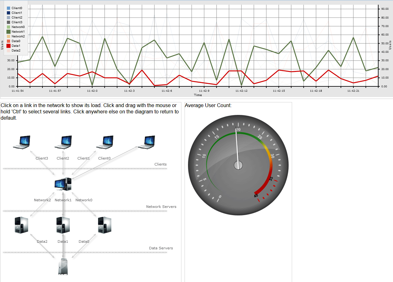
Server Load Application in JavaScript
Use this link to download the full sample with all necessary libraries and scripts.
You can also fork it from GitHub.
Visit the web pages of the diagramming and charting (with gauges) JavaScript libraries to learn more about these tools. Visit the MindFusion forums if you need technical support or want to ask further questions about MindFusion developer tools.