MindFusion Pack for WinForms, 2016.R1 has been released. Here is an overview of the new features. You can find details about each new feature here.
Visual Studio 2015 support
MindFusion Pack for WinForms now includes support for Visual Studio 2015. The installer can create VS2015 toolbox palette for the components.
Barcodes
The new BarcodeLabel and BarcodePrinter classes allow displaying and printing EAN, UPC or QR barcodes.

BarcodeLabel: QR barcodes
 MindFusion.Diagramming
Street maps
MapNodes can render street maps in OpenStreetMap format. Call FromXml method of MapContent to load an .osm file.
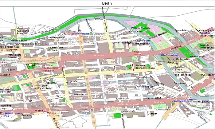
MindFusion WinForms Street maps
Resize table columns and rows
Columns and rows of a TableNode can now be resized interactively if its AllowResizeColumns or AllowResizeRows properties are enabled. In order to resize, move the mouse pointer to the border line on column’s right side or row’s bottom side until it shows resize cursor and start dragging.
Barcode nodes
The BarcodeNode class displays EAN, UPC or QR barcodes as node’s content. In-place edit operations let users enter new numeric codes for 1D codes or text strings for QR codes.
Miscellaneous
- Support for .NET 2 has been dropped; the minimum supported .NET framework version now is 3.5.
- Distribution now includes a set of digitally-signed assemblies.
- Undo/redo records for in-place edit operations are now created automatically. They are represented by instances of the EditTextCmd class.
- CompositeNode supports vertical scrolling in EditComponent (only via keyboard).
- Support for FromPage and ToPage properties of PrinterSettings .
- CreateBarcodeNode methods added to the Factory class.
- The BarcodeNodeStyle property of Diagram defines the default appearance of BarcodeNodes.
- Improved speed when dragging large hierarchies of grouped nodes.
- ZoomControl can now be used with other components by MindFusion and has been moved to MindFusion.Common.WinForms assembly and namespace.
- and much more.
 MindFusion.Mapping
Street maps
You can render street maps in OpenStreetMap format by adding a StreetMapLayer instance to the MapView. In order to load a street map, create a new StreetMapLayer > object and call its Map‘s LoadFromXml method to load the corresponding *.osm file.
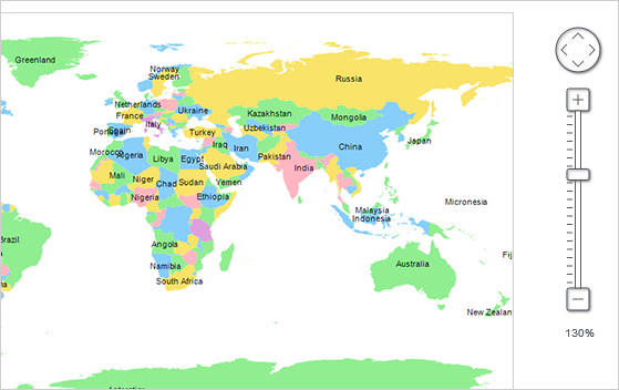
Zoom control
The ZoomControl class lets user change interactively the current zoom level and scroll position of a MapView. To set it up, add a ZoomControl to the form, place it anywhere over a MapView, and set the control’s Target property to that view.
Multiple selection
Now it’s possible to select multiple decorations or map shapes by drawing a selection rectangle. To enable that, set the Behavior property to Select. Selected elements are stored in the Selection collection of respective layer objects.
API changes
- The type of MapElement‘s Label property has been changed from string to Label class. The FontName and FontSize properties have been moved from MapElement to Label.
- Type of Layers property changed from List to ObservableCollection .
 MindFusion.Reporting
Barcodes
MindFusion.Reporting reports can now display UPC-A, UPC-E, EAN-8, EAN-13, and QR barcodes. The barcodes are represented by the new Barcode report item.
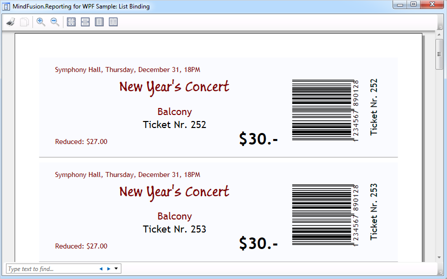
WinForms Reporter: Barcode Report Items
Miscellaneous
- PageSectionVisibility and AffectsParentLayout properties added to the ReportItem class.
 MindFusion.Scheduling
Improved List View
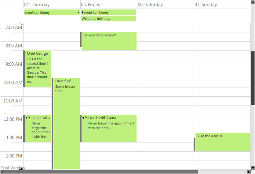
The List view can now display an additional header and a footer. To turn them on, set the appropriate flag to the HeaderStyle property of the ListViewSettings class. The FooterFormat and MainHeaderFormat properties let you customize the text in the respective header. The text can also be customized through the CustomizeText event of the Calendar class. The size of the headers can be specified through the MainHeaderSize and FooterSize properties. Interactive Recurrence Rescheduling Recurrences can be rescheduled interactively by holding down the RescheduleRecurrenceKey while dragging a recurrent item. The control tries to preserve the current pattern of the recurrence when possible.
New Theme
A new built-in theme is available in MindFusion.Scheduling – the Light theme. It is available through the ThemeType enumeration.
The new ‘Light’ theme
New Properties
Several new properties have been added to the control:
- The new HScrollBarHeight and VScrollBarWidth properties in the ControlStyle class allow you to modify the size of the scrollbars.
- The RescheduleRecurrenceKey property in the Calendar class can be used to modify recurrences interactively.
- The RotateGroupHeaderTexts property in the ListViewSettings class can be used to rotate the resource names in the group headers.
- GroupHourCount, HourFormat and TimelinePadding added to the TimetableSettings class.
Miscellaneous
- GetFirstVisibleResource and GetLastVisibleResource methods added to the Calendar class;
- The performance of the Resource view has been greatly improved;
- ApproximateScreen property added to PrintOptions;
 MindFusion.Spreadsheet
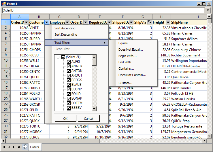
Autofiltering
Worksheets now support autofiltering. To enable it, call the AutoFilter method of the CellRange class. To specify autofiltering criteria for individual columns, use the AutoFilter overload.
Multiple Selection
MindFusion.Spreadsheet now supports selection of multiple cell ranges. Cell ranges can be added to the selection interactively, by holding down the CTRL key while dragging with the mouse, or programmatically, by using one of the new methods of the Selection class: Add, AddRow, and AddColumn.
Miscellaneous
- The new EnableTypeInference property can be used to suppress automatic type inference in the workbook.
- The tooltips displayed when the user resizes rows and columns can now be turned off through the ShowResizeHeaderToolTips property. The format of these tooltips can be specified through the ResizeColumnToolTipFormat and ResizeRowToolTipFormat properties.
- New SetData overload, which allows setting culture-invariant data to cells;
- New EvaluateFormulas method added to the Workbook class;
Installer for the latest version can be downloaded at https://www.mindfusion.eu/WinFormsTrial.zip
Updated assemblies are also available as MindFusion.Pack NuGet package.
About MindFusion.WinForms Pack: A set of five WinForms programming components that provide your application with a rich choice of diagramming, charting, scheduling, mapping, reporting and gauge features. The tools are very easy to implement and use. They boast intuitive API and various step-by-step tutorials to get you started. Both online and offline documentation is available.
A sample browser presents you with all the samples for each control to let you easily navigate to what you need. You can check some of the features of each component right now if you look at the online demos:
- MindFusion.Diagramming online demo
- MindFusion.Charting online demo
- MindFusion.Scheduling online demo
- MindFusion.Reporting online demo
Visit the features – page of the components for more information about their capabilities:
- Spreadsheet for WinForms features page
- Charting for WinForms features page
- Mapping for WinForms features page
- Gauges for WinForms features page
- Diagramming for WinForms features page
- Scheduling for WinForms features page
- Reporting for WinForms features page
You can check the prices and licensing scheme here. All components are royalty-free.