WinForms.Spreadsheet: Sorting Data

In this blog we will discuss how to sort existing data in MindFusion.Spreadsheet for WinForms both programmatically and by using the built-in form.

Introduction

As with all previous blogs we start off by creating a new Windows Forms Application in Visual Studio and adding a WorkbookView control to the main form. The WorkbookView displays a Workbook with a single worksheet.

Initializing the data

The data that should be sorted is contained in an CSV (comma-separated value) file, which is loaded at the start of the application. Some minor formatting is applied to the imported data, such as emphasizing the header row. The columns are automatically resized to fit the content through the ResizeColumnsToFit method of the WorkbookView class.

Sorting programmatically

The sorting is performed by calling the Sort method of the Worksheet class and providing a SortOptions object. This object contains information about the sort, such as which row or column to sort by, the sort direction (horizontal or vertical) and so on. In this particular case, we sort the data by columns, therefore we specify TopToBottom for the sort direction:

sortOptions.Direction = SortDirection.TopToBottom;

The columns (or rows) to sort by are specified by SortKey objects, added to the Keys collection of the SortOptions class. The order of the keys in the collection is important. For example, to sort by the first column and then by the fourth column, we define the following keys:

sortOptions.Keys.Add(new SortKey(0));
sortOptions.Keys.Add(new SortKey(3));

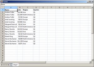
The Sort method accepts as argument the range to be sorted. In this sample we would like to prevent the header row from being sorted and specify A2:D15 for the target range.

The following image shows the running sample:

spreadsheet-sorting

Sorting through the built-in form

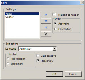
Sorting can also be performed through the built-in SortForm form, contained in the MindFusion.Spreadsheet.WinForms.StandardForms.dll assembly. The image below displays the form with the first and fourth columns selected as sort keys:

spreadsheet-sortform

The source code is available for download from here:

https://mindfusion.eu/_samples/SpreadsheetSorting.zip

The trial version of MindFusion.Spreadsheet for WinForms can be downloaded from here:

Download MindFusion.Spreadsheet for WinForms Trial Version

About MindFusion.Spreadsheet for WinForms: A powerful .NET spreadsheet component with great capabilities for editing, styling and formatting large amounts of data.

Drill Down Chart in WPF

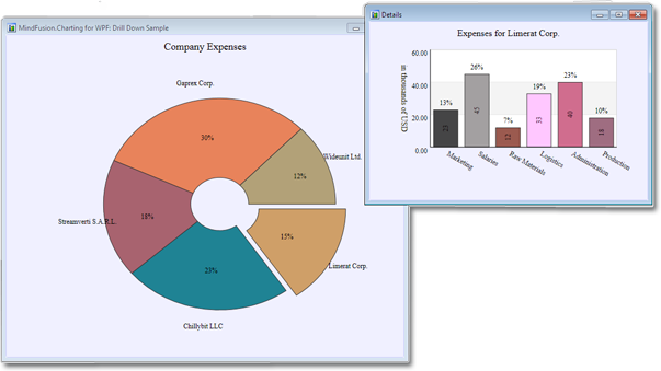
In this post we discuss how to create a drill down chart with the MindFusion.Charting for WPF tool. Our main chart will be a pie chart, where each peace shows some aggregate data. When clicked, a new chart pops up – a bar chart, which shows details about the clicked piece.

The Data

For the data we use an ObservableCollection called CompanyExpenses. It contains objects of type Expenses. The Expenses class implements INotifyPropertyChanged. Here is a code snippet:

public class Expenses : INotifyPropertyChanged
    {
  public Expenses(string corporationName, double marketing, double salaries, 
            double rawMaterials, double logistics, double administration, double production)
        {
            this.corporationName = corporationName;
            this.marketing = marketing;
            this.salaries = salaries;
            this.rawMaterials = rawMaterials;
            this.logistics = logistics;
            this.administration = administration;
            this.production = production;
          
}

.............
}  

We have properties for the various company expenses and a property for the name of the corporation. We have a special Sum property, which gives us the total of all expenses for the corporation. This property will be used by the main chart – the pie chart:

public double Sum
        {
            get { return sum; }
            set
            {
                sum = value;
                OnPropertyChanged("Sum");
            }
        }

The Pie Chart

The pie chart displays the expenses of all 5 corporations – together with their name and their share. We use data binding, the ComapnyExpenses list provides the DataSource:

CompanyExpenses data = new CompanyExpenses();
 pieChart1.DataSource = data;

In order to show the name of the company as an outer label, we must set the OuterLabelType to CustomText and bind Expenses.CorporationName to the OuterLabelPath property. We do this in XAML:

my:PieSeries OuterLabelOffset="30" OuterLabelPath="CorporationName" OuterLabelType="CustomText" DataPath="Sum" InnerLabelType="Percents" Name="pieSeries1" DetachedPiecesList="20"

The Sum property, which we mentioned above, provides data for the chart. The brushes are set with the brush editor in the property grid.

Hit Testing

We use the charting component’s HitTest method to detect when a piece was clicked and to show a bar chart with the respective data. PiePiece.PieceIndex gives us the index of the clicked piece. We use the Control.MouseDown event to detect mouse clicks.

private void pieChart1_MouseDown(object sender, MouseButtonEventArgs e)
        {
            List result = 
                pieChart1.HitTest(e.GetPosition(pieChart1));

            if (result.Count > 0 && result[0] is MindFusion.Charting.Wpf.PiePiece)
            {
                MindFusion.Charting.Wpf.PiePiece piece = 
                    result[0] as MindFusion.Charting.Wpf.PiePiece;

                Details d = new Details(data[piece.PieceIndex]);
                d.Show();
            }
        }

The HitTest method returns a collection of ChartElement objects. In our case we don’t have several ChartElements that overlap each other and might be clicked simultaneously, that’s why we take the first ChartElement.

The Detailed Chart

The detailed chart is a bar chart that displays the data for a single Expenses object. We set the labels at the X-axis to display the type of the expense:

barChart1.XAxisSettings.LabelType = MindFusion.Charting.Wpf.LabelType.CustomText;
            barChart1.XLabels = new List() { "Marketing", "Salaries", "Raw Materials", "Logistics", "Administration", "Production"};
            barChart1.XAxisSettings.LabelRotationAngle = 30;
            barChart1.XAxisSettings.CustomLabelPosition = MindFusion.Charting.Wpf.CustomLabelPosition.ChartDataPoints;

When we create the Details window, we pass as argument the Expenses object the chart refers to:

public Details( Expenses expenses)
{
barSeries1.YData = expenses.ExpensesList;

}

The data for the bar chart comes from the list of the expenses, which is a DoubleCollection.

Here is a screenshot of the final drill down chart:

The main pie chart with the bar chart that shows details for the clicked pie piece.

The main pie chart with the bar chart that shows details for the clicked pie piece.

You can download the complete source code for the project from this link:

Download MindFusion.Charting Drill Down Sample

Real Time Line Chart

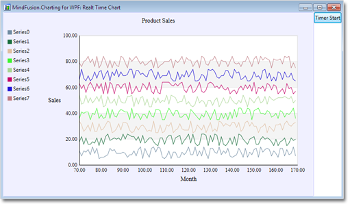
In today’s post we are going to build a real time line chart with the following features:

  • 8 data series with 100 points each.
  • Ten times per second we add 10 random points to each series and remove the last ten.
  • Each tenth of the second we update the min and max values of the X-axis.
  • Legend
The final chart

The final chart

Create the series

We create 8 series and add them to the Series collection of the chart:

for (int i = 0; i < 8; i++)
{
     LineSeries series = new LineSeries();
     series.StrokeThickness = 3;
     series.Strokes.Add(RandomStroke);
     series.Fills = series.Strokes;
     series.Title = "Series" + i;
     series.XData = new DoubleCollection();
     series.YData = new DoubleCollection();

     for (int j = 0; j < 100; j++)
     {
        series.XData.Add(j);
        series.YData.Add(10 + 10 * i + random.Next(-5, 5));
      }

     lineChart.Series.Add(series);
 }

Each series is drawn with a random generated stroke:

  private Brush RandomStroke
  {
     get
     {
        byte r = (byte)random.Next(0, 255);
        byte g = (byte)random.Next(0, 255);
        byte b = (byte)random.Next(0, 255);
        return new SolidColorBrush(Color.FromArgb(255, r, g, b));
       }
     }

We must set the Title and Fills properties though we don’t need them for the chart – they are used by the legend. The Y-values of the line points are random numbers between 10 and 90.

The Legend

ChartLegend legend = new ChartLegend();
legend.Series = lineChart.Series;
lineChart.Legends.Add(legend);

Our legend is of type ChartLegend, which means we must set its Series property to the list of ChartSeries that the legend explains. The ChartLegend reads the labels for its items from the Title property of a ChartSeries. It draws the series rectangles with the first brush in ChartSeries.Strokes and fills them with the first brush in ChartSeries.Fills. That’s why it was important to set the Title, Fills and Strokes properties as shown above.

The Axis
The axis shows scale divisions with interval 10. Initially they range from 0 to 100 in 10 intervals.

lineChart.XAxisSettings.MinValue = 0;
lineChart.XAxisSettings.Interval = 10;
lineChart.XAxisSettings.LabelType = LabelType.AutoScale;

Updating Data in Real Time

We create a timer that simulates reading real time data. The timer ticks ten times every second:

timer.Interval = TimeSpan.FromMilliseconds(100);
timer.Tick += new EventHandler(OnTimerTick);

When the timer ticks, we generate ten new values for each of the eight series, add them to each series and remove the last ten values:

foreach (LineSeries series in lineChart.Series)
{
    for (int i = 10 - 1; i >= 0; i--)
    {
         series.XData.Remove(series.XData[i]);
         series.YData.Remove(series.YData[i]);
    }
}

foreach (LineSeries series in lineChart.Series)
{
    int counter = 0;
    for (int i = 0; i < 10; i++)
    {
         series.XData.Add(i + maxX);
         series.YData.Add(10 + counter * 10 + random.Next(-5, 5));
     }
     counter++;
}

Here we use a global variable maxX, which we have declared in the class:

private int maxX = 100;

We increase our global variable with 10 to keep up with the change in the data:

maxX += 10;

Updating the Axis
At each tick of the timer we increase the start of the axis with 10:

lineChart.XAxisSettings.MinValue += 10;

Performance Optimization
Performance is greatly improved if we set the thickness of the lines to 1 rather than 3. The reason for this is that Windows GDI system draws thick lines by filling polygons. This requires numerous calculations about the coordinates of each polygon. When the thickness is small, Windows GDI draws lines rather than polygons, which speeds up drawing and performance.

series.StrokeThickness = 3;

Download of the Sample
You can download the sample with complete source code from here:

Download the Sample