Line Chart With Multiple Axes in WPF

A common scenario when building charts is the ability to render multiple series bound to multiple axes, each one with its own scale. To deal with this issue, MindFusion.Charting for WPF control has added support for multiple axes of all types – X, Y, Y2, X2 and in this post we’ll look how to add and customize them and how to create series bound to a given axis.

The sample imitates a production chart, where three different scales measure three different values – work output, capital and energy consumption – all of which presumably participate in producing a single unit of a product. On the right side we have a single Y2 axis, which measures the amount of units produced. The X-axis displays the time scale. Let’s look at the chart elements, one by one.

I. The Y-Axes

The Y-axes, as all axes in the chart are an instance of the Axis class and are added to the appropriate collection property. The Axis class defines all types of useful properties needed to customize an axis. We define the three axes in XAML:

<chart:linechart.yaxes>
    <chart:axescollection>
        <chart:axis minvalue="0" interval="5" maxvalue="60" labelformat="F0" tick="3" title="kWh/day" titlerotationangle="270" labelstroke="Red" titlestroke="Red"></chart:axis>
        <chart:axis minvalue="0" interval="300" maxvalue="2100" title="Capital (USD)" tick="3" titlerotationangle="270" labelstroke="Purple" titlestroke="Purple"></chart:axis>
        <chart:axis minvalue="100" interval="2.5" maxvalue="130" title="Work Productivity (%)" customlabelposition="AutoScalePoints" axiscrossingpoint="100.0" labeltype="CustomText" tick="3" titlerotationangle="270" labelstroke="Green" titlestroke="Green"></chart:axis>
    </chart:axescollection>
</chart:linechart.yaxes>

The property names easily describe what is set: the minimum and maximum values on each of the three axes, the title, the stroke for the labels and the title, the interval and the length of the axis ticks. Let’s note that the type of labels for the last Y-axis is “CustomText” – this means we will specify the labels explicitly rather than allow the control to generate them as with the other two axes – they don’t set a label type and the default value (the auto scale) is rendered.

Here is how we define the labels:

double start = 100.0;

    //130 is the last number at the axis
    while (start <= 130)
    {
        string l = start.ToString("F1") + "%";
        chart.YAxes[2].Labels.Add(l);
        start += 2.5;
    }

II. The Y2 Axis

The Y2-axis is just one and it is entirely declared in XAML:

<chart:linechart.y2axes>
    <chart:axescollection>
        <chart:axis minvalue="0" interval="1000" maxvalue="12000" tick="3" labelformat="F0" titlerotationangle="270" title="Units"></chart:axis>
     </chart:axescollection>
</chart:linechart.y2axes>

The label format is set with the standard .NET numeric strings – in this case it is a floating number without trailing zeros. In this axis, as well in the other Y-axes you might have noticed that we use the TitleRotationAngle property. This property rotates the title label at an arbitrary angle between 0 and 360. In our case we want the label drawn vertically, to conserve space.

III. The Series

The series are created in code. They specify scatter type because we want each series to have markers at data points. The YAxis property specifies the Y-axis, which a given Series is bound to. Finally, we specify the tool tip type because we want to have a tool tip when the mouse hovers a data point.

 LineSeries series0 = new LineSeries();
 series0.YAxis = chart.YAxes[0];
 series0.ScatterType = ScatterType.Square;
 series0.ScatterFills = new BrushCollection() { Brushes.Pink };
 series0.ScatterStrokes = new BrushCollection() { Brushes.Red };
 series0.Strokes = new BrushCollection() { Brushes.Red };
 series0.ToolTipType = ToolTipType.ChartData;

The data is random generated numbers. We use the Axis.XData and Axis.YData properties to set it.

 for (int i = 0; i < 30; i++)
     {
        series0.XData.Add(i * 6);
        data1.Add(rand.NextDouble() * 60.0);     
      }

      data1.Sort();
      series0.YData = new DoubleCollection(data1);
      //don't forget to add the series
      chart.Series.Add(series0);

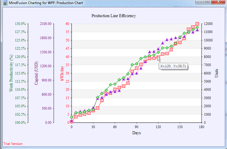
Last but not least – don’t forget to add the series to the Series collection property of the chart. With that our chart is ready – here is the result:

Charting for WPF: Multiple Axes and Series

Charting for WPF: Multiple Axes and Series

You can download the sample with the chart libraries from here:

WPF Chart With Multiple Axes Sample Download

If you have any questions regarding the chart component use the forum, email or the help desk to contact MindFusion. More information about Charting for WPF, which includes a premium 3D charting library and a Real time charting library optimized to handle huge data sets can be found here.

Line Chart with a Separator in WinForms

In today’s post we’ll show how to build a line chart with several line series and a separator line. The separator line is drawn at a given height and divides the chart into two halves.

The Line Series

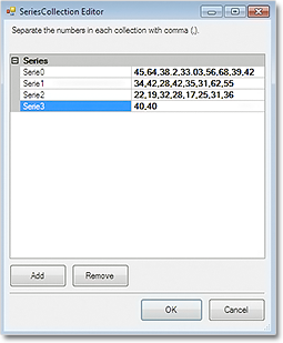
The line series are three, so we must add three lists with data to the XData and YData properties. We can do this in three ways: type the values in design time, write them in code or use data binding. In design time we use the built-in collection editors of the control:

The Series collection editor

The Series collection editor

In code we make lists with the data and add them to XData or YData:

lineChart1.YData.Clear();
lineChart1.YData.Add(new List { 45, 64, 38.2, 33.03, 56, 68, 39, 42 });
lineChart1.YData.Add(new List { 34, 42, 28, 42, 35, 31, 62, 55 });
lineChart1.YData.Add(new List { 22, 19, 32, 28, 17, 25, 31, 36 });

If you want to use data binding then set DataSource to the name of the data source, DataMember to specify the name of the table which will supply the data and XDataFields/YDataFields to provide the name(s) of the fields. In this case we will require three data base columns for each of the three series – separate the names with a comma e.g.

lineChart1.YDataFields = "Sales1,Sales2,Sales3";

For XData we use the same list because we want the series to appear exactly under each other:

lineChart1.XData.Clear();
lineChart1.XData.Add(new List { 10, 20, 30, 40, 50, 60, 70, 80 });

The Series

We set LineType to Line and Scatter because we want to show scatters at data points:

lineChart1.LineType = MindFusion.Charting.LineTypes.Line |  
MindFusion.Charting.LineTypes.Scatter;

The LineTypes enumeration allows bit wise combining of its members. We use ChartPens to set the pens for the line series. ShapesPens and ShapeBrushes set the pens for the outline and the brushes for filling the scatters:

lineChart1.ChartPens.Add(new MindFusion.Drawing.Pen(Color.FromArgb(102, 205, 170), 6));
lineChart1.ShapePens.Add(new MindFusion.Drawing.Pen(Color.FromArgb(102, 205, 170), 2));   

The pens for the series are thicker than the pens for the scatters. The fill brush is slightly lighter:

lineChart1.ShapeBrushes.Add(new MindFusion.Drawing.SolidBrush(Color.FromArgb(175, 251, 175)));

Finally – we set the size of the shapes and their type:

lineChart1.Shapes.Add(MindFusion.Charting.Shape.Circle);
lineChart1.ShapeSizes.Add(10);

The Separator

There are two ways to draw the separator line.

The first is to add a custom summary value. In this case the separator line will be drawn from the
smallest X-data value to the biggest one, parallel to the axes.

lineChart1.AddCustomSummary(40.0, "");

The summary line is drawn with shapes at both ends, but we can hide them by setting their size to 0:

lineChart1.SummaryBrushes.Add(new MindFusion.Drawing.SolidBrush(Color.Gray));
lineChart1.SummaryShapeSizes.Add(0);

The second way to draw the separator line is to add it as a 4th series in the XData and YData lists and add a pen for it in the ChartPens list. The advantage is that we can make the line as long as we want, in our case – as long as the length of the X-axis:

lineChart1.XData.Add(new List { 0, 90 });

The Legend

We use LegendLabels to add the labels for the line series:

lineChart1.LegendLabels = new List() { "2010", "2011", "2012" };

We set the background of the legend, but we don’t have to add any brushes or shapes for the legend items – they are taken automatically from the line series settings:

lineChart1.LegendBackgroundBrush = new MindFusion.Drawing.SolidBrush(Color.FromArgb(253, 253,  
253));


The Grid

The GridType is GridType.HorScale. We use GridBrush, AltGridBrush and GridPen to set the colors for the grid.

lineChart1.GridPen = new MindFusion.Drawing.Pen(Color.FromArgb(200, 200, 200));
lineChart1.GridPen.DashStyle = System.Drawing.Drawing2D.DashStyle.Dash;
lineChart1.GridType = MindFusion.Charting.GridType.HorScale;

If you make the changes to the chart in code, don’t forget to call UpdateChart() to make sure the
control knows changes have happened and the chart must be updated.

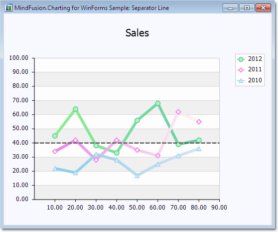
Here is the final chart:

A line chart with a separator line.

A line chart with a separator line.

The sample is available for download from here:

Download Line Chart with Separator Line Sample

You can download the trial version of the component with extensive documentation and many other samples from here:

Download MindFusion.Charting for WinForms Trial Version

Line Chart with DateTime Data in ASP.NET

In this post we demonstrate how to use MindFusion.Charting for ASP.NET component to create a line chart that shows the number of unique visitors to a store/website in a period of 6 weeks.

Data

The data for the X-axis are DateTime values. We create an array with the DateTime values that we’ll use and add it to the XData property of our chart. Before that we have to delete the predefined array that is added when the control is dropped at the form:

DateTime dt1 = new DateTime(2013, 6, 14);
DateTime dt2 = new DateTime(2013, 6, 7);
DateTime dt3 = new DateTime(2013, 5, 31);
DateTime dt4 = new DateTime(2013, 5, 24);
DateTime dt5 = new DateTime(2013, 5, 17);
DateTime dt6 = new DateTime(2013, 5, 10);

ArrayList data = new ArrayList() { dt1, dt2, dt3, dt4, dt5, dt6 };
LineChart1.XData.Clear();
LineChart1.XData.Add(data);

Next, we must make some adjustments in the settings for the X-axis to tell the control that DateTime data is used. We set the DataFormat property to DateTime and we specify the time range for the axis. This is how we do this:

LineChart1.XAxisSettings.DataFormat = MindFusion.Charting.DataFormat.DateTime;

LineChart1.XAxisSettings.StartDateTime = new DateTime(2013, 5, 3);
LineChart1.XAxisSettings.EndDateTime = new DateTime(2013, 6, 20);
//set the interval to one week - 7 days
LineChart1.XAxisSettings.TimeSpan = new TimeSpan(7, 0, 0, 0);

The data for the Y-axis are numbers. We can set them through the property grid or set them in code.

LineChart1.YData.Clear();
ArrayList data1 = new ArrayList() { 56, 13, 45, 17, 82, 22 };
LineChart1.YData.Add(data1);

The X-axis

First, we must change the LabelType property of XAxisSettings from “ChartData”, which is the default to “AutoScale”. This will make the axis show the time range we’ve set in code above. Then, we change how the DateTime values will be formatted. The Default DateTimeFormat shows the full time and date and is not suitable. We change it to “LongDate”, which does not draw any time.

XAxisSettings-DateTimeFormat="LongDate" 
XAxisSettings-DrawTicksUniformly="False" XAxisSettings-DrawZero="True" 
XAxisSettings-LabelBrush="s:#FF696969" XAxisSettings-LabelOffset="10" 
XAxisSettings-LabelType="AutoScale" XAxisSettings-TitleLabel="Week" 
XAxisSettings-TitleLabelBrush="s:#FF696969" XAxisSettings-TitleLabelOffset="10"

We type “Week” as TitleLabel for the axis and set the DrawZero property to true to show the first label, which is otherwise omitted.

Upon preview we notice that the labels are too close to the axis, that’s why we use LabelOffset and TitleLabelOffset to add some space before them. Finally, we change the color of the labels, to make them dark gray rather than black.

The Y-axis

Customizing the Y-axis is rather simple. We change the interval with AxisDelta to 5 and increase the MaxValue to 100. We don’t need decimal fractions for the labels, that’s why we change the NumberFormat. We add a TitleLabel and change its orientation with TitleLabelOrientation. Finally we use LabelBrush and TitleLabelBrush to change the colors of the labels – we use the same brushes as for the X-axis.

YAxisSettings-AxisDelta="5" 
YAxisSettings-LabelBrush="s:#FF696969" 
YAxisSettings-MaxValue="100" YAxisSettings-NumberFormat="Fixed_point_0Digits" 
YAxisSettings-TitleLabel="Unique Visitors" 
YAxisSettings-TitleLabelBrush="s:#FF696969" 
YAxisSettings-TitleLabelOrientation="BottomToTop"

The Grid

Initially the chart shows no grid – but we want to show a grid. That’s why we change GridType to “Crossed” and set a GridPen. The dark gray background of the plot area together with its outlining are set with PlotAreaOutlinePen and PlotAreaBrush.

GridPen="n:0/#FFE1E1E1/0/0/0//0/0/10/" GridType="Crossed" PlotAreaBrush="s:#FFC0C0C0" 
PlotAreaOutlinePen="n:0/#FF787878/0/0/0//0/0/10/"

This is the code that was generated by the designer because we set the properties through the property grid. If we set them with code, it will be:

LineChart1.GridPen = new MindFusion.Drawing.Pen(Color.FromArgb(225,225,225));
LineChart1.GridType = MindFusion.Charting.GridType.Crossed;
LineChart1.PlotAreaBrush = new MindFusion.Drawing.SolidBrush(Color.FromArgb(192, 192, 192));
LineChart1.PlotAreaOutlinePen = new MindFusion.Drawing.Pen(Color.FromArgb(120, 120, 120));


The Line Series

We want scatters at data points and we want to show labels above those scatters. The LabelType property lets us set the type to be both line and scatters:

LineChart1.LineType = MindFusion.Charting.LineTypes.Line | MindFusion.Charting.LineTypes.Scatter;

This is the default type, so you don’t need to set it if you have not changed it before. We use ShapeBrushes, ShapePens and ShapeSizes to set the brushes and size of the scatters. We can do this in the property grid or in code. Finally, we want to show labels above scatters. We use LabelType and LabelFormat to set what kind of labels are drawn and since our labels are numbers – how they are formatted.

LabelBorder="RoundedRect" LabelBorderBackground="s:#FFFFFFE0" LabelBorderOutline="n:0/#FF787878/0/0/0//0/0/10/" LabelFormat="Fixed_point_0Digits" LabelType="Data"

In code you write:

LineChart1.LabelBorder = MindFusion.Charting.Border.RoundedRect;
LineChart1.LabelBorderBackground = new MindFusion.Drawing.SolidBrush(Color.FromArgb(255, 255, 224));
LineChart1.LabelBorderOutline = new MindFusion.Drawing.Pen(Color.FromArgb(120, 120,120));
LineChart1.LabelFormat = MindFusion.Charting.NumberFormat.Fixed_point_0Digits;
LineChart1.LabelType = MindFusion.Charting.LabelType.Data;

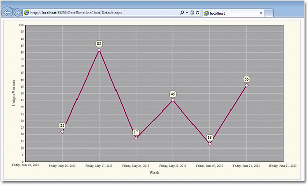
Here is the final chart:

Line chart with DateTime values in ASP.NET

Line chart with DateTime values in ASP.NET

You can download the sample from this link:

Download Line Chart for ASP.NET Sample

The trial version of the component is available from here:

MindFusion.Charting for ASP.NET Trial Version Download