
We have just released a new version of the Mapping component for WinForms. The release contains some exciting new features, details below:
Street maps
You can render street maps in OpenStreetMap format by adding a StreetMapLayer instance to the MapView. In order to load a street map, create a new StreetMapLayer object and call its Map‘s LoadFromXml method to load the corresponding *.osm file. The pens and brushes used for drawing the map are stored within the StreetMapPens and StreetMapBrushes collections in the static StreetMapFeatures class. You can define additional pens and brushes for drawing and painting certain map features by using the StreetMapLayer’s AddPen and AddBrush methods.
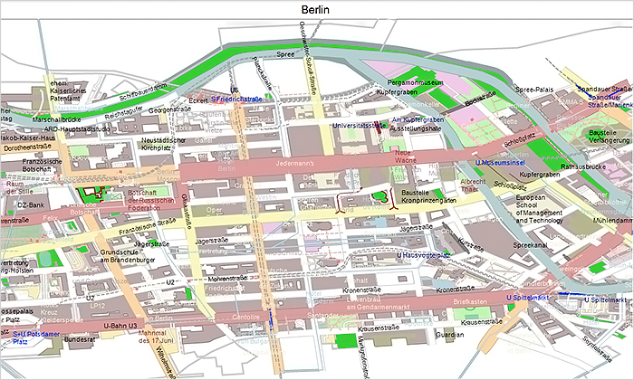
MindFusion Map Control for WinForms: Street maps
Zoom control
The ZoomControl class lets users change interactively the current zoom level and scroll position of a MapView. To set it up, add a ZoomControl to the form, place it anywhere over a MapView, and set the control’s Target property to that view. Set the ZoomStep and ScrollStep properties to specify the amount added to view’s zoom level or scroll position by ZoomControl’s buttons. You can customize the control’s appearance by setting properties such as Fill, BorderColor, CornerRadius and TickPosition.
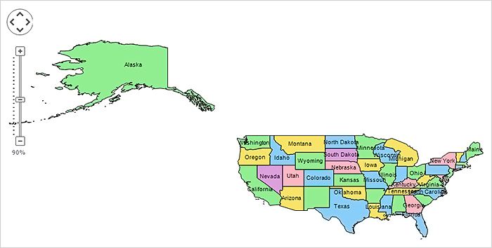
MindFusion Map Control for WinForms: Zoom
Multiple selection
Now it’s possible to select multiple decorations or map shapes by drawing a selection rectangle. To enable that, set the Behavior property to Select. Selected elements are stored in the Selection collection of respective layer objects.
API changes
- The type of MapElement‘s Label property has been changed from string to Label class.
- The FontName and FontSize properties have been moved from MapElement to Label.
- Type of Layers property changed from List to ObservableCollection.
About MindFusion Mapping for WinForms: Use this powerful WinForms control to provide your software with maps of your choice that include any type of administrative, geographical and political data. The component offers a comprehensive data set of mapping data, which is royalty-free and can easily be integrated into any MindFusion map. You can organize the map data in layers and combine several data files to deliver to the end user the exact map that is required. The advanced pan and zoom options offer a convenient way for the users to inspect in details even a large map. The control fully supports the OpenStreetMap format and lets you create precise and elegant street maps. The API is neatly organized and dutifully documented with plenty of sample code that guarantees you can easily build the map your application demands without compromises on speed and quality. More on Mapping for WinForms here.

