In this blog post we will use the Js Diagram library to create a beautiful organizational chart, where people from the company are represented with the hierarchy links between them. Each employee has a photo, name, position, boss and section for comments. The links between them demonstrate the hierarchy.

Run the sample from https://mindfusion.eu/samples/javascript/diagram/OrgChart/OrgChartEditor.html
I. Application Setup
We create a new folder for the project and there we copy the scripts that the sample uses. They are predominantly jQuery scripts, which you can also link from the jQuery CDN website.
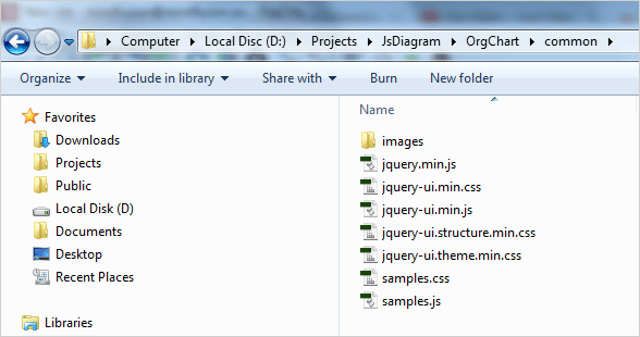
Org Chart in JavaScript: Directory Structure
The samples.css and samples.js scripts are used by all MindFusion JavaScript samples and are not relevant to your application. They layout and style the HTML content.
We need to create two files for this application – an HTML page and a JavaScript file that will be used by it. We create OrgChartEditor.html and link the following scripts and a CSS file in the section:
<a href="http://common/jquery.min.js">http://common/jquery.min.js</a>
<a href="http://common/jquery-ui.min.js">http://common/jquery-ui.min.js</a>
Then we create an empty (for now) js file that will hold the code-behind for the web page. It is called OrgChartEditor.js. We must reference it, from the HTML but we will do that at the end, before the closing tag. That is done because some browsers might not load correctly the scripts if they are initialize before the HTML code for the canvas.
<a href="http://MindFusion.Common.js">http://MindFusion.Common.js</a>
<a href="http://MindFusion.Diagramming.js">http://MindFusion.Diagramming.js</a>
<a href="http://OrgChartEditor.js">http://OrgChartEditor.js</a>
As you see, we have copied MindFusion.Common.js and MindFusion.Diagramming.js in the directory of the web page. There we have also saved OrgChartEditor.js.
The diagram uses an HTML Canvas to render itself. We create one on the web page:
<!-- The Diagram component is bound to the canvas element below -->
<div style="width: 100%; height: 100%; overflow: auto;">
	<canvas id="diagram" width="2100" height="2100">
		This page requires a browser that supports HTML 5 Canvas element.
	</canvas>
</div>
Note that the element has an id. That’s important because we will reference it in the code behind file.
II. The OrgChartNode.
Each employee on the diagram is represented by a special node – the OrgChartNode. This node is a customized TableNode.
// creates a table node with the default settings
var OrgChartNode = function (parent, boss)
{
       AbstractionLayer.initializeBase(OrgChartNode, this, [parent]);

       this.childNodes = [];

	// set up table cells
	this.redimTable(3, 4);
	this.getCell(1, 3).setColumnSpan(2);
	this.getCell(0, 0).setRowSpan(4);
	this.getCell(1, 1).setText("Title:");
	this.getCell(1, 1).setFont(
            new Font("Verdana", 3.5, true /*bold*/, false /*italic*/));
	this.getCell(1, 2).setFont(
            new Font("Verdana", 3.5, true /*bold*/, false /*italic*/));
	this.getCell(1, 0).setFont(
            new Font("Verdana", 3.5, true /*bold*/, false /*italic*/));
	this.getCell(1, 3).setFont(
            new Font("Verdana", 3, false /*bold*/, false /*italic*/));
	this.configureCells();
Each OrgChartNode has a parent and a boss. The CEO, which is the topmost node in the hierarchy has no boss. The OrgChartNode is a TableNode with 3 columns and four rows. Cell(0,0) is reserved for the image of the employee. It spans 4 rows.
The cells in the second column with index 1 are for labels: title, name, id and comments. We style them with bold font.
The prototype of the OrgChartNode gets or sets the properties which deal with the data we need for each employee. We set the fields for each new node and update the existing canvas elements. We define an updateCanvasElements method that calls the updateCanvasElements of the parent class to mark the changes. We also declare setter/getter methods for each OrgChartNode field:
OrgChartNode.prototype =
{
	// updates the existing elements
	updateCanvasElements: function (node)
	{
		this.setFields();
		AbstractionLayer.callBaseMethod(OrgChartNode, this, 'updateCanvasElements');
	},

        // gets the title of the employee
	getTitle: function ()
	{
		return this.title;
	},
        // sets the title of the employee
	setTitle: function (value)
	{
		if (this.title !== value)
		{
			this.title = value;
			this.invalidate();
		}
	},
When we set a new value we invalidate the canvas so that the changes can be rendered correctly on the screen.
// assigns the employee data to the table cells
setFields: function()
{
    // hide the caption and place the employee names on row 0
    this.setCaptionHeight(0);
    this.getCell(1,0).setText("Name:")
    this.getCell(2,0).setText(this.fullName);
    ….
    ….
    …..
    // rearrange the org hierarchy
    this.setHierarchy();
    this.setColor();
},
The setFields method takes the data from the OrgChartNode fields and assigns it to the correct cells of the table. It also assigns the correct boss of the employee. In our samples bosses are assigned automatically and cannot be edited by the user. This is done by the setHierarchy method:
// rebuilds the hierarchy
setHierarchy: function ()
{
    // the ceo has no boss
    if (this.boss == undefined)
	{
	   this.hierarchy = 0;
	}
	else
	 {
             // first level of executives under the boss
	     if (this.boss.hierarchy == undefined)
	     {
		  this.hierarchy = 1;
	     }
	     else
	     {
	         // increase the depth of the hierarchy
		 this.hierarchy = this.boss.hierarchy + 1;
		 this.boss.addChild(this);
		}
	  }

         // rearrange the hierarchy
	 for (var i = 0; i < this.childNodes; i++)
		this.childNodes[i].setHierarchy();
		this.setColor();
},
The setColor method assigns the right color for the background of the table. Different levels in the hierarchy are distinguished by different colors. The top level – the CEO – is read.
III. Interaction
The org chart allows the users to do a lot of things: edit certain table cells, delete and create nodes, create and delete links, move and drag the nodes. This is done by handling a lot of events that the diagram library exposes.
First, we set the Behavior property of the diagram to “Custom”. This means we will define how the library responds to user actions. This is done because none of the predefined Behavior modes answer the specific needs of our application:
diagram.setBehavior(Behavior.Custom);
Then we start handling events. First, we handle the Clicked event:
diagram.addEventListener(Event.clicked, function (diagram, eventArgs)
{
     // check which mouse button was clicked
     var button = eventArgs.getMouseButton();
     var position = eventArgs.getMousePosition();

     ….
});
We handle differently clicks with the right and left mouse buttons. If it is the right mouse button we should create a new OrgChartNode:
// click with the right mouse button creates a node
if (button === 2)
{
	var node = new OrgChartNode(diagram, undefined);
	node.setBounds(new Rect(position.x, position.y, 20, 20));
	node.resize();

	// adds the node to the diagram items
	diagram.addItem(node);

	// rearrange the diagram
	diagram.arrangeAnimated(tree);
}
Initially, the node has no boss, it will be determined once we link it to the rest of the org chart.
Let’s see what happens when the users clicks on a node:
diagram.addEventListener(Event.nodeClicked, onNodeClicked);
We handle the nodeClicked event with the onNodeClicked method:
// raised when the user clicks on a node
function onNodeClicked(diagram, eventArgs)
{
	// checks if the user has clicked with the left mouse button (0)
	var button = eventArgs.getMouseButton();
	if (button === 0)
		editNode(diagram, eventArgs);

        //click with the right mouse button creates a node
        else if (button === 2)
        createNode(diagram, eventArgs);
}
When the node is clicked with the left mouse button – we edit it. When it is clicked with the right one – we create a new node, linked to it, one level deeper into the hierarchy.
// called when the user edits a table
function editNode(diagram, eventArgs)
{
     var cellEditor = eventArgs.getNode().cellFromPoint(eventArgs.getMousePosition());

     // the table node to edit
     var tableNode = eventArgs.getNode();
     ...
     ...
}
We use the cellFromPoint method to identify the cell that was clicked. The cells that cannot be edited – the ones that render the labels – have no cellEditor.
// cells that cannot be edited have no cellEditor assigned
if (cellEditor.cell != undefined)
       if(cellEditor.cell.editable == true)
	   edit = true;
If the cell can be edited we check which is the cell and what type of content it renders:
// if the cell can be edited
if (edit)
{
	diagram.beginEdit(eventArgs.getNode(),eventArgs.getMousePosition());
	$("diagram_inplaceInput").attr("placeholder", "url");

	cellEditor.cell.onEdited = function (diagram, tableCell)
	{
		if (edit)
		{
			if (cellEditor.cell.image)
			{
				// read and assign the URL of the new image
				if (tableCell.getNewText() != undefined &&
					tableCell.getNewText() != "" &&
					tableCell.getNewText != "undefined")
				{
				tableNode.setImageLocation(tableCell.getNewText());
				cellEditor.cell.text.height = 0;
				cellEditor.cell.text.text = "";
				}
			}
              .....
}
In the code above we check to see if the image location is correctly set and if so – we read the new image from the url and render it in the cell.
Handling the other events is easier, let’s look at the event fired when cell text is edited:
//add an eventListener for the cellTextEdited event
diagram.addEventListener(Event.cellTextEdited, function (diagram, cellArgs)
{
   cellArgs.getCell().onEdited(diagram, cellArgs);
});
Here we just call the onEdited method of the cell that is edited, which we explained above. The samples handles this way a lot of events: nodeDeleted, linkCreated, nodeModified and many more. You can check them in the source code provided with the sample.
IV. Diagram Layout
The org chart uses the predefined TreeLayout to arrange the diagram. It is ideal for hierarchical types of charts because it neatly arranges all nodes from a given level in a row/column based on the direction set.
// we apply the tree layout to arrange the diagram
tree = new MindFusion.Graphs.TreeLayout();

// customize the tree layout
tree.direction = MindFusion.Graphs.LayoutDirection.TopToBottom;
tree.linkType = MindFusion.Graphs.TreeLayoutLinkType.Cascading;
The TreeLayout is animated:
// rearrange the diagram
diagram.arrangeAnimated(tree);
It is called not only at the beginning but also each time a new node is created or deleted, link is created and/or deleted as well when link or node is edited.
V. New Nodes
Finally, let’s see how nodes are created in code:
var ctoNode = new OrgChartNode(diagram, ceoNode);
ctoNode.setBounds(new Rect(25, 55, 60, 25));
ctoNode.setBoss(ceoNode);
ctoNode.setTitle("CTO");
ctoNode.setFullName("Bob Smith");
ctoNode.setImageLocation("cto.png");
ctoNode.setComment("A great person!");
ctoNode.resize();
diagram.addItem(ctoNode);
New nodes, as you already know are created by the user with a right mouse button click on any node. If a link is deleted, the node is detached from the hierarchy and the user should drop it over an existing node to indicate its place in the hierarchy.
With this we finish our sample. We have presented you with the most important information on how this org chart in JavaScript is created. You can download the complete source code of the sample from this link:
Download MindFusion JavaScript Organizational Chart Sample
The sample is also available on GitHub at https://github.com/MindFusionComponents/JavaScript-Diagram-Samples/tree/master/OrgChart
The sample is available online at https://mindfusion.eu/samples/javascript/diagram/OrgChart/OrgChartEditor.html
Find out more about MindFusion JavaScript Diagram Library at https://mindfusion.eu/javascript-diagram.html