MindFusion.WebForms Pack, 2015.R1

MindFusion announceс а неш release of our WebForms suite of components. Here is an overview of the most important new features:

Licensing

We no longer make separate trial build of the control assemblies. Instead there is a new LicenseKey property, which disables a component’s evaluation mode. If your application contains more than one control by MindFusion, you could call MindFusion.Licensing.LicenseManager.AddLicense(key) to specify the key once instead of setting it per each control. License key strings are listed on the Keys & Downloads page at MindFusion’s customer portal.

Zoom control

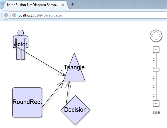
The ZoomControl class from MindFusion.Common.WebForms lets users change interactively the current zoom level and scroll position of a DiagramView or a MapView. To set it up, add a ZoomControl element to the page and set the control’s TargetId property to the id of the view. The control has numerous properties for customizing its appearance.

ASP.NET Diagrammer: The Zoom control

ASP.NET Diagrammer: The Zoom control

Visual Studio 2015 Toolbox Support

MindFusion.WebForms components can now be installed automatically into Visual Studio 2015 toolbox palette.

chartMindFusion.Charting

Custom Formatting of Labels for Line charts

Line charts now support custom formatting of labels. To use custom formatting, set LabelFormat to NumberFormat.Custom and use LabelCustomFormat.

Sorted Bars

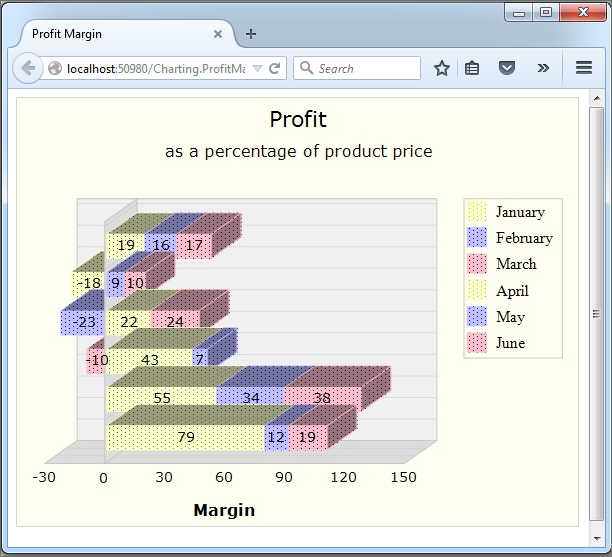
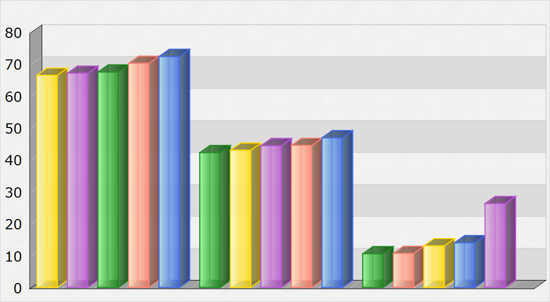
The algorithm for sorting of bars has been improved. Bars in a series or in clusters can be sorted in ascending or descending order – use the SortOrder property. You can also sort each series/cluster with the SortSeriesBy property. Bar can be sorted with their colors preserved if SortColor is set to true.

ASP.NET Chart: The Bar chart control

ASP.NET Chart: The Bar chart control

MindFusion WebForms DiagrammerMindFusion.Diagramming

Canvas mode improvements

  • Shape property of TableNode and ContainerNode is now supported in Canvas mode.
  • CellFrameStyle and EnableStyledText properties of TableNode are now supported in Canvas mode.
  • CellTextEditedScript event raised when users edit the text of table cells.
  • CreateEditControlScript event lets you create custom DOM element or fragment to use as in-place text editor.
  • NodeListView raises nodeSelected event when the user selects a node.
  • Load XML files from client side by calling loadFromXml method of Diagram class.
  • as well many more new properties and events.

Styled text in Canvas mode

The EnableStyledText property of ShapeNode allows using HTML-like formatting tags to apply various attributes to the node’s text. At this time the component supports the following formatting tags:

<b> specifies bold text
<i> specifies italic text
<u> specifies underlined text
<color=value> specifies text color
<br /> specifies line break

Zoom control

(not available in JavaApplet mode)
The ZoomControl class lets users change interactively the current zoom level and scroll position of a DiagramView. To set it up, add a ZoomControl element to the page and set the control’s TargetId property to the id of a DiagramView. The control offers numerous customization properties like ZoomStep, ScrollStep and various appearance setting properties such as Fill, BorderColor, CornerRadius and TickPosition.

WebForms Gauge Control by MindFusionMindFusion.Gauges

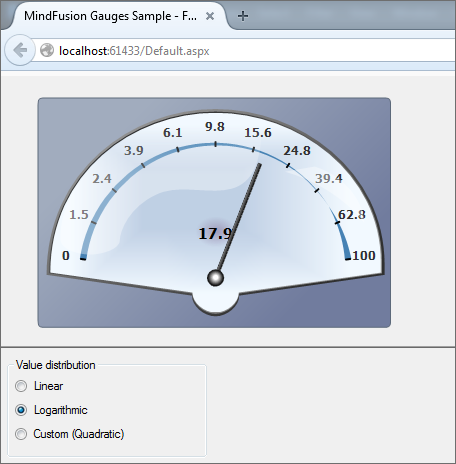
Linear and oval gauge controls have been added to MindFusion.WebForms pack. The gauges are drawn on client side using HTML Canvas API. Users can change gauge values interactively by dragging their elements.

The ASP.NET Gauge control

The ASP.NET Gauge control

WebForms Scheduler by MindFusionMindFusion.Scheduling

Horizontal Timetable view

Horizontal layout has been added to the Timetable view. The horizontal timetable view displays a collection of rows where each row represents the allotment of resources to distinct hours of a day; the rows in this view represent dates, tasks, locations, contacts or resources.

ASP.NET UI Suite of controlsMindFusion.UI

The bundled jQuery version has been upgraded to 1.11.2.

You can read further details about the release at the announcement page at MindFUsion discussion board.

The trial version of the new MindFusion.WebForms Pack is available for direct download from this link:

Download MindFusion ASP.NET Pack 2015.R1

About MindFusion.WebForms Pack: A set of WebForms components that add great variety of features to your ASP.NET application with a few mouse clicks. The pack contains advanced components for diagramming, scheduling, charting and UI (Accordion, ColorPicker, TabControl, Window, WindowHost, DockControl, Button, Slideshow, Zoom and more). Each tool boasts easy to learn and use API and is quickly integrated into any web application that targets the ASP.NET platform. The controls support numerous options for styling, data import / export, user interaction and offer rich event set. There are plenty of samples and step-by-step tutorials as well detailed documentation.

Use the features page for each of the tools to find out more about its capabilities and the numerous ways it can boost your performance and speed up the development of your application:

Visit the buy page for details on the licensing scheme and prices. If you have questions please contact us. We shall be happy to assist you.

Combination Chart in Android

This post is a step-by-step tutorial in how to create a combination chart in android with the Charting for Android library.

I. Project configuration

Let’s create a new project. In Eclipse, we choose File -> New -> Android Application Project. We write “CombinationChart” as an application name. The package is called com.mindfusion.combinationchart. The other settings remain unchanged.

II. Adding the jar file.

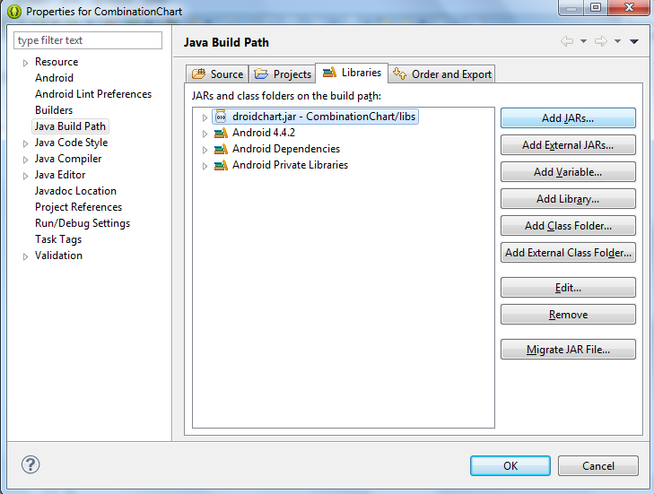
With project created, it’s time to add the libraries. Copy the droidchart.jar from the libs directory of the sample project (download file here) to the libs directory of your project. Then right-click on your project and choose Properties -> Java Build Path -> Libraries -> Add JARs. Navigate to the libs folder and add the droidchart.jar.

Adding a JAR library to an Android application project

Adding a JAR library to an Android application project

III. Declaring the chart

Time to declare the chart in the layout of the application. We build a simple application, where the chart will be the only thing that shows. So, we edit the activity_main.xml file, which is found in res -> layout folder in the project tree for the CombinationChart application.

We change the layout to Linear and we introduce a new xml node – chart. The chart node refers to a class found in the com.mindfusion.charting namespace.

<LinearLayout xmlns:android="http://schemas.android.com/apk/res/android"
xmlns:tools="http://schemas.android.com/tools"
xmlns:chart="http://schemas.android.com/apk/lib/com.mindfusion.charting"
...

Then we declare the chart:

<com.mindfusion.charting.AxesChart
android:id=”@+id/combi_chart”
android:layout_width=”fill_parent”
android:layout_height=”wrap_content”
chart:gridType=”horizontal”
chart:titleOffset=”40dp”
chart:titleHeight=”40dp”
chart:labelHeight=”12dp”
tools:context=”.MainActivity” />

We name it combi_chart. This is important because we’ll use the name to retrieve the chart object in the next step.

IV. General chart settings.

In this step we’ll set the general chart settings. First, we get the chart object, which is declared in the layour (see previous step).


private AxesChart chart;
....
chart = (AxesChart)findViewById(R.id.combi_chart);

Then we set the title and the offset of the title e.g. the space between the title and the plot are for the chart. We also set the height of the font for the title labels and the other labels at the chart.


chart.setTitle("Visitors in Paradise Hotels");
chart.setTitleOffset(50f);
chart.setTitleHeight(30f);
chart.setLabelHeight(20f);

V. The grid.

Our chart has a crossed grid with light gray grid stripes. This is set with the following code:


ArrayList gridStrokes = new ArrayList();
gridStrokes.add(Color.rgb(207, 207, 207));
chart.setGridStrokeColors(gridStrokes);


chart.setGridType(GridType.Crossed);

VI. The axes.

The X-axis has 10 intervals. Each division has its own label. We set the label type to custom text, specify the labels and customize the min and max numbers to be shown:


chart.xAxisSettings.setMin(0f);
chart.xAxisSettings.setMax(10f);
chart.xAxisSettings.setInterval(1f);
chart.xAxisSettings.setLabelType(AxisLabelType.Custom);


ArrayList xLabels = new ArrayList();
Collections.addAll(xLabels, "2005", "2006", "2007", "2008", "2009", "2010", "2011", "2012", "2013", "2014");
chart.xAxisSettings.setLabels(xLabels);

The Y-axis has no custom labels, it just shows the value intervals. But it has a title. Here is how we set it:


chart.yAxisSettings.setMin(0f);
chart.yAxisSettings.setMax(30f);
chart.yAxisSettings.setInterval(10f);
chart.yAxisSettings.setLabelType(AxisLabelType.Scale);
chart.yAxisSettings.setTitle("in thousands");

VII. The bar series.

The first series is a bar series. We create a new instance of the BarSeries class and add 10 x and y float numbers, which will be used to calculate the size and location of the bars:


BarSeries series1 = new BarSeries();

ArrayList xData = new ArrayList();
for(int i = 0; i < 10; i++)
xData.add((float)i);
series1.setXData(xData);


ArrayList yData1 = new ArrayList();
Collections.addAll(yData1, 15f, 17f, 18f, 19f, 18.4f, 16.4f, 12f, 17f, 18.7f, 19.1f );
series1.setYData(yData1);

The next thing to do is to specify the colors for the bars and their outlining. The library has the FillColors and StrokeColors property, which we use:


ArrayList fillColors1 = new ArrayList();
fillColors1.add(Color.rgb(174, 200, 68));
series1.setFillColors(fillColors1);


ArrayList strokeColors1 = new ArrayList();
strokeColors1.add(Color.rgb(115, 133, 45));
series1.setStrokeColors(strokeColors1);

Let’s not forget to add the ready series to the collection of series.


chart.addSeries(series1);

VIII. The line series with scatters.

The line series is an instance of the LineSeries class, where we set the ScatterType and LineType properties:


LineSeries series2 = new LineSeries();
series2.setScatterType(ScatterType.Circle);
series2.setLineType(LineType.Line);
series2.setScatterSize(20f);
...
chart.addSeries(series2);

The ScatterFillColors and ScatterStrokeColors are used for setting the colors of the scatters. The properties for the line are the same as with the bar series: StrokeColors.

IX The area series.

The area series has a different line type than the scatter series. We don’t set the scatter type here since its set to “None” by default.

The data in both line series is set in the same way as in the bar series and we don’t cite it again.


LineSeries series3 = new LineSeries();
series3.setLineType(LineType.Area);
...
chart.addSeries(series3);

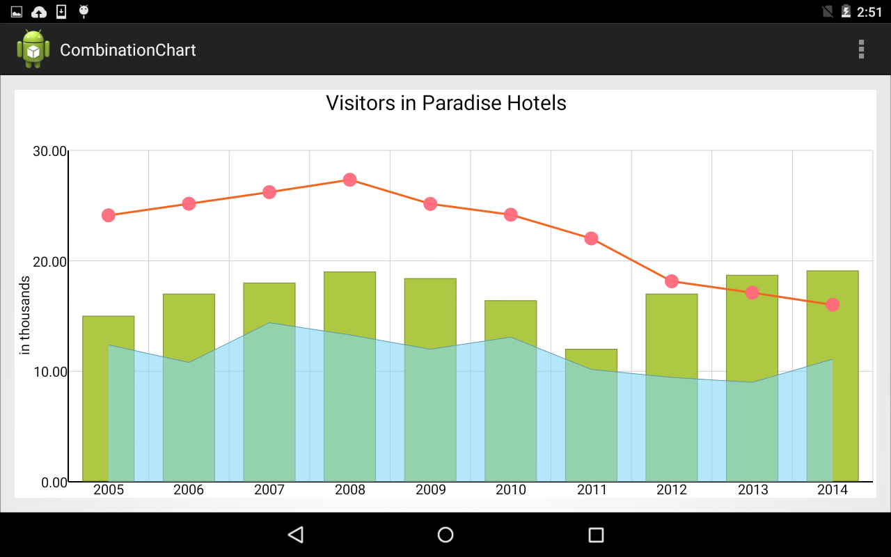
Here is the final chart:

An elegant combination chart for Android mobile devices.

An elegant combination chart for Android mobile devices.

The sample is available for download from here:

Download Android Combination Chart Sample

Read more about MindFusion Charting for Android library here.

MindFusion Charting for WinForms, V3.6

MindFusion has released a new version of its Charting for WinForms programming control. Here is an overview of the most important new features:

Custom Formatting of Labels
You can now use custom formatting for numeric labels for all chart types. The formatting is applied when you set the format of the label to NumberFormat.Custom. The properties that set the custom number format use the .net custom format strings.

Labels in a WinForms bar chart

Labels in a WinForms bar chart

Sorting of Bars
MindFusion WinFormsCharting control offers you greatly improved sorting of bar values in a bar chart. You can use the SortOrder property to sort the bars in each series or cluster in ascending or descending order. You can also sort each series/cluster with the SortSeriesBy property. You can preserve the color of each bar when sorted if you set the SortColor property to true.

A WinForms chart with sorted bars.

A WinForms chart with sorted bars.

License keys
MindFusion no longer provides separate trial and licensed versions of its components. Instead, you should set the LicenseKey property to disable the component’s evaluation mode and stop displaying trial messages. If your application has more than one Diagram instance or other controls by MindFusion, a single call to MindFusion.Licensing.LicenseManager.AddLicense(key) is enough to specify the key for all the controls. You can find your license key strings listed on the Keys & Downloads page at your http://clientsarea.eu account.

Miscellaneous

  • Bars are now outlined with the consecutive pen from the ChartPens collection rather than the AxisPen.
  • Drawing of line and area charts has greatly been improved – the control now draws only the visible portion of the chart rather than the whole chart, which was clipped to the visible rectangle.
  • AreaOpacity property added to radar charts.
  • AxesOnTop property in radar charts sets the order of drawing for the graphic and the axes.
  • SortYData and SortXData properties added to line charts.
  • In line charts colors can be sorted with line series or scatters when those get sorted.

The trial version is available for direct download from this link:

Download MindFusion.Charting for WinForms 3.6

Technical support is available at the forum, help desk or at e-mail support@mindfusion.eu. All inquiries are answered within hours of being received.

About MindFusion.Charting for WinForms: a professional programming component for WinForms, which lets you create remarkable charts fast and easy. The tool supports all major chart types – line, pie, radar and bar – and numerous variations of them – column, area, bubble, polar, doughnut etc. 3D charts are supported as well.

Charting for WinForms supports a rich user interaction model with features like zoom, hit testing, drill down, mouse dragging and more. You can use delegates to present mathematical functions, undefined values are also acceptable. Values can be data arrays or retrieved through a database.

The appearance of each chart is fully customizable. The control offers strong design-time support with custom collection editors and chart wizards. At your disposal is a set of predefined appearance themes and a theme editor tool. A full list of the features can be read here.

Working Hours Bar Chart in WinForms

In this post we will explore how to create a bar chart that shows the weekly working hours for each
member of a team. We use MindFusion.Charting for WinForms component.

The Type of the Bar Chart

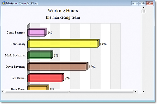
We decide to use a horizontal bar chart, which will give a clear visual representation of the data in this case. We use the BarType property to choose the bar type and set the Horizontal property:

barChart1.Horizontal = true;
barChart1.BarType = MindFusion.Charting.BarType.Single3D;

A 3D chart would look more sophisticated so we choose “Single3D” for a BarType.

The Data

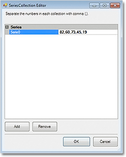
We don’t need to set data for both axes – one is enough. The control automatically sets values for the
other axis to make the bars equally distributed. We can write the data by hand or use the built-in
design time collection editor:


barChart1.Data.Add(new List() { 82, 60, 73, 45, 19, 34, 58, 23, 69, 17 });

The data collection editor

The data collection editor

The Axes

The X-axis shows a scale of the total working hours for the week. We set its LabelType to “AutoScale
and set the interval to 10:

barChart1.XAxisSettings.LabelType = MindFusion.Charting.AxisLabelType.AutoScale;
barChart1.XAxisSettings.AxisDelta = 10;

This is the only axis that shows numbers on the chart, so we show the starting zero number:

barChart1.XAxisSettings.DrawZero = true;

We want to show whole numbers at the axis – no decimal fractions – and we use the NumberFormat property to set this:

barChart1.XAxisSettings.NumberFormat = MindFusion.Charting.NumberFormat.Fixed_point_0Digits;

Finally, we set the title:

barChart1.XAxisSettings.TitleLabel = "Total Weekly Hours";

For the Y-axis we want to show custom labels – the name of each employee. We use the YLabels property to specify the labels and set YAxisSettings.LabelType to the appropriate value:

barChart1.YAxisSettings.LabelType = MindFusion.Charting.AxisLabelType.CustomText;
barChart1.YLabels.Add(new List() { "Mary Johnson", "Tim Davidson", "Alan Hank", "Elisa Labate", "Boris Foster", "Tim Carnes", "Olivia Beverling", "Mark Buchanan", "Ron Callary", "Cindy Peterson" });

The Grid

A vertical grid will help us identify the value of each bar. The GridType property, together with the
GridBrush and AltGridBrush help use set the type and colors of the grid. We outline the plot area with PlotAreaOutline:

GridType = MindFusion.Charting.GridType.VertScale;
barChart1.GridBrush = new MindFusion.Drawing.SolidBrush(Color.White);
barChart1.AltGridBrush = new MindFusion.Drawing.SolidBrush(Color.FromArgb(240, 240, 240));
PlotAreaOutlinePen = new MindFusion.Drawing.Pen(Color.FromArgb(220, 220, 220));

The Bar Colors

We use ChartBrushes and ChartPens to specify how our bars will be colored. Here is the final chart:

3D BarChart in .NET WinForms

3D BarChart in .NET WinForms

Scrolling the chart:

We set the ResizeType to “Scrollable“. This way we can scroll to see all data on the chart without the need to increase the size of the chart and let it take too much space.

barChart1.ResizeType = MindFusion.Charting.WinForms.ResizeType.Scrollable;

The sample is available for download from here:

Download WinForms Working Hours Bar Chart Sample

A trial version of MindFusion.Charting for WinForms is available from here:

Download MindFusion.Charting for WinForms

Drill Down Chart in WPF

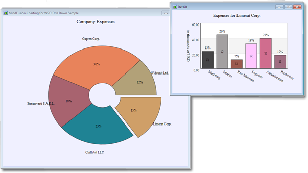
In this post we discuss how to create a drill down chart with the MindFusion.Charting for WPF tool. Our main chart will be a pie chart, where each peace shows some aggregate data. When clicked, a new chart pops up – a bar chart, which shows details about the clicked piece.

The Data

For the data we use an ObservableCollection called CompanyExpenses. It contains objects of type Expenses. The Expenses class implements INotifyPropertyChanged. Here is a code snippet:

public class Expenses : INotifyPropertyChanged
    {
  public Expenses(string corporationName, double marketing, double salaries, 
            double rawMaterials, double logistics, double administration, double production)
        {
            this.corporationName = corporationName;
            this.marketing = marketing;
            this.salaries = salaries;
            this.rawMaterials = rawMaterials;
            this.logistics = logistics;
            this.administration = administration;
            this.production = production;
          
}

.............
}  

We have properties for the various company expenses and a property for the name of the corporation. We have a special Sum property, which gives us the total of all expenses for the corporation. This property will be used by the main chart – the pie chart:

public double Sum
        {
            get { return sum; }
            set
            {
                sum = value;
                OnPropertyChanged("Sum");
            }
        }

The Pie Chart

The pie chart displays the expenses of all 5 corporations – together with their name and their share. We use data binding, the ComapnyExpenses list provides the DataSource:

CompanyExpenses data = new CompanyExpenses();
 pieChart1.DataSource = data;

In order to show the name of the company as an outer label, we must set the OuterLabelType to CustomText and bind Expenses.CorporationName to the OuterLabelPath property. We do this in XAML:

my:PieSeries OuterLabelOffset="30" OuterLabelPath="CorporationName" OuterLabelType="CustomText" DataPath="Sum" InnerLabelType="Percents" Name="pieSeries1" DetachedPiecesList="20"

The Sum property, which we mentioned above, provides data for the chart. The brushes are set with the brush editor in the property grid.

Hit Testing

We use the charting component’s HitTest method to detect when a piece was clicked and to show a bar chart with the respective data. PiePiece.PieceIndex gives us the index of the clicked piece. We use the Control.MouseDown event to detect mouse clicks.

private void pieChart1_MouseDown(object sender, MouseButtonEventArgs e)
        {
            List result = 
                pieChart1.HitTest(e.GetPosition(pieChart1));

            if (result.Count > 0 && result[0] is MindFusion.Charting.Wpf.PiePiece)
            {
                MindFusion.Charting.Wpf.PiePiece piece = 
                    result[0] as MindFusion.Charting.Wpf.PiePiece;

                Details d = new Details(data[piece.PieceIndex]);
                d.Show();
            }
        }

The HitTest method returns a collection of ChartElement objects. In our case we don’t have several ChartElements that overlap each other and might be clicked simultaneously, that’s why we take the first ChartElement.

The Detailed Chart

The detailed chart is a bar chart that displays the data for a single Expenses object. We set the labels at the X-axis to display the type of the expense:

barChart1.XAxisSettings.LabelType = MindFusion.Charting.Wpf.LabelType.CustomText;
            barChart1.XLabels = new List() { "Marketing", "Salaries", "Raw Materials", "Logistics", "Administration", "Production"};
            barChart1.XAxisSettings.LabelRotationAngle = 30;
            barChart1.XAxisSettings.CustomLabelPosition = MindFusion.Charting.Wpf.CustomLabelPosition.ChartDataPoints;

When we create the Details window, we pass as argument the Expenses object the chart refers to:

public Details( Expenses expenses)
{
barSeries1.YData = expenses.ExpensesList;

}

The data for the bar chart comes from the list of the expenses, which is a DoubleCollection.

Here is a screenshot of the final drill down chart:

The main pie chart with the bar chart that shows details for the clicked pie piece.

The main pie chart with the bar chart that shows details for the clicked pie piece.

You can download the complete source code for the project from this link:

Download MindFusion.Charting Drill Down Sample