MindFusion.Scheduling for Java Swing, V1.1

MindFusion has released a new version of its scheduling library for Java Swing. Here is an overview of the new features:

Item Effects

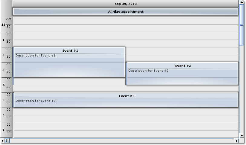
You can apply the new Glass and Aero visual effects to all items. If you want to apply an effect, create an instance of one of the effect classes, set up its properties and add the instance to the AwtCalendar.ItemEffects collection. You can choose between two effect types – AeroEffect and GlassEffect. You can add, remove or modify effects at any time and this will reflect immediately on the appearance of the calendar. The Item Effects topic in the library’s documentation gives detailed explanation on how to create and apply visual effects.

Item visual effects

Item visual effects

Custom Grouping

Custom grouping lets you specify secondary resources individually for each primary resource. You an do this with the new customizeGrouping event. You can also apply grouping by the runtime type of the resources, not just the four predefined categories.

Custom grouping of items

Custom grouping of items

New Events

The CalendarListener interface exposes several new events – beginItemDrawing, itemDrawing, endItemDrawing, and filterItem.

Miscellaneous

  • We have fixed a bug where styled item texts did not appear.
  • The getExactDateAt method works more consistently in various scenarios.
  • New setViewport method.

You can read more about the new version at the forum. The trial version is available for immediate download from the link below:

Download Scheduling for Java Swing Library, V1.1 Trial Version

Technical support is available at the Scheduling for Java forum, per e-mail or through the help desk. Providing timely and high-quality technical support to all its clients and evaluators is a priority for MindFusion. We make sure your questions get competent and detailed answers within hours after being posted.

About Scheduling for Java Swing: A programming class library written entirely in Java that lets you build the most sophisticated schedules, calendars and task managers fast and easy. The component boasts a comprehensive feature set that includes custom-typed events, undo/redo functionality, scrolling, tool tips and much more. You can choose among six view styles, which are easy to change and customize. The appearance of each schedule is completely customizable and supports themes, user-assigned mouse cursors and a variety of font, pen and brush options.

A detailed list with the features of the tool is available at the Scheduling for Java Swing features page. The trial version includes a variety of samples and you have plenty of sample code to study. Online documentation with useful tutorials is also available.

The library is royalty-free, source-code is also available. You can see a list of the current prices here. Check the discount page for a list of the available discounts.

Custom appearance of WPF Resource view

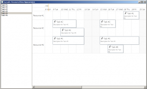
Continuing from the previous post we will now customize the appearance of the Resource view to achieve a more aesthetically pleasing presentation. The appearance of the view is customized by setting various properties of the Calendar.ResourceViewSettings object.

We will build our presentation on the Silver theme by reducing the sharpness and contrast of colors and making the font uniform across the entire view. The customization process is divided to the following steps:

Customize the view background.

calendar.ResourceViewSettings.CalendarStyle.Background = Brushes.White;

Customize the row headers.

calendar.ResourceViewSettings.ExpandableRows = false;
calendar.ResourceViewSettings.HeaderStyle.FontFamily = headerFont;
calendar.ResourceViewSettings.HeaderStyle.FontSize = 13;
calendar.ResourceViewSettings.HeaderStyle.Foreground = new SolidColorBrush(Color.FromArgb(255, 64, 64, 64));
calendar.ResourceViewSettings.HeaderStyle.Background = Brushes.White;
calendar.ResourceViewSettings.HeaderStyle.BorderBrush = borderBrush;
calendar.ResourceViewSettings.HeaderStyle.BorderThickness = new Thickness(0, 0, 0, 1);

Customize the view cells.

calendar.ResourceViewSettings.CellStyle.Background = Brushes.White;
calendar.ResourceViewSettings.CellStyle.BorderBrush = borderBrush;
calendar.ResourceViewSettings.WeekendStyle.Background = new SolidColorBrush(Color.FromArgb(255, 250, 250, 250));
calendar.ResourceViewSettings.WeekendStyle.BorderBrush = borderBrush;

Customize the view timelines.

calendar.ResourceViewSettings.BottomTimelineSettings.CalendarStyle.Background = Brushes.White;
calendar.ResourceViewSettings.BottomTimelineSettings.CalendarStyle.BorderBrush = borderBrush;
calendar.ResourceViewSettings.BottomTimelineSettings.CalendarStyle.FontFamily = headerFont;
calendar.ResourceViewSettings.BottomTimelineSettings.CalendarStyle.FontSize = 13;
calendar.ResourceViewSettings.BottomTimelineSettings.CalendarStyle.FontWeight = FontWeights.Normal;
calendar.ResourceViewSettings.BottomTimelineSettings.NowFillBrush = Brushes.Transparent;
calendar.ResourceViewSettings.MiddleTimelineSettings.CalendarStyle.Background = Brushes.White;
calendar.ResourceViewSettings.MiddleTimelineSettings.CalendarStyle.BorderBrush = borderBrush;
calendar.ResourceViewSettings.MiddleTimelineSettings.CalendarStyle.FontFamily = headerFont;
calendar.ResourceViewSettings.MiddleTimelineSettings.CalendarStyle.FontSize = 13;
calendar.ResourceViewSettings.MiddleTimelineSettings.CalendarStyle.FontWeight = FontWeights.Normal;
calendar.ResourceViewSettings.MiddleTimelineSettings.NowFillBrush = Brushes.Transparent;

Note that the font, headerFont and borderBrush variables are defined as follows:

FontFamily font = new FontFamily("Segoe UI");
FontFamily headerFont = new FontFamily("Segoe UI Light");
Brush borderBrush = new SolidColorBrush(Color.FromArgb(255, 224, 224, 224));

The final result is displayed below.

scheduling-resourceviewappearance

The complete sample project is available for download here:
https://mindfusion.eu/_samples/WpfPlannerResourceViewAppearance.zip

You can get the trial version of MindFusion.Scheduling for WPF from this link:
https://mindfusion.eu/WpfPlannerTrial.zip

Enjoy!

Custom items in WPF Calendar

Expanding on the previous post we will now modify the appearance of the calendar items through the use of a custom item presenter. To define the new presenter, simply create a new Style resource with TargetType set to ItemPresenter and place this Style somewhere in the resource look-up path – for example in the application’s or the window’s resource dictionaries. The Style must contain a setter for the Template property that defines the appearance of the item:

<style targettype="{x:Type planner:ItemPresenter}">
  <Setter Property="Template">
    <Setter.Value>
      <ControlTemplate TargetType="{x:Type planner:ItemPresenter}">
        <Grid>
        ...
        </Grid>
      </ControlTemplate>
    </Setter.Value>
  </Setter>
</style>

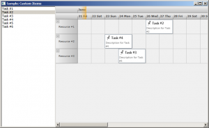
In this particular case the presenter represents a grid with two rows. The top row contains an icon and the header text of the item. The bottom row contains the description text. Note, that the TextBlock displaying the header text of the item has a name – HeaderBlock. The element with this name defines the position of the TextBox when the item is in-place edited.

Various appearance properties are also customized – such as FontFamily, Background and BorderBrush, by assigning new values to the respective properties of the Calendar.ItemSettings.CalendarStyle object:

calendar.ItemSettings.CalendarStyle.FontFamily = new FontFamily("Segoe UI");
calendar.ItemSettings.CalendarStyle.Background = Brushes.White;
calendar.ItemSettings.CalendarStyle.BorderBrush = Brushes.SlateGray;

Finally, the size of the calendar lanes is increased to accommodate the new appearance of the items:

calendar.ResourceViewSettings.LaneSize = 54;

The final result is displayed below.

scheduling-customitems

The complete sample project is available for download here:
https://mindfusion.eu/_samples/WpfPlannerCustomItems.zip

You can get the trial version of MindFusion.Scheduling for WPF from this link:
https://mindfusion.eu/WpfPlannerTrial.zip

Enjoy!

Implementing drag & drop in MindFusion.Scheduling for WPF

In this post we will discuss how to implement drag & drop using MindFusion.Scheduling for WPF. The goal is to enable users to create appointments by dragging items from an external source and dropping them onto the Calendar control surface.

The source

For the purposes of this sample the drag & drop source would be a simple ListBox control. The following XAML declares a ListBox with several predefined items:

  Task #1
  Task #2
  Task #3
  Task #4
  Task #5
  Task #6

The calendar

To enable the Calendar control to be the target of drag & drop operations, set its AllowDrop property to true. The following XAML snippet illustrates the definition of the Calendar control:

<planner:calendar x:name="calendar" grid.column="1" currentview="ResourceView" grouptype="GroupByResources" theme="Silver" allowdrop="True">
  <planner:calendar.itemresources>
    <planner:resource name="Resource #1">
    <planner:resource name="Resource #2">
    <planner:resource name="Resource #3">
  </planner:resource></planner:resource></planner:resource></planner:calendar.itemresources>
</planner:calendar>

The calendar is set up to display three resources in a Resource view.

The drag & drop

The drag & drop operation is initiated by calling the DragDrop.DoDragDrop static method and passing a reference to the dragged data. In our case we would want to initiate drag & drop when the user clicks on an item in the ListBox and starts dragging. Because the MouseDown event is consumed by the ListBox when the mouse is pressed over an item, we need to handle the PreviewMouseDown event. The following C# code displays the handlers of the PreviewMouseDown and MouseMove events:

private void taskList_PreviewMouseDown(object sender, MouseButtonEventArgs e)
{
  mouseDown = e.LeftButton == MouseButtonState.Pressed;
}

private void taskList_MouseMove(object sender, MouseEventArgs e)
{
  if (taskList.SelectedItem != null && mouseDown)
  {
    mouseDown = false;
    string data = ((ListBoxItem)taskList.SelectedItem).Content.ToString();
    DragDrop.DoDragDrop(taskList, data, DragDropEffects.Copy);
  }
}

To give visual feedback to the user when the mouse moves over the Calendar control during drag & drop operation, handle the DragOver event:

private void calendar_DragOver(object sender, DragEventArgs e)
{
  e.Effects = DragDropEffects.None;
  if (e.Data.GetDataPresent(typeof(string)))
  {
    DateTime? date = calendar.GetDateAt(e.GetPosition(calendar));
    if (date != null)
      e.Effects = DragDropEffects.Copy;
  }
}

This handler checks whether the dragged data matches the expected type and whether the location under the mouse cursor represents a valid date.

Finally, handle the Calendar.Drop event. This event is raised when the user releases the mouse over the Calendar control during a drag & drop operation.

private void calendar_Drop(object sender, DragEventArgs e)
{
  if (e.Data.GetDataPresent(typeof(string)))
  {
    Point point = e.GetPosition(calendar);
    DateTime? date = calendar.GetDateAt(point);
    Resource resource = calendar.GetResourceAt(point);
    if (date != null && resource != null)
    {
      string task = (string)e.Data.GetData(typeof(string));
      Appointment appointment = new Appointment();
      appointment.HeaderText = task;
      appointment.StartTime = date.Value;
      appointment.EndTime = appointment.StartTime.AddDays(2);
      appointment.Resources.Add(resource);
      calendar.Schedule.Items.Add(appointment);
    }
  }
}

The following image shows the running sample with several created appointments:

Drag & drop

The source code is available for download from here:

Download the Complete Source Code for the Sample

You can get the trial version of MindFusion.Scheduling for WPF from this link:

Download MindFusion.Scheduling for WPF Trial Version

MindFusion Pack for Silverlight 2013.R1

MindFusion has released a new version of its Silverlight controls suite. There are new features in many of the controls, here are details:

Visual Studio 2012 Support

New assemblies for all components targeting Silverlight 5 are available. Additionally all samples provide versions for Visual Studio 2012.

chartMindFusion.Charting

Radar and Polar charts
The Silverlight charting control adds a brand new types of charts – radar and polar charts. They support unlimited number of data series, 4 label types at the inner and outer axes, spiderweb, scatters and many more.

Radar chart

Radar chart

Hit testing
The new HitTest method returns a list of all ChartElement objects, which contain the specified point. Each chart type has its own ChartElement-derived class, which exposes properties for the hit object – data, labels, value etc.

Visual Effects
All chart types support the System.Windows.Media.Effects.DropShadowEffect and System.Windows.Media.Effects.Blur effect. Use the Effect property to specify the chosen effect.

diagram16x16MindFusion.Diagramming

Node Effects
You can apply to nodes two visual effects, represented by the GlassEffect and AeroEffect classes. Effects can be added, removed or modified at any time and this will immediately reflect on the diagram. Effects of different types can be applied simultaneously.

Themes and Theme Editor
A theme in DiagramLite is a set of styles, each associated with a specific item type. When the theme is applied to a diagram, the styles registered in the theme affect all objects of their associated type. Styles are associated with item types within the theme through the RegisterStyle method. The package also includes a Theme Editor tool that provides simple visual environment for theme creation and modification. There are also several predefined themes available in the Themes subfolder of the installation root folder.

Diagram documents and tabbed views
The DiagramDocument class represents a collection of diagram pages or sheets, represented by DiagramPage objects. New pages can be added to the document and existing pages can be removed and reordered via the Pages collection.

The new TabbedDiagramView can be used to display DiagramDocument objects. The view displays a tab for each page in the document. You can change the active page, add and remove pages as well rearrange them by dragging with the mouse.

One-way graph Layout
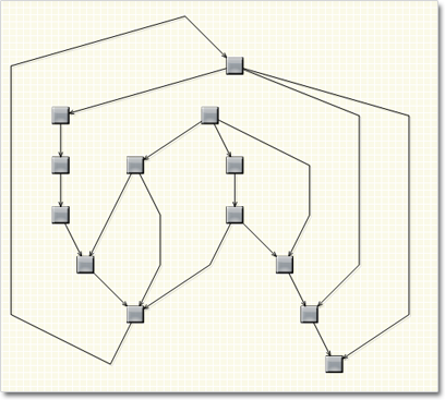
The OneWayLayout class ensures that links enter into nodes from the same general direction and exit them from the opposite side. If the graph contains cycles, some links bend around the nodes to keep the enter/exit direction consistent. The algorithm aims to minimize the number of such links.
One Way Graph Layout

One Way Graph Layout

Multiple labels per link
The LinkLabel class allows multiple captions to be displayed for a single DiagramLink object. Link labels provide a set of properties allowing full customization of their display and positioning. The labels support automatic arrangement.

Layers
Items can now be assigned to layers, and layers can be hidden, locked or moved up/down in the Z order as a group. Set the LayerIndex property of items to associate them with layers in the Diagram.Layers collection. The Layer objects provide Visible, Locked and ZIndex properties, which affect all items in the respective layer. Layers also expose a Title property shown in the LayerListView control.

Layer list control
The LayerListView control provides user interface for working with Layer objects. The control displays a list of all layers in a specified Diagram with a title and an overview area, and also allows editing of layer’s Title, Visible and Locked properties and choosing the Diagram’s currently active layer.

Magnifier
The new magnifier tool lets you interactively zoom in (or out) portions of the diagram by holding down a modifier key or pressing a mouse button. The magnifier’s zoom factor and size are
customizable.
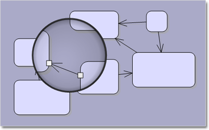
The Magnifier Tool

The Magnifier Tool

Report-16x16MindFusion.Reporting

Side-By-Side Containers
You can arrange items in the report parallelly by putting them inside the new SideBySideContainer report item. One of the uses is to display two (or more) data ranges next to each other.

Miscellaneous

  • New DefaultEncoding property in PdfExporter;
  • New Median aggregate function;
A sample report

A sample report

Calendar-16x16MindFusion.Scheduling

Improved item presenter
The ItemPresenter class now provides the start and end time of the represented item fragment through the new StartTime and EndTime properties. In addition, derived classes can override the new OnStartTimeChanged, OnEndTimeChanged, and OnItemPropertyChanged methods to get notified when the StartTime or EndTime properties change or when any property of the underlying item changes.

Improved recurrence
The Recurrennce class exposes a new event – ValidateOccurrence, which can be used to validate and customize the occurrences of a recurrence pattern.

A sample schedule

A sample schedule

You can read further details about the release at the forum. A trial version is available for download from here:

Download MindFusion Silverlight Pack R1.2013

Technical Support
You are welcomed to post your questions at the forum section of the respective product. You can also use the help desk or the support e-mail. MindFusion puts special effort in providing fast and competent technical support to everyone using our products.

About MindFusion.Silverlight Pack: A set of advanced Silverlight components that help you build your business application easy and on time. The tools provide you with a complete set of features for creating, editing and rendering complex flowcharts, charts, diagrams, calendars, maps, schedules and reports. A set of gauges and UI elements is also included. Each component offers various samples, tutorials and detailed documentation. The controls offer simple and intuitive API, completely customizable appearance, numerous input/output options and a rich event set. Each tool has been thoroughly tested to guarantee that you and your application get the high quality and performance you deserve.