Custom items in WPF Calendar

Expanding on the previous post we will now modify the appearance of the calendar items through the use of a custom item presenter. To define the new presenter, simply create a new Style resource with TargetType set to ItemPresenter and place this Style somewhere in the resource look-up path – for example in the application’s or the window’s resource dictionaries. The Style must contain a setter for the Template property that defines the appearance of the item:

<style targettype="{x:Type planner:ItemPresenter}">
  <Setter Property="Template">
    <Setter.Value>
      <ControlTemplate TargetType="{x:Type planner:ItemPresenter}">
        <Grid>
        ...
        </Grid>
      </ControlTemplate>
    </Setter.Value>
  </Setter>
</style>

In this particular case the presenter represents a grid with two rows. The top row contains an icon and the header text of the item. The bottom row contains the description text. Note, that the TextBlock displaying the header text of the item has a name – HeaderBlock. The element with this name defines the position of the TextBox when the item is in-place edited.

Various appearance properties are also customized – such as FontFamily, Background and BorderBrush, by assigning new values to the respective properties of the Calendar.ItemSettings.CalendarStyle object:

calendar.ItemSettings.CalendarStyle.FontFamily = new FontFamily("Segoe UI");
calendar.ItemSettings.CalendarStyle.Background = Brushes.White;
calendar.ItemSettings.CalendarStyle.BorderBrush = Brushes.SlateGray;

Finally, the size of the calendar lanes is increased to accommodate the new appearance of the items:

calendar.ResourceViewSettings.LaneSize = 54;

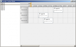
The final result is displayed below.

scheduling-customitems

The complete sample project is available for download here:
https://mindfusion.eu/_samples/WpfPlannerCustomItems.zip

You can get the trial version of MindFusion.Scheduling for WPF from this link:
https://mindfusion.eu/WpfPlannerTrial.zip

Enjoy!

Implementing drag & drop in MindFusion.Scheduling for WPF

In this post we will discuss how to implement drag & drop using MindFusion.Scheduling for WPF. The goal is to enable users to create appointments by dragging items from an external source and dropping them onto the Calendar control surface.

The source

For the purposes of this sample the drag & drop source would be a simple ListBox control. The following XAML declares a ListBox with several predefined items:

  Task #1
  Task #2
  Task #3
  Task #4
  Task #5
  Task #6

The calendar

To enable the Calendar control to be the target of drag & drop operations, set its AllowDrop property to true. The following XAML snippet illustrates the definition of the Calendar control:

<planner:calendar x:name="calendar" grid.column="1" currentview="ResourceView" grouptype="GroupByResources" theme="Silver" allowdrop="True">
  <planner:calendar.itemresources>
    <planner:resource name="Resource #1">
    <planner:resource name="Resource #2">
    <planner:resource name="Resource #3">
  </planner:resource></planner:resource></planner:resource></planner:calendar.itemresources>
</planner:calendar>

The calendar is set up to display three resources in a Resource view.

The drag & drop

The drag & drop operation is initiated by calling the DragDrop.DoDragDrop static method and passing a reference to the dragged data. In our case we would want to initiate drag & drop when the user clicks on an item in the ListBox and starts dragging. Because the MouseDown event is consumed by the ListBox when the mouse is pressed over an item, we need to handle the PreviewMouseDown event. The following C# code displays the handlers of the PreviewMouseDown and MouseMove events:

private void taskList_PreviewMouseDown(object sender, MouseButtonEventArgs e)
{
  mouseDown = e.LeftButton == MouseButtonState.Pressed;
}

private void taskList_MouseMove(object sender, MouseEventArgs e)
{
  if (taskList.SelectedItem != null && mouseDown)
  {
    mouseDown = false;
    string data = ((ListBoxItem)taskList.SelectedItem).Content.ToString();
    DragDrop.DoDragDrop(taskList, data, DragDropEffects.Copy);
  }
}

To give visual feedback to the user when the mouse moves over the Calendar control during drag & drop operation, handle the DragOver event:

private void calendar_DragOver(object sender, DragEventArgs e)
{
  e.Effects = DragDropEffects.None;
  if (e.Data.GetDataPresent(typeof(string)))
  {
    DateTime? date = calendar.GetDateAt(e.GetPosition(calendar));
    if (date != null)
      e.Effects = DragDropEffects.Copy;
  }
}

This handler checks whether the dragged data matches the expected type and whether the location under the mouse cursor represents a valid date.

Finally, handle the Calendar.Drop event. This event is raised when the user releases the mouse over the Calendar control during a drag & drop operation.

private void calendar_Drop(object sender, DragEventArgs e)
{
  if (e.Data.GetDataPresent(typeof(string)))
  {
    Point point = e.GetPosition(calendar);
    DateTime? date = calendar.GetDateAt(point);
    Resource resource = calendar.GetResourceAt(point);
    if (date != null && resource != null)
    {
      string task = (string)e.Data.GetData(typeof(string));
      Appointment appointment = new Appointment();
      appointment.HeaderText = task;
      appointment.StartTime = date.Value;
      appointment.EndTime = appointment.StartTime.AddDays(2);
      appointment.Resources.Add(resource);
      calendar.Schedule.Items.Add(appointment);
    }
  }
}

The following image shows the running sample with several created appointments:

Drag & drop

The source code is available for download from here:

Download the Complete Source Code for the Sample

You can get the trial version of MindFusion.Scheduling for WPF from this link:

Download MindFusion.Scheduling for WPF Trial Version

Drill Down Chart in WPF

In this post we discuss how to create a drill down chart with the MindFusion.Charting for WPF tool. Our main chart will be a pie chart, where each peace shows some aggregate data. When clicked, a new chart pops up – a bar chart, which shows details about the clicked piece.

The Data

For the data we use an ObservableCollection called CompanyExpenses. It contains objects of type Expenses. The Expenses class implements INotifyPropertyChanged. Here is a code snippet:

public class Expenses : INotifyPropertyChanged
    {
  public Expenses(string corporationName, double marketing, double salaries, 
            double rawMaterials, double logistics, double administration, double production)
        {
            this.corporationName = corporationName;
            this.marketing = marketing;
            this.salaries = salaries;
            this.rawMaterials = rawMaterials;
            this.logistics = logistics;
            this.administration = administration;
            this.production = production;
          
}

.............
}  

We have properties for the various company expenses and a property for the name of the corporation. We have a special Sum property, which gives us the total of all expenses for the corporation. This property will be used by the main chart – the pie chart:

public double Sum
        {
            get { return sum; }
            set
            {
                sum = value;
                OnPropertyChanged("Sum");
            }
        }

The Pie Chart

The pie chart displays the expenses of all 5 corporations – together with their name and their share. We use data binding, the ComapnyExpenses list provides the DataSource:

CompanyExpenses data = new CompanyExpenses();
 pieChart1.DataSource = data;

In order to show the name of the company as an outer label, we must set the OuterLabelType to CustomText and bind Expenses.CorporationName to the OuterLabelPath property. We do this in XAML:

my:PieSeries OuterLabelOffset="30" OuterLabelPath="CorporationName" OuterLabelType="CustomText" DataPath="Sum" InnerLabelType="Percents" Name="pieSeries1" DetachedPiecesList="20"

The Sum property, which we mentioned above, provides data for the chart. The brushes are set with the brush editor in the property grid.

Hit Testing

We use the charting component’s HitTest method to detect when a piece was clicked and to show a bar chart with the respective data. PiePiece.PieceIndex gives us the index of the clicked piece. We use the Control.MouseDown event to detect mouse clicks.

private void pieChart1_MouseDown(object sender, MouseButtonEventArgs e)
        {
            List result = 
                pieChart1.HitTest(e.GetPosition(pieChart1));

            if (result.Count > 0 && result[0] is MindFusion.Charting.Wpf.PiePiece)
            {
                MindFusion.Charting.Wpf.PiePiece piece = 
                    result[0] as MindFusion.Charting.Wpf.PiePiece;

                Details d = new Details(data[piece.PieceIndex]);
                d.Show();
            }
        }

The HitTest method returns a collection of ChartElement objects. In our case we don’t have several ChartElements that overlap each other and might be clicked simultaneously, that’s why we take the first ChartElement.

The Detailed Chart

The detailed chart is a bar chart that displays the data for a single Expenses object. We set the labels at the X-axis to display the type of the expense:

barChart1.XAxisSettings.LabelType = MindFusion.Charting.Wpf.LabelType.CustomText;
            barChart1.XLabels = new List() { "Marketing", "Salaries", "Raw Materials", "Logistics", "Administration", "Production"};
            barChart1.XAxisSettings.LabelRotationAngle = 30;
            barChart1.XAxisSettings.CustomLabelPosition = MindFusion.Charting.Wpf.CustomLabelPosition.ChartDataPoints;

When we create the Details window, we pass as argument the Expenses object the chart refers to:

public Details( Expenses expenses)
{
barSeries1.YData = expenses.ExpensesList;

}

The data for the bar chart comes from the list of the expenses, which is a DoubleCollection.

Here is a screenshot of the final drill down chart:
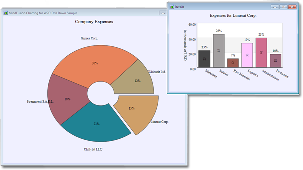
The main pie chart with the bar chart that shows details for the clicked pie piece.

The main pie chart with the bar chart that shows details for the clicked pie piece.

You can download the complete source code for the project from this link:

Download MindFusion.Charting Drill Down Sample

Diagramming for WPF 3.0.1

MindFusion has released a new version of its Diagramming component for Wpf. Most of the new features are requested by customers. Here are details:

Preserve order in tree layout
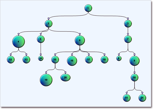
You can set the Balance property of the TreeLayout to Preserve to keep the original geometric order of child nodes when arranging them under their parent. You can use this to arrange tree branches in a specific order by first positioning them in increasing horizontal or vertical positions.

The tree layout.

The tree layout.

Selection improvements

  • When you set the Behavior property to SelectOnly users can select existing items, but not modify them or draw new ones.
  • Use the SetsDirtyFlag property of the Selection class to specify whether the Dirty flag should be set when selection changes.
  • SelectionStartMoving event is raised when the user begins moving multiple selected items.
  • You can use the ToggleSelection modifier key to select or deselect items by clicking, but selection via lasso rectangle is disabled.
Container nodes

Container nodes

Miscellaneous

You can find details about this release at the news page in the MindFusion forum. A trial version is available for immediate download from the following link:

Download MindFusion.Diagramming for WPF 3.0.1

The download contains all runtime libraries of the control, various samples for different .NET versions, extensive desktop documentation and step-by-step tutorials.

If you face difficulties installing or using Diagramming for Wpf, please contact MindFusion support team per e-mail or phone. You can also use the forum or help desk. All support inquiries are answered within hours of receiving them.

About MindFusion.Diagramming for Wpf: Designed and developed to be easy to integrate, use, and customize, this native WPF component places at your disposal every single feature you’d ever need to create flowcharts, diagrams, graphs, schemes, DB relationships, trees and many more. Its long list of style options gives you complete control over the appearance of the diagram. With a set of eight automatic layouts you are sure to choose the best arrangement for your items and make the diagram easy to comprehend.

The control boasts a long list of events, properties and methods for user interaction, item creation, data input and output. You can read the full features list here. The online demo shows samples that demonstrate various capabilities of the control – click here. The licensing scheme and prices are uploaded at the buy page. Source code is also available.

Charting for WPF 1.8

MindFusion has released a new version of its Charting component for Wpf with the following new features:

Styles and Themes
Styles define the appearance of individual chart elements such as the axis, the series and the legend. Each ChartTheme contains a collection of styles and defines the appearance of the whole chart. The new version lets you:

  • create themes based on the appearance of an existing chart;
  • create themes with the ThemeEditor tool;
  • save themes to XML files;
  • load themes from XML files;
  • use a number of predefined themes.

The “Working with Themes” tutorial gives detailed information on how to create, save, load and edit themes with MindFusion.Charting for WPF.

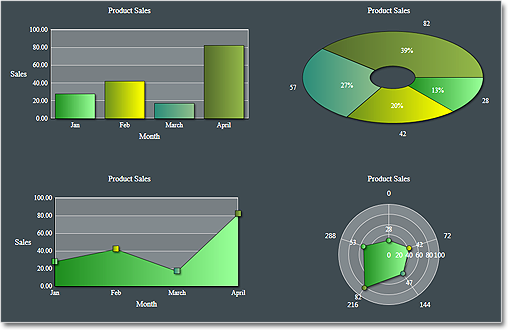
The green theme

The green theme

Improved Design Time Support
You can now edit all collection properties, including the Series collection, the brushes and strokes in design time through the property grid.

Axis Intervals
The new AxisSettings.IntervalCount property lets you specify the exact number of intervals at the axis. In such case, the control does not use the Interval property and calculates the value of each interval based on AxisSettings.Min, AxisSettings.Max and AxisSettings.IntervalCount properties.

You can read further details about the release and the other new features at the news section in the Charting forum. A trial version is available for download from here:

Download MindFusion.Charting for WPF 1.8 Trial Version

You are welcome to contact us with any questions, problems or inquiries about the Charting for Wpf control or any other of our products. MindFusion has always put special emphasis on providing excellent customer support and we usually answer your inquiries in a few hours of receiving them.

About MindFusion.Charting for Wpf: A programming component that combines powerful charting capabilities with an elegant API and easy use. Among the features of the control are fully customizable grid, positive and negative values on all chart axes, 3D charts, gauges and many more – read a detailed list here.

The control provides detailed documentation and various samples that demonstrate how to customize every type of chart. It supports a wide range of 2D and 3D charts including bar, line, radar, bubble pie etc. You can add tooltips, define themes, perform hit testing, zoom and more.