One-way Links in Diagramming for JavaScript

In this blog post we demonstrate how you can use the JavaScript Diagram library to allow users to draw an org chart or one-way graph. By default, users are allowed to draw links between any two nodes and the count of links is unlimited. We will use event and properties, available in JS Diagram to allow users to:
– draw only one link between two nodes
– draw links only in one direction.

This behavior mirrors the hierarchy of an organization: in general , each employee, represented by a node, should have only one direct boss.
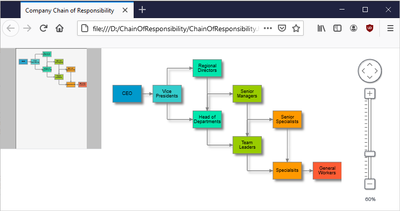

Continue reading

JavaScript Diagram with Chart Nodes

In this blog post we will create DiagramNode instances that render a chart. The charts get resized according to the size of the node. We will use two MindFusion libraries for JavaScript – Charting and Diagramming. You can run the sample online from this link:

I. Project Setup

We will use a web page that will hold the HTML Canvas element that we need in order to render the diagram:

<div style="width: 100%; height: 100%; overflow: scroll;">
    <canvas id="diagram" width="2100" height="2100" style="background:#f0f0f0;">
        This page requires a browser that supports HTML 5 Canvas element.
    </canvas>
</div>

We give the diagram’s Canavs big width and height and we also provide an id. The id is important because we will need to access the Canvas from code.

We add the scripts that we need in order to use the Charting and Diagramming libraries:

<script src="Scripts/MindFusion.Common.js" type="text/javascript"></script>
<script src="Scripts/MindFusion.Diagramming.js" type="text/javascript"></script>
<script src="Scripts/MindFusion.Charting.js" type="text/javascript"></script>

We add the references at the end of the web page, just before the closing BODY tag. We also need to add a reference to a JavaScript file that will hold the code for our sample. We name it “PieNode.js”.

II. The Diagram

In the code-behind file we create a diagram instance. We use the DOMContentLoaded event to initialize our diagram:

document.addEventListener("DOMContentLoaded", function ()
{
// create a Diagram component that wraps the "diagram" canvas
diagram = MindFusion.Diagramming.Diagram.create(document.getElementById("diagram"));
diagram.setBehavior(MindFusion.Diagramming.Behavior.LinkShapes);
diagram.setLinkHeadShapeSize(2);
diagram.setBounds(new Rect(0, 0, 2000, 2000));

// draw a pie when the user creates a node
diagram.addEventListener(Events.nodeCreated, onNodeCreated);

});

The Behavior enumeration lists various modes of behavior for the diagram. We choose Behavior.LinkShapes, which creates nodes, when the mouse is dragged
over an empty area and connects the nodes if the mouse is dragged from an existing node. We set tbe bounds of the diagram to a big Rect which guarantees that the user can draw nodes anywhere on the visible area. When the user draws towards the edge of the browser, the diagram control expands automatically.

Finally, we add an event handler for the nodeCreated event.

//nodeCreated event handler
function onNodeCreated(sender, args)
{
	var node = args.getNode();
	
	var nBounds = node.getBounds ();
	var topLeftCoord = diagram.docToClient(nBounds.topLeft());
	var bottomRightCoord = diagram.docToClient(nBounds.bottomRight());
	.......................................................
}

At first we get the node that was created. Then we need to get its actual size, for which we use the docToClient method that converts between diagram and browser measure units. We get the two coordinates of the node’s bounding rectangle.

We create then a Canvas, which takes the size of the node’s rectangle:

............................................
.....................................................
var pieChartCanvas = document.createElement('canvas');
pieChartCanvas.width = bottomRightCoord.x - topLeftCoord.x;
pieChartCanvas.height = bottomRightCoord.y - topLeftCoord.y;

We then add this temp canvas to the body of the web page and call a method “createPie” where we draw the pie chart. Once the chart is drawn we get the URL of the image and set is to the node with the setImageLocation method. We remove the Canvas from the tree with the elements because we want to use for the next node.

//create a temporary Canvas for the pie chart
//to draw itself upon
document.body.appendChild(pieChartCanvas);
createPie(pieChartCanvas);
var pieImageLocation = pieChartCanvas.toDataURL();
node.setImageLocation(pieImageLocation);
document.body.removeChild(pieChartCanvas);

III. The Chart

We create a pie chart in the Canvas provided to the createPie method:

//draw a pie chart on the provided canvas
function createPie(pieChartCanvas)
{
	var pieChart = new Controls.PieChart(pieChartCanvas);
	pieChart.startAngle = 45;			
	pieChart.showLegend = false;
	pieChart.title = "Sales";
	pieChart.titleMargin = new Charting.Margins(0, 10, 0, 0);
	pieChart.chartPadding = 3;
...........................

We set some appearance properties to make the chart look the way we want – change the start angle of the pie, add a title and title margin, hide the legend. Then we create a PieSeries which holds the data and the labels of the pie. We assign the PieSeries to the series property of the pie chart:

// create sample data
var values = new Collections.List([20.00, 30.00, 15.00, 40.00]);
pieChart.series = new Charting.PieSeries(
	values,
	new Collections.List(["20", "30", "15", "40"]),
null);

We style the chart with an instance of the PerElementSeriesStyle class, which colors all elements of a Series with the consequtive Brush and stroke from its brushes and strokes collections. Then we adjust the dataLabelsFontSize to match the size of the canvas. We make the labels be drawn with a white brush using the dataLabelsBrush property. Finally we call draw to render the pie.

var brushes = new Collections.List(
		[
			new Drawing.Brush("#0455BF"),
			new Drawing.Brush("#033E8C"),
			new Drawing.Brush("#F24405"),
			new Drawing.Brush("#F21905")
		]);

	var seriesBrushes = new Collections.List();
	seriesBrushes.add(brushes);

	var strokes = new Collections.List(
		[
			new Drawing.Brush("#c0c0c0")
		]);

	var seriesStrokes = new Collections.List();
	seriesStrokes.add(strokes);

	pieChart.plot.seriesStyle = new Charting.PerElementSeriesStyle(seriesBrushes, seriesStrokes);
	pieChart.theme.highlightStroke = new Drawing.Brush("#000063");
	pieChart.theme.dataLabelsFontSize = pieChartCanvas.height/20;
	pieChart.theme.dataLabelsBrush = new Drawing.Brush("#FFFFFF");

	pieChart.draw();

And with that the sample is ready. You can download the source code together with all MindFusion JavaScript libraries used from:

https://mindfusion.eu/samples/javascript/diagram/PieNodes.zip

About Diagramming for JavaScript: This native JavaScript library provides developers with the ability to create and customize any type of diagram, decision tree, flowchart, class hierarchy, graph, genealogy tree and more. The control offers rich event set, numerous customization options, animations, graph operations, styling and themes. You have more than 100 predefined nodes, table nodes and more than 15 automatic layout algorithms. Learn more about Diagramming for JavaScript at https://mindfusion.eu/javascript-diagram.html.

About Charting for JavaScript: MindFusion library for interactive charts and gauges. It supports all common chart types including 3D bar charts. Charts can have a grid, a legend, unlimited number of axes and series. Scroll, zoom and pan are supported out of the box. You can easily create your own chart series by implementing the Series interface.
The gauges library is part of Charting for JavaScript. It supports oval and linear gauge with several types of labels and ticks. Various samples show you how the implement the gauges to create and customize all popular gauge types: car dashboard, clock, thermometer, compass etc. Learn more about Charting and Gauges for JavaScript at https://mindfusion.eu/javascript-chart.html.

Creating custom CompositeNode components

In this post we’ll examine how CompositeNode components work in MindFusion.Diagramming for Windows Forms, and in the process create a custom radio button component. You can find the completed sample project here: RadioComponent.zip

CompositeNode was created as alternative of the ControlNode class, which lets you present any Windows Forms control as a diagram node. ControlNode has many advantages, such as letting you design the hosted user controls using Visual Studio designer, reusing them in other parts of the user interface, and including complex framework or third-party controls as their children. From the fact that each user control creates a hierarchy of Win32 windows come some disadvantages too:

  • ControlNodes cannot mix with other diagram elements in the Z order but are always drawn on top
  • performance deteriorates if showing hundreds of nodes
  • mouse events might not reach the diagram if hosted controls capture mouse input
  • print and export might not be able to reproduce the appearance of hosted controls without additional work (handling PaintControl event)

On the other hand, CompositeNode does all its drawing in DiagramView control’s canvas and is not affected by the issues listed above. CompositeNode lets you build node’s UI by composing hierarchy of components derived from ComponentBase class. Pre-defined components include layout panels, read-only or editable text fields, images, borders, buttons, check-boxes and sliders. If the UI component you need isn’t provided out of the box, you could still implement it as a custom class that derives from ComponentBase or more specific type and overriding the GetDesiredSize, ArrangeComponents and Draw methods. Lets see how that works using a RadioButtonComponent as an example.

Derive RadioButtonComponent from CheckBoxComponent so we reuse its IsChecked and Content properties:

class RadioButtonComponent : CheckBoxComponent
{
}

CompositeNode relies on a dynamic layout system that lets components determine their size by overriding GetDesiredSize method, and arranging children in allocated size by means of ArrangeComponents method. For radio button we’ll call its base class to measure content size and add enough space for drawing the radio graphics element (a circle) horizontally, while fitting it in measured height:

float RadioSize(SizeF size)
{
	return Math.Min(size.Width, size.Height);
}

public override SizeF GetDesiredSize(SizeF availableSize, IGraphics graphics)
{
	var s = base.GetDesiredSize(availableSize, graphics);
	s.Width += RadioSize(s);
	return s;
}

ArrangeComponents calls the base class to arrange its content on the right side of available space:

public override void ArrangeComponents(RectangleF availableSpace, IGraphics graphics)
{
	var radioSize = RadioSize(availableSpace.Size);
	availableSpace.X += radioSize;
	availableSpace.Width -= radioSize;
	base.ArrangeComponents(availableSpace, graphics);
}

Now override Draw and render standard radio button graphics on the left side of the component, and content on the right side:

public override void Draw(IGraphics graphics, RenderOptions options)
{
	var radioSize = RadioSize(Bounds.Size);
	var r = radioSize / 2 - 1;
	var cr = r - 1;

	graphics.FillEllipse(Brushes.White, Bounds.X + 1, Bounds.Y + 1, 2 * r, 2 * r);
	using (var pen = new System.Drawing.Pen(Color.Black, 0.1f))
		graphics.DrawEllipse(pen, Bounds.X + 1, Bounds.Y + 1, 2 * r, 2 * r);
	if (IsChecked)
		graphics.FillEllipse(Brushes.Black, Bounds.X + 2, Bounds.Y + 2, 2 * cr, 2 * cr);

	GraphicsState s = graphics.Save();
	graphics.TranslateTransform(radioSize - 1 + Bounds.X, Bounds.Y);
	Content.Draw(graphics, options);
	graphics.Restore(s);
}

We’ll want only one radio from a group to be selected. For our purposes we can count all radio buttons placed inside same stack panel as part of same group. Override the OnClick method to unselect all buttons in parent panel and select the clicked one:

protected override void OnClicked(EventArgs e)
{
	var parentStack = Parent as StackPanel;
	if (parentStack != null)
	{
		foreach (var child in parentStack.Components)
		{
			var radio = child as RadioButtonComponent;
			if (radio != null)
				radio.IsChecked = false;
		}
	}
	this.IsChecked = true;
}

That’s it, the radio button component is ready with just a screenful of code 🙂 Let’s check how it works by creating an OptionNode class that shows a group of radio buttons and exposes a property to access or change selected one:

class OptionNode : CompositeNode
{
}

You could create the stack panel and radio buttons from code if you need more dynamic configuration, e.g. one with variable number of radio buttons. For this example we’ll just load a fixed template consisting of four buttons from XML:

const string Template = @"
	<simplepanel>

        <shape name="" shape""="" shape="" roundrect""="">

		<border padding="" 2""="">

			<stackpanel name="" radiogroup""="" orientation="" vertical""="" spacing="" 1""="" horizontalalignment="" center""="">
				<radiobuttoncomponent padding="" 2""="">
					<radiobuttoncomponent.content>
						<text text="" option="" 1""="" font="" verdana,="" 3world,="" style="Bold&quot;&quot;">
					</text></radiobuttoncomponent.content>
				</radiobuttoncomponent>
				<radiobuttoncomponent padding="" 2""="">
					<radiobuttoncomponent.content>
						<text text="" option="" 2""="" font="" verdana,="" 3world,="" style="Bold&quot;&quot;">
					</text></radiobuttoncomponent.content>
				</radiobuttoncomponent>
				<radiobuttoncomponent padding="" 2""="">
					<radiobuttoncomponent.content>
						<text text="" option="" 3""="" font="" verdana,="" 3world,="" style="Bold&quot;&quot;">
					</text></radiobuttoncomponent.content>
				</radiobuttoncomponent>
				<radiobuttoncomponent padding="" 2""="">
					<radiobuttoncomponent.content>
						<text text="" option="" 4""="" font="" verdana,="" 3world,="" style="Bold&quot;&quot;">
					</text></radiobuttoncomponent.content>
				</radiobuttoncomponent>
			</stackpanel>

		</border>

    </shape></simplepanel>";

The template can be loaded using the XmlLoader class. We’ll also store a reference to the stack panel so we can access its child radio buttons:

public OptionNode()
{
	Load();
}

public OptionNode(Diagram d)
	: base(d)
{
	Load();
}

private void Load()
{
	Components.Add(XmlLoader.Load(Template, this, null));

	radioGroup = FindComponent("RadioGroup") as StackPanel;
}

StackPanel radioGroup;

Now implement a SelectedOption property that lets us select a radio button by its index. Define it as nullable integer so we can represent missing select too:

public int? SelectedOption
{
	get
	{
		for (int i = 0; i < radioGroup.Components.Count; i++)
		{
			var radioButton = (RadioButtonComponent)radioGroup.Components[i];
			if (radioButton.IsChecked)
				return i;
		}
		return null;
	}
	set
	{
		for (int i = 0; i < radioGroup.Components.Count; i++)
		{
			var radioButton = (RadioButtonComponent)radioGroup.Components[i];
			radioButton.IsChecked = value == i;
		}
	}
}

Let’s try it – create a few nodes and run the application, you’ll see the screen shown below:

var node1 = new OptionNode();
node1.Bounds = new RectangleF(20, 20, 30, 40);
node1.SelectedOption = 0;
diagram.Nodes.Add(node1);

var node2 = new OptionNode();
node2.Bounds = new RectangleF(90, 20, 30, 40);
node2.SelectedOption = 1;
diagram.Nodes.Add(node2);

var node3 = new OptionNode();
node3.Bounds = new RectangleF(20, 80, 30, 40);
node3.SelectedOption = null;
diagram.Nodes.Add(node3);

var node4 = new OptionNode();
node4.Bounds = new RectangleF(90, 80, 30, 40);
node4.SelectedOption = 3;
diagram.Nodes.Add(node4);

for (int i = 0; i < diagram.Nodes.Count - 1; i++)
	diagram.Factory.CreateDiagramLink(
		diagram.Nodes[i], diagram.Nodes[i + 1]);

Radio buttons in MindFusion diagram nodes

To be fair, this kind of nodes is simple enough to implement using standard TableNode class where radio button graphics are either custom drawn or set as Image inside table cells in first column, and text displayed in second column. However the radio buttons can be mixed with other components in CompositeNodes to implement more complex user interfaces than ones possible with tables.

For more information on MindFusion flow diagramming libraries for various desktop, web and mobile platforms, see MindFusion.Diagramming Pack page.

Enjoy!

MindFusion.WinForms Pack, 2016.R1

MindFusion Pack for WinForms, 2016.R1 has been released. Here is an overview of the new features. You can find details about each new feature here.

Visual Studio 2015 support
MindFusion Pack for WinForms now includes support for Visual Studio 2015. The installer can create VS2015 toolbox palette for the components.

Barcodes
The new BarcodeLabel and BarcodePrinter classes allow displaying and printing EAN, UPC or QR barcodes.

BarcodeLabel:  QR barcodes

BarcodeLabel: QR barcodes

MindFusion WebForms DiagrammerMindFusion.Diagramming

Street maps
MapNodes can render street maps in OpenStreetMap format. Call FromXml method of MapContent to load an .osm file.

MindFusion WinForms  Street maps

MindFusion WinForms Street maps

Resize table columns and rows
Columns and rows of a TableNode can now be resized interactively if its AllowResizeColumns or AllowResizeRows properties are enabled. In order to resize, move the mouse pointer to the border line on column’s right side or row’s bottom side until it shows resize cursor and start dragging.

Barcode nodes
The BarcodeNode class displays EAN, UPC or QR barcodes as node’s content. In-place edit operations let users enter new numeric codes for 1D codes or text strings for QR codes.

Miscellaneous

  • Support for .NET 2 has been dropped; the minimum supported .NET framework version now is 3.5.
  • Distribution now includes a set of digitally-signed assemblies.
  • Undo/redo records for in-place edit operations are now created automatically. They are represented by instances of the EditTextCmd class.
  • CompositeNode supports vertical scrolling in EditComponent (only via keyboard).
  • Support for FromPage and ToPage properties of PrinterSettings .
  • CreateBarcodeNode methods added to the Factory class.
  • The BarcodeNodeStyle property of Diagram defines the default appearance of BarcodeNodes.
  • Improved speed when dragging large hierarchies of grouped nodes.
  • ZoomControl can now be used with other components by MindFusion and has been moved to MindFusion.Common.WinForms assembly and namespace.
  • and much more.

Map-16x16MindFusion.Mapping

Street maps
You can render street maps in OpenStreetMap format by adding a StreetMapLayer instance to the MapView. In order to load a street map, create a new StreetMapLayer > object and call its Map‘s LoadFromXml method to load the corresponding *.osm file.

Zoom control
The ZoomControl class lets user change interactively the current zoom level and scroll position of a MapView. To set it up, add a ZoomControl to the form, place it anywhere over a MapView, and set the control’s Target property to that view.

map-control-zooming

Multiple selection
Now it’s possible to select multiple decorations or map shapes by drawing a selection rectangle. To enable that, set the Behavior property to Select. Selected elements are stored in the Selection collection of respective layer objects.

API changes

  • The type of MapElement‘s Label property has been changed from string to Label class. The FontName and FontSize properties have been moved from MapElement to Label.
  • Type of Layers property changed from List to ObservableCollection .

WPF Reporting ToolMindFusion.Reporting

Barcodes
MindFusion.Reporting reports can now display UPC-A, UPC-E, EAN-8, EAN-13, and QR barcodes. The barcodes are represented by the new Barcode report item.

WinForms Reporter: Barcode Report Items

WinForms Reporter: Barcode Report Items

Miscellaneous

WebForms Scheduler by MindFusionMindFusion.Scheduling

Improved List View
The List view can now display an additional header and a footer. To turn them on, set the appropriate flag to the HeaderStyle property of the ListViewSettings class. The FooterFormat and MainHeaderFormat properties let you customize the text in the respective header. The text can also be customized through the CustomizeText event of the Calendar class. The size of the headers can be specified through the MainHeaderSize and FooterSize properties. Interactive Recurrence Rescheduling Recurrences can be rescheduled interactively by holding down the RescheduleRecurrenceKey while dragging a recurrent item. The control tries to preserve the current pattern of the recurrence when possible.

New Theme
A new built-in theme is available in MindFusion.Scheduling – the Light theme. It is available through the ThemeType enumeration.

The new 'Light' theme

The new ‘Light’ theme

New Properties
Several new properties have been added to the control:

Miscellaneous

Spreadsheet-16x16MindFusion.Spreadsheet

Autofiltering
Worksheets now support autofiltering. To enable it, call the AutoFilter method of the CellRange class. To specify autofiltering criteria for individual columns, use the AutoFilter overload.

WinForms Spreadsheet: Auto filtering

Multiple Selection
MindFusion.Spreadsheet now supports selection of multiple cell ranges. Cell ranges can be added to the selection interactively, by holding down the CTRL key while dragging with the mouse, or programmatically, by using one of the new methods of the Selection class: Add, AddRow, and AddColumn.

Miscellaneous

Installer for the latest version can be downloaded at https://www.mindfusion.eu/WinFormsTrial.zip

Updated assemblies are also available as MindFusion.Pack NuGet package.

About MindFusion.WinForms Pack: A set of five WinForms programming components that provide your application with a rich choice of diagramming, charting, scheduling, mapping, reporting and gauge features. The tools are very easy to implement and use. They boast intuitive API and various step-by-step tutorials to get you started. Both online and offline documentation is available.

A sample browser presents you with all the samples for each control to let you easily navigate to what you need. You can check some of the features of each component right now if you look at the online demos:

Visit the features – page of the components for more information about their capabilities:

You can check the prices and licensing scheme here. All components are royalty-free.