In this post we will show you how to build a sample application with customizable layout based on the WinForms Dock control, which is part of MindFusion WinForms pack. You can find further details about the control at its web page.
For the purpose of the demonstration we’ve chosen an entertaining topic – a cooking recipes electronic book. Our book so far has only three recipes, all for sweets. Lets start by looking at the
I. Architecture of the sample.
The sample has two custom classes – Ingredient and Recipe. Each Ingredient has quantity, name and an image, which illustrates it. The Recipe class holds a strongly typed list with Ingredient objects, the title for each recipe, an image for the recipe, an icon for the recipe and preparation instructions.
The application consists of the dock control, which contains four DockItem-s : for the recipes, for their images, for their ingredients and with the preparation instructions. Any dock item can be dragged, dropped, aligned, minimized, hidden etc.
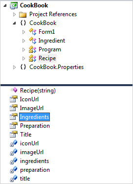
The API of the cook book application
II. The Dock Control.
We create an empty WinForms project and add the Dock control from the toolbox. The dock control fills the entire client area:
this.dockControl1.Dock = System.Windows.Forms.DockStyle.Fill;
this.dockControl1.Location = new System.Drawing.Point(0, 0);
this.dockControl1.Size = new System.Drawing.Size(784, 562);
These properties are set in the Property grid.
Each dock item is created with a title and id, which helps us identify it.
titleItem = new DockItem() { Header = "Recipe Name", Id = "Name" };
titleItem.DockStyle = DockStyle.Left;
titleItem.Content = GetContent("Name");
The DockStyle property is responsible for the initial layout of the dock item. You can choose among various dock styles – fill, bottom, top and more.
The GetContent method is very important. It prepares the controls that will be placed into each dock item and returns the appropriate one according to the parameter.
Once the dock item is created, let’s not forget to add it:
dockControl1.Items.Add(titleItem);
III. Creating the Content.
Let’s see how the content for a dock item is created. Let’s take the grid with the ingredients. It is identified with the “Ingredients” id:
private Control GetContent(string contentType)
{
  Control control = null;
  ....
  else if (contentType == "Ingredients")
         {
             grid = new DataGridView();
             grid.DefaultCellStyle.BackColor = Color.FromArgb(247, 226, 189);
             grid.Dock = DockStyle.Fill;
             grid.MultiSelect = false;
             grid.DataSource = selectedRecipe.Ingredients;
             grid.RowTemplate.MinimumHeight = 35;

             grid.RowHeadersWidthSizeMode =
            DataGridViewRowHeadersWidthSizeMode.DisableResizing;
             grid.ColumnHeadersHeightSizeMode = DataGridViewColumnHeadersHeightSizeMode.DisableResizing;
             grid.AutoSizeColumnsMode = DataGridViewAutoSizeColumnsMode.Fill;
             grid.SelectionMode = DataGridViewSelectionMode.FullRowSelect;
             grid.BackgroundColor = Color.FromArgb(253, 244, 247);

             control = grid;
         }
...
return control;
The idea is clear: you create the control, which will be rendered in the dock item and assign it to DockItem.Content. Here we make different customization for the grid – we change the color of table rows, adjust the height, turn off multiple row select and more.
IV. Changing the Content.
We change the content by handling the SelectedIndexChanged event for the ListView, which lists our recipes. When the user selects a new list item, we extract its Recipe and change the content of the other DockItem-s:
selectedRecipe = recipes[recipesListView.SelectedIndices[0]];
tb.Text = selectedRecipe.Preparation;
grid.DataSource = selectedRecipe.Ingredients;
pictureBox.Image = Image.FromFile(selectedRecipe.ImageUrl);
Here is the final output of the sample application:
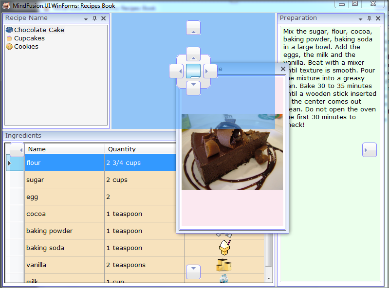
A Sample electronic cook book based on MindFusion WinForms Dock Control
You can download the sample directly from this link:
MindFusion WinForms Layout Control Sample: Electronic Cook Book in C#
MindFusion WinForms Layout Control Sample: Electronic Cook Book in VB.NET
Enjoy the fast, easy and straight-forwarded manner in which you can create a WinForms application with a flexible layout and multiple panels.