The JavaScript Diagram Library Now Supports TypeScript

Version 2.6 of MindFusion Diagram Library for JavaScript provides TypeScript definitions for all classes from Diagramming, Drawing and Graphs namespaces. MindFusion has uploaded the archive containing jsdiag.d.ts definitions file and several TypeScript sample scripts. The download is available from this link:

Download JavaScript Diagram Library With TypeScriptSupport, Version 2.6

A diagram sample written in TypeScript

A diagram sample written in TypeScript

About Diagramming for JavaScript Library: Written 100% in JavaScript, this tool uses HTML5 Canvas to draw impressive diagrams, schemes, flowcharts, trees and many more. It is browser independent, easy to use and integrate into any web application. JsDiagram supports a variety of predefined node shapes, customizable links, rich event set and many appearance options.

The user interaction model includes resizing / moving / selecting and modifying any diagram element. The tool boasts an elegant API, which is documented in details as well numerous step-by-step guides and tutorials. Various samples are provided to let you learn quickly how to use the most important features of the library – check them here. JsDiagram is not only the perfect choice for creating any type of diagram in the browser – it can also arrange it the way you wish with a mouse click using one of its automatic graph layout algorithms. For more details about the features of the component, please visit the Diagram for JavaScript page.

Container nodes initialized with TypeScript

Container nodes initialized with TypeScript

MindFusion.WinForms Pack, 2016.R2

MindFusion suite of WinForms controls has just been released and boasts a variety of new features to make you build WinForms applications faster and easier. Here is a review of the new version:

MindFusion Chart Control MindFusion.Charting

New data model

Data that should be drawn in charts is read through an interface called Series, whose instances can be assigned to the Series properties of Chart and SeriesRenderer classes. You can implement this interface in your own model classes to avoid duplicating data. The library includes several pre-defined series classes that let you specify data via IList or array objects.

Different series types in a single plot

The new data model allows adding different series types to a single plot

New rendering model

Chart graphics are drawn inside Plot components by SeriesRenderer-derived objects. Each plot can contain multiple series renderers from same or different types. For example, you can draw area, line and bar graphics in same plot by adding AreaRenderer, LineRenderer and BarRenderer objects to its SeriesRenderers collection. Chart controls automatically generate a series renderer of appropriate type for their Series.

Dashboard

The Dashboard control can contain multiple plots, axes, legends, images, gauges and text blocks arranged in dynamic layout. Individual components can be added to dashboard’s default RootPanel or LayoutPanel containers, or for more complex layouts add intermediary panels such as GridPanel and StackPanel to the default ones. To show different types of chart graphics, add Plot2D to draw in 2D Cartesian coordinate system, Plot3D for 3D Cartesian system, and PolarPlot for polar coordinate system. To draw horizontal or vertical axes, add respectively XAxisRenderer and YAxisRenderer objects. To show gauges, add LinearGaugeRenderer or OvalGaugeRenderer, whose Gauge property contains the gauge model definition.

The new WinForms Chart has a built-in dashboard control.

The new WinForms Chart has a built-in dashboard control.

Print and export

The Dashboard control and Chart controls that derive from it expose Print and PrintPreview methods for printing on paper. Call the ExportImage and CreateImage methods to generate bitmap image of the dashboard. The ExportPdf method exports the chart to a PDF (Portable Document Format) file. The ExportSvg method exports the chart to an SVG (Scalable Vector Graphics) file.

Styling

Values of appearance properties can come from several places in the component hierarchy. SeriesRenderer-derived objects can use attributes from their local SeriesStyle, from plot’s SeriesStyle, or from the *Series properties in current Theme. Component classes use either their local properties or ones defined in the theme. By default, appearance properties in SeriesRenderer > and Component > classes have null values, which makes the drawing code use values from the theme.

A rich choice of styling options are available

A rich choice of styling options are available

MindFusion WebForms Diagrammer MindFusion.Diagramming

Free-form nodes

A FreeFormNode collects all points from users’ mouse or touch input and displays them as node’s outline. To let users draw free-form nodes interactively, set Behavior to DrawFreeForms or LinkFreeForms. Use the Points property of FreeFormNode to get or set outline points programmatically. If the Closed property is set, the node is drawn as a closed shape and its interior filled, or otherwise the node is drawn as a poly-line. If the distance between first and last points drawn by user is shorter than AutoCloseDistance, the node’s Closed property is automatically set to true.

Free form nodes are drawn with the mouse

Free form nodes: just draw the node with the mouse and the control understands the shape you want

LinkLabel edit events

LinkTextEditing and LinkTextEdited events are now raised also when the user edits a LinkLabel. The Label property of the respective event-arguments class identifies the LinkLabel that is being edited. Label is a null reference if the user is editing link’s Text value.

keyboard16x16MindFusion Virtual Keyboard

MindFusion Virtual Keyboard has been initially added to MindFusion Pack for WinForms.

The WinForms virtual keyboard control: extended layout

The WinForms virtual keyboard control: extended layout

WPF Reporting ToolMindFusion.Reporting

Improved charts
MindFusion.Reporting now uses the new MindFusion charting engine to display charts in reports. The presentation of the charts has been greatly improved (particularly when resizing the charts).

Pie charts in a WinForms report

Pie charts in a WinForms report

Spreadsheet-16x16MindFusion.Spreadsheet

New and improved charts
MindFusion.Spreadsheet now uses the new MindFusion charting engine to display charts in worksheets. Along with the improved appearance (particularly when resizing the charts), the following new features have been added:

  • New Candlestick chart type;
  • New BarOverlayed and ColumnOverlayed chart types;
  • Several new legend position types;

Zoom
The worksheets can now be zoomed in and out through the new Zoom property.

Charts in a spreadsheet

The new chart engine makes spreadsheets even more appealing

MindFusion clients can download the installer for the latest version from the clients area on MindFusion website.

A direct link to download the WinForms pack is available from here:

Download MindFusion WinForms Pack 2016.R2

Updated assemblies are also available as MindFusion.Pack NuGet package.

About MindFusion.WinForms Pack: A rich set of programming components that provide WinForms developers with the complete list of features to build even the most complicated business applications fast and easy. The components integrate seamlessly and provide with a mouse click functionality that takes months to develop. Each control boasts various samples and tutorials, extensive documentation and numerous customization options that make it suitable for every type of software and scenario.

Further details about each component in the pack are available from MindFusion website:

Use this link to buy a license online. All components are royalty-free.

MindFusion.WPF Pack, 2016.R1

The new release of MindFUsion WPF Control Suite lists many new features, aimed to empower developers to create compelling business applications with even less efforts. The pack also includes new samples and tutorials. Below are the details:

License keys
There is no separate trial build of the control assemblies anymore. Instead, set the LicenseKey property of the controls to disable their evaluation mode and stop displaying trial messages. If your application contains more than one control by MindFusion, you could call MindFusion.Licensing.LicenseManager.AddLicense(key) from application start-up code to specify the key once instead of setting it per each control.

Visual Studio 2015 support
MindFusion Pack for WPF now includes support for Visual Studio 2015. The installer can create VS2015 toolbox palette for the component.

Barcodes
The new BarcodeLabel class allow displaying EAN, UPC or QR barcodes.

BarcodeLabel: QR barcodes

BarcodeLabel: QR barcodes

MindFusion Chart ControlMindFusion.Charting for WPF

Multiple Axes
The chart control enables developers to create unlimited number of axes of each type – X, X2, Y and Y2. Each axis is an instance of the Axis class and has its own set of properties for complete customization – label style, brush, tick length etc. You can set the X and Y axes of each ChartSeries to a series of your choice and thus bind each chart series to different axes, if you wish.

Multiple axes in the WPF chart control.

Multiple axes in the WPF chart control.

Improved Zooming
Selected area with width smaller than MinZoomSpan does not evoke any action in the control. In addition, the new ZoomChanged event fires whenever zoom occurs and provides useful data for the zoom action with its ZoomChangedArgs.

Cross Hair Improvements
The cross hair control has been improved with several new properties, a method and an event. The properties are:

The new CrossHairPosition method returns the current location of the cross hair. For more precise handling of cross hair movements a new event is available – CrossHairPositionChanged.

Greatly Improved 3D Charts
3D charts have received plenty of improvements, new properties and performance optimizations:

  • PointMergeThreshold – The property sets the radius of an area around a given point where no other points are drawn. The result is better performance especially in charts with numerous points, which happen to be close to one another.
  • InterpolationType.None – A new InterpolationType has been added to the InterpolationType, which does not interpolation but adds data directly and connects the points with triangulation.

The SurfaceType enum has been replaced with three bool properties, which makes the API easier to understand and use.

ScatterFaceSize – the property regulates the size of the polygons that build a 3D scatter. Bigger values lead to bigger polygons, which results in faster performance and more rough scatter mesh.

Effect3D.ShaderEffect – the property can be applied to all 3D chart elements, including scatters and performs much faster.

3D surface chart with color map and wire frame.

3D surface chart with color map and wire frame.

Exporting Images
Two new methods have been added for exporting the chart as an image – CreateImage and ExportImage.

Custom Formatting of Labels in Real-time Charts
A new property has been added to the RealTimeChart library – Axis.LabelFormatProvider. Use it to specify custom formatting of numeric labels. If required, you can specify format arguments for your format classes with Axis.LabelFormat.

MindFusion WebForms DiagrammerMindFusion.Diagramming for WPF

Free-form nodes
A FreeFormNode collects all points from users’ mouse or touch input and displays them as node’s outline. To let users draw free-form nodes interactively, set Diagram.Behavior to DrawFreeForms or LinkFreeforms. Use the Points property of FreeFormNode to get or set outline points programmatically. If the Closed property is set, the node is drawn as a closed shape and its interior filled, or otherwise the node is drawn as a poly-line. If the distance between first and last points drawn by user is shorter than Diagram.AutoCloseDistance, the node’s Closed property is automatically set to true . AutoCloseDistance default value is Double.MaxValue , so free-form nodes are always closed.

Wpf Diagram: Free Shapes

Wpf Diagram: Free Shapes

Shape control points
Shape formulas can now be parameterized by associating control points with Shape objects. Each control point is passed to the shape script as a named variable. Apart from the name, you can specify the default, min and max coordinates for each parameter via the ShapeControlPoint constructor, and whether to treat its values as percents or fixed offset.

Resize table columns and rows
Columns and rows of a TableNode can now be resized interactively if its AllowResizeColumns or AllowResizeRows properties are enabled. In order to resize, move the mouse pointer to the border line on column’s right side or row’s bottom side until it shows resize cursor and start dragging. The control raises TableColumnResizing and TableRowResizing events to let you validate new size or prevent resizing some elements.

Barcode nodes
The BarcodeNode class displays EAN, UPC or QR barcodes as node’s content. In-place edit operations let users enter new numeric codes for 1D codes or text strings for QR codes. The barcode format is specified via the Format property, the encoded number or text is set via Content, and color of 1D bars / 2D modules via BarColor.

Barcode diagram nodes

Barcode diagram nodes

Support for Visio stencils
The diagram can now display shapes from stencil files in Visio 2003 XML stencil format (.vsx). To load a stencil file, use an instance of the VisioStencil class. The shapes are displayed in the diagram through VisioNode objects.

ShapeDesigner improvements

  • The ShapeDesigner control supports undo. Call its Undo or Redo methods to respectively undo or redo a change done to the designed shape.
  • ZoomFactor property added to ShapeDesigner. It also supports interactive zoom in/out via mouse wheel.
  • The SelectedElement property exposes the graphic element currently selected in ShapeDesigner canvas. You can bind to its stroke and brush properties to create alternative user interface for editing element attributes.

AnchorPatern improvements

  • The XUnit and YUnit properties allow specifying the coordinates of an AnchorPoint as a fixed offset from the node’s top-left corner rather than in percentage, so that the point position does not change when the node is resized.
  • The AnchorPattern property of Shape class lets you associate anchor points with shape definitions. If a ShapeNode instance does not contain its own AnchorPattern, it will derive the one defined by the node’s Shape.
  • The RowAnchorPattern property lets you specify default AnchorPattern for all table rows.

Map-16x16MindFusion.Mapping for WPF

Zoom control
The ZoomControl class lets user change interactively the current zoom level and scroll position of a MapView. To set it up, add a ZoomControl to the page, place it anywhere over a MapView, and set the control’s Target property to that view. Set the ZoomStep and ScrollStep properties to specify the amount added to view’s zoom level or scroll position by ZoomControl’s buttons.

map-control-zooming

Miscellaneous

  • The new Behavior property lets users select multiple map elements interactively.

WPF Reporting ToolMindFusion.Reporting for WPF

Report Parameters
Parameters can now be added to a report through the new Parameters collection of the Report class. The parameters provide name, description and value and can be of any type, including expression. For more information about parameters, check the Report Parameters topic.

Barcodes
MindFusion.Reporting for WPF reports can now display UPC-A, UPC-E, EAN-8, EAN-13, and QR barcodes. The barcodes are represented by the new Barcode report item.

wpf_barcode_report_items

Schedule ControlMindFusion.Scheduling for WPF

Interactive Recurrence Rescheduling
Recurrences can be rescheduled interactively by holding down the RescheduleRecurrenceKey while dragging a recurrent item. The control tries to preserve the current pattern of the recurrence when possible.

New Theme
A new built-in theme is available in MindFusion.Scheduling for WPF – the Light theme. It is available through the ThemeType enumeration.

The new 'Light' theme

The new ‘Light’ theme

New Members
Several new properties and events have been added to the control:

You can read details about the new features of the pack at the news page on the forum. The trial version is available for direct download from this link:

Download MindFusion.Pack for WPF 2016.R1

About MindFusion.Wpf Pack: A set of advanced WPF components that help you build your business application easy and on time. The tools provide you with a complete set of features to create, edit and render complex flowcharts, charts, diagrams, calendars, schedules, maps and reports. A set of gauges and UI elements is also included. Each component offers various samples, tutorials and detailed documentation. The controls offer simple and intuitive API, completely customizable appearance, numerous input/output options and a rich event set. Each tool has been thoroughly tested to guarantee that you and your application get the high quality and performance you deserve.

You can read more about the capabilities of each component at its features page:

Prices and licenses are explained in details at the buy page.

Creating custom CompositeNode components

In this post we’ll examine how CompositeNode components work in MindFusion.Diagramming for Windows Forms, and in the process create a custom radio button component. You can find the completed sample project here: RadioComponent.zip

CompositeNode was created as alternative of the ControlNode class, which lets you present any Windows Forms control as a diagram node. ControlNode has many advantages, such as letting you design the hosted user controls using Visual Studio designer, reusing them in other parts of the user interface, and including complex framework or third-party controls as their children. From the fact that each user control creates a hierarchy of Win32 windows come some disadvantages too:

  • ControlNodes cannot mix with other diagram elements in the Z order but are always drawn on top
  • performance deteriorates if showing hundreds of nodes
  • mouse events might not reach the diagram if hosted controls capture mouse input
  • print and export might not be able to reproduce the appearance of hosted controls without additional work (handling PaintControl event)

On the other hand, CompositeNode does all its drawing in DiagramView control’s canvas and is not affected by the issues listed above. CompositeNode lets you build node’s UI by composing hierarchy of components derived from ComponentBase class. Pre-defined components include layout panels, read-only or editable text fields, images, borders, buttons, check-boxes and sliders. If the UI component you need isn’t provided out of the box, you could still implement it as a custom class that derives from ComponentBase or more specific type and overriding the GetDesiredSize, ArrangeComponents and Draw methods. Lets see how that works using a RadioButtonComponent as an example.

Derive RadioButtonComponent from CheckBoxComponent so we reuse its IsChecked and Content properties:

class RadioButtonComponent : CheckBoxComponent
{
}

CompositeNode relies on a dynamic layout system that lets components determine their size by overriding GetDesiredSize method, and arranging children in allocated size by means of ArrangeComponents method. For radio button we’ll call its base class to measure content size and add enough space for drawing the radio graphics element (a circle) horizontally, while fitting it in measured height:

float RadioSize(SizeF size)
{
	return Math.Min(size.Width, size.Height);
}

public override SizeF GetDesiredSize(SizeF availableSize, IGraphics graphics)
{
	var s = base.GetDesiredSize(availableSize, graphics);
	s.Width += RadioSize(s);
	return s;
}

ArrangeComponents calls the base class to arrange its content on the right side of available space:

public override void ArrangeComponents(RectangleF availableSpace, IGraphics graphics)
{
	var radioSize = RadioSize(availableSpace.Size);
	availableSpace.X += radioSize;
	availableSpace.Width -= radioSize;
	base.ArrangeComponents(availableSpace, graphics);
}

Now override Draw and render standard radio button graphics on the left side of the component, and content on the right side:

public override void Draw(IGraphics graphics, RenderOptions options)
{
	var radioSize = RadioSize(Bounds.Size);
	var r = radioSize / 2 - 1;
	var cr = r - 1;

	graphics.FillEllipse(Brushes.White, Bounds.X + 1, Bounds.Y + 1, 2 * r, 2 * r);
	using (var pen = new System.Drawing.Pen(Color.Black, 0.1f))
		graphics.DrawEllipse(pen, Bounds.X + 1, Bounds.Y + 1, 2 * r, 2 * r);
	if (IsChecked)
		graphics.FillEllipse(Brushes.Black, Bounds.X + 2, Bounds.Y + 2, 2 * cr, 2 * cr);

	GraphicsState s = graphics.Save();
	graphics.TranslateTransform(radioSize - 1 + Bounds.X, Bounds.Y);
	Content.Draw(graphics, options);
	graphics.Restore(s);
}

We’ll want only one radio from a group to be selected. For our purposes we can count all radio buttons placed inside same stack panel as part of same group. Override the OnClick method to unselect all buttons in parent panel and select the clicked one:

protected override void OnClicked(EventArgs e)
{
	var parentStack = Parent as StackPanel;
	if (parentStack != null)
	{
		foreach (var child in parentStack.Components)
		{
			var radio = child as RadioButtonComponent;
			if (radio != null)
				radio.IsChecked = false;
		}
	}
	this.IsChecked = true;
}

That’s it, the radio button component is ready with just a screenful of code 🙂 Let’s check how it works by creating an OptionNode class that shows a group of radio buttons and exposes a property to access or change selected one:

class OptionNode : CompositeNode
{
}

You could create the stack panel and radio buttons from code if you need more dynamic configuration, e.g. one with variable number of radio buttons. For this example we’ll just load a fixed template consisting of four buttons from XML:

const string Template = @"
	<simplepanel>

        <shape name="" shape""="" shape="" roundrect""="">

		<border padding="" 2""="">

			<stackpanel name="" radiogroup""="" orientation="" vertical""="" spacing="" 1""="" horizontalalignment="" center""="">
				<radiobuttoncomponent padding="" 2""="">
					<radiobuttoncomponent.content>
						<text text="" option="" 1""="" font="" verdana,="" 3world,="" style="Bold&quot;&quot;">
					</text></radiobuttoncomponent.content>
				</radiobuttoncomponent>
				<radiobuttoncomponent padding="" 2""="">
					<radiobuttoncomponent.content>
						<text text="" option="" 2""="" font="" verdana,="" 3world,="" style="Bold&quot;&quot;">
					</text></radiobuttoncomponent.content>
				</radiobuttoncomponent>
				<radiobuttoncomponent padding="" 2""="">
					<radiobuttoncomponent.content>
						<text text="" option="" 3""="" font="" verdana,="" 3world,="" style="Bold&quot;&quot;">
					</text></radiobuttoncomponent.content>
				</radiobuttoncomponent>
				<radiobuttoncomponent padding="" 2""="">
					<radiobuttoncomponent.content>
						<text text="" option="" 4""="" font="" verdana,="" 3world,="" style="Bold&quot;&quot;">
					</text></radiobuttoncomponent.content>
				</radiobuttoncomponent>
			</stackpanel>

		</border>

    </shape></simplepanel>";

The template can be loaded using the XmlLoader class. We’ll also store a reference to the stack panel so we can access its child radio buttons:

public OptionNode()
{
	Load();
}

public OptionNode(Diagram d)
	: base(d)
{
	Load();
}

private void Load()
{
	Components.Add(XmlLoader.Load(Template, this, null));

	radioGroup = FindComponent("RadioGroup") as StackPanel;
}

StackPanel radioGroup;

Now implement a SelectedOption property that lets us select a radio button by its index. Define it as nullable integer so we can represent missing select too:

public int? SelectedOption
{
	get
	{
		for (int i = 0; i < radioGroup.Components.Count; i++)
		{
			var radioButton = (RadioButtonComponent)radioGroup.Components[i];
			if (radioButton.IsChecked)
				return i;
		}
		return null;
	}
	set
	{
		for (int i = 0; i < radioGroup.Components.Count; i++)
		{
			var radioButton = (RadioButtonComponent)radioGroup.Components[i];
			radioButton.IsChecked = value == i;
		}
	}
}

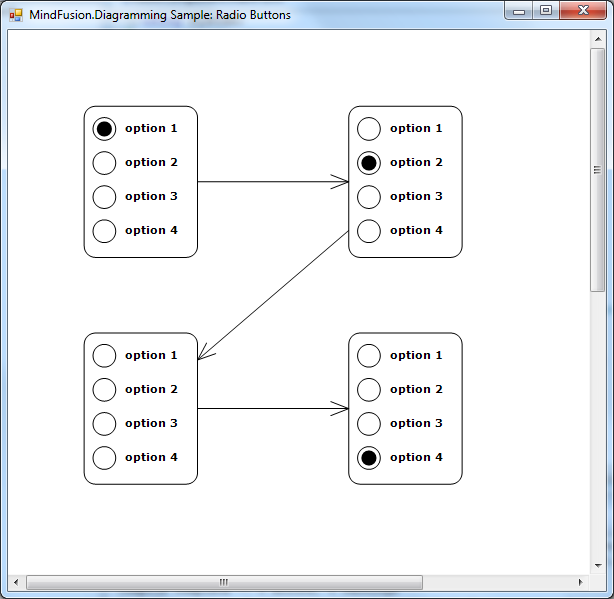
Let’s try it – create a few nodes and run the application, you’ll see the screen shown below:

var node1 = new OptionNode();
node1.Bounds = new RectangleF(20, 20, 30, 40);
node1.SelectedOption = 0;
diagram.Nodes.Add(node1);

var node2 = new OptionNode();
node2.Bounds = new RectangleF(90, 20, 30, 40);
node2.SelectedOption = 1;
diagram.Nodes.Add(node2);

var node3 = new OptionNode();
node3.Bounds = new RectangleF(20, 80, 30, 40);
node3.SelectedOption = null;
diagram.Nodes.Add(node3);

var node4 = new OptionNode();
node4.Bounds = new RectangleF(90, 80, 30, 40);
node4.SelectedOption = 3;
diagram.Nodes.Add(node4);

for (int i = 0; i < diagram.Nodes.Count - 1; i++)
	diagram.Factory.CreateDiagramLink(
		diagram.Nodes[i], diagram.Nodes[i + 1]);

Radio buttons in MindFusion diagram nodes

To be fair, this kind of nodes is simple enough to implement using standard TableNode class where radio button graphics are either custom drawn or set as Image inside table cells in first column, and text displayed in second column. However the radio buttons can be mixed with other components in CompositeNodes to implement more complex user interfaces than ones possible with tables.

For more information on MindFusion flow diagramming libraries for various desktop, web and mobile platforms, see MindFusion.Diagramming Pack page.

Enjoy!

MindFusion.WinForms Pack, 2016.R1

MindFusion Pack for WinForms, 2016.R1 has been released. Here is an overview of the new features. You can find details about each new feature here.

Visual Studio 2015 support
MindFusion Pack for WinForms now includes support for Visual Studio 2015. The installer can create VS2015 toolbox palette for the components.

Barcodes
The new BarcodeLabel and BarcodePrinter classes allow displaying and printing EAN, UPC or QR barcodes.

BarcodeLabel:  QR barcodes

BarcodeLabel: QR barcodes

MindFusion WebForms DiagrammerMindFusion.Diagramming

Street maps
MapNodes can render street maps in OpenStreetMap format. Call FromXml method of MapContent to load an .osm file.

MindFusion WinForms  Street maps

MindFusion WinForms Street maps

Resize table columns and rows
Columns and rows of a TableNode can now be resized interactively if its AllowResizeColumns or AllowResizeRows properties are enabled. In order to resize, move the mouse pointer to the border line on column’s right side or row’s bottom side until it shows resize cursor and start dragging.

Barcode nodes
The BarcodeNode class displays EAN, UPC or QR barcodes as node’s content. In-place edit operations let users enter new numeric codes for 1D codes or text strings for QR codes.

Miscellaneous

  • Support for .NET 2 has been dropped; the minimum supported .NET framework version now is 3.5.
  • Distribution now includes a set of digitally-signed assemblies.
  • Undo/redo records for in-place edit operations are now created automatically. They are represented by instances of the EditTextCmd class.
  • CompositeNode supports vertical scrolling in EditComponent (only via keyboard).
  • Support for FromPage and ToPage properties of PrinterSettings .
  • CreateBarcodeNode methods added to the Factory class.
  • The BarcodeNodeStyle property of Diagram defines the default appearance of BarcodeNodes.
  • Improved speed when dragging large hierarchies of grouped nodes.
  • ZoomControl can now be used with other components by MindFusion and has been moved to MindFusion.Common.WinForms assembly and namespace.
  • and much more.

Map-16x16MindFusion.Mapping

Street maps
You can render street maps in OpenStreetMap format by adding a StreetMapLayer instance to the MapView. In order to load a street map, create a new StreetMapLayer > object and call its Map‘s LoadFromXml method to load the corresponding *.osm file.

Zoom control
The ZoomControl class lets user change interactively the current zoom level and scroll position of a MapView. To set it up, add a ZoomControl to the form, place it anywhere over a MapView, and set the control’s Target property to that view.

map-control-zooming

Multiple selection
Now it’s possible to select multiple decorations or map shapes by drawing a selection rectangle. To enable that, set the Behavior property to Select. Selected elements are stored in the Selection collection of respective layer objects.

API changes

  • The type of MapElement‘s Label property has been changed from string to Label class. The FontName and FontSize properties have been moved from MapElement to Label.
  • Type of Layers property changed from List to ObservableCollection .

WPF Reporting ToolMindFusion.Reporting

Barcodes
MindFusion.Reporting reports can now display UPC-A, UPC-E, EAN-8, EAN-13, and QR barcodes. The barcodes are represented by the new Barcode report item.

WinForms Reporter: Barcode Report Items

WinForms Reporter: Barcode Report Items

Miscellaneous

WebForms Scheduler by MindFusionMindFusion.Scheduling

Improved List View
The List view can now display an additional header and a footer. To turn them on, set the appropriate flag to the HeaderStyle property of the ListViewSettings class. The FooterFormat and MainHeaderFormat properties let you customize the text in the respective header. The text can also be customized through the CustomizeText event of the Calendar class. The size of the headers can be specified through the MainHeaderSize and FooterSize properties. Interactive Recurrence Rescheduling Recurrences can be rescheduled interactively by holding down the RescheduleRecurrenceKey while dragging a recurrent item. The control tries to preserve the current pattern of the recurrence when possible.

New Theme
A new built-in theme is available in MindFusion.Scheduling – the Light theme. It is available through the ThemeType enumeration.

The new 'Light' theme

The new ‘Light’ theme

New Properties
Several new properties have been added to the control:

Miscellaneous

Spreadsheet-16x16MindFusion.Spreadsheet

Autofiltering
Worksheets now support autofiltering. To enable it, call the AutoFilter method of the CellRange class. To specify autofiltering criteria for individual columns, use the AutoFilter overload.

WinForms Spreadsheet: Auto filtering

Multiple Selection
MindFusion.Spreadsheet now supports selection of multiple cell ranges. Cell ranges can be added to the selection interactively, by holding down the CTRL key while dragging with the mouse, or programmatically, by using one of the new methods of the Selection class: Add, AddRow, and AddColumn.

Miscellaneous

Installer for the latest version can be downloaded at https://www.mindfusion.eu/WinFormsTrial.zip

Updated assemblies are also available as MindFusion.Pack NuGet package.

About MindFusion.WinForms Pack: A set of five WinForms programming components that provide your application with a rich choice of diagramming, charting, scheduling, mapping, reporting and gauge features. The tools are very easy to implement and use. They boast intuitive API and various step-by-step tutorials to get you started. Both online and offline documentation is available.

A sample browser presents you with all the samples for each control to let you easily navigate to what you need. You can check some of the features of each component right now if you look at the online demos:

Visit the features – page of the components for more information about their capabilities:

You can check the prices and licensing scheme here. All components are royalty-free.